


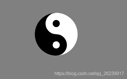
1.利用两个全等的矩形拼成一个正方形,再将其变成两个半圆,凑在一起就是一个正圆
<!DOCTYPE html>
<html>
	<head>
		<meta charset="utf-8">
		<title></title>
		<style>
			body{
				background-color: gray;
			}
			.outer1 {
				width: 600px;
				height: 300px;
				background-color: white;
				margin: 0px auto 0px auto;
				border-radius: 300px 300px 0 0;

			}

			.outer2 {
				width: 600px;
				height: 300px;
				background-color: black;
				margin: 0 auto;
				border-radius: 0 0 300px 300px;
			}

			.outer1:before {
				content: "";
				width: 300px;
				height: 300px;
				background-color: white;
				display: inline-block;
				transform: translate(0, 50%);
				border-radius: 50%;
			}

			.outer1:after {
				content: "";
				width: 150px;
				height: 150px;
				background-color: black;
				position: absolute;
				display: block;
				transform: translate(50%, -50%);
				border-radius: 50%;
			}

			.outer2:before {
				content: "";
				width: 300px;
				height: 300px;
				background-color: black;
				display: inline-block;
				position: absolute;
				transform: translate(100%, -50%);
				border-radius: 50%;
			}

			.outer2:after {
				content: "";
				width: 150px;
				height: 150px;
				background-color: white;
				position: absolute;
				display: block;
				transform: translate(250%, -50%);
				border-radius: 50%;


			}
			.box{
				margin: 500px auto 0px auto;
				width: 600px;
				height: 600px;
				border:1px solid black;
				border-radius: 50%;
				animation:xuanzhuan 4s infinite linear ;
			}

			@keyframes xuanzhuan{

				0%{
					transform: rotate(0deg);
				}

				25%{
					transform: rotate(-90deg);
				}

				50%{
					transform: rotate(-180deg);
				}

				75%{
					transform: rotate(-270deg);
				}

				100%{
					transform: rotate(-360deg);
				}
			}
		</style>
	</head>
	<body>
		<div class="box">
			<div class="outer1">

			</div>
			<div class="outer2">

			</div>
		</div>

	</body>
</html>
2.利用border-left 和 border-right
| 条件 | |
|---|---|
| 宽度为0 | 高度为数值 |
【也可以利用border-top 与 border-bottom 此时高度为0】
<!DOCTYPE html>
<html>
	<head>
		<meta charset="utf-8">
		<title></title>
		<style>
			body{
				background-color: gray;
			}
			.box{
				position: relative;
				margin: 300px auto;
				width: 0px;
				height: 600px;
				/* border-style: solid; */
				border-left: 300px   solid black;
				border-right: 300px  solid white;
				border-radius: 50%;
			}
			.box:before {
				content: "";
				width: 300px;
				height: 300px;
				display: block;
				background-color: white;
				transform: translate(-50%,0);
				border-radius: 50%;
			}

			.box:after {
				content: "";
				width: 100px;
				height: 100px;
				background-color: white;
				position: absolute;
				display: inline-block;
				transform: translate(-50%, 100%);
				border-radius: 50%;
			}
			.point{
				position: absolute;
				top:0;
			}
			.point:before{
				content: "";
				width: 300px;
				height: 300px;
				display: block;
				background-color: black;
				transform: translate(-50%,100%);
				border-radius: 50%;
			}
			.point:after{
					content: "";
				width: 100px;
				height: 100px;
				background-color: black;
				display: inline-block;
				transform: translate(-50%, -200%);
				border-radius: 50%;
			}
		</style>
	</head>
	<body>
		<div class="box">
			<div class="point"></div>
		</div>

	</body>
</html>


 7579
7579


 被折叠的 条评论
为什么被折叠?
被折叠的 条评论
为什么被折叠?
 到【灌水乐园】发言


