


阅读前,请浏览此处上方目录。
Android UI编程
本章内容为个人笔记,参考书籍有:《疯狂的android》第3版、《第一行代码》———————————————————————————————————————————————————
在学校里听老师讲课,总会让学生误会程序员的主要工作不是界面美化,那都是美工做得事情。但随着移动开发的不断发展,在软件开发的过程中,界面设计和功能开发同样重要。界面美观的应用不仅可以大大增加用户粘性,还可以帮我们吸引更多新用户。如果善用UI控件,可以做出让人赏心悦目的应用。
Android应用绝大部分UI组件都放在android.widget包及其子包、android.view包及其子包中,Android应用的所有UI都继承了View类。View类还有一个重要的子类,ViewGroup,但ViewGroup通常作为其他组件其他组件的容器使用。Android的所有UI组件都是建在View、ViewGroup基础之上,ViewGroup是View的子类,因此ViewGroup也可以被当成View使用。但由于ViewGroup是一个抽象类,因此实际使用中通常总是使用ViewGroup的子类来作为容器,例如各种布局管理器。
1、布局管理器
1.1 LinearLayout 线性布局
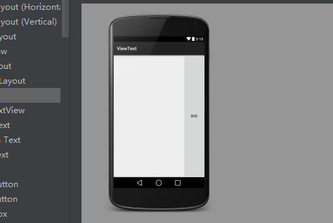
LinearLayout 是最常用的布局,它会把容器里面的组件一个挨一个的排列起来,LinearLayout 可以控制各组件横纵向排列(通过android:orientation属性控制)。设置排列方式可以设置为 android:orientation="vertical" (垂直排列),android:orientation="horizontal"(水平排列)。还有一个XML属性是 android:gravity对齐方式,有很对齐方式。学习LinearLayout还有另外一个重要属性android:layout_weight,这个属性允许我们使用比例方式来指定控件的大小,在手机屏幕适配性方面起到非常重要的作用。
<LinearLayout
    android:layout_width="match_parent"
    android:layout_height="match_parent"
    android:gravity="right"
    android:orientation="vertical">
    <Button
        android:layout_width="wrap_content"
        android:layout_height="wrap_content"
        android:layout_weight="1"
        android:text="按钮" />
</LinearLayout>
1.2 TableLayout 表格布局
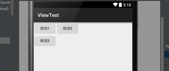
TableLayout继承了LinearLayout,因此它的本质依然是线性布局管理器。表格布局采用行、列的形式来管理UI组件,TableLayout并不需要明确声明包含多少行多少列,而是通过添加TableRow来控制表格的行数和列数。每次向TableLayout中添加一个TableRow,该TableRow就是一个表格行。接下来示范:
    <TableRow>
        <Button
            android:layout_width="wrap_content"
            android:layout_height="wrap_content"
            android:text="按钮1" />
        <Button
            android:layout_width="wrap_content"
            android:layout_height="wrap_content"
            android:text="按钮2" />
    </TableRow>
    <TableRow>
        <Button
            android:layout_width="wrap_content"
            android:layout_height="wrap_content"
            android:text="按钮3" />
    </TableRow>
</TableLayout>
TableLayout 还有三个属性需要认知,
- android:collapseColumns(设置需要被隐藏列序号)
- android:shrinkColumns(设置需要被收缩列序号)
- android:stretchColumns(设置需要被拉伸列序号)
1.3 FrameLayout 帧布局
FrameLayout 相对于其他布局管理器来说比较简单,但应用的场景也减少。FrameLayout直接继承了ViewGroup组件,为每个加入其中的组件创建一个空白区域,把组件一个个地叠加在一起。
 <FrameLayout
        android:layout_width="match_parent"
        android:layout_height="match_parent">
        <Button
            android:layout_width="wrap_content"
            android:layout_height="wrap_content"
            android:text="New Button"
            android:id="@+id/button" />
        <ImageButton
            android:layout_width="wrap_content"
            android:layout_height="wrap_content"
            android:src="@drawable/a4"/>
    </FrameLayout>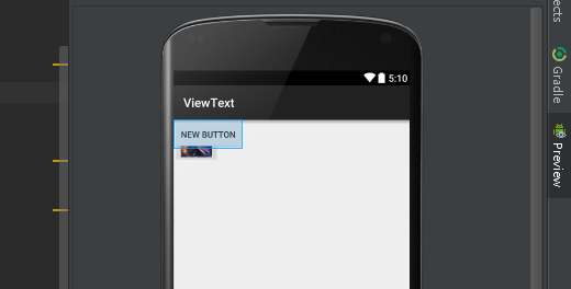
显然两个组件重叠在左上角,这种布局可能用到的地方可以不多。
1.4 RelativeLayout相对布局
RelativeLayout也是一种比较常用布局,相对布局容器内子组件的位置总是相对于兄弟组件、父容器来决定的,因此这种布局方式被称为相对布局。
以下是只能设为boolean值得属性:
| android:layout_centerHorizontal | 控制该子组件是否位于布局容器的水平居中 |
| android:layout_centerVertical | 控制该子组件是否位于布局容器的垂直居中 |
| android:layout_centerInParent | 控制该子组件是否位于布局容器的中央位置 |
| android:layout_alignParentTop | 控制该子组件是否与布局容器顶端对齐 |
| android:layout_alignParentBottom | 控制该子组件是否与布局容器低端对齐 |
| android:layout_alignParentLeft | 控制该子组件是否与布局容器左端对齐 |
| android:layout_alignParentRight | 控制该子组件是否与布局容器右边对齐 |
| android:layout_above | 控制该子组件位于给出ID组件的上方 |
| android:layout_below | 控制该子组件位于给出ID组件的下方 |
| android:layout_toLeftOf | 控制该子组件位于给出ID组件的左侧 |
| android:layout_toRightOf | 控制该子组件位于给出ID组件的右侧 |
| android:layout_alighTop | 控制该子组件与给出ID组件的上边界对齐 |
| android:layout_alighBottom | 控制该子组件与给出ID组件的下边界对齐 |
| android:layout_alighLeft | 控制该子组件与给出ID组件的左边界对齐 |
| android:layout_alighRight | 控制该子组件与给出ID组件的右边界对齐 |
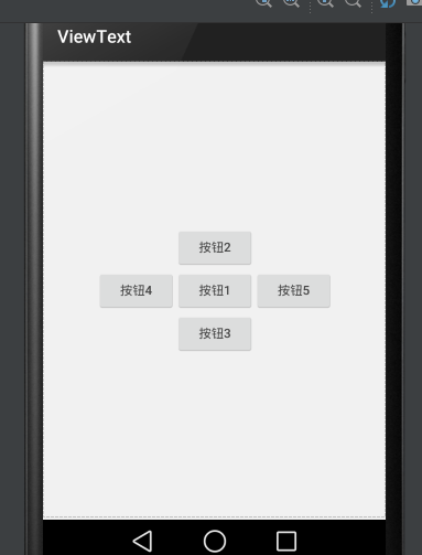
 <RelativeLayout
        android:layout_width="match_parent"
        android:layout_height="match_parent">
        <!--定义按钮Bt1位于父容器中间-->
        <Button
            android:id="@+id/bt1"
            android:layout_width="wrap_content"
            android:layout_height="wrap_content"
            android:layout_centerInParent="true"
            android:text="按钮1" />
        <!--定义Bt2位于按钮Bt1上方-->
        <Button
            android:id="@+id/bt2"
            android:layout_width="wrap_content"
            android:layout_height="wrap_content"
            android:layout_above="@id/bt1"
            android:layout_alignLeft="@id/bt1"
            android:text="按钮2" />
        <!--定义Bt3位于按钮Bt1下方-->
        <Button
            android:id="@+id/bt3"
            android:layout_width="wrap_content"
            android:layout_height="wrap_content"
            android:layout_below="@id/bt1"
            android:layout_alignLeft="@id/bt1"
            android:text="按钮3" />
        <!--定义Bt4位于按钮Bt1左方-->
        <Button
            android:id="@+id/bt4"
            android:layout_width="wrap_content"
            android:layout_height="wrap_content"
            android:layout_toLeftOf="@id/bt1"
            android:layout_alignTop="@id/bt1"
            android:text="按钮4" />
        <!--定义Bt2位于按钮Bt1右方-->
        <Button
            android:id="@+id/bt5"
            android:layout_width="wrap_content"
            android:layout_height="wrap_content"
            android:layout_alignTop="@id/bt1"
            android:layout_toRightOf="@id/bt1"
            android:text="按钮5" />
    </RelativeLayout>
1.5 GridLayout 网格布局
GridLayout的作用类似于HTML中的Table标签,它把整个容器划分成rows*columns个网格,每个网格可以放置一个组件。除此之外也可以设置一个组件横跨多少列、纵跨多少行。
首先要说的是GridLayout与LinearLayout布局一样,也分为水平和垂直两种方式,默认是水平布局:
| android:orientation | horizontal 水平 vertical 垂直 |
第二就是GridLayout的属性:
| android:rowCount | 设置该网格的列数量 |
| android:columnCount | 设置该网格的行数量 |
| android:layout_rowSpan | 设置该子组件在容器纵跨几行 |
| android:layout_columnSpan | 设置该子组件在容器横跨几行 |
【实例】计算器界面:
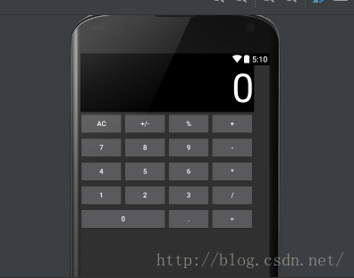
<?xml version="1.0" encoding="utf-8"?>
<GridLayout xmlns:android="http://schemas.android.com/apk/res/android"
    android:layout_width="wrap_content"
    android:layout_height="wrap_content"
    android:columnCount="4"
    android:orientation="horizontal"
    android:rowCount="6">

    <TextView
        android:layout_columnSpan="4"
        android:layout_gravity="fill"
        android:background="#000"
        android:gravity="right"
        android:text="0"
        android:textColor="#fff"
        android:textSize="80dp" />
    <Button
        android:id="@+id/bt1"
        android:text="AC" />
    <Button
        android:id="@+id/bt2"
        android:text="+/-" />
    <Button
        android:id="@+id/bt3"
        android:text="%" />
    <Button
        android:id="@+id/bt4"
        android:text="+" />
    <Button
        android:id="@+id/bt5"
        android:text="7" />
    <Button
        android:id="@+id/bt6"
        android:text="8" />
    <Button
        android:id="@+id/bt7"
        android:text="9" />
    <Button
        android:id="@+id/bt8"
        android:text=" - " />
    <Button
        android:id="@+id/bt9"
        android:text="4" />
    <Button
        android:id="@+id/bt10"
        android:text="5" />
    <Button
        android:id="@+id/bt11"
        android:text="6" />
    <Button
        android:id="@+id/bt12"
        android:text="*" />
    <Button
        android:id="@+id/bt13"
        android:text="1" />
    <Button
        android:id="@+id/bt14"
        android:text="2" />
    <Button
        android:id="@+id/bt15"
        android:text="3" />
    <Button
        android:id="@+id/bt16"
        android:text="/" />
    <Button
        android:id="@+id/bt17"
        android:layout_columnSpan="2"
        android:layout_gravity="fill"
        android:text="0" />
    <Button
        android:id="@+id/bt18"
        android:text="." />
    <Button
        android:id="@+id/bt19"
        android:text="=" />
</GridLayout> android:layout_columnSpan="2"
android:layout_gravity="fill" 1.6 AbsoluteLayout绝对布局
AbsoluteLayout绝对布局犹如div指定了absolute属性,用X,Y坐标来指定元素的位置!
该布局目前已经淘汰,知道就行了!
-----------------------------------------------------
2、常用控件的使用方法
2.1 TextView文本框
TextView是Android中最简单的控件,它主要用于界面显示一段文本信息,有点类似Swing编程中的JLabel,但又比JLabel强大。还有些 样式、文本转换autoLink和autoText、文本超长ellipsize等等不一一多说。
<LinearLayout xmlns:android="http://schemas.android.com/apk/res/android"
    android:layout_width="match_parent"
    android:layout_height="match_parent"
    android:orientation="vertical">
    <TextView
        android:id="@+id/textView"
        android:layout_width="wrap_content"
        android:layout_height="wrap_content"
        android:text="New Text" />
</LinearLayout>
2.2 EditText编辑框
EditText 是程序中用于和用户进行交互十分重要的控件,它允许用户在控件里输入和编辑内容,应用的场景最常见就是输入账号密码。
EditText 与 TextView非常相似,他甚至与TextView共用了绝大部分XML属性和方法,他们之间最大的区别就是:EditText 可以接受用户的输入。
- android:hint:指定编辑框的提示信息;
- android:inputType:指定编辑框输入内容的类型(textPassword、numberPassword、number、date、phone、text)
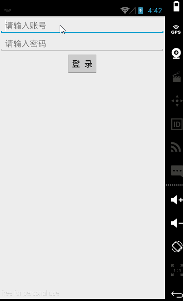
【实例】简单登录界面
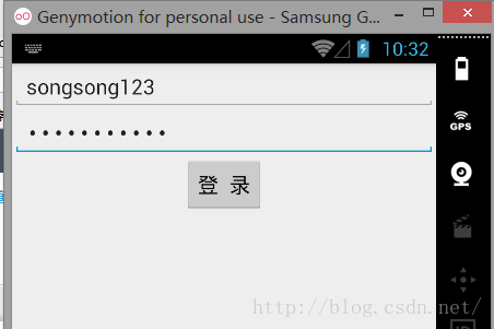
账号密码同样输入songsong123时在密码框就会显示点点,这是android:inputType的功能。
<LinearLayout xmlns:android="http://schemas.android.com/apk/res/android"
    android:layout_width="match_parent"
    android:layout_height="match_parent"
    android:gravity="center_horizontal"
    android:orientation="vertical">
    <EditText
        android:layout_width="match_parent"
        android:layout_height="wrap_content"
        android:hint="请输入账号"
        android:id="@+id/editText" />
    <EditText
        android:inputType="textPassword"
        android:layout_width="match_parent"
        android:layout_height="wrap_content"
        android:hint="请输入密码"
        android:id="@+id/editText2" />
    <Button
        android:layout_width="wrap_content"
        android:layout_height="wrap_content"
        android:text="登  录"
        android:textAllCaps="false"
        android:id="@+id/button" />
</LinearLayout>
        android:maxLines="1"
        android:maxLength="10"
2.3 Button按钮
Button是程序用于和用户交互的一个重要控件,Button继承了TextView。它主要是在UI界面上生成一个按钮,该按钮可以供用户单击,当用户单击按钮时,就会触发onClick时间。
实例依然是刚刚那个:
    <Button
        android:layout_width="wrap_content"
        android:layout_height="wrap_content"
        android:text="登  录"
        android:textAllCaps="false"
android:id="@+id/button" />public class MainActivity extends Activity {
private Button button;
private EditText editText;
@Override
protected void onCreate(Bundle savedInstanceState) {
super.onCreate(savedInstanceState);
setContentView(R.layout.text4);
button = (Button) findViewById(R.id.button);
editText = (EditText) findViewById(R.id.editText);
button.setOnClickListener(new View.OnClickListener() {
@Override
public void onClick(View v) {
String str = editText.getText().toString();
Toast.makeText(getApplicationContext(), str, Toast.LENGTH_SHORT).show();
}
});
}
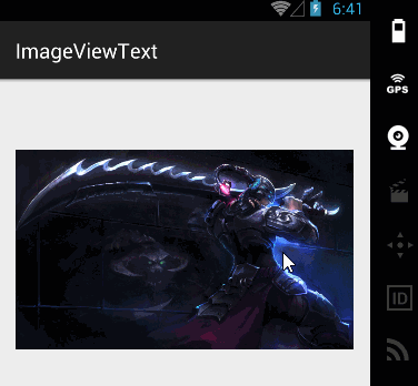
2.4 ImageView图片
ImageView是继承自View组件,主要功能不仅用于显示ImageView,而且还可以显示任何Drawable对象。
  <ImageView
        android:id="@+id/imageView"
        android:layout_width="200dp"
        android:layout_height="200dp"
android:src="@drawable/a4"/>ImageView所支持的android:scaleType属性可指定如下属性
- fitXY:拉伸图片(不按比例)以填充View的宽高。
- fitStart:按比例拉伸图片,拉伸后图片的高度为View的高度,且显示在View的左边。
- fitCenter:按比例拉伸图片,拉伸后图片的高度为View的高度,且显示在View的中间。
- fitEnd:按比例拉伸图片,拉伸后图片的高度为View的高度,且显示在View的右边。
- center:按原图大小显示图片,但图片宽高大于View的宽高时,截图图片中间部分显示。
- centerCrop:按比例放大原图直至等于某边View的宽高显示。
- centerInside:当原图宽高或等于View的宽高时,按原图大小居中显示;反之将原图缩放至View的宽高居中显示。
【实例】图片的动态切换:
通过单击ImageView的setImageResource()方法动态完成切换图片:
public class MainActivity extends ActionBarActivity {

    int[] images = new int[]{
            R.drawable.img1,
            R.drawable.img2,
            R.drawable.img3,
    };
    private ImageView img1;
    int currentImg = 1;

    @Override
    protected void onCreate(Bundle savedInstanceState) {
        super.onCreate(savedInstanceState);
        setContentView(R.layout.activity_main);
        img1 = (ImageView) findViewById(R.id.img1);
        img1.setOnClickListener(new View.OnClickListener() {
            @Override
            public void onClick(View v) {
                img1.setImageResource(images[++currentImg % images.length]);
            }
        });
    }
2.5 RadioButton单选按钮 和 CheckBox复选框
RadioButton和CheckBox是用户界面中最普通的UI控件,他们都继承了Button类,因此都可直接调用Button支持的各种属性和方法。RadioButton和CheckBox和普通Button不同的是他们多了个可选中的功能android:checked属性。RadioButton和CheckBox的不同点在于一组RadioButton只能选中一个,因此RadioButton通常要与RadioGroup一起使用,用于一组单选按钮。
【实例】获取用户信息的简单实例:
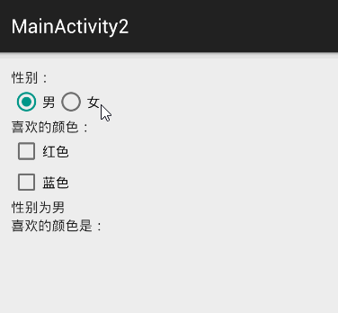
界面布局代码:
<LinearLayout xmlns:android="http://schemas.android.com/apk/res/android"
    xmlns:tools="http://schemas.android.com/tools"
    android:layout_width="match_parent"
    android:layout_height="match_parent"
    android:orientation="vertical"
    tools:context="songsong.com.imageviewtext.MainActivity2">

   <TextView
        android:id="@+id/tv1"
        android:layout_width="wrap_content"
        android:layout_height="wrap_content"
        android:text="性别:" />
    <RadioGroup
        android:id="@+id/rg1"
        android:layout_width="wrap_content"
        android:layout_height="wrap_content"
        android:orientation="horizontal">
        <RadioButton
            android:id="@+id/male"
            android:layout_width="wrap_content"
            android:layout_height="wrap_content"
            android:checked="true"
            android:text="男" />
        <RadioButton
            android:id="@+id/female"
            android:layout_width="wrap_content"
            android:layout_height="wrap_content"
            android:text="女" />
    </RadioGroup>
    <TextView
        android:id="@+id/tv2"
        android:layout_width="wrap_content"
        android:layout_height="wrap_content"
        android:text="喜欢的颜色:" />
    <CheckBox
        android:id="@+id/checkBox1"
        android:layout_width="wrap_content"
        android:layout_height="wrap_content"
        android:text="红色" />
    <CheckBox
        android:id="@+id/checkBox2"
        android:layout_width="wrap_content"
        android:layout_height="wrap_content"
        android:text="蓝色" />
    <TextView
        android:id="@+id/tv3"
        android:layout_width="wrap_content"
        android:layout_height="wrap_content"
        android:text="性别为男"/>
    <TextView
        android:id="@+id/tv4"
        android:layout_width="wrap_content"
        android:layout_height="wrap_content"
        android:text="喜欢的颜色是:"/>
</LinearLayout>
public class MainActivity2 extends ActionBarActivity {

    RadioGroup radioGroup;
    TextView show;
    CheckBox checkBox1;
    CheckBox checkBox2;
    TextView showbox;

    @Override
    protected void onCreate(Bundle savedInstanceState) {
        super.onCreate(savedInstanceState);
        setContentView(R.layout.activity_main2);
        radioGroup = (RadioGroup) findViewById(R.id.rg1);
        show = (TextView) findViewById(R.id.tv3);

        checkBox1 = (CheckBox) findViewById(R.id.checkBox1);
        checkBox2 = (CheckBox) findViewById(R.id.checkBox2);
        showbox = (TextView) findViewById(R.id.tv4);

        radioGroup.setOnCheckedChangeListener(new RadioGroup.OnCheckedChangeListener() {

            @Override
            public void onCheckedChanged(RadioGroup group, int checkedId) {
                String tip = checkedId == R.id.male ? "性别为男" : "性别为女";
                show.setText(tip);
            }
        });
        checkBox1.setOnCheckedChangeListener(new CompoundButton.OnCheckedChangeListener() {
            @Override
            public void onCheckedChanged(CompoundButton buttonView, boolean isChecked) {
                if (isChecked) {
                    String str = showbox.getText().toString();
                    showbox.setText(str + checkBox1.getText().toString());
                }
            }
        });
        checkBox2.setOnCheckedChangeListener(new CompoundButton.OnCheckedChangeListener() {
            @Override
            public void onCheckedChanged(CompoundButton buttonView, boolean isChecked) {
                if (isChecked) {
                    String str = showbox.getText().toString();
                    showbox.setText(str + checkBox2.getText().toString());
                }
            }
        });

    }
}
2.6 ProgressBar进度条
进度条也是UI界面中一种非常实用的空间,通常用于向用户显示某些耗时操作完成的百分比。进度条可以动态显示进度,因此避免长时间执行某个耗时操作时,让用户感觉程序失去了响应,从而更好提高用户的友好性。
通过style属性可以为ProgressBar指定风格:
- @android:style/Widget.ProgressBar.Horizontal:水平进度条
- @android:style/widget.ProgressBar.Inverse:普通大小的环形进度条
- @android:style/widget.ProgressBar.Large:大环形进度条
- @android:style/widget.ProgressBar.Large.Inverse:大环形进度条
- @android:style/widget.ProgressBar.Small:小环形进度条
- @android:style/widget.ProgressBar.Small.Inverse:小环形进度条
ProgressBar常用的XML属性:
- android:max:设置该进度条的最大值
- style:样式
- android:progress:设置该进度条已完成进度值
<LinearLayout xmlns:android="http://schemas.android.com/apk/res/android"
xmlns:tools="http://schemas.android.com/tools"
android:layout_width="match_parent"
android:layout_height="match_parent"
android:orientation="vertical"
tools:context="songsong.com.imageviewtext.ProgressBarText">
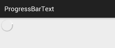
<ProgressBar
android:layout_width="wrap_content"
android:layout_height="wrap_content"
android:id="@+id/progressBar" />
</LinearLayout>
当数据加载完成时,我们就需要另外一个属性android:visibility进行指定
- visible:可见的,这是默认值;
- invisible:不可见的,仍然占据着原来位置和大小;
- gone:不仅不可见,而且不再占用任何屏幕空间;
也可以在代码中设置setVisibiliy():
- View.VISIBLE
- View.INVISIBLE
- View.GONE
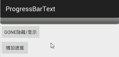
【实例】ProgressBar进度条隐藏
<LinearLayout xmlns:android="http://schemas.android.com/apk/res/android"
    xmlns:tools="http://schemas.android.com/tools"
    android:layout_width="match_parent"
    android:layout_height="match_parent"
    android:orientation="vertical"
    tools:context="songsong.com.imageviewtext.ProgressBarText">

    <ProgressBar
        style="@android:style/Widget.ProgressBar.Horizontal"
        android:layout_width="match_parent"
        android:layout_height="wrap_content"
        android:max="100"
        android:id="@+id/probar2" />
    <Button
        android:id="@+id/bt1"
        android:layout_width="wrap_content"
        android:layout_height="wrap_content"
        android:text="GONE隐藏/显示"/>
    <Button
        android:id="@+id/bt2"
        android:layout_width="wrap_content"
        android:layout_height="wrap_content"
        android:text="增加进度"/>
</LinearLayout>
public class ProgressBarText extends ActionBarActivity {
    ProgressBar progressBar;
    Button bt1;
    Button bt2;

    @Override
    protected void onCreate(Bundle savedInstanceState) {
        super.onCreate(savedInstanceState);
        setContentView(R.layout.activity_progress_bar_text);
        progressBar = (ProgressBar) findViewById(R.id.probar2);
        bt1 = (Button) findViewById(R.id.bt1);
        bt2 = (Button) findViewById(R.id.bt2);
        bt1.setOnClickListener(new View.OnClickListener() {
            @Override
            public void onClick(View v) {
                if (progressBar.getVisibility() == View.GONE) {
                    progressBar.setVisibility(View.VISIBLE);
                } else {
                    progressBar.setVisibility(View.GONE);
                }
            }
        });
        bt2.setOnClickListener(new View.OnClickListener() {
            @Override
            public void onClick(View v) {
                int progress = progressBar.getProgress();
                if (progress>=100){
                    progressBar.setVisibility(View.GONE);
                    Toast.makeText(getApplicationContext(),"加载完成",Toast.LENGTH_SHORT).show();
                }else {
                    progress = progress + 10;
                    progressBar.setProgress(progress);
                }
            }
        });
    }
}
public class TitleProgressBar extends Activity {

    @Override
    protected void onCreate(Bundle savedInstanceState) {
        super.onCreate(savedInstanceState);
        //设置窗口特征:启用显示进度的进度条
        requestWindowFeature(Window.FEATURE_PROGRESS);  //①
        //设置窗口特征:启用不显示进度的进度条
//		requestWindowFeature(Window.FEATURE_INDETERMINATE_PROGRESS); //②
        setContentView(R.layout.activity_title_progress_bar);

        Button bn1 = (Button) findViewById(R.id.bn1);
        Button bn2 = (Button) findViewById(R.id.bn2);

        bn1.setOnClickListener(new View.OnClickListener() {
            @Override
            public void onClick(View v) {
                setProgressBarIndeterminateVisibility(true); //显示不带进度的进度条
                setProgressBarVisibility(true); //显示带进度的进度条
                setProgress(4500);
            }
        });
        bn2.setOnClickListener(new View.OnClickListener() {
            @Override
            public void onClick(View v) {
                setProgressBarIndeterminateVisibility(false); //显示不带进度的进度条
                setProgressBarVisibility(false); //显示带进度的进度条
            }
        });

    }
}
2.7 SeekBar拖动条
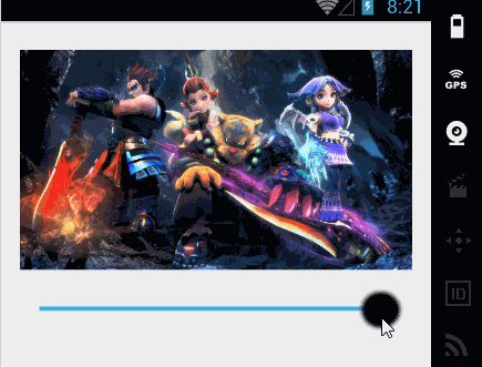
SeekBar允许用户改变拖动条的滑块外观,改变滑块外观通过android:thumb属性来指定:- android:thumb:指定一个Drawable对象,该对象将作为自定义滑块;
【实例】该程序的界面布局中需要两个组件:一个ImageView用于显示图片,一个SeekBar用于动态改变图片的透明度,界面布局如下:
<LinearLayout xmlns:android="http://schemas.android.com/apk/res/android"
    xmlns:tools="http://schemas.android.com/tools"
    android:layout_width="match_parent"
    android:layout_height="match_parent"
    android:orientation="vertical"
    tools:context="songsong.com.imageviewtext.SeekBarTest">

    <ImageView
        android:id="@+id/imageView1"
        android:layout_width="wrap_content"
        android:layout_height="200dp"
        android:scaleType="fitCenter"
        android:src="@drawable/img1" />

    <SeekBar
        android:id="@+id/sbk1"
        android:layout_width="match_parent"
        android:layout_height="wrap_content"
        android:max="255"
        android:progress="255"
        android:thumb="@drawable/black" />
</LinearLayout>
public class SeekBarTest extends Activity {
    ImageView imageView;
    SeekBar seekBar;
    protected void onCreate(Bundle savedInstanceState) {
        super.onCreate(savedInstanceState);
        setContentView(R.layout.activity_seek_bar);
        seekBar = (SeekBar) findViewById(R.id.sbk1);
        imageView = (ImageView) findViewById(R.id.imageView1);
        //当拖动条的滑块位置发生变化的时候触发该方法
        seekBar.setOnSeekBarChangeListener(new SeekBar.OnSeekBarChangeListener() {
            @Override
            public void onProgressChanged(SeekBar seekBar, int progress, boolean fromUser) {
                imageView.setImageAlpha(progress);//动态改变透明度
            }

            @Override
            public void onStartTrackingTouch(SeekBar seekBar) {
            }

            @Override
            public void onStopTrackingTouch(SeekBar seekBar) {
            }
        });
    }
}
2.8 AlertDialog对话框
【实例】创建简单对话框,界面只有一个按钮,在代码中为此按钮绑定监听器:
public class AlertDialogText extends Activity {
protected void onCreate(Bundle savedInstanceState) {
...
//为按钮绑定单击事件
public void onClick(View v) {
AlertDialog.Builder builder = new AlertDialog.Builder(AlertDialogText.this);
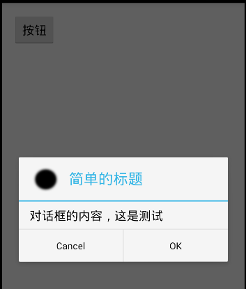
builder.setTitle("简单的标题"); //设置对话框标题
builder.setMessage("对话框的内容\n,这是测试"); //设置对话框内容
builder.setIcon(R.drawable.black); //设置对话框图标
builder.setCancelable(false); //可否取消
builder.setPositiveButton("OK", new DialogInterface.OnClickListener() { //为builder添加确定按钮
@Override
public void onClick(DialogInterface dialog, int which) {
}
});
builder.setNegativeButton("Cancel", new DialogInterface.OnClickListener() { //为builder添加取消按钮
@Override
public void onClick(DialogInterface dialog, int which) {
}
});
builder.show();
}
});
}
}
上面这种样式是最简单的,AlertDialog还提供了如下6中方法来指定对话框的内容:
- setMessage():设置对话框内容为简单文本;
- setltems():设置对话框内容为简单列表项;
- setSingleChoiceltems():设置对话框内容为单选列表项;
- setMultiChoiceltems():设置对话框内容为多选列表项;
- setAdapter():设置对话框内容为自定义列表项;
- setView():设置对话框内容为自定义View;
【实例】用setView来设置登录界面:
1、定义界面布局login.xml
<?xml version="1.0" encoding="utf-8"?>
<LinearLayout xmlns:android="http://schemas.android.com/apk/res/android"
    android:layout_width="match_parent"
    android:layout_height="match_parent"
    android:orientation="vertical"
    android:id="@+id/lg"
    android:padding="30dp">
    <EditText
        android:id="@+id/et1"
        android:layout_width="match_parent"
        android:layout_height="wrap_content"
        android:hint="请输入账号" />
    <EditText
        android:id="@+id/et2"
        android:inputType="textPassword"
        android:layout_width="match_parent"
        android:layout_height="wrap_content"
        android:hint="请输入密码" />
    <LinearLayout
        android:layout_width="match_parent"
        android:layout_height="wrap_content"
        android:orientation="horizontal">
        <EditText
            android:id="@+id/et3"
            android:layout_width="match_parent"
            android:layout_height="wrap_content"
            android:layout_weight="1" />
        <Button
            android:id="@+id/bt2"
            android:layout_width="220dp"
            android:layout_height="wrap_content"
            android:layout_gravity="center_horizontal"
            android:layout_weight="1"
            android:text="短信验证" />
    </LinearLayout>
</LinearLayout>
public class ViewAlertDialogText extends ActionBarActivity {

    @Override
    protected void onCreate(Bundle savedInstanceState) {
        super.onCreate(savedInstanceState);
        setContentView(R.layout.activity_view_alert_dialog_text);

        findViewById(R.id.bt1).setOnClickListener(new View.OnClickListener() {
            @Override
            public void onClick(View v) {
                LinearLayout lg = (LinearLayout) getLayoutInflater().inflate(R.layout.login, null);
                new AlertDialog.Builder(ViewAlertDialogText.this)
                        .setTitle("登录界面")
                        .setIcon(R.drawable.black)
                        .setView(lg)
                        .setCancelable(false)
                        .setPositiveButton("确定", new DialogInterface.OnClickListener() {
                            @Override
                            public void onClick(DialogInterface dialog, int which) {
                            }
                        })
                        .setNegativeButton("取消", new DialogInterface.OnClickListener() {
                            @Override
                            public void onClick(DialogInterface dialog, int which) {
                            }
                        })
                        .show();
            }
        });
    }
}

2.9 ProgressDialog进度对话框
ProgressDialog和AlertDialog有点类似,但ProgressDialog一般用来表示当前操作比较耗时,让用户耐心等待。创建ProgressDialog进度对话框有如下两种方式:
- 如果只是创建简单的进度对话框,那么调用ProgressDialog提供的静态show()方法显示对话框即可。
- 创建ProgressDialog,然后调用方法对对话框里的进度条进行设置,设置完成后将对话框显示即可。
为了对进度对话框的进度条进行设置,ProgressDialog包含了如下常用的方法:
- setIndeterminate(boolean indeterminate):设置对话框里的进度条不显示进度值;
- setMax(int):设置对话框里进度条的最大值;
- setMessage(CharSequece):设置对话框里的消息;
- setProgress(int value):设置对话框里进度条的进度值;
- setProgressStyle (int style):设置对话框里进度条的风格;
【实例】ProgressDialog简单实例
public class ProgressDialog_text extends Activity {

    final static int MAX_PROGRESSS = 100;  //最大的进度值
    private int[] data = new int[50];      //模拟填充长度为100的数组
    int progressStatus = 0;                //记录对话框的完成的百分比
    int hasData = 0;
    ProgressDialog pd2;

    //定义一个负责更新进度的handler
    Handler handler = new Handler() {
        public void handleMessage(Message msg) {
            if (msg.what == 0x123) {       //表明消息是由该程序发送的
                pd2.setProgress(progressStatus);
            }
        }
    };

    @Override
    protected void onCreate(Bundle savedInstanceState) {
        super.onCreate(savedInstanceState);
        setContentView(R.layout.activity_progress_dialog_text);
    }

    //调用静态方法显示环形进度条btn1
    public void showSpinner(View source) {
        ProgressDialog.show(this, "任务执行中", "任务执行中,请稍等", false, true);

    }

    //显示进度的进度条btn2
    public void showProgress(View source) {
        progressStatus = 0;             //将进度条的完成进度重设为0
        hasData = 0;                    //重新开始填充数组
        pd2 = new ProgressDialog(this);
        pd2.setMax(MAX_PROGRESSS);      //设置最大值
        pd2.setTitle("任务完成百分比"); //设置对话框标题
        pd2.setMessage("耗时任务的完成百分比");  //设置内容
        pd2.setCancelable(false);  //设置是否响应back键
        pd2.setProgressStyle(ProgressDialog.STYLE_HORIZONTAL);   //设置样式
        pd2.setIndeterminate(false);  //设置对话框是否显示进度
        pd2.show();
        new Thread() {
            public void run() {
                while (progressStatus < MAX_PROGRESSS) {
                    progressStatus = MAX_PROGRESSS * doWork() / data.length;    //获取耗时操作的完成百分比
                    handler.sendEmptyMessage(0x123);            //发送空消息到Handler
                }
                if (progressStatus >= MAX_PROGRESSS) {
                    pd2.dismiss();    //如果认为完成,关闭对话框
                }
            }
        }.start();
    }

    //模拟一个耗时的操作
    public int doWork() {

        data[hasData++] = (int) (Math.random() * 100);
        try {
            Thread.sleep(100);
        } catch (InterruptedException e) {
            e.printStackTrace();
        }
        return hasData;
    }
}
<LinearLayout xmlns:android="http://schemas.android.com/apk/res/android"
    android:layout_width="match_parent"
    android:layout_height="match_parent"
    android:gravity="center_horizontal"
    android:orientation="vertical">

    <Button
        android:layout_width="match_parent"
        android:layout_height="wrap_content"
        android:onClick="showSpinner"
        android:text="环形进度条" />

    <Button
        android:layout_width="match_parent"
        android:layout_height="wrap_content"
        android:onClick="showProgress"
        android:text="显示进度的进度条" />
</LinearLayout>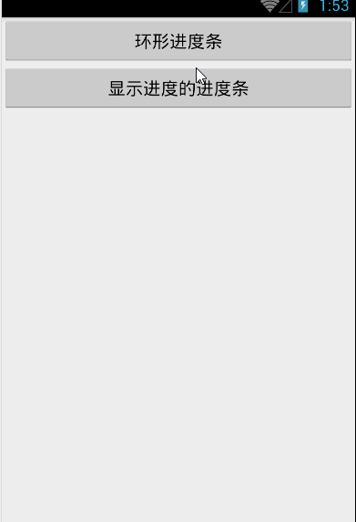
2.10 Menu菜单
菜单是用户界面中最常见的元素之一。在Android中,菜单被分为如下三种,选项菜单(OptionsMenu)、上下文菜单(ContextMenu)和子菜单(SubMenu)。
- 选项菜单(OptionsMenu):最常规的菜单,不支持勾选标记。
- 子菜单(SubMenu):子菜单点击后单出的子菜单项,不支持菜单项图标,不支持嵌套子菜单。
- 上下文菜单(ContextMenu):长按视图控件后出现的菜单,不支持菜单快捷键和图标。
常用方法:
- add():用于添加菜单项;
- addSubMenu():用于添加子菜单。
需要重写的方法:
- public boolean onCreateOptionsMenu(Menu menu):当用户单击Menu键时触发的方法。
- public boolean onOptionsItemSelected(MenuItem item):选项菜单的菜单项被单击后的回调方法。
add(int groupid,int itemid,int order,charSequence title)方法的四个参数,依次是:
- 组别:如果不分组的话就写0。
- ID:这个很重要,Android根据这个Id来确定不同的菜单。
- 顺序:那个菜单现在在前面由这个参数的大小决定,从1到6一次是同上往下,从左到右排。
- 标题:菜单的显示文本。
【实例】如何为Android应用添加菜单和子菜单。
该程序的java代码如下:
public class MainActivity extends Activity {
    // 定义字体大小菜单项的标识
    final int FONT_10 = 0x111;
    final int FONT_12 = 0x112;
    final int FONT_14 = 0x113;
    final int FONT_16 = 0x114;
    final int FONT_18 = 0x115;
    // 定义普通菜单项的标识
    final int PLAIN_ITEM = 0x11b;
    // 定义字体颜色菜单项的标识
    final int FONT_RED = 0x116;
    final int FONT_BLUE = 0x117;
    final int FONT_GREEN = 0x118;
    private EditText edit;

    @Override
    protected void onCreate(Bundle savedInstanceState) {
        super.onCreate(savedInstanceState);
        setContentView(R.layout.activity_main);
        edit = (EditText) findViewById(R.id.edt1);
    }

    @Override
    public boolean onCreateOptionsMenu(Menu menu) {
        SubMenu fontMenu = menu.addSubMenu("字体大小");
        fontMenu.setIcon(R.drawable.font);
        fontMenu.setHeaderIcon(R.drawable.font);
        fontMenu.add(0, FONT_10, 0, "10号字体");
        fontMenu.add(0, FONT_12, 0, "12号字体");
        fontMenu.add(0, FONT_14, 0, "14号字体");

        menu.add(0, PLAIN_ITEM, 0, "普通菜单项");

        SubMenu colorMenu = menu.addSubMenu("字体颜色");
        colorMenu.setIcon(R.drawable.color);
        colorMenu.setHeaderIcon(R.drawable.color);
        colorMenu.setHeaderTitle("选择文字颜色");
        colorMenu.add(0, FONT_RED, 0, "红色");
        colorMenu.add(0, FONT_GREEN, 0, "绿色");

       return super.onCreateOptionsMenu(menu);
    }

    @Override
    public boolean onOptionsItemSelected(MenuItem item) {

        switch (item.getItemId()) {
            case FONT_10:
                edit.setTextSize(10 * 2);
                break;
            case FONT_12:
                edit.setTextSize(12 * 2);
                break;
            case FONT_14:
                edit.setTextSize(14 * 2);
                break;
            case FONT_RED:
                edit.setTextColor(Color.RED);
                break;
            case FONT_BLUE:
                edit.setTextColor(Color.BLUE);
                break;
            case FONT_GREEN:
                edit.setTextColor(Color.GREEN);
                break;
            case PLAIN_ITEM:
                Toast toast = Toast.makeText(MainActivity.this, "您单击了普通菜单项", Toast.LENGTH_SHORT);
                toast.show();
                break;
        }
        return true;
    }
}

接下来是上下文菜单:当用户长按该组件时显示上下文菜单,首先要学会开发上下文菜单的步骤:
- 重写Activity的onCreateContextMenu()方法;
- 调用Activity的registerForContextMenu()方法为view组件注册上下文菜单;
- 重写onContextItemSelected()方法为菜单项提供相应;
【实例】通过长按组件改变组件的背景颜色:
public class OtherActivity extends Activity {

    //为每个菜单定义一个标识
    final int Menu1 = 0x111;
    final int Menu2 = 0x112;
    final int Menu3 = 0x113;
    private TextView textView;

    @Override
    protected void onCreate(Bundle savedInstanceState) {
        super.onCreate(savedInstanceState);
        setContentView(R.layout.activity_other);
        textView = (TextView) findViewById(R.id.txt);

       registerForContextMenu(textView);   //为textView绑定事件
    }

    @Override
    public void onCreateContextMenu(ContextMenu menu, View v, ContextMenu.ContextMenuInfo menuInfo) {
        //创建上下文菜单时触发该方法
        menu.add(0, Menu1, 0, "红色");
        menu.add(0, Menu2, 0, "绿色");
        menu.add(0, Menu3, 0, "蓝色");

        menu.setGroupCheckable(0, true, true);  //将3个菜单项设置为 单选项

        menu.setHeaderTitle("选择背景色");  //设置标题
    }

    @Override
    public boolean onContextItemSelected(MenuItem item) {
        //创建上下文菜单项被单击时触发该方法

        switch (item.getItemId()) {
            case Menu1:
                item.setCheckable(true);
                textView.setBackgroundColor(Color.RED);
                break;
            case Menu2:
                item.setCheckable(true);
                textView.setBackgroundColor(Color.GREEN);
                break;
            case Menu3:
                item.setCheckable(true);
                textView.setBackgroundColor(Color.BLUE);
                break;
        }
        return true;
    }
}

接下来还要学习的是使用XML文件定义菜单:android提供了两种创建菜单的方式,一种是在Java代码中创建,另外一种是使用XML资源文件定义。我之前做的都是java代码中创建,但在java代码中定义菜单会有很多不足的地方。
- 在java代码中定义菜单、菜单项,必然档子程序代码臃肿。
- 需要程序员采用硬编码方式为每个菜单项分配ID,为每个菜单组分配ID,会导致应用可扩展性、维护性降低。
- 使用XML资源文件来定义菜单,可以提供更好的解耦。
用于android studio在创建android项目时,会默认在res目录下新建menu子目录,并在该子目录下提供menu_main.xml菜单资源文件,由此可见,android更推荐使用XML资源文件来定义菜单。
- <item.../>元素:定义菜单项;
- <group.../>子元素:将多个<item.../>定义的菜单项包装成一个菜单组;
- checkableBehavior:指定改组菜单的选择行为。none不选、all多选、single单选。
- menuCategory:对菜单进行分类,指定菜单的优先级。container、system、secondary、alternative。
- visible:指定该组菜单是否可见。
- enable:指定该组菜单是否可用。
需要注意的是:<item.../>元素用于定义菜单项,<item.../>元素又可包含<menu.../>元素,位于<item.../>元素内部的<menu.../>元素就代表子菜单。
【实例】使用XML资源文件定义 选项菜单 和 上下文菜单。
首先为选项菜单编写XML资源文件:menu_main.xml,在<menu.../>元素里包含三个<item.../>子元素,这表明该菜单里有三个菜单项。第一、第三菜单项都包含子菜单。
<menu xmlns:android="http://schemas.android.com/apk/res/android"
    xmlns:app="http://schemas.android.com/apk/res-auto"
    xmlns:tools="http://schemas.android.com/tools"
    tools:context="songsong.com.menutext.MenuText_XML">

    <item android:title="字体大小">
        <menu>
            <group android:checkableBehavior="single">
                <item
                    android:id="@+id/font_10"
                    android:title="10号字体" />
                <item
                    android:id="@+id/font_11"
                    android:title="11号字体" />
                <item
                    android:id="@+id/font_12"
                    android:title="12号字体" />
            </group>
        </menu>
    </item>
    <item
        android:id="@+id/putongitem"
        android:title="普通菜单"></item>
    <item
        android:id="@+id/Font_color"
        android:title="字体颜色">
        <menu>
            <group>
                <item
                    android:id="@+id/ren_font"
                    android:title="红色" />
                <item
                    android:id="@+id/blue_font"
                    android:title="蓝色" />
                <item
                    android:id="@+id/green_font"
                    android:title="绿色" />
            </group>
        </menu>
    </item>
</menu>
<?xml version="1.0" encoding="utf-8"?>
<menu xmlns:android="http://schemas.android.com/apk/res/android">

    <group android:checkableBehavior="single">
        <item
            android:id="@+id/red"
            android:alphabeticShortcut="r"
            android:title="红色" />
        <item
            android:id="@+id/blue"
            android:alphabeticShortcut="b"
            android:title="蓝色" />
        <item
            android:id="@+id/green"
            android:alphabeticShortcut="g"
            android:title="绿色" />
    </group>
</menu>
public class MenuText_XML extends Activity {
    private TextView txt;

    @Override
    protected void onCreate(Bundle savedInstanceState) {
        super.onCreate(savedInstanceState);
        setContentView(R.layout.activity_menu_text__xml);
        txt = (TextView) findViewById(R.id.txt);
        registerForContextMenu(txt);                //为上下文菜单绑定事件txt
    }

    @Override
    public boolean onCreateOptionsMenu(Menu menu) {
        MenuInflater inflater = new MenuInflater(this);
        inflater.inflate(R.menu.menu_main, menu);      //绑定选项菜单R.menu.menu_main
        return super.onCreateOptionsMenu(menu);
    }

    @Override
    public void onCreateContextMenu(ContextMenu menu, View v, ContextMenu.ContextMenuInfo menuInfo) {
        MenuInflater inflater = new MenuInflater(this);
        inflater.inflate(R.menu.context, menu);         //绑定上下文菜单R.menu.context
        menu.setHeaderTitle("请选择背景色");
    }

    @Override
    public boolean onOptionsItemSelected(MenuItem item) {    //选项菜单被单击后回调的方法

        if (item.isCheckable()) {  //是否选中
            item.setCheckable(true); //设置为选中
        }
        switch (item.getItemId()) {
            case R.id.font_10:
                txt.setTextSize(10 * 2);
                break;
            case R.id.font_11:
                txt.setTextSize(11 * 2);
                break;
            case R.id.font_12:
                txt.setTextSize(12 * 2);
                break;
            case R.id.putongitem:
                Toast toast = Toast.makeText(MenuText_XML.this, "你点击了普通菜单项", Toast.LENGTH_SHORT);
                toast.show();
                break;
            case R.id.ren_font:
                txt.setTextColor(Color.RED);
                break;
            case R.id.blue_font:
                txt.setTextColor(Color.BLUE);
                break;
            case R.id.green_font:
                txt.setTextColor(Color.GREEN);
                break;
        }
        return true;
    }

    @Override
    public boolean onContextItemSelected(MenuItem item) {    //上下文菜单被单击时触发该方法
        item.setCheckable(true);
        switch (item.getItemId()) {
            case R.id.red:
                item.setCheckable(true);
                txt.setBackgroundColor(Color.RED);
                break;

            case R.id.blue:
                item.setCheckable(true);
                txt.setBackgroundColor(Color.BLUE);
                break;

            case R.id.green:
                item.setCheckable(true);
                txt.setBackgroundColor(Color.GREEN);
                break;
        }
        return true;
    }
}


最后一种是PopupMenu弹出式菜单:PopupMenu会在指定的组件上弹出一个列表,它的菜单选项来自Menu资源。以下是创建步骤:
【实例】简单的PopupMenu使用
先定义Menu资源文件XML:
<?xml version="1.0" encoding="UTF-8"?>
<menu xmlns:android="http://schemas.android.com/apk/res/android">
    <item
        android:id="@+id/search"
        android:icon="@android:drawable/ic_menu_search"
        android:title="查找" />
    <item
        android:id="@+id/add"
        android:icon="@android:drawable/ic_menu_add"
        android:title="添加" />-
    <item
        android:id="@+id/edit"
        android:icon="@android:drawable/ic_menu_edit"
        android:title="编辑">-
        <menu>
            <item
                android:id="@+id/copy"
                android:title="复制" />
            <item
                android:id="@+id/cut"
                android:title="剪切" />
            <item
                android:id="@+id/paste"
                android:title="粘贴" />
        </menu>
    </item>

    <item
        android:id="@+id/exit"
        android:title="隐藏菜单" />
</menu>
public class PopupMenuText extends Activity {

    @Override
    protected void onCreate(Bundle savedInstanceState) {
        super.onCreate(savedInstanceState);
        setContentView(R.layout.activity_popup_menu);

        final Button bt1 = (Button) findViewById(R.id.bt1);
        bt1.setOnClickListener(new View.OnClickListener() {
            @Override
            public void onClick(View v) {
                final PopupMenu popup = new PopupMenu(PopupMenuText.this, bt1);
                popup.getMenuInflater().inflate(R.menu.popup_menu, popup.getMenu());

               popup.setOnMenuItemClickListener(new PopupMenu.OnMenuItemClickListener() {
                    public boolean onMenuItemClick(MenuItem item) {

                        switch (item.getItemId()) {
                            case R.id.exit:
                                popup.dismiss();// 隐藏该对话框
                                break;
                            default:
                                Toast toast = Toast.makeText(PopupMenuText.this, "您单击了【"
                                        + item.getTitle() + "】菜单项", Toast.LENGTH_SHORT); // 使用Toast显示用户单击的菜单项
                                toast.show();
                        }
                        return true;
                    }
                });
                popup.show(); //showing popup menu

            }
        });
    }
}

2.11 ActionBar活动条
本段内容参考与:http://www.cnblogs.com/yc-755909659/p/4290784.html
2.11.1.ActionBar介绍
活动条(ActionBar)是Android3.0的重要更新之一,ActionBar位于传统标题栏title bar的位置,也就是显示在屏幕的顶部。对于Android平板设备来说屏幕更大它的标题使用ActionBar来设计可以展示更多丰富的内容,方便操控。
2.11.2.ActionBar功能

- ActionBar的图标,可显示软件图标,也可用其他图标代替。当软件不在最高级页面时,图标左侧会显示一个左箭头,用户可以通过这个箭头“向上导航”;
- 如果你的应用要在不同的View中显示数据,这部分允许用户来切换视图。一般的作法是用一个下拉菜单或者是Tab选项卡。如果只有一个界面,那这里可以显示应用程序的标题或者是更长一点的商标信息;
- 两个action按钮,这里放重要的按钮功能,为用户进行某项操作提供直接的访问;
- overflow按钮,放不下的按钮会被置于“更多...”菜单项中,“更多...”菜单项是以下拉形式实现的。
2.11.3.如何使用
2.11.3.1、添加ActionBar
最新的Android版本已经默认启用了ActionBar,因此只要在AndroidManifest.xml文件的SDK配置中指定该应用的目标版本高于11,默认就会启用ActionBar。
2.11.3.2、取消ActionBar
如果希望关闭ActionBar,则可以设置该应用的主题为NoActionBar。
<<application
        android:icon="@mipmap/ic_launcher"
        android:label="@string/app_name"
        android:theme="@style/Theme.AppCompat.Light.NoActionBar" >
       ...
</application>ActionBar actionBar = getActionBar();
actionBar.show(); //显示
actionBar.hide(); //隐藏

2.11.3.3、修改Action Bar的图标和标题
默认情况下,系统会使用<application>或者<activity>中icon属性指定的图片来作为ActionBar的图标,但是我们也可以改变这一默认行为。如果我们想要使用另外一张图片来作为ActionBar的图标,可以在<application>或者<activity>中通过logo属性来进行指定,而标题中的内容使用label属性来指定。
<activity
            android:name=".MainActivity"
            android:logo="@drawable/black"
            android:label="ActionBar学习">
           ...
        </activity>
2.11.3.4、添加Action按钮,显示选项菜单项
Android不再强制要求手机必须提供MENU按键,这样可能导致用户无法打开选项菜单。为了解决这个问题Android提供ActionBar作为解决方案。
ActionBar还可以根据应用程序当前的功能来提供与其相关的Action按钮,这些按钮都会以图标或文字的形式直接显示在ActionBar上。当然,如果按钮过多,ActionBar上显示不完,多出的一些按钮可以隐藏在overflow里面,点击一下overflow按钮就可以看到全部的Action按钮了。
<?xml version="1.0" encoding="utf-8"?>
<menu xmlns:android="http://schemas.android.com/apk/res/android">

    <item
        android:id="@+id/select_id"
        android:icon="@drawable/a5"
        android:showAsAction="always"
        android:title="查询" />
    <item
        android:id="@+id/baohu_id"
        android:icon="@drawable/a6"
        android:showAsAction="always"
        android:title="保护" />
    <item
        android:id="@+id/delete_id"
        android:icon="@drawable/a7"
        android:showAsAction="always"
        android:title="删除" />

</menu>- fRoom:会显示在ActionBar,但如果满了就会显示在溢出列表。
- never:永远不会显示在ActionBar,只会在溢出列表中。
- always:无论是否满了都要显示在ActionBar。
- withText:示意在ActionBar中显示文本标题。
- collapseActionView :声明了这个操作视窗应该被折叠到一个按钮中,当用户选择这个按钮时,这个操作视窗展开。
在MainActivity.java文件中重写onCreateOptionsMenu方法:
   public boolean onCreateOptionsMenu(Menu menu) {
        MenuInflater inflater = new MenuInflater(this);
        inflater.inflate(R.menu.menu_main, menu);
        return super.onCreateOptionsMenu(menu);
    }
2.11.3.5、响应Action按钮的点击事件
接着在Activity中重写onOptionsItemSelected()方法,通过方法传入的MenuItem参数,我们可以调用它的getItemId()方法和menu资源中的id进行比较,从而辨别出用户点击的是哪一个Action按钮。
 @Override
    public boolean onOptionsItemSelected(MenuItem item) {
        switch (item.getItemId()) {
            case R.id.select_id:
                Toast.makeText(this, "你点击了“查询”按键!", Toast.LENGTH_SHORT).show();
                return true;
            case R.id.baohu_id:
                Toast.makeText(this, "你点击了“保护”按键!", Toast.LENGTH_SHORT).show();
                return true;
            case R.id.delete_id:
                Toast.makeText(this, "你点击了“删除”按键!", Toast.LENGTH_SHORT).show();
                return true;
            default:
                return super.onOptionsItemSelected(item);
        }
}启用ActionBar图标导航的功能,可以允许用户根据当前应用的位置来在不同界面之间切换。比如,A界面展示了一个列表,点击某一项之后进入了B界面,这时B界面就应该启用ActionBar图标导航功能,这样就可以回到A界面。
为了将应用程序图标转变成可以点击的图标,可以调用以下方法:
- setDisplayHomeAsUpEnabled(boolean):设置是否将应用程序图标转变成可点击的图标,并在图标上添加向左的箭头。
- setDisplayOptions(int):通过传人int类型常量来控制该ActionBar的显示选项。
- setDisplayShowHomeEnabled(boolean):设置是否显示应用程序图标。
- setHomeButtonEnabled(boolean):设置是否将应用程序图标转变成可点击的按钮。
先来看看效果:

实例中,通过点击action按钮,启动另一个Activity(TwoActivity),发现TwoActivity的程序图标多了个向左的箭头,点击是返回父Activity(MainActivity)。
第一步:MainActivity.java通过点击“查询”action按钮创建TwoActivity:
    public boolean onOptionsItemSelected(MenuItem item) {
        switch (item.getItemId()) {
            case R.id.select_id:

                Intent intent = new Intent(this, TwoActivity.class);  //启动TwoActivity
                startActivity(intent);
                return true;
         ...
}1、在TwoActivity的onCreate中:
 protected void onCreate(Bundle savedInstanceState) {
        super.onCreate(savedInstanceState);
        setContentView(R.layout.activity_two);
        ActionBar actionBar = getActionBar();
        actionBar.setDisplayHomeAsUpEnabled(true); //设置为true
} <activity
android:name=".TwoActivity"
android:label="@string/title_activity_two"
android:parentActivityName=".MainActivity">
</activity></pre><pre name="code" class="java">public boolean onOptionsItemSelected(MenuItem item) {
switch (item.getItemId()) {
case android.R.id.home:
Intent upIntent = NavUtils.getParentActivityIntent(this);
if (NavUtils.shouldUpRecreateTask(this, upIntent)) {
TaskStackBuilder.create(this)
.addNextIntentWithParentStack(upIntent)
.startActivities();
} else {
upIntent.addFlags(Intent.FLAG_ACTIVITY_CLEAR_TOP);
NavUtils.navigateUpTo(this, upIntent);
}
return true;
}
return super.onOptionsItemSelected(item);
}2.11.3.6、添加Action View
为了在ActionBar上添加Action View,可以来用如下两种方式:
- android:actionLayout属性:指定Action View的实现类。
- android:actionViewClass属性:指定Action View对应的视图资源。
【实例】标题上的搜索和时钟
本实例在菜单资源文件中定义两个Action Item,但这两个Action Item都是使用Action View。资源文件代码如下(menu_main.xml):
<menu xmlns:android="http://schemas.android.com/apk/res/android"
    xmlns:tools="http://schemas.android.com/tools"
    tools:context="songsong.com.actionbartest.ActionViewTest">

    <item
        android:id="@+id/search"
        android:actionViewClass="android.widget.SearchView"
        android:orderInCategory="50"
        android:showAsAction="always" />
    <item
        android:id="@+id/progress"
        android:actionLayout="@layout/clock"
        android:orderInCategory="100"
        android:showAsAction="always" />

</menu>
<?xml version="1.0" encoding="utf-8"?>
<AnalogClock xmlns:android="http://schemas.android.com/apk/res/android"
    android:layout_width="wrap_content"
    android:layout_height="wrap_content">
</AnalogClock>
2.11.3.7、Overflow按钮
Overflow按钮是显示在ActionBar右边的三个点,其意为“更多”,当actionbar上面显示内容满了的时候将会自动填充进Overflow列表。但更多时候,如果手机有Menu按键的情况下,Overflow按钮是不显示的。所有如果要想在有Menu手机中显示,就要加入一段大神已经写好的代码:
public class ActionViewTest extends Activity {

    @Override
    protected void onCreate(Bundle savedInstanceState) {
        ...
        setOverflowShowingAlways();//调用方法
    }
<pre name="code" class="java">private void setOverflowShowingAlways() {
        try {
            ViewConfiguration config = ViewConfiguration.get(this);
            Field menuKeyField = ViewConfiguration.class.getDeclaredField("sHasPermanentMenuKey");
            if (menuKeyField != null) {
                menuKeyField.setAccessible(true);
                menuKeyField.setBoolean(config, false);
            }
        } catch (Exception e) {
            e.printStackTrace();
        }
}效果图:

2.11.3.9、让Overflow中的选项显示图标
为了让Action按钮在Overflow中能显示图标,就要在Activity中重写onMenuOpened()方法
  @Override
    public boolean onMenuOpened(int featureId, Menu menu) {
        if (featureId == Window.FEATURE_ACTION_BAR && menu != null) {
            if (menu.getClass().getSimpleName().equals("MenuBuilder")) {
                try {
                    Method m = menu.getClass().getDeclaredMethod("setOptionalIconsVisible", Boolean.TYPE);
                    m.setAccessible(true);
                    m.invoke(menu, true);
                } catch (Exception e) {
                }
            }
        }
        return super.onMenuOpened(featureId, menu);
    }
2.11.3.10添加导航Tabs :暂未完成
2.11.3.11添加下拉列表导航:暂未完成
2.12 ListView的使用
【实例】ListView简单的使用
第一步,在Layout_main.xml中定义ListView控件:
<LinearLayout xmlns:android="http://schemas.android.com/apk/res/android"
    xmlns:tools="http://schemas.android.com/tools"
    android:layout_width="match_parent"
    android:layout_height="match_parent"
    tools:context=".MainActivity">

    <ListView
        android:layout_width="match_parent"
        android:layout_height="wrap_content"
        android:divider="#f00"
        android:dividerHeight="2px"
        android:entries="@array/books"
        android:headerDividersEnabled="false"></ListView>

</LinearLayout>
第二步,在Java文件中:
public class ArrayAdapterTest extends Activity {
@Override
protected void onCreate(Bundle savedInstanceState) {
super.onCreate(savedInstanceState);
setContentView(R.layout.activity_arrayadaptertest);
ListView ls = (ListView) findViewById(R.id.list);
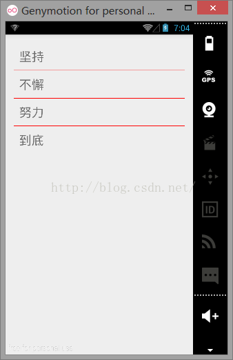
String arr1[] = new String[]{"坚持", "不懈", "努力", "到底"};
ArrayAdapter<String> adapter1 = new ArrayAdapter<String>(ArrayAdapterTest.this, R.layout.array_item, arr1);
ls.setAdapter(adapter1);
}
}
如果想要对ListView的外观、行为进行定制,就需要通过Adapter控制每个列表项的外观和行为。
Adapter适配器:Adapter本身只是一个接口,他常用的实现类如下:
- ArrayAdapter:简单、易用的Adapter,通常用于数组或list集合的多个值包装成的多个列表项。
- SimpleAdapter:并不简单,功能强大的Adapter,可用于将list集合的多个对象包装成多个列表项。
- BaseAdapter:通常用于被扩展。扩展BaseAdapter可用对各列表项进行最大限度的定制。
刚刚的简单实例就用到了ArrayAdapter适配器
ArrayAdapter<String> adapter1 = new ArrayAdapter<String>(ArrayAdapterTest.this, R.layout.array_item, arr1);

ls.setAdapter(adapter1);- Context:这个参数无需多说,它代表了访问整个Android应用的接口,几乎创建所有的组件都需要传入Context对象。
- textViewResourcele:一个资源ID,该资源ID代表一个TextView。
- 数组或list:该数组或list将负责为多个列表项提供数据。
在最后为listView设定适配器 :ls.setAdapter(adapter1);
【实例】使用SimpleAdapter创建ListView
先定义界面布局文件:
<LinearLayout xmlns:android="http://schemas.android.com/apk/res/android"
    xmlns:tools="http://schemas.android.com/tools"
    android:layout_width="match_parent"
    android:layout_height="match_parent"
    tools:context="songsong.com.listviewtext.SimpleAdapterTest">

    <ListView
        android:id="@+id/lv1"
        android:layout_width="match_parent"
        android:layout_height="wrap_content"></ListView>

</LinearLayout>
public class SimpleAdapterTest extends Activity {
    private String[] title = new String[]{"我是标题1", "我是标题2", "我是标题3", "我是标题4"};
    private String[] content = new String[]{"我是内容1", "我是内容2", "我是内容3", "我是内容4"};
    private int[] ImageIds = new int[]{R.drawable.a1, R.drawable.a2, R.drawable.a3, R.drawable.a4};

    @Override
    protected void onCreate(Bundle savedInstanceState) {
        super.onCreate(savedInstanceState);
        setContentView(R.layout.activity_simpleadaptertest);
          //创建一个List集合,List集合的元素是Map.
        List<Map<String, Object>> listItems = new ArrayList<Map<String, Object>>();

        for (int i = 0; i < title.length; i++) {
            Map<String, Object> listItem = new HashMap<String, Object>();

            listItem.put("A1", ImageIds[i]);
            listItem.put("A2", title[i]);
            listItem.put("A3", content[i]);
            listItems.add(listItem);
        }
        SimpleAdapter simpleAdapter = new SimpleAdapter(
                SimpleAdapterTest.this,
                listItems,
                R.layout.simple_item,
                new String[]{"A1", "A2", "A3"},
                new int[]{R.id.img1, R.id.tv1, R.id.tv2});

        ListView listView = (ListView) findViewById(R.id.lv1);

        listView.setAdapter(simpleAdapter);
    }
}- 第1个参数:仍然是Context。
- 第2个参数:该参数应该是一个List<? extends Map<String,?>>类型的集合对象,该集合对象中米格Map<String,?>对象生成一个列表项。
- 第3个参数:该参数指定一个界面布局的ID。例如我的布局文件名叫R.layout.simple_item。
- 第4个参数:该参数应该是一个String[]类型的参数,该参数决定提取Map<String,?>对象中哪些Key对应的Value来生成列表项(数组名)。
- 第5个参数:该参数应该是一个int[]类型的参数,该参数决定填充哪些组件。
R.layout.simple_item对应的布局文件代码如下:
<?xml version="1.0" encoding="utf-8"?>
<LinearLayout xmlns:android="http://schemas.android.com/apk/res/android"
    android:layout_width="match_parent"
    android:layout_height="match_parent"
    android:orientation="horizontal"
    android:padding="15dp">

    <ImageView
        android:id="@+id/img1"
        android:layout_width="wrap_content"
        android:layout_height="wrap_content" />

    <LinearLayout
        android:layout_width="match_parent"
        android:layout_height="wrap_content"
        android:orientation="vertical">

        <TextView
            android:id="@+id/tv1"
            android:layout_width="wrap_content"
            android:layout_height="wrap_content"
            android:textSize="20dp" />

        <TextView
            android:id="@+id/tv2"
            android:layout_width="wrap_content"
            android:layout_height="wrap_content"
            android:textSize="14dp" />

    </LinearLayout>
</LinearLayout>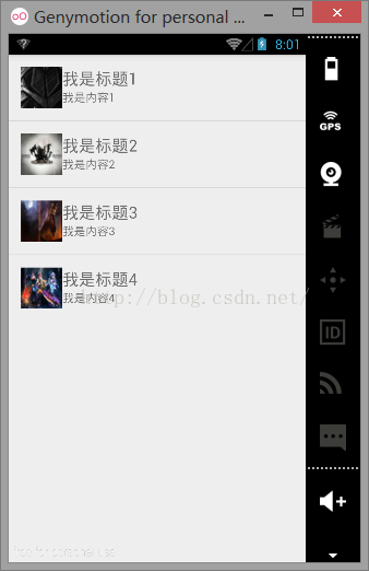
如果需要监听用户单击、选中某个列表项的时间,则可以通过AdapterView的setOnItemClickListener()方法来监听单击事件,setOnItemSelectedListener()方法来监听选中事件。
 listView.setOnItemClickListener(new AdapterView.OnItemClickListener() {   //第position项被单击时激发该方法
            @Override
            public void onItemClick(AdapterView<?> parent, View view, int position, long id) {
                System.out.println(title[position] + "被单击了");
            }
        });
        listView.setOnItemSelectedListener(new AdapterView.OnItemSelectedListener() {    //选中事件绑定监听器
            @Override
            public void onItemSelected(AdapterView<?> parent, View view, int position, long id) {
                System.out.println(title[position] + "被选中了");
            }
            @Override
            public void onNothingSelected(AdapterView<?> parent) {
            }
});【实例】扩展BaseAdapter实现不存储列表项ListView: 暂未写
2.13、Spinner的功能与用法
Spinner组件与Swing编程中的Spinner不同,此处的Spinner其实就是一个列表选择框,不过Android的列表选择框并不需要显示下拉列表,而是相当于弹出一个菜单供用户选择。
以下是XML属性及其相关方法:
- android:entries:使用数组资源设置该下拉列表框的列表项。
- android:prompt:设置该列表选择框的提示信息。
有两种定义Spinner的方式,第一种是定义数组资源:
<LinearLayout xmlns:android="http://schemas.android.com/apk/res/android"
    xmlns:tools="http://schemas.android.com/tools"
    android:layout_width="match_parent"
    android:layout_height="match_parent"
    android:orientation="vertical"
    tools:context=".MainActivity">

    <Spinner
        android:layout_width="match_parent"
        android:layout_height="wrap_content"
        android:entries="@array/books"
        android:prompt="@string/tishi"></Spinner>

    <Spinner
        android:id="@+id/spinner_id"
        android:layout_width="match_parent"
        android:layout_height="wrap_content"></Spinner>
</LinearLayout>
另外一种是java代码:
public class MainActivity extends Activity {
    Spinner spinner;

    @Override
    protected void onCreate(Bundle savedInstanceState) {
        super.onCreate(savedInstanceState);
        setContentView(R.layout.activity_main);

        spinner = (Spinner) findViewById(R.id.spinner_id);

        String[] data = {"坚持", "不懈", "努力", "奋斗"};

        ArrayAdapter<String> adapter = new ArrayAdapter<String>(this, android.R.layout.simple_list_item_multiple_choice, data);
        spinner.setAdapter(adapter);
    }
}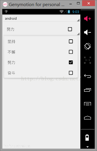
取得用户的选择代码可以使用getSelectedItem()方法取得用户的选择,如下所示:
String sp = spinner.getSelectedItem().toString();
2.14自动完成文本框AutoCompleteTextView的功能与用法 :暂未完成
2.15自定义AndroidUI组件
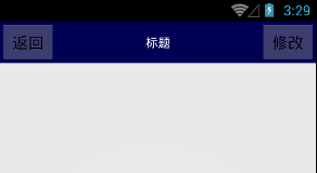
【实例】自定义标题栏
新建一个title.xml布局文件:
<?xml version="1.0" encoding="utf-8"?>
<LinearLayout xmlns:android="http://schemas.android.com/apk/res/android"
    android:layout_width="match_parent"
    android:layout_height="wrap_content"
    android:orientation="horizontal"
    android:background="#005">

    <Button
        android:id="@+id/title_back"
        android:layout_width="wrap_content"
        android:layout_height="wrap_content"
        android:layout_gravity="center"
        android:text="返回" />

    <TextView
        android:layout_width="wrap_content"
        android:layout_height="wrap_content"
        android:layout_gravity="center"
        android:layout_weight="1"
        android:gravity="center"
        android:text="标题" />

    <Button
        android:id="@+id/title_edit"
        android:layout_width="wrap_content"
        android:layout_height="wrap_content"
        android:layout_gravity="center"
        android:text="修改" />
</LinearLayout>
<LinearLayout xmlns:android="http://schemas.android.com/apk/res/android"
    xmlns:tools="http://schemas.android.com/tools"
    android:layout_width="match_parent"
    android:layout_height="match_parent"
    tools:context=".MainActivity">

    <include layout="@layout/title"></include>
</LinearLayout>
public class MainActivity extends Activity {

    @Override
    protected void onCreate(Bundle savedInstanceState) {
        super.onCreate(savedInstanceState);
        requestWindowFeature(Window.FEATURE_NO_TITLE);
        setContentView(R.layout.activity_main);
    }
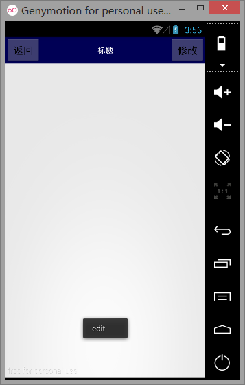
为了要按钮能响应事件,需要修改代码,新建Java文件TitleLayout,并继承LinearLayout,代码如下
public class TitleLayout extends LinearLayout {

    public TitleLayout(Context context, AttributeSet attrs) {
        super(context, attrs);
        LayoutInflater.from(context).inflate(R.layout.title, this);

        Button back = (Button) findViewById(R.id.title_back);
        back.setOnClickListener(new OnClickListener() {
            @Override
            public void onClick(View v) {
                ((Activity) getContext()).finish();
            }
        });

        Button edit = (Button) findViewById(R.id.title_edit);
        edit.setOnClickListener(new OnClickListener() {
            @Override
            public void onClick(View v) {
                Toast.makeText(getContext(), "edit", Toast.LENGTH_SHORT).show();
            }
        });
    }
}
    <songsong.com.zidingyikongjian.TitleLayout
        android:layout_width="match_parent"
        android:layout_height="wrap_content">

    </songsong.com.zidingyikongjian.TitleLayout>
——————————————————————
学习内容:
- 掌握View和ViewGroup类
- 学习各个常用控件的使用方法
- 了解View的本质
- 熟练掌握自定义AndroidUI组件
- 熟练掌握Canvas和Drawable画自定义组件以及事件
- 熟练NinePatch图像的使用(9图):保存局部不变,其余拉伸
- 日记工具Log
- 了解Android界面事件机制
考察问题:
- View是所有控件的基类,能否说一下他与Activity的关系。
- View的核心是什么,能否说一下里面的onDraw函数。
- 自定义组件如何实现自定义事件。
- NinePatch是干什么的
- 简单描述下Android界面事件机制


 2038
2038


 被折叠的 条评论
为什么被折叠?
被折叠的 条评论
为什么被折叠?
 到【灌水乐园】发言


