


下面是纯CSS设置Checkbox复选框控件的五种简单样式,有兴趣的可以进行改动将其变成自己想要的样式。

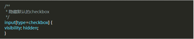
首先,需要添加一段CSS隐藏所有的Checkbox复选框,下面我们会改变它的外观。要做到点需要添加一段代码到你的CSS文件中。
隐藏掉所有的Checkbox复选框后,我们需要添加一个label HTML元素,我们都知道,当点击的有for属性的label标签时,对应的Checkbox复选框会被选中。这意味着,我们可以通过label的点击事件来处理我们的Checkbox复选框。
样式一

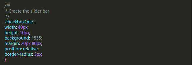
此复选框风格就像一个解锁滑块,滑块选中和未选中状态会显示在的不同位置。当单击滑块按钮(label标签),将会选中复选框,然后滑块移动到ON位置。
我们开始创建复选框区的HTML。

因为这个样式的复选框,一个label不足以完成任务,我们用一个DIV元素包含checkbox,我们需要使用它们来做黑色条带和圆角。
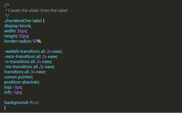
现在,我们可以把label作为条带上的滑块,我们希望按钮效果是从条带的一侧移动到另一侧,我们可以添加label的过渡。
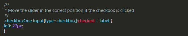
现在这个滑块在选中(关闭)位置,当我们选中复选框,我们希望有一个反应发生,所以我们可以移动滑块到另一端。我们需要知道,判断复选框被选中,如果是则改变label元素的left属性。
这就是你需要的第一个Checkbox复选框的CSS。
样式二
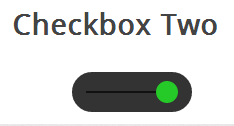
此复选框风格像样式一样,但不同的是,这个滑块按钮会改变颜色。当您单击滑块按钮,它移动到条带的另一边,并改变按钮的颜色。
HTML代码和样式一是完全一样的。
这个DIV会变成比样式一大一些的条带,label依然是作为滑块,使用下面的CSS来定义它。
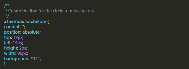
这个样式中间有一个黑色的条,滑块会沿着它左右滑动,但是DIV元素已经使用了,所以我们需要用:before伪类创建一个新的元素。
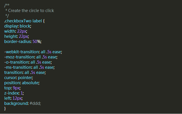
和样式一一样,接下来我们为label写CSS样式,把它用作滑块。
我要实现和样式一差不多的选中状态,当选中时改变label的left和background属性。
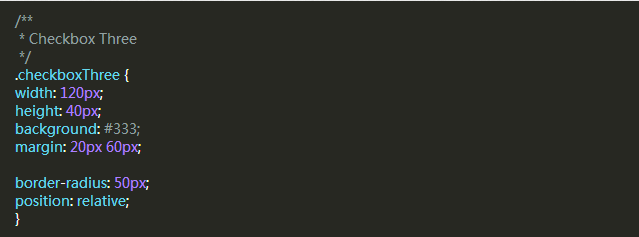
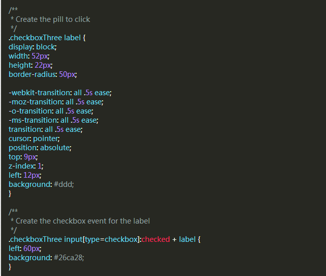
样式三
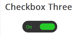
这个复选框的样式比样式二更复杂一些,它和前面的例子一样会左右滑动,并且当改变选中和未选中的状态时,滑块滑动到另一侧并且在原位置显示对应的文本。
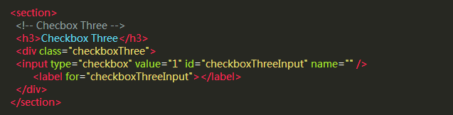
首先,我们写HTML代码,这和前面是相同的。
然后,我们用相同的方式把div作为滑块,下面的代码会创建一个黑色圆角的条带,我们可以把滑块和文本放到里面。
当滑块处于未选中状态时,滑块会在左侧,并且右边显示”OFF”,当点击的时候,滑块移动到右侧,左侧显示”ON”。
但是元素数量不足以让我们实现这些功能,所以我们要用:before和:after两个伪类创建两个元素,分别放置”ON”和”OFF”。

和前面一样,我们来添加滑块的样式,当被点击时它会移动到另一侧,并且改变颜色。
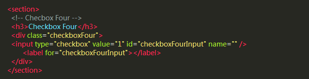
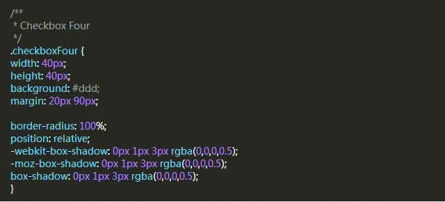
样式四

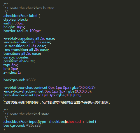
在这个样式中,我们会创建两个圆形,当点击时改变里面的圆形的颜色表示选中与未选中的状态。
和前面一样的HTML代码。
接下来我们要为checkbox创建外面的圆形,使用CSS的border-radius属性,并且设置为100%就可以创建一个正圆形。
然后我们用label元素来创建一个小一点的圆形,它会根据checkbox状态来改变颜色。
样式五

这个复选框的样式有些不同,它看起来只是比浏览器默认的checkbox样式稍微好了些,但是不同的是我们可以根据自己的需要来定义它的样式了。
首先还是一样的HTML代码
在前面的例子中,我们把div作为checkbox的滑动条带或者外部的圆圈,但是这一次我们不需要了,可以使用div元素来设置复选框的区域。
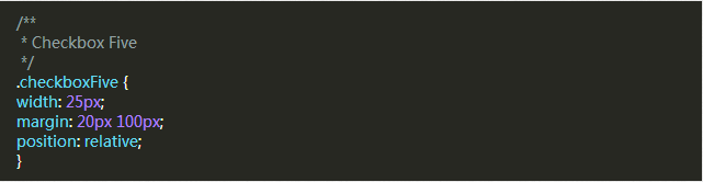
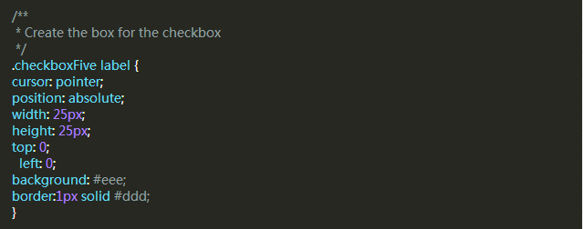
label标签用于Click事件和我们要定义的复选框的方框样式。
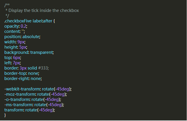
接下来,我们要创建方框中的对勾,对于这一点,我们可以使用:after伪类创建一个新的元素,为了实现这个样式,我们可以创建一个5px x 9px的长方形并给他加上边框。这时候我们去掉上面和右边的边框之后,它会看起来像一个字母L。然后我们可以使用CSS的transform属性让它旋转一下,这样看起来就像是一个对勾。
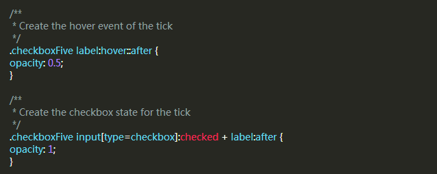
在上面的CSS中,我们已经设置它的透明度为0.2,所以你会看到的复选框有一个半透明的对勾。你可以在悬停的时候加深一点,在选中时,可以把设置为不透明。
这将会为你创建全新的checkbox复选框样式。
<!DOCTYPE html>
<html>
<head>
<meta charset="utf-8">
<title>Checkbox样式</title>
<style type="text/css" media="screen">
body {
color: #444;
font-size: 1.6em;
background: #ccc;
}
.container {
width: 90%;
margin: 20px 3%;
padding: 25px;
min-height: 400px;
height: auto;
background: #FFF;
}
section {
float: left;
width: 30%;
margin: 20px 20px;
}
hr {
clear: both;
}
/**
* Start by hiding the checkboxes
*/
input[type=checkbox] {
visibility: hidden;
}
/**
* Create the slider bar
*/
/* 滑动线 */
.checkboxOne {
width: 40px;
height: 10px;
background: #555;
position: relative;
border-radius: 3px;
}
/**
* Create the slider from the label
*/
.checkboxOne label {
display: block;
width: 16px;
height: 16px;
border-radius: 50%;
-webkit-transition: all .5s ease;
-moz-transition: all .5s ease;
-o-transition: all .5s ease;
-ms-transition: all .5s ease;
transition: all .5s ease;
cursor: pointer;
position: absolute;
top: -3px;
left: -3px;
background: #ccc;
}
/**
* Move the slider in the correct position if the checkbox is clicked
*/
.checkboxOne input[type=checkbox]:checked+label {
left: 27px;
}
/**
* Checkbox Two
*/
.checkboxTwo {
width: 120px;
height: 40px;
background: #333;
border-radius: 50px;
position: relative;
}
/**
* Create the line for the circle to move across
*/
/* 方框中间的横线 */
.checkboxTwo:before {
content: '';
position: absolute;
top: 19px; /* 居中:checkboxTwo 的高度的一半 */
left: 14px;
/* 横线的大小 */
height: 2px;
width: 90px;
background: #111;
}
/**
* Create the circle to click
*/
/* 移动的圆形 */
.checkboxTwo label {
display: block;
width: 22px;
height: 22px;
border-radius: 50%;
/* 动画写在启动的样式里 */
-webkit-transition: all .5s ease;
-moz-transition: all .5s ease;
-o-transition: all .5s ease;
-ms-transition: all .5s ease;
transition: all .5s ease;
cursor: pointer;
position: absolute;
top: 9px;
left: 12px;
background: #ddd;
}
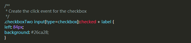
/**
* Create the click event for the checkbox
*/
.checkboxTwo input[type=checkbox]:checked+label {
left: 84px;
background: #26ca28;
}
/**
* Checkbox Three
*/
.checkboxThree {
width: 120px;
height: 40px;
background: #333;
border-radius: 50px;
position: relative;
}
/**
* Create the text for the On position
*/
/* before和 after的定位,以使用元素为基准 子绝父相*/
.checkboxThree:before {
content: 'On';
position: absolute;
top: 12px;
left: 13px;
color: #26ca28;
font-size: 16px;
}
/**
* Create the label for the off position
*/
.checkboxThree:after {
content: 'Off';
position: absolute;
top: 12px;
left: 84px;
color: #ddd;
font-size: 16px;
}
/**
* Create the pill to click
*/
.checkboxThree label {
display: block;
width: 52px;
height: 22px;
border-radius: 50px;
-webkit-transition: all .5s ease;
-moz-transition: all .5s ease;
-o-transition: all .5s ease;
-ms-transition: all .5s ease;
transition: all .5s ease;
cursor: pointer;
position: absolute;
top: 9px;
left: 12px;
z-index: 1;
background: #ddd;
}
/**
* Create the checkbox event for the label
* @type {[type]}
*/
.checkboxThree input[type=checkbox]:checked+label {
left: 60px;
background: #26ca28;
}
/**
* Checkbox Four
*/
.checkboxFour {
width: 40px;
height: 40px;
background: #ddd;
border-radius: 100%;
position: relative;
-webkit-box-shadow: 0px 1px 3px rgba(0, 0, 0, 0.5);
-moz-box-shadow: 0px 1px 3px rgba(0, 0, 0, 0.5);
box-shadow: 0px 1px 3px rgba(0, 0, 0, 0.5);
}
/**
* Create the checkbox button
*/
.checkboxFour label {
display: block;
width: 30px;
height: 30px;
border-radius: 100px;
-webkit-transition: all .5s ease;
-moz-transition: all .5s ease;
-o-transition: all .5s ease;
-ms-transition: all .5s ease;
transition: all .5s ease;
cursor: pointer;
position: absolute;
top: 5px;
left: 5px;
z-index: 1;
background: #333;
-webkit-box-shadow: inset 0px 1px 3px rgba(0, 0, 0, 0.5);
-moz-box-shadow: inset 0px 1px 3px rgba(0, 0, 0, 0.5);
box-shadow: inset 0px 1px 3px rgba(0, 0, 0, 0.5);
}
/**
* Create the checked state
*/
.checkboxFour input[type=checkbox]:checked+label {
background: #26ca28;
}
/**
* Checkbox Five
*/
.checkboxFive {
width: 25px;
margin: 20px 100px;
position: relative;
}
/**
* Create the box for the checkbox
*/
.checkboxFive label {
cursor: pointer;
position: absolute;
width: 25px;
height: 25px;
top: 0;
left: 0;
background: #eee;
border: 1px solid #ddd;
}
/**
* Display the tick inside the checkbox
*/
.checkboxFive label:after {
opacity: 0.2;
content: '';
position: absolute;
width: 9px;
height: 5px;
/* 内容为透明 */
background: transparent;
top: 6px;
left: 7px;
/* 四条边框的样式 */
border: 3px solid #333;
border-top: none;
border-right: none;
/* 旋转 */
-webkit-transform: rotate(-45deg);
-moz-transform: rotate(-45deg);
-o-transform: rotate(-45deg);
-ms-transform: rotate(-45deg);
transform: rotate(-45deg);
}
/**
* Create the hover event of the tick
*/
.checkboxFive label:hover::after {
opacity: 0.5;
}
/**
* Create the checkbox state for the tick
*/
.checkboxFive input[type=checkbox]:checked+label:after {
opacity: 1;
}
</style>
</head>
<body>
<section class="container">
<section>
<!-- 样式一 -->
<h3>样式一</h3>
<div class="checkboxOne">
<input type="checkbox" value="1" id="checkboxOneInput" name="" />
<label for="checkboxOneInput"></label>
</div>
</section>
<section>
<!-- 样式二 -->
<h3>样式二</h3>
<div class="checkboxTwo">
<input type="checkbox" value="1" id="checkboxTwoInput" name="" />
<label for="checkboxTwoInput"></label>
</div>
</section>
<section>
<!-- 样式三 -->
<h3>样式三</h3>
<div class="checkboxThree">
<input type="checkbox" value="1" id="checkboxThreeInput" name="" />
<label for="checkboxThreeInput"></label>
</div>
</section>
<section>
<!-- 样式四 -->
<h3>样式四</h3>
<div class="checkboxFour">
<input type="checkbox" value="1" id="checkboxFourInput" name="" />
<label for="checkboxFourInput"></label>
</div>
</section>
<section>
<!-- 样式五 -->
<h3>样式五</h3>
<div class="checkboxFive">
<input type="checkbox" value="1" id="checkboxFiveInput" name="" />
<label for="checkboxFiveInput"></label>
</div>
</section>
<div style="clear:both;"></div>
</section>
</body>
</html>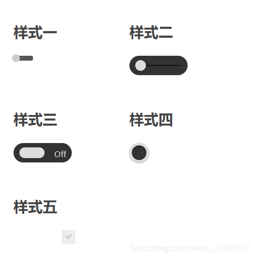
https://cssdeck.com/labs/css-checkbox-styles
<!DOCTYPE html>
<html>

<head>
  <meta charset="utf-8">
  <title>Checkbox样式</title>
  <style>
    body {
      background: #555;
    }

    h1 {
      color: #eee;
      font: 30px Arial, sans-serif;
      -webkit-font-smoothing: antialiased;
      text-shadow: 0px 1px black;
      text-align: center;
      margin-bottom: 50px;
    }

    input[type=checkbox] {
      visibility: hidden;
    }

    /* SLIDE ONE */
    .slideOne {
      width: 50px;
      height: 10px;
      background: #333;
      margin: 20px auto;

      -webkit-border-radius: 50px;
      -moz-border-radius: 50px;
      border-radius: 50px;
      position: relative;

      -webkit-box-shadow: inset 0px 1px 1px rgba(0, 0, 0, 0.5), 0px 1px 0px rgba(255, 255, 255, 0.2);
      -moz-box-shadow: inset 0px 1px 1px rgba(0, 0, 0, 0.5), 0px 1px 0px rgba(255, 255, 255, 0.2);
      box-shadow: inset 0px 1px 1px rgba(0, 0, 0, 0.5), 0px 1px 0px rgba(255, 255, 255, 0.2);
    }

    .slideOne label {
      display: block;
      width: 16px;
      height: 16px;

      -webkit-border-radius: 50px;
      -moz-border-radius: 50px;
      border-radius: 50px;

      -webkit-transition: all .4s ease;
      -moz-transition: all .4s ease;
      -o-transition: all .4s ease;
      -ms-transition: all .4s ease;
      transition: all .4s ease;
      cursor: pointer;
      position: absolute;
      top: -3px;
      left: -3px;

      -webkit-box-shadow: 0px 2px 5px 0px rgba(0, 0, 0, 0.3);
      -moz-box-shadow: 0px 2px 5px 0px rgba(0, 0, 0, 0.3);
      box-shadow: 0px 2px 5px 0px rgba(0, 0, 0, 0.3);
      background: #fcfff4;

      background: -webkit-linear-gradient(top, #fcfff4 0%, #dfe5d7 40%, #b3bead 100%);
      background: -moz-linear-gradient(top, #fcfff4 0%, #dfe5d7 40%, #b3bead 100%);
      background: -o-linear-gradient(top, #fcfff4 0%, #dfe5d7 40%, #b3bead 100%);
      background: -ms-linear-gradient(top, #fcfff4 0%, #dfe5d7 40%, #b3bead 100%);
      background: linear-gradient(top, #fcfff4 0%, #dfe5d7 40%, #b3bead 100%);
      filter: progid:DXImageTransform.Microsoft.gradient(startColorstr='#fcfff4', endColorstr='#b3bead', GradientType=0);
    }

    .slideOne input[type=checkbox]:checked+label {
      left: 37px;
    }

    /* SLIDE TWO */
    .slideTwo {
      width: 80px;
      height: 30px;
      background: #333;
      margin: 20px auto;

      -webkit-border-radius: 50px;
      -moz-border-radius: 50px;
      border-radius: 50px;
      position: relative;

      -webkit-box-shadow: inset 0px 1px 1px rgba(0, 0, 0, 0.5), 0px 1px 0px rgba(255, 255, 255, 0.2);
      -moz-box-shadow: inset 0px 1px 1px rgba(0, 0, 0, 0.5), 0px 1px 0px rgba(255, 255, 255, 0.2);
      box-shadow: inset 0px 1px 1px rgba(0, 0, 0, 0.5), 0px 1px 0px rgba(255, 255, 255, 0.2);
    }

    .slideTwo:after {
      content: '';
      position: absolute;
      top: 14px;
      left: 14px;
      height: 2px;
      width: 52px;

      -webkit-border-radius: 50px;
      -moz-border-radius: 50px;
      border-radius: 50px;
      background: #111;

      -webkit-box-shadow: inset 0px 1px 1px rgba(0, 0, 0, 0.5), 0px 1px 0px rgba(255, 255, 255, 0.2);
      -moz-box-shadow: inset 0px 1px 1px rgba(0, 0, 0, 0.5), 0px 1px 0px rgba(255, 255, 255, 0.2);
      box-shadow: inset 0px 1px 1px rgba(0, 0, 0, 0.5), 0px 1px 0px rgba(255, 255, 255, 0.2);
    }

    .slideTwo label {
      display: block;
      width: 22px;
      height: 22px;

      -webkit-border-radius: 50px;
      -moz-border-radius: 50px;
      border-radius: 50px;

      -webkit-transition: all .4s ease;
      -moz-transition: all .4s ease;
      -o-transition: all .4s ease;
      -ms-transition: all .4s ease;
      transition: all .4s ease;
      cursor: pointer;
      position: absolute;
      top: 4px;
      z-index: 1;
      left: 4px;

      -webkit-box-shadow: 0px 2px 5px 0px rgba(0, 0, 0, 0.3);
      -moz-box-shadow: 0px 2px 5px 0px rgba(0, 0, 0, 0.3);
      box-shadow: 0px 2px 5px 0px rgba(0, 0, 0, 0.3);
      background: #fcfff4;

      background: -webkit-linear-gradient(top, #fcfff4 0%, #dfe5d7 40%, #b3bead 100%);
      background: -moz-linear-gradient(top, #fcfff4 0%, #dfe5d7 40%, #b3bead 100%);
      background: -o-linear-gradient(top, #fcfff4 0%, #dfe5d7 40%, #b3bead 100%);
      background: -ms-linear-gradient(top, #fcfff4 0%, #dfe5d7 40%, #b3bead 100%);
      background: linear-gradient(top, #fcfff4 0%, #dfe5d7 40%, #b3bead 100%);
      filter: progid:DXImageTransform.Microsoft.gradient(startColorstr='#fcfff4', endColorstr='#b3bead', GradientType=0);
    }

    .slideTwo label:after {
      content: '';
      position: absolute;
      width: 10px;
      height: 10px;

      -webkit-border-radius: 50px;
      -moz-border-radius: 50px;
      border-radius: 50px;
      background: #333;
      left: 6px;
      top: 6px;

      -webkit-box-shadow: inset 0px 1px 1px rgba(0, 0, 0, 1), 0px 1px 0px rgba(255, 255, 255, 0.9);
      -moz-box-shadow: inset 0px 1px 1px rgba(0, 0, 0, 1), 0px 1px 0px rgba(255, 255, 255, 0.9);
      box-shadow: inset 0px 1px 1px rgba(0, 0, 0, 1), 0px 1px 0px rgba(255, 255, 255, 0.9);
    }

    .slideTwo input[type=checkbox]:checked+label {
      left: 54px;
    }

    .slideTwo input[type=checkbox]:checked+label:after {
      background: #00bf00;
    }

    /* SLIDE THREE */
    .slideThree {
      width: 80px;
      height: 26px;
      background: #333;
      margin: 20px auto;

      -webkit-border-radius: 50px;
      -moz-border-radius: 50px;
      border-radius: 50px;
      position: relative;

      -webkit-box-shadow: inset 0px 1px 1px rgba(0, 0, 0, 0.5), 0px 1px 0px rgba(255, 255, 255, 0.2);
      -moz-box-shadow: inset 0px 1px 1px rgba(0, 0, 0, 0.5), 0px 1px 0px rgba(255, 255, 255, 0.2);
      box-shadow: inset 0px 1px 1px rgba(0, 0, 0, 0.5), 0px 1px 0px rgba(255, 255, 255, 0.2);
    }

    .slideThree:after {
      content: 'OFF';
      font: 12px/26px Arial, sans-serif;
      color: #000;
      position: absolute;
      right: 10px;
      z-index: 0;
      font-weight: bold;
      text-shadow: 1px 1px 0px rgba(255, 255, 255, .15);
    }

    .slideThree:before {
      content: 'ON';
      font: 12px/26px Arial, sans-serif;
      color: #00bf00;
      position: absolute;
      left: 10px;
      z-index: 0;
      font-weight: bold;
    }

    .slideThree label {
      display: block;
      width: 34px;
      height: 20px;

      -webkit-border-radius: 50px;
      -moz-border-radius: 50px;
      border-radius: 50px;

      -webkit-transition: all .4s ease;
      -moz-transition: all .4s ease;
      -o-transition: all .4s ease;
      -ms-transition: all .4s ease;
      transition: all .4s ease;
      cursor: pointer;
      position: absolute;
      top: 3px;
      left: 3px;
      z-index: 1;

      -webkit-box-shadow: 0px 2px 5px 0px rgba(0, 0, 0, 0.3);
      -moz-box-shadow: 0px 2px 5px 0px rgba(0, 0, 0, 0.3);
      box-shadow: 0px 2px 5px 0px rgba(0, 0, 0, 0.3);
      background: #fcfff4;

      background: -webkit-linear-gradient(top, #fcfff4 0%, #dfe5d7 40%, #b3bead 100%);
      background: -moz-linear-gradient(top, #fcfff4 0%, #dfe5d7 40%, #b3bead 100%);
      background: -o-linear-gradient(top, #fcfff4 0%, #dfe5d7 40%, #b3bead 100%);
      background: -ms-linear-gradient(top, #fcfff4 0%, #dfe5d7 40%, #b3bead 100%);
      background: linear-gradient(top, #fcfff4 0%, #dfe5d7 40%, #b3bead 100%);
      filter: progid:DXImageTransform.Microsoft.gradient(startColorstr='#fcfff4', endColorstr='#b3bead', GradientType=0);
    }

    .slideThree input[type=checkbox]:checked+label {
      left: 43px;
    }

    /* ROUNDED ONE */
    .roundedOne {
      width: 28px;
      height: 28px;
      background: #fcfff4;

      background: -webkit-linear-gradient(top, #fcfff4 0%, #dfe5d7 40%, #b3bead 100%);
      background: -moz-linear-gradient(top, #fcfff4 0%, #dfe5d7 40%, #b3bead 100%);
      background: -o-linear-gradient(top, #fcfff4 0%, #dfe5d7 40%, #b3bead 100%);
      background: -ms-linear-gradient(top, #fcfff4 0%, #dfe5d7 40%, #b3bead 100%);
      background: linear-gradient(top, #fcfff4 0%, #dfe5d7 40%, #b3bead 100%);
      filter: progid:DXImageTransform.Microsoft.gradient(startColorstr='#fcfff4', endColorstr='#b3bead', GradientType=0);
      margin: 20px auto;

      -webkit-border-radius: 50px;
      -moz-border-radius: 50px;
      border-radius: 50px;

      -webkit-box-shadow: inset 0px 1px 1px white, 0px 1px 3px rgba(0, 0, 0, 0.5);
      -moz-box-shadow: inset 0px 1px 1px white, 0px 1px 3px rgba(0, 0, 0, 0.5);
      box-shadow: inset 0px 1px 1px white, 0px 1px 3px rgba(0, 0, 0, 0.5);
      position: relative;
    }

    .roundedOne label {
      cursor: pointer;
      position: absolute;
      width: 20px;
      height: 20px;

      -webkit-border-radius: 50px;
      -moz-border-radius: 50px;
      border-radius: 50px;
      left: 4px;
      top: 4px;

      -webkit-box-shadow: inset 0px 1px 1px rgba(0, 0, 0, 0.5), 0px 1px 0px rgba(255, 255, 255, 1);
      -moz-box-shadow: inset 0px 1px 1px rgba(0, 0, 0, 0.5), 0px 1px 0px rgba(255, 255, 255, 1);
      box-shadow: inset 0px 1px 1px rgba(0, 0, 0, 0.5), 0px 1px 0px rgba(255, 255, 255, 1);

      background: -webkit-linear-gradient(top, #222 0%, #45484d 100%);
      background: -moz-linear-gradient(top, #222 0%, #45484d 100%);
      background: -o-linear-gradient(top, #222 0%, #45484d 100%);
      background: -ms-linear-gradient(top, #222 0%, #45484d 100%);
      background: linear-gradient(top, #222 0%, #45484d 100%);
      filter: progid:DXImageTransform.Microsoft.gradient(startColorstr='#222', endColorstr='#45484d', GradientType=0);
    }

    .roundedOne label:after {
      -ms-filter: "progid:DXImageTransform.Microsoft.Alpha(Opacity=0)";
      filter: alpha(opacity=0);
      opacity: 0;
      content: '';
      position: absolute;
      width: 16px;
      height: 16px;
      background: #00bf00;

      background: -webkit-linear-gradient(top, #00bf00 0%, #009400 100%);
      background: -moz-linear-gradient(top, #00bf00 0%, #009400 100%);
      background: -o-linear-gradient(top, #00bf00 0%, #009400 100%);
      background: -ms-linear-gradient(top, #00bf00 0%, #009400 100%);
      background: linear-gradient(top, #00bf00 0%, #009400 100%);

      -webkit-border-radius: 50px;
      -moz-border-radius: 50px;
      border-radius: 50px;
      top: 2px;
      left: 2px;

      -webkit-box-shadow: inset 0px 1px 1px white, 0px 1px 3px rgba(0, 0, 0, 0.5);
      -moz-box-shadow: inset 0px 1px 1px white, 0px 1px 3px rgba(0, 0, 0, 0.5);
      box-shadow: inset 0px 1px 1px white, 0px 1px 3px rgba(0, 0, 0, 0.5);
    }

    .roundedOne label:hover::after {
      -ms-filter: "progid:DXImageTransform.Microsoft.Alpha(Opacity=30)";
      filter: alpha(opacity=30);
      opacity: 0.3;
    }

    .roundedOne input[type=checkbox]:checked+label:after {
      -ms-filter: "progid:DXImageTransform.Microsoft.Alpha(Opacity=100)";
      filter: alpha(opacity=100);
      opacity: 1;
    }

    /* ROUNDED TWO */
    .roundedTwo {
      width: 28px;
      height: 28px;
      background: #fcfff4;

      background: -webkit-linear-gradient(top, #fcfff4 0%, #dfe5d7 40%, #b3bead 100%);
      background: -moz-linear-gradient(top, #fcfff4 0%, #dfe5d7 40%, #b3bead 100%);
      background: -o-linear-gradient(top, #fcfff4 0%, #dfe5d7 40%, #b3bead 100%);
      background: -ms-linear-gradient(top, #fcfff4 0%, #dfe5d7 40%, #b3bead 100%);
      background: linear-gradient(top, #fcfff4 0%, #dfe5d7 40%, #b3bead 100%);
      filter: progid:DXImageTransform.Microsoft.gradient(startColorstr='#fcfff4', endColorstr='#b3bead', GradientType=0);
      margin: 20px auto;

      -webkit-border-radius: 50px;
      -moz-border-radius: 50px;
      border-radius: 50px;

      -webkit-box-shadow: inset 0px 1px 1px white, 0px 1px 3px rgba(0, 0, 0, 0.5);
      -moz-box-shadow: inset 0px 1px 1px white, 0px 1px 3px rgba(0, 0, 0, 0.5);
      box-shadow: inset 0px 1px 1px white, 0px 1px 3px rgba(0, 0, 0, 0.5);
      position: relative;
    }

    .roundedTwo label {
      cursor: pointer;
      position: absolute;
      width: 20px;
      height: 20px;

      -webkit-border-radius: 50px;
      -moz-border-radius: 50px;
      border-radius: 50px;
      left: 4px;
      top: 4px;

      -webkit-box-shadow: inset 0px 1px 1px rgba(0, 0, 0, 0.5), 0px 1px 0px rgba(255, 255, 255, 1);
      -moz-box-shadow: inset 0px 1px 1px rgba(0, 0, 0, 0.5), 0px 1px 0px rgba(255, 255, 255, 1);
      box-shadow: inset 0px 1px 1px rgba(0, 0, 0, 0.5), 0px 1px 0px rgba(255, 255, 255, 1);

      background: -webkit-linear-gradient(top, #222 0%, #45484d 100%);
      background: -moz-linear-gradient(top, #222 0%, #45484d 100%);
      background: -o-linear-gradient(top, #222 0%, #45484d 100%);
      background: -ms-linear-gradient(top, #222 0%, #45484d 100%);
      background: linear-gradient(top, #222 0%, #45484d 100%);
      filter: progid:DXImageTransform.Microsoft.gradient(startColorstr='#222', endColorstr='#45484d', GradientType=0);
    }

    .roundedTwo label:after {
      -ms-filter: "progid:DXImageTransform.Microsoft.Alpha(Opacity=0)";
      filter: alpha(opacity=0);
      opacity: 0;
      content: '';
      position: absolute;
      width: 9px;
      height: 5px;
      background: transparent;
      top: 5px;
      left: 4px;
      border: 3px solid #fcfff4;
      border-top: none;
      border-right: none;

      -webkit-transform: rotate(-45deg);
      -moz-transform: rotate(-45deg);
      -o-transform: rotate(-45deg);
      -ms-transform: rotate(-45deg);
      transform: rotate(-45deg);
    }

    .roundedTwo label:hover::after {
      -ms-filter: "progid:DXImageTransform.Microsoft.Alpha(Opacity=30)";
      filter: alpha(opacity=30);
      opacity: 0.3;
    }

    .roundedTwo input[type=checkbox]:checked+label:after {
      -ms-filter: "progid:DXImageTransform.Microsoft.Alpha(Opacity=100)";
      filter: alpha(opacity=100);
      opacity: 1;
    }

    /* SQUARED ONE */
    .squaredOne {
      width: 28px;
      height: 28px;
      background: #fcfff4;

      background: -webkit-linear-gradient(top, #fcfff4 0%, #dfe5d7 40%, #b3bead 100%);
      background: -moz-linear-gradient(top, #fcfff4 0%, #dfe5d7 40%, #b3bead 100%);
      background: -o-linear-gradient(top, #fcfff4 0%, #dfe5d7 40%, #b3bead 100%);
      background: -ms-linear-gradient(top, #fcfff4 0%, #dfe5d7 40%, #b3bead 100%);
      background: linear-gradient(top, #fcfff4 0%, #dfe5d7 40%, #b3bead 100%);
      filter: progid:DXImageTransform.Microsoft.gradient(startColorstr='#fcfff4', endColorstr='#b3bead', GradientType=0);
      margin: 20px auto;
      -webkit-box-shadow: inset 0px 1px 1px white, 0px 1px 3px rgba(0, 0, 0, 0.5);
      -moz-box-shadow: inset 0px 1px 1px white, 0px 1px 3px rgba(0, 0, 0, 0.5);
      box-shadow: inset 0px 1px 1px white, 0px 1px 3px rgba(0, 0, 0, 0.5);
      position: relative;
    }

    .squaredOne label {
      cursor: pointer;
      position: absolute;
      width: 20px;
      height: 20px;
      left: 4px;
      top: 4px;

      -webkit-box-shadow: inset 0px 1px 1px rgba(0, 0, 0, 0.5), 0px 1px 0px rgba(255, 255, 255, 1);
      -moz-box-shadow: inset 0px 1px 1px rgba(0, 0, 0, 0.5), 0px 1px 0px rgba(255, 255, 255, 1);
      box-shadow: inset 0px 1px 1px rgba(0, 0, 0, 0.5), 0px 1px 0px rgba(255, 255, 255, 1);

      background: -webkit-linear-gradient(top, #222 0%, #45484d 100%);
      background: -moz-linear-gradient(top, #222 0%, #45484d 100%);
      background: -o-linear-gradient(top, #222 0%, #45484d 100%);
      background: -ms-linear-gradient(top, #222 0%, #45484d 100%);
      background: linear-gradient(top, #222 0%, #45484d 100%);
      filter: progid:DXImageTransform.Microsoft.gradient(startColorstr='#222', endColorstr='#45484d', GradientType=0);
    }

    .squaredOne label:after {
      -ms-filter: "progid:DXImageTransform.Microsoft.Alpha(Opacity=0)";
      filter: alpha(opacity=0);
      opacity: 0;
      content: '';
      position: absolute;
      width: 16px;
      height: 16px;
      background: #00bf00;

      background: -webkit-linear-gradient(top, #00bf00 0%, #009400 100%);
      background: -moz-linear-gradient(top, #00bf00 0%, #009400 100%);
      background: -o-linear-gradient(top, #00bf00 0%, #009400 100%);
      background: -ms-linear-gradient(top, #00bf00 0%, #009400 100%);
      background: linear-gradient(top, #00bf00 0%, #009400 100%);

      top: 2px;
      left: 2px;

      -webkit-box-shadow: inset 0px 1px 1px white, 0px 1px 3px rgba(0, 0, 0, 0.5);
      -moz-box-shadow: inset 0px 1px 1px white, 0px 1px 3px rgba(0, 0, 0, 0.5);
      box-shadow: inset 0px 1px 1px white, 0px 1px 3px rgba(0, 0, 0, 0.5);
    }

    .squaredOne label:hover::after {
      -ms-filter: "progid:DXImageTransform.Microsoft.Alpha(Opacity=30)";
      filter: alpha(opacity=30);
      opacity: 0.3;
    }

    .squaredOne input[type=checkbox]:checked+label:after {
      -ms-filter: "progid:DXImageTransform.Microsoft.Alpha(Opacity=100)";
      filter: alpha(opacity=100);
      opacity: 1;
    }

    /* SQUARED TWO */
    .squaredTwo {
      width: 28px;
      height: 28px;
      background: #fcfff4;

      background: -webkit-linear-gradient(top, #fcfff4 0%, #dfe5d7 40%, #b3bead 100%);
      background: -moz-linear-gradient(top, #fcfff4 0%, #dfe5d7 40%, #b3bead 100%);
      background: -o-linear-gradient(top, #fcfff4 0%, #dfe5d7 40%, #b3bead 100%);
      background: -ms-linear-gradient(top, #fcfff4 0%, #dfe5d7 40%, #b3bead 100%);
      background: linear-gradient(top, #fcfff4 0%, #dfe5d7 40%, #b3bead 100%);
      filter: progid:DXImageTransform.Microsoft.gradient(startColorstr='#fcfff4', endColorstr='#b3bead', GradientType=0);
      margin: 20px auto;

      -webkit-box-shadow: inset 0px 1px 1px white, 0px 1px 3px rgba(0, 0, 0, 0.5);
      -moz-box-shadow: inset 0px 1px 1px white, 0px 1px 3px rgba(0, 0, 0, 0.5);
      box-shadow: inset 0px 1px 1px white, 0px 1px 3px rgba(0, 0, 0, 0.5);
      position: relative;
    }

    .squaredTwo label {
      cursor: pointer;
      position: absolute;
      width: 20px;
      height: 20px;
      left: 4px;
      top: 4px;

      -webkit-box-shadow: inset 0px 1px 1px rgba(0, 0, 0, 0.5), 0px 1px 0px rgba(255, 255, 255, 1);
      -moz-box-shadow: inset 0px 1px 1px rgba(0, 0, 0, 0.5), 0px 1px 0px rgba(255, 255, 255, 1);
      box-shadow: inset 0px 1px 1px rgba(0, 0, 0, 0.5), 0px 1px 0px rgba(255, 255, 255, 1);

      background: -webkit-linear-gradient(top, #222 0%, #45484d 100%);
      background: -moz-linear-gradient(top, #222 0%, #45484d 100%);
      background: -o-linear-gradient(top, #222 0%, #45484d 100%);
      background: -ms-linear-gradient(top, #222 0%, #45484d 100%);
      background: linear-gradient(top, #222 0%, #45484d 100%);
      filter: progid:DXImageTransform.Microsoft.gradient(startColorstr='#222', endColorstr='#45484d', GradientType=0);
    }

    .squaredTwo label:after {
      -ms-filter: "progid:DXImageTransform.Microsoft.Alpha(Opacity=0)";
      filter: alpha(opacity=0);
      opacity: 0;
      content: '';
      position: absolute;
      width: 9px;
      height: 5px;
      background: transparent;
      top: 4px;
      left: 4px;
      border: 3px solid #fcfff4;
      border-top: none;
      border-right: none;

      -webkit-transform: rotate(-45deg);
      -moz-transform: rotate(-45deg);
      -o-transform: rotate(-45deg);
      -ms-transform: rotate(-45deg);
      transform: rotate(-45deg);
    }

    .squaredTwo label:hover::after {
      -ms-filter: "progid:DXImageTransform.Microsoft.Alpha(Opacity=30)";
      filter: alpha(opacity=30);
      opacity: 0.3;
    }

    .squaredTwo input[type=checkbox]:checked+label:after {
      -ms-filter: "progid:DXImageTransform.Microsoft.Alpha(Opacity=100)";
      filter: alpha(opacity=100);
      opacity: 1;
    }


    /* SQUARED THREE */
    .squaredThree {
      width: 20px;
      margin: 20px auto;
      position: relative;
    }

    .squaredThree label {
      cursor: pointer;
      position: absolute;
      width: 20px;
      height: 20px;
      top: 0;
      border-radius: 4px;

      -webkit-box-shadow: inset 0px 1px 1px rgba(0, 0, 0, 0.5), 0px 1px 0px rgba(255, 255, 255, .4);
      -moz-box-shadow: inset 0px 1px 1px rgba(0, 0, 0, 0.5), 0px 1px 0px rgba(255, 255, 255, .4);
      box-shadow: inset 0px 1px 1px rgba(0, 0, 0, 0.5), 0px 1px 0px rgba(255, 255, 255, .4);

      background: -webkit-linear-gradient(top, #222 0%, #45484d 100%);
      background: -moz-linear-gradient(top, #222 0%, #45484d 100%);
      background: -o-linear-gradient(top, #222 0%, #45484d 100%);
      background: -ms-linear-gradient(top, #222 0%, #45484d 100%);
      background: linear-gradient(top, #222 0%, #45484d 100%);
      filter: progid:DXImageTransform.Microsoft.gradient(startColorstr='#222', endColorstr='#45484d', GradientType=0);
    }

    .squaredThree label:after {
      -ms-filter: "progid:DXImageTransform.Microsoft.Alpha(Opacity=0)";
      filter: alpha(opacity=0);
      opacity: 0;
      content: '';
      position: absolute;
      width: 9px;
      height: 5px;
      background: transparent;
      top: 4px;
      left: 4px;
      border: 3px solid #fcfff4;
      border-top: none;
      border-right: none;

      -webkit-transform: rotate(-45deg);
      -moz-transform: rotate(-45deg);
      -o-transform: rotate(-45deg);
      -ms-transform: rotate(-45deg);
      transform: rotate(-45deg);
    }

    .squaredThree label:hover::after {
      -ms-filter: "progid:DXImageTransform.Microsoft.Alpha(Opacity=30)";
      filter: alpha(opacity=30);
      opacity: 0.3;
    }

    .squaredThree input[type=checkbox]:checked+label:after {
      -ms-filter: "progid:DXImageTransform.Microsoft.Alpha(Opacity=100)";
      filter: alpha(opacity=100);
      opacity: 1;
    }

    /* SQUARED FOUR */
    .squaredFour {
      width: 20px;
      margin: 20px auto;
      position: relative;
    }

    .squaredFour label {
      cursor: pointer;
      position: absolute;
      width: 20px;
      height: 20px;
      top: 0;
      border-radius: 4px;

      -webkit-box-shadow: inset 0px 1px 1px white, 0px 1px 3px rgba(0, 0, 0, 0.5);
      -moz-box-shadow: inset 0px 1px 1px white, 0px 1px 3px rgba(0, 0, 0, 0.5);
      box-shadow: inset 0px 1px 1px white, 0px 1px 3px rgba(0, 0, 0, 0.5);
      background: #fcfff4;

      background: -webkit-linear-gradient(top, #fcfff4 0%, #dfe5d7 40%, #b3bead 100%);
      background: -moz-linear-gradient(top, #fcfff4 0%, #dfe5d7 40%, #b3bead 100%);
      background: -o-linear-gradient(top, #fcfff4 0%, #dfe5d7 40%, #b3bead 100%);
      background: -ms-linear-gradient(top, #fcfff4 0%, #dfe5d7 40%, #b3bead 100%);
      background: linear-gradient(top, #fcfff4 0%, #dfe5d7 40%, #b3bead 100%);
      filter: progid:DXImageTransform.Microsoft.gradient(startColorstr='#fcfff4', endColorstr='#b3bead', GradientType=0);
    }

    .squaredFour label:after {
      -ms-filter: "progid:DXImageTransform.Microsoft.Alpha(Opacity=0)";
      filter: alpha(opacity=0);
      opacity: 0;
      content: '';
      position: absolute;
      width: 9px;
      height: 5px;
      background: transparent;
      top: 4px;
      left: 4px;
      border: 3px solid #333;
      border-top: none;
      border-right: none;

      -webkit-transform: rotate(-45deg);
      -moz-transform: rotate(-45deg);
      -o-transform: rotate(-45deg);
      -ms-transform: rotate(-45deg);
      transform: rotate(-45deg);
    }

    .squaredFour label:hover::after {
      -ms-filter: "progid:DXImageTransform.Microsoft.Alpha(Opacity=30)";
      filter: alpha(opacity=30);
      opacity: 0.5;
    }

    .squaredFour input[type=checkbox]:checked+label:after {
      -ms-filter: "progid:DXImageTransform.Microsoft.Alpha(Opacity=100)";
      filter: alpha(opacity=100);
      opacity: 1;
    }
  </style>
</head>

<body>
  <h1>CSS3 Checkbox Styles</h1>

  <!-- Slide ONE -->
  <div class="slideOne">
    <input type="checkbox" value="None" id="slideOne" name="check" />
    <label for="slideOne"></label>
  </div>

  <!-- Slide TWO -->
  <div class="slideTwo">
    <input type="checkbox" value="None" id="slideTwo" name="check" />
    <label for="slideTwo"></label>
  </div>

  <!-- Slide THREE -->
  <div class="slideThree">
    <input type="checkbox" value="None" id="slideThree" name="check" />
    <label for="slideThree"></label>
  </div>

  <!-- Rounded ONE -->
  <div class="roundedOne">
    <input type="checkbox" value="None" id="roundedOne" name="check" />
    <label for="roundedOne"></label>
  </div>

  <!-- Rounded TWO -->
  <div class="roundedTwo">
    <input type="checkbox" value="None" id="roundedTwo" name="check" />
    <label for="roundedTwo"></label>
  </div>

  <!-- Squared ONE -->
  <div class="squaredOne">
    <input type="checkbox" value="None" id="squaredOne" name="check" />
    <label for="squaredOne"></label>
  </div>

  <!-- Squared TWO -->
  <div class="squaredTwo">
    <input type="checkbox" value="None" id="squaredTwo" name="check" />
    <label for="squaredTwo"></label>
  </div>

  <!-- Squared THREE -->
  <div class="squaredThree">
    <input type="checkbox" value="None" id="squaredThree" name="check" />
    <label for="squaredThree"></label>
  </div>

  <!-- Squared FOUR -->
  <div class="squaredFour">
    <input type="checkbox" value="None" id="squaredFour" name="check" />
    <label for="squaredFour"></label>
  </div>

</body>

</html>


 379
379


 被折叠的 条评论
为什么被折叠?
被折叠的 条评论
为什么被折叠?
 到【灌水乐园】发言


