


二、表单
Bootstrap框架默认的表单是垂直显示风格,/*源码请查阅bootstrap.css
| .类名、标签 | 作用 | 在bootstrap.css的位置 |
|---|---|---|
| .form-horizontal | 1、设置表单控件padding和margin值。 2、改变“form-group”的表现形式,类似于网格系统的“row”。 | /源码请查阅bootstrap.css文件第1963行~第1991行/ |
| .form-inline | 将表单的控件都在一行内显示 | /源码请查阅bootstrap.css文件第1928行~第1962行/ |
| 输入框input | 为了让控件在各种表单风格中样式不出错,需要添加类名“form-control” | # |
| 下拉选择框select | Bootstrap框架中的下拉选择框使用和原始的一致,多行选择设置multiple属性的值为multiple。Bootstrap框架会为这些元素提供统一的样式风格 | # |
| 文本域textarea | 文本域和原始使用方法一样,设置rows可定义其高度,设置cols可以设置其宽度。但如果textarea元素中添加了类名“form-control”类名,则无需设置cols属性。因为Bootstrap框架中的“form-control”样式的表单控件宽度为100%或auto。 | # |
| 复选框checkbox和单选择按钮radio(案例一) | Bootstrap框架中checkbox和radio有点特殊,Bootstrap针对他们做了一些特殊化处理,主要是checkbox和radio与label标签配合使用会出现一些小问题(最头痛的是对齐问题)。使用Bootstrap框架,开发人员无需考虑太多,只需要按照下面的方法使用即可。1、不管是checkbox还是radio都使用label包起来了 2、checkbox连同label标签放置在一个名为“.checkbox”的容器内 3、radio连同label标签放置在一个名为“.radio”的容器内在Bootstrap框架中,主要借助“.checkbox”和“.radio”样式,来处理复选框、单选按钮与标签的对齐方式。 | 源码请查看bootstrap.css文件第1742行~第1762行: |
| checkbox-inline,radio-inline | 1、如果checkbox需要水平排列,只需要在label标签上添加类名“checkbox-inline” 2、如果radio需要水平排列,只需要在label标签上添加类名“radio-inline” | 源码请查看bootstrap.css文件第1767行~第1780行 |
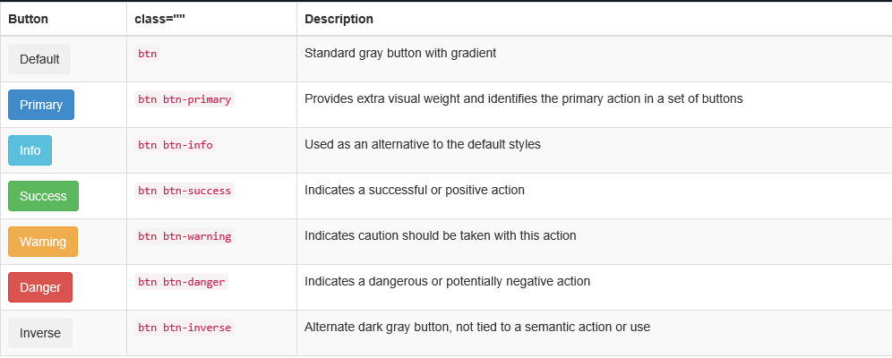
| button(案列二) | 在Bootstrap框架中的按钮都是采用来实现。这里先让大家看看Bootstrap的按钮长成什么样:有关于Bootstrap中按钮如何制作,在这里不做过多阐述 | |
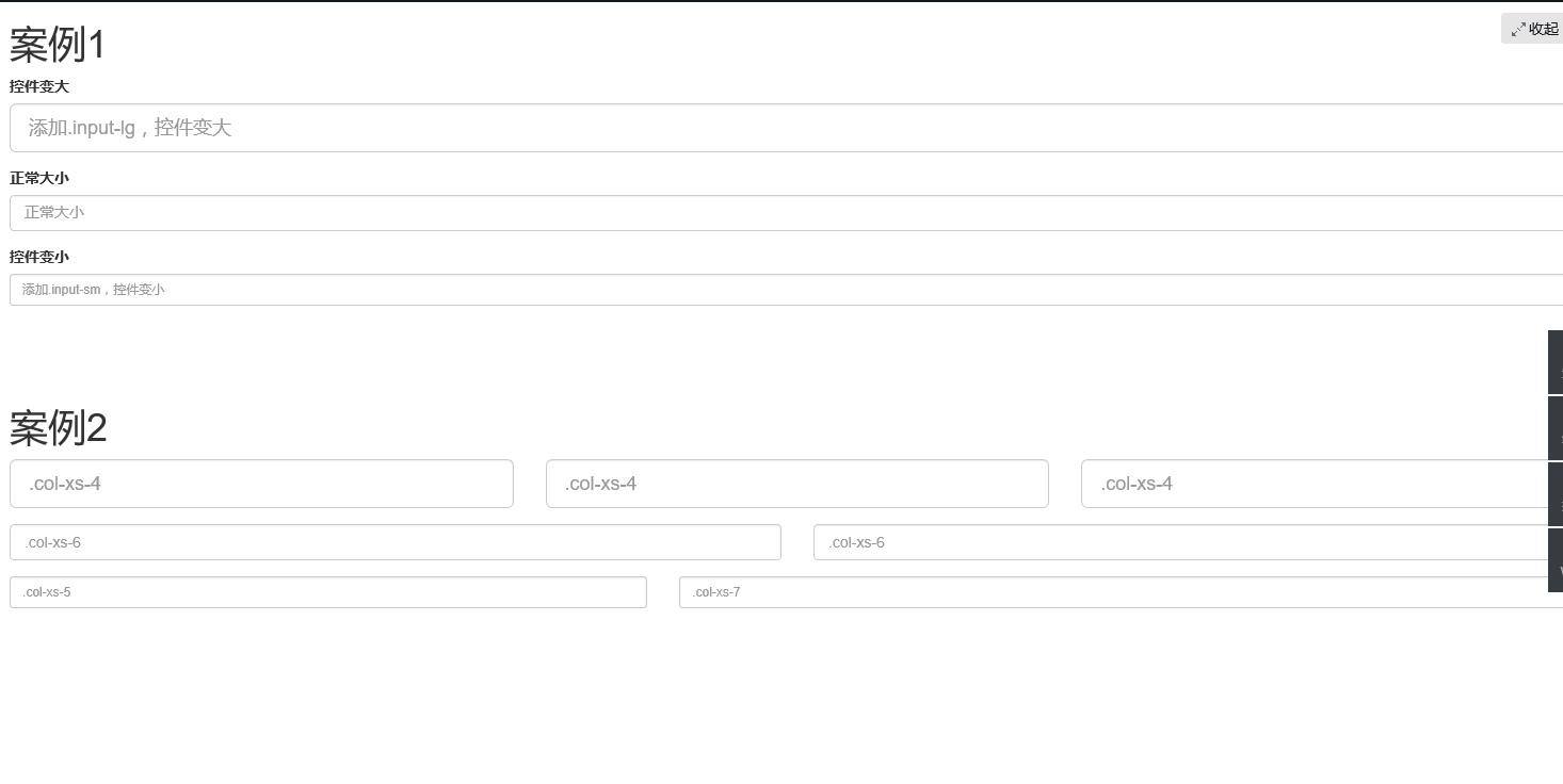
| 表单控件大小(案列三) | 1、input-sm:让控件比正常大小更小 2、input-lg:让控件比正常大小更大 | 源码请查阅bootstrap.css文件第1795~第1824行: |
/* 未完待续,正在更新中*/
复选框checkbox和单选择按钮radio案例一
<!doctype html>
<html lang="en">
<head>
    <meta charset="UTF-8">
    <title>表单控件——表单控件大小</title>
    <link rel="stylesheet" href="//netdna.bootstrapcdn.com/bootstrap/3.1.1/css/bootstrap.min.css">
</head>
<body>
<form role="form">
  <h3>案例1</h3>
  <div class="checkbox">
    <label>
      <input type="checkbox" value="">
      记住密码
    </label>
  </div>
  <div class="radio">
    <label>
      <input type="radio" name="optionsRadios" id="optionsRadios1" value="love" checked>
      喜欢
    </label>
  </div>
    <div class="radio">
    <label>
      <input type="radio" name="optionsRadios" id="optionsRadios2" value="hate">
      不喜欢
    </label>
  </div>


</form>
</body>
</html>
运行结果如下

案列二,按钮
<!doctype html>
<html lang="en">
<head>
    <meta charset="UTF-8">
    <title>表单控件状态——焦点状态</title>
    <link rel="stylesheet" href="//netdna.bootstrapcdn.com/bootstrap/3.1.1/css/bootstrap.min.css">
</head>
<body>
<table class="table table-bordered table-striped">
    <thead>
      <tr>
        <th>Button</th>
        <th>class=""</th>
        <th>Description</th>
      </tr>
    </thead>
    <tbody>
      <tr>
        <td><button class="btn" href="#">Default</button></td>
        <td><code>btn</code></td>
        <td>Standard gray button with gradient</td>
      </tr>
      <tr>
        <td><button class="btn btn-primary" href="#">Primary</button></td>
        <td><code>btn btn-primary</code></td>
        <td>Provides extra visual weight and identifies the primary action in a set of buttons</td>
      </tr>
      <tr>
        <td><button class="btn btn-info" href="#">Info</button></td>
        <td><code>btn btn-info</code></td>
        <td>Used as an alternative to the default styles</td>
      </tr>
      <tr>
        <td><button class="btn btn-success" href="#">Success</button></td>
        <td><code>btn btn-success</code></td>
        <td>Indicates a successful or positive action</td>
      </tr>
      <tr>
        <td><button class="btn btn-warning" href="#">Warning</button></td>
        <td><code>btn btn-warning</code></td>
        <td>Indicates caution should be taken with this action</td>
      </tr>
      <tr>
        <td><button class="btn btn-danger" href="#">Danger</button></td>
        <td><code>btn btn-danger</code></td>
        <td>Indicates a dangerous or potentially negative action</td>
      </tr>
      <tr>
        <td><button class="btn btn-inverse" href="#">Inverse</button></td>
        <td><code>btn btn-inverse</code></td>
        <td>Alternate dark gray button, not tied to a semantic action or use</td>
      </tr>
    </tbody>
  </table>
</body>
</html>
运行结果
案列三
前面介绍水平表单时说过,如果表单使用了类名“form-horizontal”,其中“form-group”就相当于网格系统中的“row”。换句话说,如果没有这样做,要通过网格系统来控制表单控件宽度,就需要这样使用:
<!doctype html>
<html lang="en">
<head>
    <meta charset="UTF-8">
    <title>表单控件大小</title>
    <link rel="stylesheet" href="//netdna.bootstrapcdn.com/bootstrap/3.1.1/css/bootstrap.min.css">
</head>
<body>
<h1>案例1</h1>
<form role="form">
  <div class="form-group">
    <label class="control-label">控件变大</label>
    <input class="form-control input-lg" type="text" placeholder="添加.input-lg,控件变大">
  </div>
  <div class="form-group">
    <label class="control-label">正常大小</label>
    <input class="form-control" type="text" placeholder="正常大小">
  </div>
  <div class="form-group">
    <label class="control-label">控件变小</label>
    <input class="form-control input-sm" type="text" placeholder="添加.input-sm,控件变小">
  </div>
</form>
  <br>
  <br>
  <br>
 <h1>案例2</h1>
<form role="form" class="form-horizontal">
  <div class="form-group">
    <div class="col-xs-4">
      <input class="form-control input-lg" type="text" placeholder=".col-xs-4">
    </div>
    <div class="col-xs-4">
      <input class="form-control input-lg" type="text" placeholder=".col-xs-4">
    </div>
    <div class="col-xs-4">
      <input class="form-control input-lg" type="text" placeholder=".col-xs-4">
    </div>
  </div>
  <div class="form-group">
    <div class="col-xs-6"><input class="form-control" type="text" placeholder=".col-xs-6"></div>
    <div class="col-xs-6"><input class="form-control" type="text" placeholder=".col-xs-6"></div>

  </div>
  <div class="form-group">
    <div class="col-xs-5">
      <input class="form-control input-sm" type="text" placeholder=".col-xs-5">
    </div>
    <div class="col-xs-7">
      <input class="form-control input-sm" type="text" placeholder=".col-xs-7">
    </div>
  </div>
</form>
</body>
</html>


 扫一扫
扫一扫
 2498
2498

 被折叠的 条评论
为什么被折叠?
被折叠的 条评论
为什么被折叠?
 到【灌水乐园】发言


