


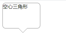
空心三角原理:主要利用元素伪类(:before,:after)实现
<style>
#talkbubble {
width: 120px;
height: 80px;
position: relative;
-moz-border-radius: 10px;
-webkit-border-radius: 10px;
border-radius: 10px;
border: 1px #808080 solid;
background-color: #fff;
}

#talkbubble:before {
content: " ";
position: absolute;
top: 100%;
left: 50px;
width: 0;
height: 0;
border-left: 15px solid transparent;
border-top: 15px solid #808080;
border-right: 15px solid transparent;
}

.inlayer:after {
content: " ";
position: absolute;
top: 100%;
left: 51px;
width: 0;
height: 0;
border-left: 14px solid transparent;
border-top: 14px solid #fff;
border-right: 14px solid transparent;
}

#talkbubble:hover {
background-color: #ff0000;
}

.inlayer:hover:after {
width: 0;
height: 0;
border-left: 14px solid transparent;
border-top: 14px solid #ff0000;
border-right: 14px solid transparent;
}
</style>

<!-- html -->
<div id="talkbubble" class="inlayer">
空心三角形
</div>
https://blog.csdn.net/u012329294/article/details/79687647
这个也可以参考下


 452
452


 被折叠的 条评论
为什么被折叠?
被折叠的 条评论
为什么被折叠?
 到【灌水乐园】发言


