


引入
as下
dependencies {
 //...
    compile 'com.android.support:design:25.3.1'
}
- 1
- 2
- 3
- 4

- 1
- 2
- 3
- 4
即可
android.support.design.widget.CoordinatorLayout
CoordinatorLayout is a super-powered {@link Android.widget.FrameLayout FrameLayout}
CoordinatorLayout作为“super-powered FrameLayout”基本实现两个功能:
- 作为顶层布局
- 调度协调子布局
CoordinatorLayout使用新的思路通过协调调度子布局的形式实现触摸影响布局的形式产生动画效果。CoordinatorLayout通过设置子View的 Behaviors来调度子View。系统(Support V7)提供了AppBarLayout.Behavior, AppBarLayout.ScrollingViewBehavior, FloatingActionButton.Behavior, SwipeDismissBehavior 等。
一、简单使用FloatingActionButton
<?xml version="1.0" encoding="utf-8"?>
<android.support.design.widget.CoordinatorLayout
    xmlns:android="http://schemas.android.com/apk/res/android"
    xmlns:app="http://schemas.android.com/apk/res-auto"
    android:layout_width="match_parent"
    android:layout_height="match_parent">


    <android.support.design.widget.FloatingActionButton
        android:id="@+id/fab"
        android:layout_width="wrap_content"
        android:layout_height="wrap_content"
        android:layout_gravity="end|bottom"
        android:layout_margin="16dp"
        android:src="@drawable/ic_done" />

</android.support.design.widget.CoordinatorLayout>
- 1
- 2
- 3
- 4
- 5
- 6
- 7
- 8
- 9
- 10
- 11
- 12
- 13
- 14
- 15
- 16
- 17
- 1
- 2
- 3
- 4
- 5
- 6
- 7
- 8
- 9
- 10
- 11
- 12
- 13
- 14
- 15
- 16
- 17
FloatingActionButton可以使用以下属性,跟着appbar移动
app:layout_anchor="@id/appbar"
app:layout_anchorGravity="bottom|right|end"
- 1
- 2
- 1
- 2
public class MainActivity extends AppCompatActivity {

    @Override
    protected void onCreate(Bundle savedInstanceState) {
        super.onCreate(savedInstanceState);
        setContentView(R.layout.activity_main);
        findViewById(R.id.fab).setOnClickListener(new View.OnClickListener() {
            @Override
            public void onClick(View view) {

                Snackbar.make(view,"FAB",Snackbar.LENGTH_LONG)
                        .setAction("cancel", new View.OnClickListener() {
                            @Override
                            public void onClick(View v) {
                                //这里的单击事件代表点击消除Action后的响应事件

                            }
                        })
                        .show();
            }
        });
    }
}
- 1
- 2
- 3
- 4
- 5
- 6
- 7
- 8
- 9
- 10
- 11
- 12
- 13
- 14
- 15
- 16
- 17
- 18
- 19
- 20
- 21
- 22
- 23
- 1
- 2
- 3
- 4
- 5
- 6
- 7
- 8
- 9
- 10
- 11
- 12
- 13
- 14
- 15
- 16
- 17
- 18
- 19
- 20
- 21
- 22
- 23
Snackbar类似toast
二、与toobar使用
<android.support.design.widget.CoordinatorLayout xmlns:android="http://schemas.android.com/apk/res/android"
xmlns:app="http://schemas.android.com/apk/res-auto"
android:id="@+id/main_content"
android:layout_width="match_parent"
android:layout_height="match_parent">
<android.support.design.widget.AppBarLayout
android:id="@+id/appbar"
android:layout_width="match_parent"
android:layout_height="wrap_content"
android:theme="@style/ThemeOverlay.AppCompat.Dark.ActionBar">
<android.support.v7.widget.Toolbar
android:id="@+id/toolbar"
android:layout_width="match_parent"
android:layout_height="?attr/actionBarSize"
android:background="?attr/colorPrimary"
app:popupTheme="@style/ThemeOverlay.AppCompat.Light"
app:layout_scrollFlags="scroll|enterAlways" />
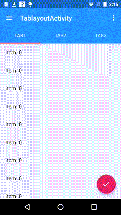
<android.support.design.widget.TabLayout
android:id="@+id/tabs"
android:layout_width="match_parent"
android:layout_height="wrap_content" />
</android.support.design.widget.AppBarLayout>
<android.support.v4.view.ViewPager
android:id="@+id/viewpager"
android:layout_width="match_parent"
android:layout_height="match_parent"
app:layout_behavior="@string/appbar_scrolling_view_behavior" />
<android.support.design.widget.FloatingActionButton
android:id="@+id/fab"
android:layout_width="wrap_content"
android:layout_height="wrap_content"
android:layout_gravity="end|bottom"
android:layout_margin="@dimen/fab_margin"
android:src="@drawable/ic_done" />
</android.support.design.widget.CoordinatorLayout>
- 1
- 2
- 3
- 4
- 5
- 6
- 7
- 8
- 9
- 10
- 11
- 12
- 13
- 14
- 15
- 16
- 17
- 18
- 19
- 20
- 21
- 22
- 23
- 24
- 25
- 26
- 27
- 28
- 29
- 30
- 31
- 32
- 33
- 34
- 35
- 36
- 37
- 38
- 39
- 40
- 41
- 42
- 1
- 2
- 3
- 4
- 5
- 6
- 7
- 8
- 9
- 10
- 11
- 12
- 13
- 14
- 15
- 16
- 17
- 18
- 19
- 20
- 21
- 22
- 23
- 24
- 25
- 26
- 27
- 28
- 29
- 30
- 31
- 32
- 33
- 34
- 35
- 36
- 37
- 38
- 39
- 40
- 41
- 42
效果显示,视图滚动时,Toolbar会隐藏,这个效果是android Support Library里面,新增的CoordinatorLayout, AppBarLayout实现的。
AppBarLayout is a vertical {@link LinearLayout}
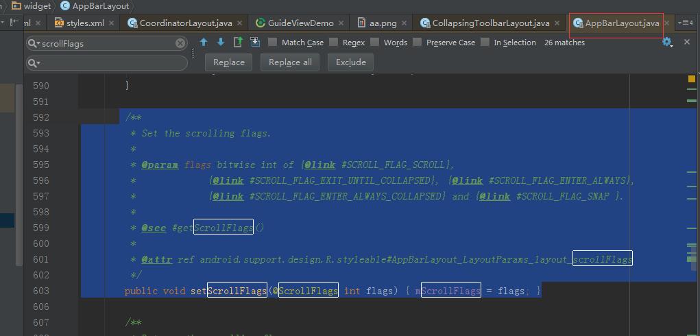
通过AppBarLayout的子视图的属性控制。观察AppBarLayout的子布局,Toobar有app:layout_scrollFlags属性,这就是控制滑动时视图效果的属性。app:layout_scrollFlags有四个值:
1. scroll: 所有想滚动出屏幕的view都需要设置这个flag,
没有设置这个flag的view将被固定在屏幕顶部。例如,TabLayout 没有设置这个值,将会停留在屏幕顶部。
2. enterAlways: 设置这个flag时,向下的滚动都会导致该view变为可见,启用快速“返回模式”。
3. enterAlwaysCollapsed:
当你的视图已经设置minHeight属性又使用此标志时,你的视图只能已最小高度进入,只有当滚动视图到达顶部时才扩大到完整高度。
4. exitUntilCollapsed: 滚动退出屏幕,最后折叠在顶端。
为了ToolBar可以滚动,CoordinatorLayout里面,放一个带有可滚动的View.如上的例子,放的是ViewPager,而ViewPager里面是放了RecylerView的,即是可以滚动的View。
CoordinatorLayout包含的子视图中带有滚动属性的View需要设置app:layout_behavior属性。例如,示例中Viewpager设置了此属性。
app:layout_behavior="@string/appbar_scrolling_view_behavior"
- 1
- 1
<string
name="appbar_scrolling_view_behavior"
translatable="false">
android.support.design.widget.AppBarLayout$ScrollingViewBehavior</string>
- 1
- 2
- 3
- 4
- 1
- 2
- 3
- 4
可以用NestedScrollView 不明白为什么scrollview不可以,
指向类的全名
为了使得Toolbar有滑动效果,必须做到如下三点:
1. CoordinatorLayout作为布局的父布局容器。
2. 给AppBarLayout需要滑动的组件设置
app:layout_scrollFlags=”scroll|enterAlways” 属性。
3. 给CoordinatorLayout 中滑动的组件设置 app:layout_behavior属性
使用toolbar需要将activity的样式 actionbar隐藏使用
<style name="AppTheme" parent="Theme.AppCompat.Light">
 <item name="windowActionBar">false</item>
 <item name="windowNoTitle">true</item>
 <style>
- 1
- 2
- 3
- 4
- 1
- 2
- 3
- 4
acitivty
Toolbar mToolbar = (Toolbar) findViewById(R.id.toolbar);
setSupportActionBar(mToolbar);
- 1
- 2
- 1
- 2
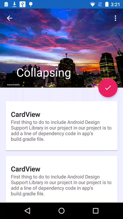
三、嵌套CollapsingToolbarLayout
CollapsingToolbarLayout extends FrameLayout
<?xml version="1.0" encoding="utf-8"?>
<android.support.design.widget.CoordinatorLayout xmlns:android="http://schemas.android.com/apk/res/android"
    xmlns:app="http://schemas.android.com/apk/res-auto"
    xmlns:tools="http://schemas.android.com/tools"
    android:layout_width="match_parent"
    android:layout_height="match_parent"
    tools:context="com.andyidea.guidedemo.CoordActivity">

    <android.support.design.widget.AppBarLayout
        android:layout_width="match_parent"
        android:layout_height="wrap_content"
        android:fitsSystemWindows="true"
        android:theme="@style/ThemeOverlay.AppCompat.Dark.ActionBar">

        <android.support.design.widget.CollapsingToolbarLayout
            android:layout_width="match_parent"
            android:layout_height="wrap_content"
            android:fitsSystemWindows="true"
            app:contentScrim="?attr/colorPrimary"
            app:expandedTitleMarginEnd="64dp"
            app:expandedTitleMarginStart="48dp"
            app:layout_collapseParallaxMultiplier="0.6"
            app:layout_scrollFlags="scroll|exitUntilCollapsed">

            <ImageView
                android:layout_width="match_parent"
                android:layout_height="match_parent"
                android:fitsSystemWindows="true"
                android:scaleType="centerCrop"
                android:src="@drawable/aa"
                app:layout_collapseMode="parallax" />

            <android.support.v7.widget.Toolbar
                android:id="@+id/toolbar"
                android:layout_width="match_parent"
                android:layout_height="?attr/actionBarSize"
                app:layout_collapseMode="pin"
                app:popupTheme="@style/ThemeOverlay.AppCompat.Dark"></android.support.v7.widget.Toolbar>
        </android.support.design.widget.CollapsingToolbarLayout>
    </android.support.design.widget.AppBarLayout>

    <android.support.v4.widget.NestedScrollView
        android:layout_width="match_parent"
        android:layout_height="match_parent"
        app:layout_behavior="@string/appbar_scrolling_view_behavior">

        <LinearLayout
            android:layout_width="match_parent"
            android:layout_height="wrap_content"
            android:orientation="vertical">

            <TextView
                android:layout_width="match_parent"
                android:layout_height="500dp"
                android:background="@color/Gold"
                android:text="dome" />

            <TextView
                android:layout_width="match_parent"
                android:layout_height="500dp"
                android:background="@color/Gold"
                android:text="dome" />
        </LinearLayout>
    </android.support.v4.widget.NestedScrollView>

</android.support.design.widget.CoordinatorLayout>
- 1
- 2
- 3
- 4
- 5
- 6
- 7
- 8
- 9
- 10
- 11
- 12
- 13
- 14
- 15
- 16
- 17
- 18
- 19
- 20
- 21
- 22
- 23
- 24
- 25
- 26
- 27
- 28
- 29
- 30
- 31
- 32
- 33
- 34
- 35
- 36
- 37
- 38
- 39
- 40
- 41
- 42
- 43
- 44
- 45
- 46
- 47
- 48
- 49
- 50
- 51
- 52
- 53
- 54
- 55
- 56
- 57
- 58
- 59
- 60
- 61
- 62
- 63
- 64
- 65
- 66
- 67
- app:layout_collapseParallaxMultiplier CollapsingToolbarLayout滑动时,子视图的视觉差,可以通过属性app:layout_collapseParallaxMultiplier=”0.6”改变。值de的范围[0.0,1.0],值越大视察越大
- app:contentScrim=”?attr/colorPrimary” ToolBar被折叠到顶部固定时候的背景,你可以调用setContentScrim(Drawable)方法改变背景或者 在属性中使用 app:contentScrim=”?attr/colorPrimary”来改变背景。
- app:layout_collapseMode=”parallax” 子视图的折叠模式,在子视图设置,有两种“pin”:固定模式,在折叠的时候最后固定在顶端;“parallax”:视差模式,在折叠的时候会有个视差折叠的效果。我们可以在布局中使用属性app:layout_collapseMode=”parallax”来改变。


 扫一扫
扫一扫
 7041
7041

 被折叠的 条评论
为什么被折叠?
被折叠的 条评论
为什么被折叠?
 到【灌水乐园】发言


