


在开发前端页面的时候,要经常考虑到一些设备屏幕的兼容性问题,需要根据屏幕的分辨率以及缩放比例来进行实时动态设定元素宽高,这里我总结了使用JavaScript方法获取电脑屏幕的分辨率和缩放比例大小,比如Window:
获取电脑屏幕缩放比例
    getDevicePixelRatio() {
      let ratio = 0
      let screen = window.screen
      let ua = navigator.userAgent.toLowerCase()
      if (window.devicePixelRatio !== undefined) {
        ratio = window.devicePixelRatio
      } else if (~ua.indexOf('msie')) {
        if (screen.deviceXDPI && screen.logicalXDPI) {
          ratio = screen.deviceXDPI / screen.logicalXDPI
        }
      } else if (window.outerWidth !== undefined && window.innerWidth !== undefined) {
        ratio = window.outerWidth / window.innerWidth
      }
      if (ratio) {
        ratio = Math.round(ratio * 100)
      }
      return ratio
    }
获取屏幕分辨率
   分辨率的高:window.screen.height*this.getDevicePixelRatio()/100   //乘以缩放比例为真实的像素
   分辨率的宽:window.screen.width*this.getDevicePixelRatio()/100    //乘以缩放比例为真实的像素
   屏幕可用工作区的高度:window.screen.availHeight;
   屏幕可用工作区的宽度:window.screen.availWidth;
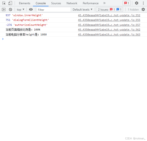
测试结果


 扫一扫
扫一扫


 7480
7480

 被折叠的 条评论
为什么被折叠?
被折叠的 条评论
为什么被折叠?
 到【灌水乐园】发言


