


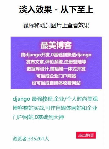
 本文介绍了一个简单的HTML和CSS实现的图片淡入效果案例。当鼠标悬停在图片上时,图片底部会出现一个从下至上逐渐显现的文字覆盖层。此效果通过CSS的过渡属性实现。
<!DOCTYPE html>
<html lang="en">

<head>
    <meta charset="UTF-8">
    <meta name="viewport" content="width=device-width, initial-scale=1.0">
    <title>从下至上</title>
    <style>
        body {
            text-align: center;
        }

        .container {
            position: relative;
            width: 17%;
            margin: auto;
        }

        .image {
            display: block;
            width: 100%;
            height: auto;
        }

        .overlay {
            position: absolute;
            bottom: 0;
            left: 0;
            right: 0;
            background-color: #008CBA;
            /* 隐藏文本 */
            overflow: hidden;
            width: 100%;
            height: 0;
            /* 设置一个淡入淡出的效果 */
            transition: .5s ease;
        }

        .container:hover .overlay {
            height: 100%;
        }

        .text {
            /* 设置文本不换行 */
            white-space: nowrap;
            color: white;
            font-size: 20px;
            position: absolute;
            overflow: hidden;
            /* 设置文字居中 */
            top: 50%;
            left: 50%;
            transform: translate(-50%, -50%);
            -ms-transform: translate(-50%, -50%);
        }
    </style>
</head>

<body>
    <h2>淡入效果 - 从下至上</h2>
    <p>鼠标移动到图片上查看效果</p>

    <div class="container">
        <img src="img/1.jpg" alt="Avatar" class="image">
        <div class="overlay">
            <div class="text">Hello World</div>
        </div>
    </div>
</body>

</html>
另外三个源码,在码蝗网首页,代码太多,我就不全放这了


 扫一扫
扫一扫


 441
441

 被折叠的 条评论
为什么被折叠?
被折叠的 条评论
为什么被折叠?
 到【灌水乐园】发言


