关键点
- 背景色绘制区域 background-clip:text
- 浏览器兼容
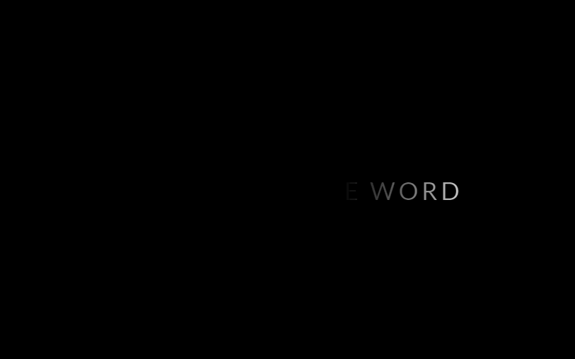
预览
完整代码
<!DOCTYPE html>
<html lang="en">
  <head>
    <meta charset="UTF-8" />
    <meta name="viewport" content="width=device-width, initial-scale=1.0" />
    <meta http-equiv="X-UA-Compatible" content="ie=edge" />
    <title>Document</title>
    <style>
      @import url(https://fonts.googleapis.com/css?family=Lato);
      body {
        display: flex;
        height: 100vh;
        justify-content: center;
        align-items: center;
        text-align: center;
        background: black;
      }

      .shining {
        font-size: 2em;
        font-family: Lato, sans-serif;
        letter-spacing: 4px;
        text-transform: uppercase;
        background: linear-gradient(90deg, black 0%, white 50%, black 100%);
        background-size: 80%;
        background-repeat: no-repeat;
        color: transparent;
        -webkit-background-clip: text;
        background-clip: text;
        -webkit-animation: shining 3s linear infinite;
        animation: shining 3s linear infinite;
      }

      @-webkit-keyframes shining {
        from {
          background-position: -500%;
        }
        to {
          background-position: 500%;
        }
      }

      @keyframes shining {
        from {
          background-position: -500%;
        }
        to {
          background-position: 500%;
        }
      }
    </style>
  </head>
  <body>
    <p class="shining">This is handsome word</p>
  </body>
</html>
升级版(彩虹渐变)
HSl
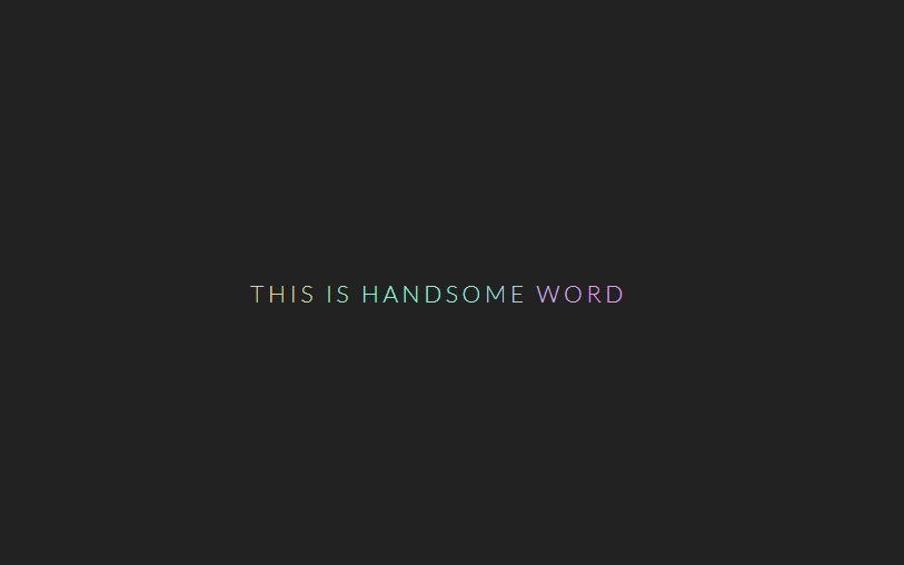
预览
完整代码
<!DOCTYPE html>
<html lang="en">
  <head>
    <meta charset="UTF-8" />
    <meta name="viewport" content="width=device-width, initial-scale=1.0" />
    <meta http-equiv="X-UA-Compatible" content="ie=edge" />
    <title>Document</title>
    <style>
      @import url("https://fonts.googleapis.com/css?family=Lato:300");
      body {
        display: flex;
        height: 100vh;
        justify-content: center;
        align-items: center;
        text-align: center;
        background: #222;
      }

      .rainbow {
        letter-spacing: 0.2rem;
        font-size: 1.2rem;
        font-family: Lato, serif;
        text-transform: uppercase;
      }
      .rainbow span {
        animation: rainbow 50s alternate infinite forwards;
      }

      @keyframes rainbow {
        0% {
          color: #ef8fba;
        }
        5% {
          color: #a4ef8f;
        }
        10% {
          color: #d98fef;
        }
        15% {
          color: #efa48f;
        }
        20% {
          color: #efe78f;
        }
        25% {
          color: #8fefbf;
        }
        30% {
          color: #8fefe2;
        }
        35% {
          color: #8f96ef;
        }
        40% {
          color: #d1ef8f;
        }
        45% {
          color: #8fa4ef;
        }
        50% {
          color: #efd78f;
        }
        55% {
          color: #8fefc4;
        }
        60% {
          color: #efc98f;
        }
        65% {
          color: #8fefd2;
        }
        70% {
          color: #ef8fea;
        }
        75% {
          color: #8fefb7;
        }
        80% {
          color: #ef8fba;
        }
        85% {
          color: #efe18f;
        }
        90% {
          color: #dcef8f;
        }
        95% {
          color: #ccef8f;
        }
        100% {
          color: #ed8fef;
        }
      }
    </style>
  </head>
  <body>
    <p class="rainbow">This is handsome word</p>
  </body>
  <script>
    let rainbowText = document.querySelector(".rainbow");
    let letters = rainbowText.textContent.split("");
    rainbowText.textContent = "";
    letters.forEach((letter, i) => {
      let span = document.createElement("span");
      span.textContent = letter;
      span.style.animationDelay = `${-20 + i * 0.2}s`;
      rainbowText.append(span);
    });
  </script>
</html>
升级版(打字机效果)
text-shadow
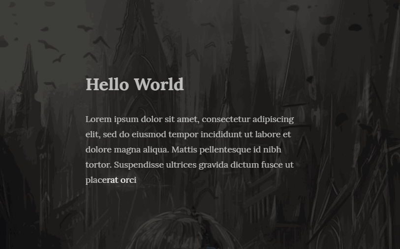
预览
完整代码
<!DOCTYPE html>
<html lang="en">
  <head>
    <meta charset="UTF-8" />
    <meta name="viewport" content="width=device-width, initial-scale=1.0" />
    <meta http-equiv="X-UA-Compatible" content="ie=edge" />
    <title>Document</title>
    <style>
      @import url("https://fonts.googleapis.com/css?family=Lora:400,400i,700");
      body {
        display: flex;
        flex-direction: column;
        height: 100vh;
        justify-content: center;
        align-items: center;
        background-image: linear-gradient(
            rgba(16, 16, 16, 0.8),
            rgba(16, 16, 16, 0.8)
          ),
          url(https://i.loli.net/2019/11/03/RtVq2wxQYySDb8L.jpg);
        background-size: cover;
      }

      p {
        margin: 0em 5em 4em 5em;
      }

      .glowIn {
        text-align: left;
        width: 400px;
        line-height: 1.8;
        color: white;
        font-family: Lora, serif;
      }
      .glowIn span {
        animation: glowIn 0.8s ease both;
      }

      @keyframes glowIn {
        from {
          opacity: 0;
        }
        65% {
          opacity: 1;
          text-shadow: 0 0 25px white;
        }
        75% {
          opacity: 1;
        }
        to {
          opacity: 0.7;
        }
      }
    </style>
  </head>
  <body>
    <h1 class="glowIn">Hello World</h1>
    <p class="glowIn">
      Lorem ipsum dolor sit amet, consectetur adipiscing elit, sed do eiusmod
      tempor incididunt ut labore et dolore magna aliqua. Mattis pellentesque id
      nibh tortor. Suspendisse ultrices gravida dictum fusce ut placerat orci
      nulla. A lacus vestibulum sed arcu.
    </p>
  </body>
  <script>
    let glowInTexts = document.querySelectorAll(".glowIn");
    glowInTexts.forEach(glowInText => {
      let letters = glowInText.textContent.split("");
      glowInText.textContent = "";
      letters.forEach((letter, i) => {
        let span = document.createElement("span");
        span.textContent = letter;
        span.style.animationDelay = `${i * 0.05}s`;
        glowInText.append(span);
      });
    });
  </script>
</html>


 111
111


 被折叠的 条评论
为什么被折叠?
被折叠的 条评论
为什么被折叠?
 到【灌水乐园】发言


