


 本文详细介绍了Ant Design中的List组件,包括其组件结构、属性配置如bordered、dataSource、loading等,以及如何自定义渲染列表项。此外,还讨论了List的栅格系统、分页功能和不同屏幕尺寸下的响应式布局。List组件提供了灵活的数据展示方案,并且支持加载更多和空数据状态的定制。
Ant-design 源码分析之数据展示(十一)List
2021SC@SDUSC
一、组件结构
1、ant代码结构
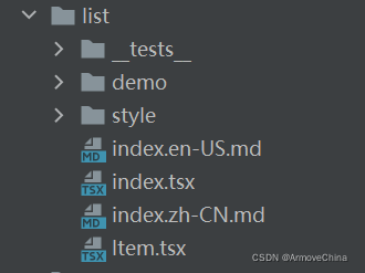
2、组件结构
ant中List的index.tsx中引入了Item。
二、antd组件调用关系
1、index.tsx
导入相应模块以及相应的ICON图标
import * as React from 'react';
import classNames from 'classnames';
import Spin, {

    SpinProps } from '../spin';
import useBreakpoint from '../grid/hooks/useBreakpoint';
import {

    Breakpoint, responsiveArray } from '../_util/responsiveObserve';
import {

    RenderEmptyHandler, ConfigContext } from '../config-provider';
import Pagination, {

    PaginationConfig } from '../pagination';
import {

    Row } from '../grid';
import Item from './Item';

export {

    ListItemProps, ListItemMetaProps } from './Item';
column:列数
gutter:栅格间隔
xs:<576px;sm:≥576px;md :≥768px;lg:≥992px;xl :≥1200px ;xxl :≥1600px。
export type ColumnCount = number;

export type ColumnType = 'gutter' | 'column' | 'xs' | 'sm' | 'md' | 'lg' | 'xl' | 'xxl';

export interface ListGridType {


  gutter?: number;
  column?: ColumnCount;
  xs?: ColumnCount;
  sm?: ColumnCount;
  md?: ColumnCount;
  lg?: ColumnCount;
  xl?: ColumnCount;
  xxl?: ColumnCount;
}
//列表大小
export type ListSize = 'small' | 'default' | 'large';
//横排列表竖排列表
export type ListItemLayout = 'horizontal' | 'vertical';
export interface ListProps<T> {


  bordered?: boolean;
  className?: string;
  style?: React.CSSProperties;
  children?: React.ReactNode;
  dataSource?: T[];
  extra?: React.ReactNode;
  grid?: ListGridType;
  id?: string;
  itemLayout?: ListItemLayout;
  loading?: boolean | SpinProps;
  loadMore?: React.ReactNode;
  pagination?: PaginationConfig | false;
  prefixCls?: string;
  rowKey?: ((item: T) => React.Key) | keyof T;
  renderItem?: (item: T, index: number) => React.ReactNode;
  size?: ListSize;
  split?: boolean;
  header?: React.ReactNode;
  footer?: React.ReactNode;
  locale?: ListLocale;
}
bordered:是否展示边框,类型为boolean
dataSource:列表数据源,类型为any[]
footer:列表底部,类型为ReactNode
grid:列表栅格配置,类型为object
header:列表头部,类型为ReactNode
itemLayout:设置 List.Item 布局, 设置成 vertical 则竖直样式显示, 默认横排,类型为string
loading:当卡片内容还在加载中时,可以用 loading 展示一个占位,类型为boolean | object (更多)
loadMore:加载更多,类型为ReactNode
locale:默认文案设置,目前包括空数据文案,类型为object
pagination:对应的 pagination 配置, 设置 false 不显示,类型为boolean | object
renderItem:当使用 dataSource 时,可以用 renderItem 自定义渲染列表项,类型为(item) => ReactNode
rowKey:当 renderItem 自定义渲染列表项有效时,自定义每一行的 key 的获取方式,类型为keyof T | (item: T) => React.Key
size:list 的尺寸,类型为default | large | small
split:是否展示分割线,类型为boolean
export interface ListLocale {


  emptyText: React.ReactNode | (() => React.ReactNode);
}
//栅格,布局
export interface ListConsumerProps {


  grid?: any;
  itemLayout?: string;
}

export const ListContext = React.createContext<ListConsumerProps>({

   });

export const ListConsumer = ListContext.Consumer;
function List<T>({


  pagination = false as ListProps<any>['pagination'],
  prefixCls: customizePrefixCls,
  bordered = false,
  split = true,
  className,
  children,
  itemLayout,
  loadMore,
  grid,
  dataSource = [],
  size,
  header,
  footer,
  loading = false,
  rowKey,
  renderItem,
  locale,
  ...rest
}: ListProps<T>) {


  const paginationObj = pagination && typeof pagination === 'object' ? pagination : {

   };
//分页
  const [paginationCurrent, setPaginationCurrent] = React.useState(
    paginationObj.defaultCurrent || 1,
  );
  const [paginationSize, setPaginationSize] = React.useState(paginationObj.defaultPageSize || 10);

  const {

    getPrefixCls, renderEmpty, direction } = React.useContext(ConfigContext);
 最低0.47元/天 解锁文章


 扫一扫
扫一扫


 628
628

 被折叠的 条评论
为什么被折叠?
被折叠的 条评论
为什么被折叠?
 到【灌水乐园】发言


