


<!DOCTYPE html>
<html>
<head>
<meta charset="utf-8">
<title></title>
<style>
/* 父元素 */
.father{
border: 1px solid green;
display: flex;/* 让父元素修改弹性布局 */
/* 默认子元素水平排列 */
/* 修改默认行为:子元素垂直排列 */
flex-direction: column;
}
/* 子元素 */
.son{
width: 100px;
height: 100px;
background: aqua;
border: 1px solid #0000FF;
}
</style>
</head>
<body>
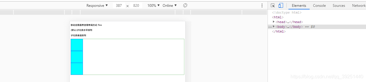
<h3>移动应用最常使用布局方式 flex</h3>
<h3>(默认)子元素水平排列</h3>
<h3>子元素垂直排列</h3>
<div class="father">
<div class="son"></div>
<div class="son"></div>
<div class="son"></div>
</div>
</body>
</html>
<!DOCTYPE html>
<html>
<head>
<meta charset="utf-8">
<title></title>
<style>
.father{
width: 300px;
height: 300px;
border: 1px solid firebrick;
display: flex;
/* 子元素水平居中 垂直居中 */
justify-content: center;/* 水平居中 */
align-items: center;/* 垂直居中 */
}
.son{
width: 100px;
height: 100px;
background: #008000;
}
</style>
</head>
<body>
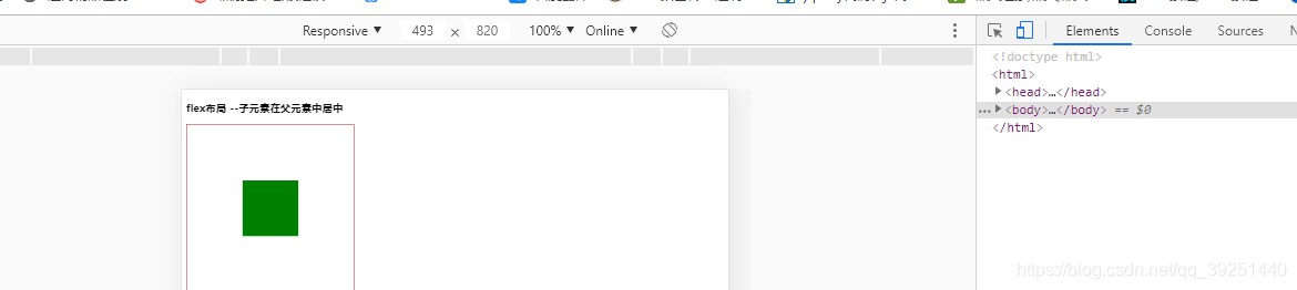
<h3>flex布局 --子元素在父元素中居中</h3>
<div class="father">
<div class="son"></div>
</div>
</body>
</html>
<!DOCTYPE html>
<html>
<head>
<meta charset="utf-8">
<title></title>
<style>
*{margin: 0;padding: 0;}
.wrap{
width: 750px;
height: 1000px;
margin: 0 auto;
border: 1px solid crimson;
}
.nav{
display: flex;
flex-wrap: wrap;/* 换行 */
}
.item{
width: 20%;/* 子元素宽度 */
height: 200px;
border: 1px solid blue;
box-sizing: border-box;/* 重新计算宽度 */
}
</style>
</head>
<body>
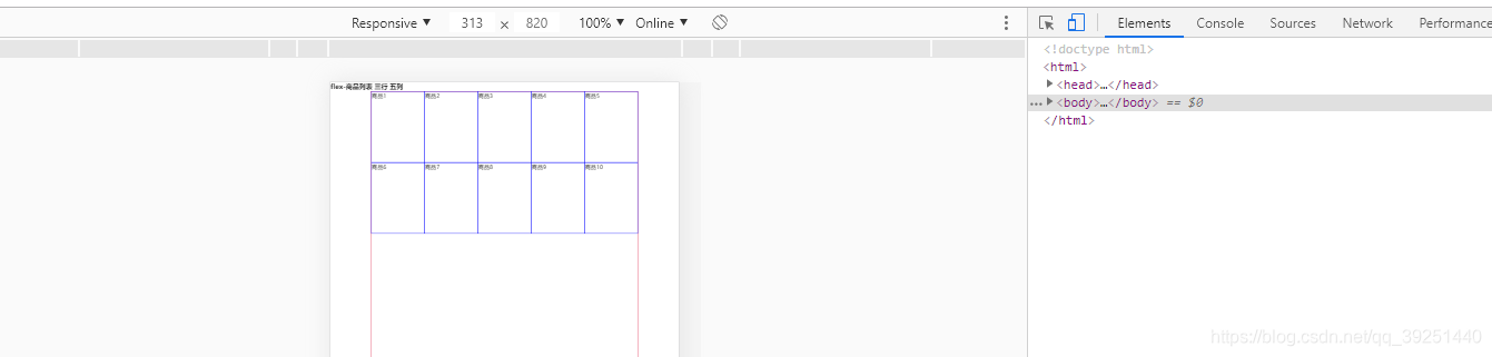
<h3>flex-商品列表 三行 五列</h3>
<div class="wrap">
<div class="nav">
<div class="item">商品1</div>
<div class="item">商品2</div>
<div class="item">商品3</div>
<div class="item">商品4</div>
<div class="item">商品5</div>
<div class="item">商品6</div>
<div class="item">商品7</div>
<div class="item">商品8</div>
<div class="item">商品9</div>
<div class="item">商品10</div>
</div>
</div>
</body>
</html>
<!DOCTYPE html>
<html lang="en">
<head>
    <meta charset="UTF-8">
    <meta name="viewport" content="width=device-width, initial-scale=1.0">
    <title>Document</title>
    <style>
        .container{
            border: 1px solid #000;
            width: 500px;
            height: 500px;
            margin-left: 20px;
            margin-top: 20px;
            /* display: inline-flex; */
            display: flex;/* 以块级元素存在,占用一行 */
            flex-direction: row;/* 元素顺序显示位置操作 */
            /* justify-content: center;垂直位置对齐方式 */
            /* align-items: center;水平位置对齐方式 */
            /* 换行操作 */
            flex-wrap: wrap;
            /* 垂直对齐方式 */
            align-content: flex-start;
        }

        .item{
            width: 100px;
            height: 100px;
            color: #fff;
            font-size: 50px;
            text-align: center;
            line-height: 100px;
        }

        .item:nth-of-type(1){
            background-color: #ff0000;
            align-self: stretch;
            /* order: 1; */
            flex-grow: 1;
        }
        .item:nth-of-type(2){
            background-color: #00ff00;
            align-self: stretch;
            /* order: 1; */
            flex-grow: 1;
        }
        .item:nth-of-type(3){
            background-color: #0400ff;
            align-self: stretch;
            /* order: 0;item顺序数值越小排在前面 */
            flex-grow: 1;
        }
        .item:nth-of-type(4){
            background-color: #00b7ff;
        }
        .item:nth-of-type(5){
            background-color: #fbff00;
        }
        .item:nth-of-type(6){
            background-color: #ff00f2;
        }
        .item:nth-of-type(7){
            background-color: #9900ff;
        }
    </style>
</head>
<body>
    <!-- div>div.item*3 -->
    <div class="container">
        <div class="item">1</div>
        <div class="item">2</div>
        <div class="item">3</div>
        <div class="item">4</div>
        <div class="item">5</div>
        <div class="item">6</div>
        <div class="item">7</div>
    </div>
</body>
</html> 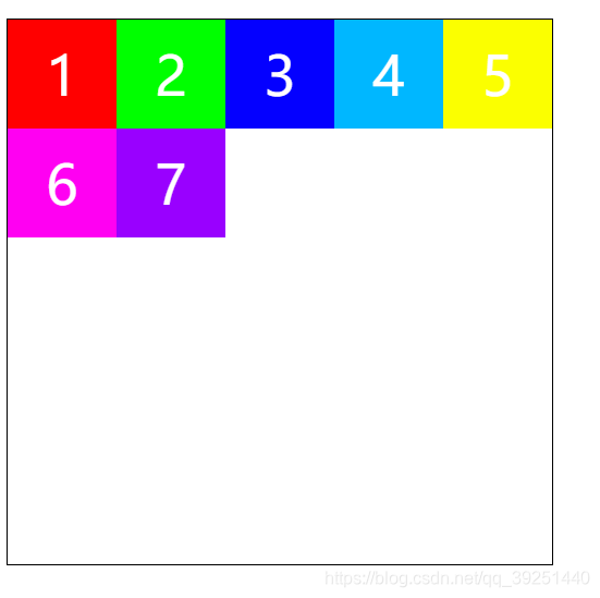


 803
803


 被折叠的 条评论
为什么被折叠?
被折叠的 条评论
为什么被折叠?
 到【灌水乐园】发言


