


前言:元素一般分为 块级元素 和 行内元素
块级元素可以设置高度,宽度,行内元素则不能,如果非要给行内元素设置宽高,只需要将 display 属性设置为 inline-block 即可
一.水平对齐:
1.行内元素
· 给当前元素的父级元素设置 text-align:center
代码:
        .box{
            text-align: center;
            /* 此处父元素没有宽度和高度
               宽度默认为浏览器的可视宽度
               高度默认为0, 此处是 p标签内容 撑出来的高度 */
        }
        .text{}
<div class="box">
        <p class="text">我是一段文字</p>
</div>
展示:

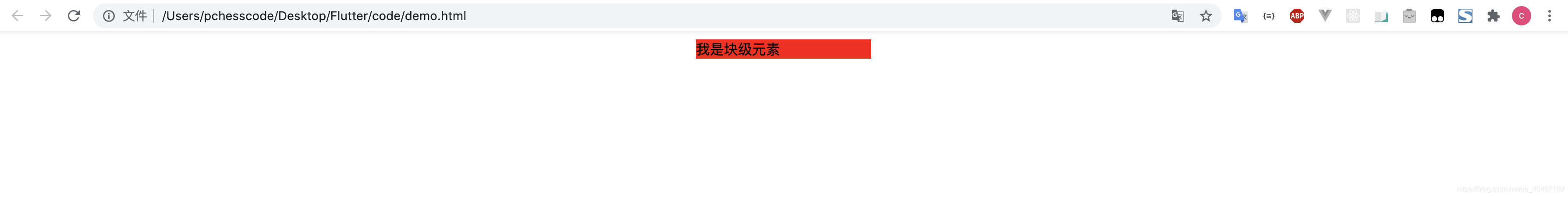
2.块级元素
· 该块级元素有固定的宽度 ,给该元素设置 margin : 0 auto
代码
.box{
            width: 200px;
            margin: 0 auto;
            /* 此处的 0 可以为任意的尺寸 */
            background-color: red;
            /* 为了方便大家看该元素的位置,此处加了背景颜色 */
        }
<body>
    <div class="box">
        我是块级元素
    </div>
</body>
展示:
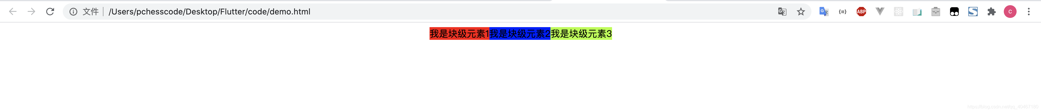
拓展:如果需要多个 块级元素 居中对齐呢?
-
方法一:
代码:
        .box{
            margin: 0 auto;
            width: 325px;
        }
        .box_one{
            background-color: red;
        }
        .box_two{
            background-color: blue;
        }
        .box_three{
            background-color: greenyellow;
        }
        .box_one,
        .box_two,
        .box_three{
            display: inline-block;
        }
<body>
    <!-- 此处我们的多元素 被父元素包裹, 给父元素居中属性,子元素是不是也就居中了呢 -->
    <div class="box">
        <div class="box_one">
            我是块级元素1
        </div>
        <div class="box_two">
            我是块级元素2
        </div>
        <div class="box_three">
            我是块级元素3
        </div>
    </div>
</body>
展示:

-
方法二(flex 布局):
还不了解flex布局的朋友可以看看这篇 :flex布局看这一篇就够了
代码:
        .box{
          display: flex;
          flex-direction: row;
          justify-content: center;
        }
        .box_one{
            background-color: red;
        }
        .box_two{
            background-color: blue;
        }
        .box_three{
            background-color: greenyellow;
        }
        .box_one,
        .box_two,
        .box_three{
        }

<body>
    <div class="box">
        <div class="box_one">
            我是块级元素1
        </div>
        <div class="box_two">
            我是块级元素2
        </div>
        <div class="box_three">
            我是块级元素3
        </div>
    </div>
</body>
展示:
二.垂直居中:
为了方便演示,此处的垂直居中,均在 div 盒模型中演示
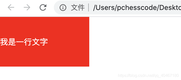
1-1.行内元素(单行)
·line-height 属性 设置的高度和父元素的高度相同即可
代码:
        *{
            padding: 0;
            margin: 0;
        }
        .box{
            background-color: red;
            width: 10vw;
            height: 100px;
        }
        p{
            color: white;
            line-height: 100px;
        }
<body>
    <div class="box">
        <p>我是一行文字</p>
    </div>
</body>
展示:
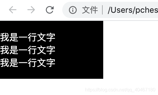
1-2.行内元素(多行)
此处推荐使用flex布局
代码:
        *{
            padding: 0;
            margin: 0;
        }
        .box{
            background-color: black;
            width: 10vw;
            height: 100px;
            display: flex;
            flex-direction:column;
            justify-content: center;
        }
        p{
            color: white;
        }

<body>
    <div class="box">
        <p>我是一行文字</p>
        <p>我是一行文字</p>
        <p>我是一行文字</p>
    </div>
</body>
展示:
2-1.块级元素(单个)
要不要尝试一下使用定位属性实现呢
代码:
.box{
            background-color: black;
            width: 300px;
            height: 300px;
            position: relative;
        }
.box_son{
            width: 50px;
            height: 50px;
            background-color: white;
            position: absolute;
            top: 50%;
            transform: translateY(-50%);
        }
<body>
    <div class="box">
        <div class="box_son">
        </div>
    </div>
</body>
展示:

2-2.块级元素(多个)
如果有多个块级元素呢?那我还是推荐 flex布局哈,大家都可以试试,我这个就不浪费大家时间了,下面来总结一下,在现实生活中,其实水平居中和垂直居中是相辅相成的,下面给大家使用flex布局给大家展示一下
3.综合展示
3-1.块级
 .box{
            background-color: black;
            width: 300px;
            height: 300px;
            display: flex;
            align-items: center;
            justify-content: center;
        }
        .box_son{
            width: 50px;
            height: 50px;
            background-color: white;
}
<body>
    <div class="box">
        <div class="box_son"></div>
    </div>
</body>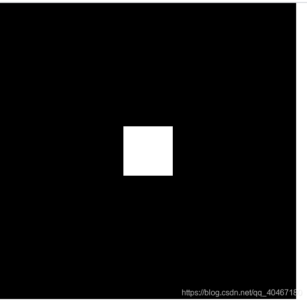
3-2.行内元素
.box{
            background-color: black;
            width: 300px;
            height: 300px;
            display: flex;
            align-items: center;
            justify-content: center;
        }
        p{
            color: white;
}
<body>
    <div class="box">
       <p>我是文字</p>
    </div>
</body>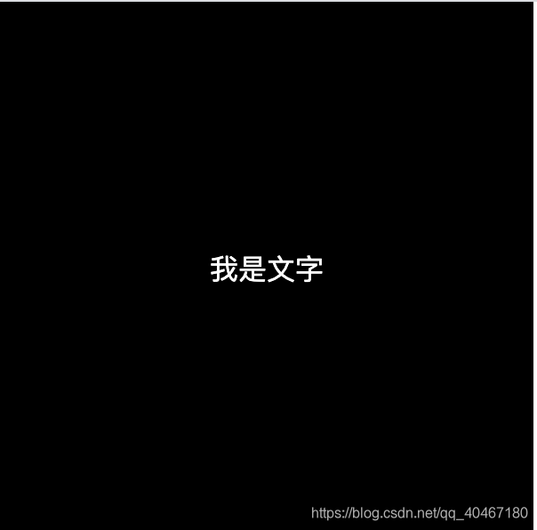
3-3.行内元素(多个)
 .box{
            background-color: black;
            width: 300px;
            height: 300px;
            display: flex;
            flex-direction: column;
            align-items: center;
            justify-content: center;
        }
        p{
            color: white;
        }
<body>
    <div class="box">
       <p>收藏!</p>
       <p>点赞!</p>
       <p>关注啊!</p>
    </div>
</body>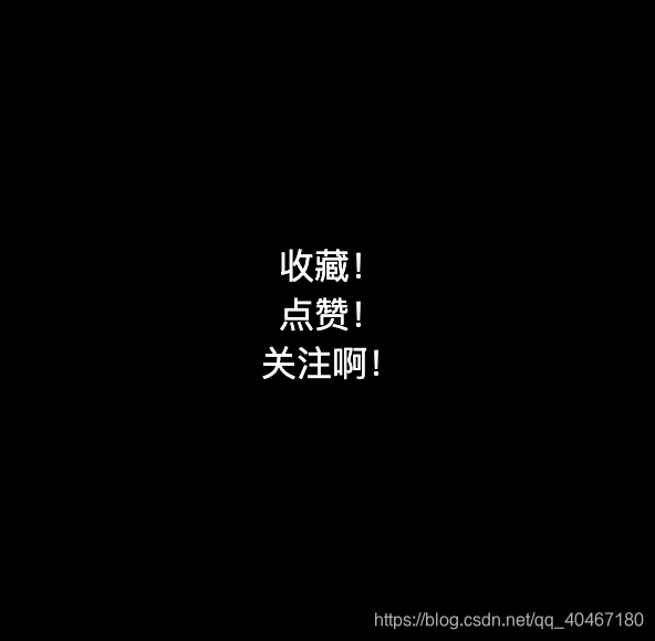
欢迎关注我的公众号:码上学习鸭


 1331
1331


 被折叠的 条评论
为什么被折叠?
被折叠的 条评论
为什么被折叠?
 到【灌水乐园】发言


