


项目场景:
渐变圆角边框
问题描述:
无法给一个圆角的div加上渐变的边框
border-image 存在缺陷不支持圆角
使用完 border-image 之后,border-radius 设置是无效的,达不到圆角的效果
解决方案:
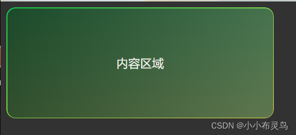
background-image/background-clip
 <div class="outBor">
        <div class="content">
            <span>内容区域</span>
        </div>
    </div>
html,body{
        background-color: rgb(51, 50, 50);
    }
    .outBor{
        width: 360px;
        height: 150px;
        padding: 1px;
        display: flex;
        justify-content: center;
        align-items: center;
        border: none;
       background-color: transparent;
       box-sizing:border-box;
         /* 这里需要设置两个背景,第一个背景是内容区域的背景,另一个是实现渐变边框的背景 */
       background-image: linear-gradient(100deg,rgba(29,39,34,0.8)0.94%,rgba(54,87,79,0.8) 94.7%),linear-gradient(to bottom right,  #0fd850, #f9f047);
       border-radius: 12px;
        /* 背景裁切的时候,第一个背景需要从内容区域开始裁切,因此设置为content-box;
        第二个背景需要作为渐变边框,因此需要从边框处开始裁切 */
       background-clip: content-box,padding-box;
    }
    .content{
        width: 359px;
        height: 148px;
        padding:15px;
        color: #f1f1ee;
        display: flex;
        justify-content: center;
        align-items: center;
    }


 530
530


 被折叠的 条评论
为什么被折叠?
被折叠的 条评论
为什么被折叠?
 到【灌水乐园】发言


