<!DOCTYPE html>
<html lang="zh">
<head>
<meta charset="UTF-8">
<meta http-equiv="X-UA-Compatible" content="IE=edge">
<meta name="viewport" content="width=device-width, initial-scale=1.0">
<title>Document</title>
<link rel="stylesheet" href="./样式/重置样式表/reset.css">
<style>
.box1{
width:200px;
height:200px;
background-color: #bfa;
padding:50px;
}
.box2{
height:200px;
background-color: pink;
}
</style>
</head>
<body>
<div class="box1">
<div class="box2">123</div>
</div>
</body>
</html>
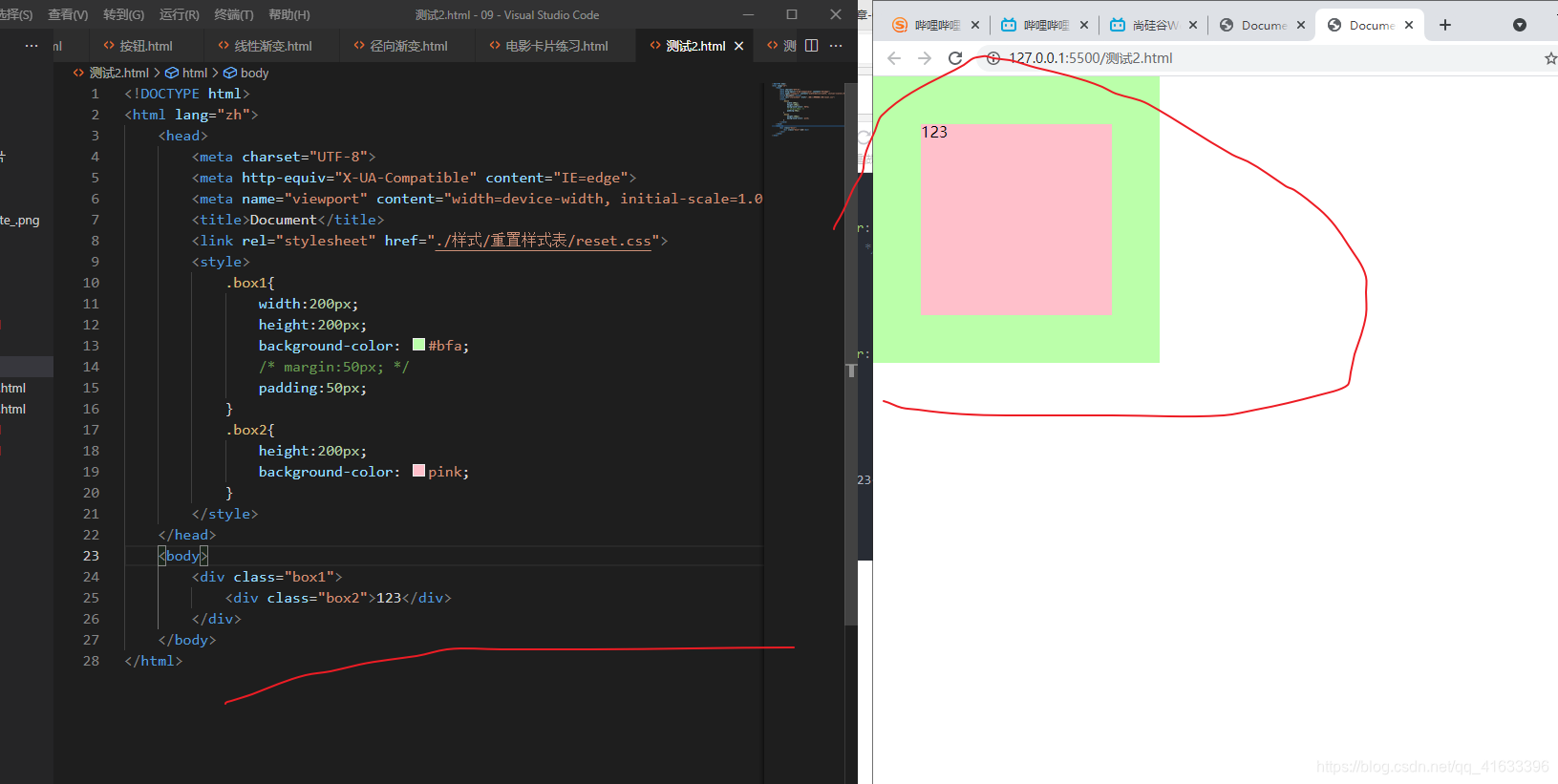
注意上面之所以会有差别是因为,设置padding时,其颜色(是指background的颜色,而不是指color的颜色)会和该元素的content(内容区)的颜色保持一致
因此下面这个练习中,以下两处不管是设置padding还是margin,看到的效果是一样的
<!DOCTYPE html>
<html lang="zh">
<head>
<meta charset="UTF-8">
<meta http-equiv="X-UA-Compatible" content="IE=edge">
<meta name="viewport" content="width=device-width, initial-scale=1.0">
<title>Document</title>
<link rel="stylesheet" href="./样式/重置样式表/reset.css">
<link rel="stylesheet" href="./样式/图标字体/css/all.css">
<style>
.outer-wrapper{
width:240px;
margin:10px auto;
box-shadow: 0px 0px 10px rgba(0, 0, 0, 0.3);
}
.img-wrapper img{
width:100%;
height:auto;
vertical-align:bottom;
}
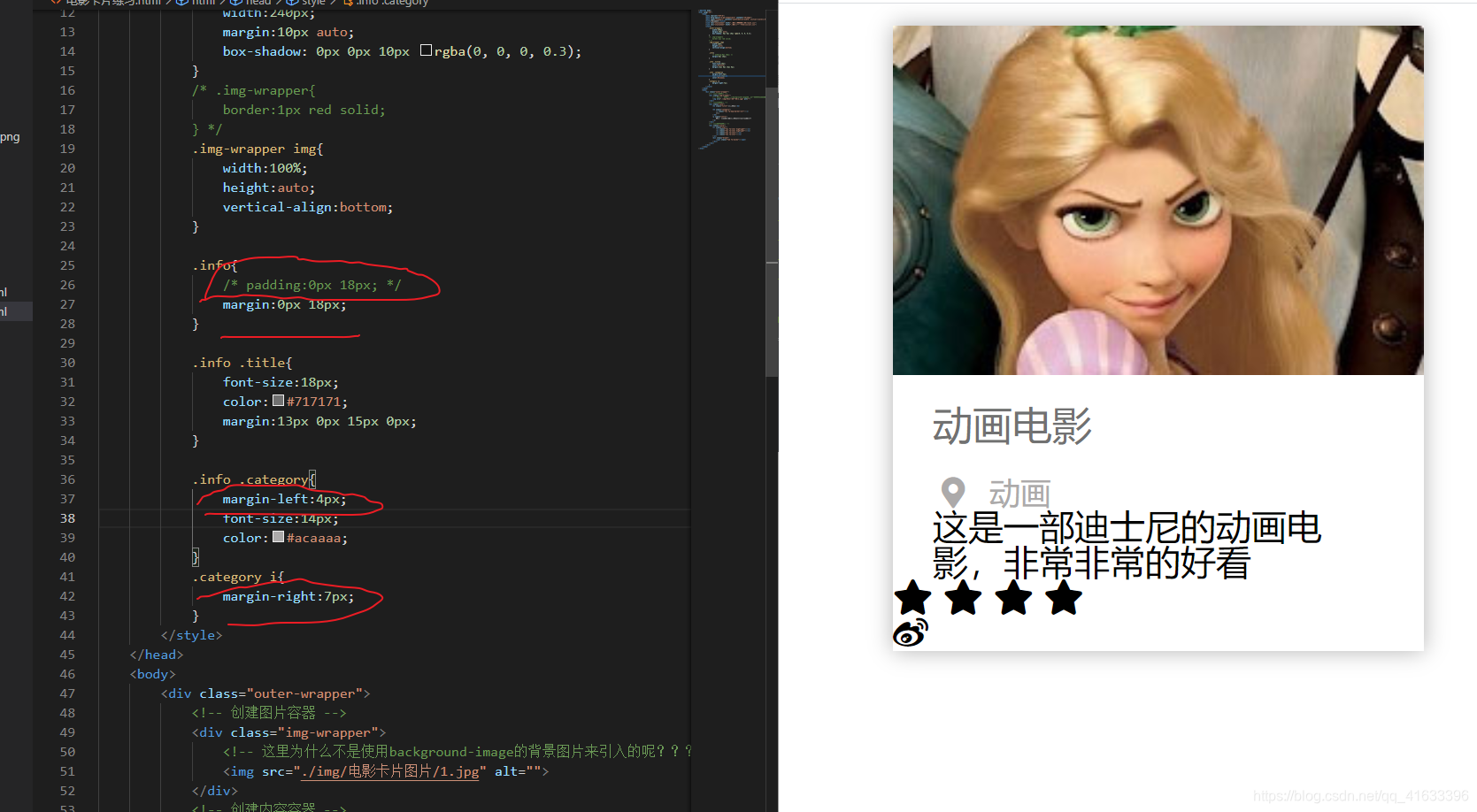
.info{
margin:0px 18px;
}
.info .title{
font-size:18px;
color:#717171;
margin:13px 0px 15px 0px;
}
.info .category{
margin-left:4px;
font-size:14px;
color:#acaaaa;
}
.category i{
margin-right:7px;
}
</style>
</head>
<body>
<div class="outer-wrapper">
<div class="img-wrapper">
<img src="./img/电影卡片图片/1.jpg" alt="">
</div>
<div class="info">
<h2 class="title">动画电影</h2>
<h3 class="category">
<i class="fas fa-map-marker-alt"></i>
动画
</h3>
<p class="intro">
这是一部迪士尼的动画电影,非常非常的好看
</p>
</div>
<div class="score">
<ul class="star">
<li class="fas fa-star highlight"></li>
<li class="fas fa-star highlight"></li>
<li class="fas fa-star"></li>
<li class="fas fa-star"></li>
</ul>
<div class="brand">
<span class="fab fa-weibo"></span>
</div>
</div>
</div>
</body>
</html>
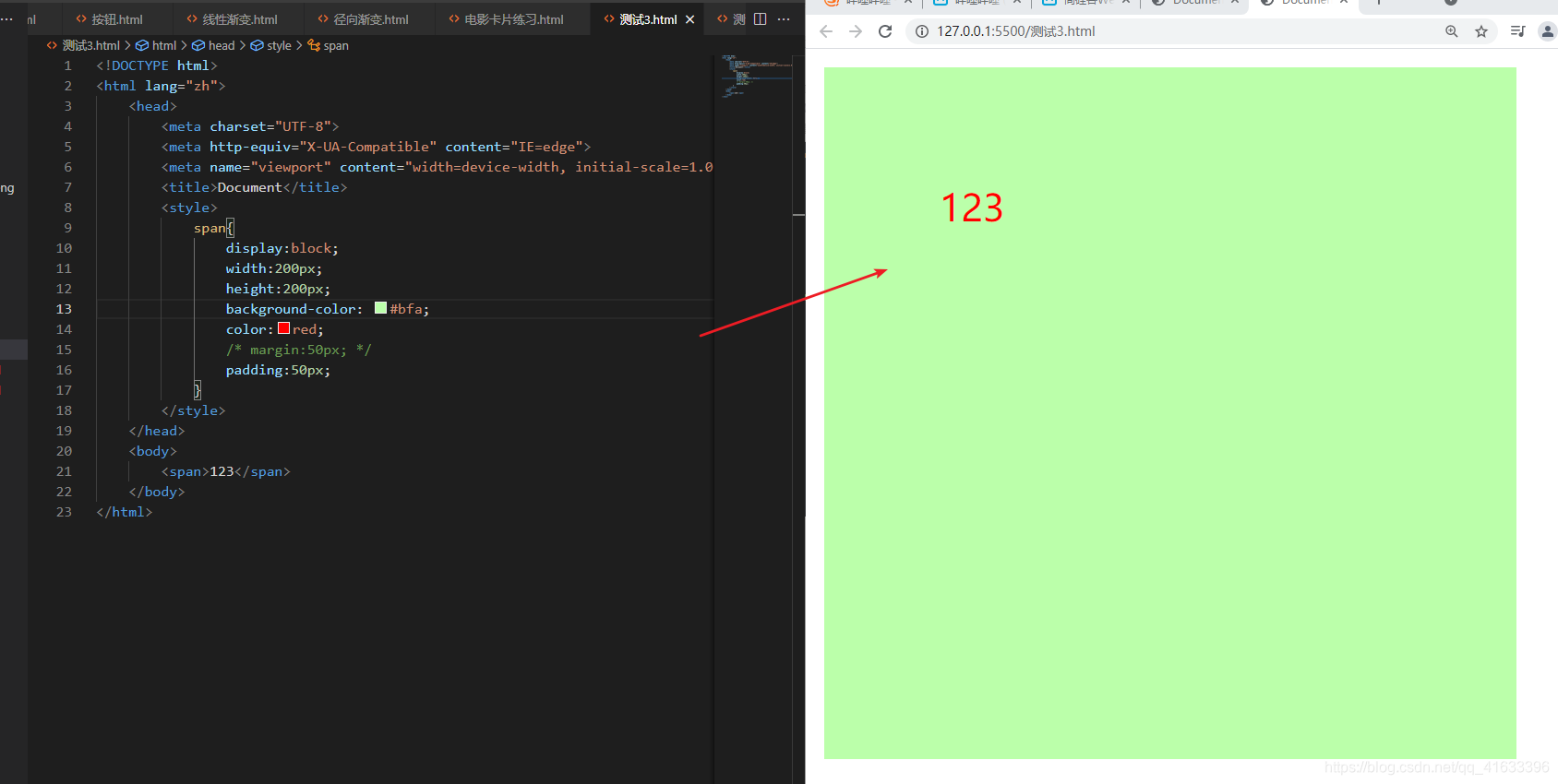
虽然它们的字体颜色不一样,但是color不会从content,蔓延到padding,以下可以进行测试
<!DOCTYPE html>
<html lang="zh">
<head>
<meta charset="UTF-8">
<meta http-equiv="X-UA-Compatible" content="IE=edge">
<meta name="viewport" content="width=device-width, initial-scale=1.0">
<title>Document</title>
<style>
span{
display:block;
width:200px;
height:200px;
background-color: #bfa;
color:red;
padding:50px;
}
</style>
</head>
<body>
<span>123</span>
</body>
</html>
现在可以更加的明确,为什么视频课中的京东顶部导航条中那个竖线(没有采用图片,也没有采用图标字体),采用块元素设置宽和高以及设置background-color颜色的方式来实现时,那个设置边距时,就不能设置padding,否则会出问题
<!DOCTYPE html>
<html lang="zh">
<head>
<meta charset="UTF-8">
<meta http-equiv="X-UA-Compatible" content="IE=edge">
<meta name="viewport" content="width=device-width, initial-scale=1.0">
<title>Document</title>
<link rel="stylesheet" href="./reset.css">
<link rel="stylesheet" href="./css/all.css">
<style>
.clearfix::before,
.clearfix::after {
content: '';
display: table;
clear: both;
}
body {
font: 12px/1.5 Microsoft YaHei, Heiti SC, tahoma, arial, Hiragino Sans GB, "\5B8B\4F53", sans-serif;
}
.top-bar-wrapper {
width: 100%;
background-color: #E3E4E5;
border-bottom: 1px #DDDDDD solid;
line-height: 30px;
height: 30px;
position: relative;
}
.top-bar {
width: 1190px;
margin: 0px auto;
}
.top-bar a,
.top-bar span,
.top-bar i {
color: #999;
text-decoration: none;
}
.top-bar a:hover,
.top-bar .highlight {
color: #f10215;
}
.location {
float: left;
}
.location .current-city {
padding: 0px 10px;
position:relative;
z-index:9999;
border: 1px solid transparent;
background-clip: padding-box;
}
.location:hover .current-city {
background-color:white;
border: 1px solid transparent;
border-bottom: none;
}
.location:hover .city-list {
display: block;
}
.location .fas {
color: #f10215;
}
.location .city-list {
display: none;
width: 321px;
height: 463px;
background-color: white;
border: 1px solid rgb(204, 204, 204);
position: absolute;
box-shadow: 0px 2px 2px rgba(0, 0, 0, 0.3);
top: 30px;
z-index:999;
}
.short-cut {
float: right;
}
.short-cut .line {
width: 1px;
height: 10px;
background-color: #999;
margin: 12px 5px 0px;
}
.short-cut li {
margin: 0px 12px;
}
ul li {
float: left;
}
</style>
</head>
<body>
<div class="top-bar-wrapper">
<div class="top-bar clearfix">
<div class="location">
<div class="current-city">
<i class="fas fa-map-marker-alt"></i>
<a href="javascript:;">湖北</a>
</div>
<div class="city-list"></div>
</div>
<ul class="short-cut">
<li>
<a href="javascript:;">你好,请登录</a>
<a class="highlight " href="javascript:;">免费注册</a>
</li>
<li class="line"></li>
<li>
<a href="javascript:;">我的订单</a>
</li>
<li class="line"></li>
<li>
<a href="javascript:;">我的京东</a>
<i class="fas fa-angle-down"></i>
</li>
<li class="line"></li>
<li>
<a href="javascript:;">京东会员</a>
</li>
<li class="line"></li>
<li>
<a class="highlight" href="javascript:;">企业采购</a>
<i class="fas fa-angle-down"></i>
</li>
<li class="line"></li>
<li>
<span>客户服务</span>
<i class=" fas fa-angle-down"></i>
</li>
<li class="line"></li>
<li>
<span>网站导航</span>
<i class="fas fa-angle-down"></i>
</li>
<li class="line"></li>
<li>
<span>手机京东</span>
</li>
</ul>
</div>
</div>
</body>
</html>
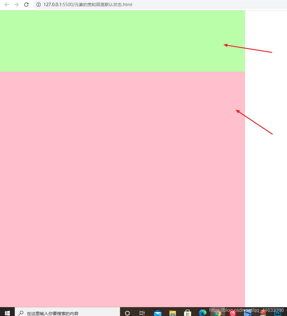
下面解释下,为什么有的时候给元素设置外边距或者是内边距的时候,会碰到,该元素的内容区的宽度不发生变化,但是,有的时候该元素的内容区会发生变化,而且还会缩小。
当被设置外边距的元素的宽度被固定时,此时给该元素设置外边距,此时与宽度对应的外边距的变化是
<!DOCTYPE html>
<html lang="zh">
<head>
<meta charset="UTF-8">
<meta http-equiv="X-UA-Compatible" content="IE=edge">
<meta name="viewport" content="width=device-width, initial-scale=1.0">
<title>Document</title>
<link rel="stylesheet" href="./样式/重置样式表/reset.css">
<style>
.box1{
width:800px;
height:1000px;
background-color: pink;
}
.box2{
width:200px;
height: 200px;
background-color: #bfa;
margin:50px 100px;
}
</style>
</head>
<body>
<div class="box1">
<div class="box2"></div>
</div>
</body>
</html>
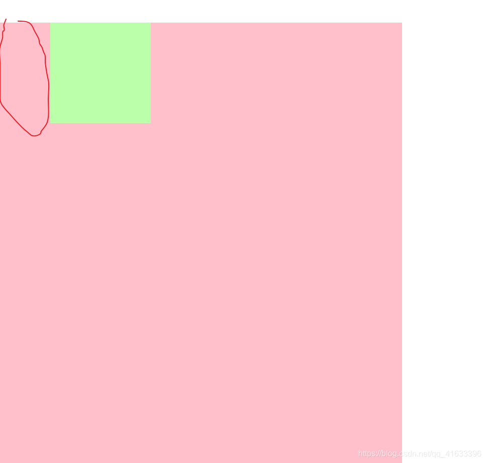
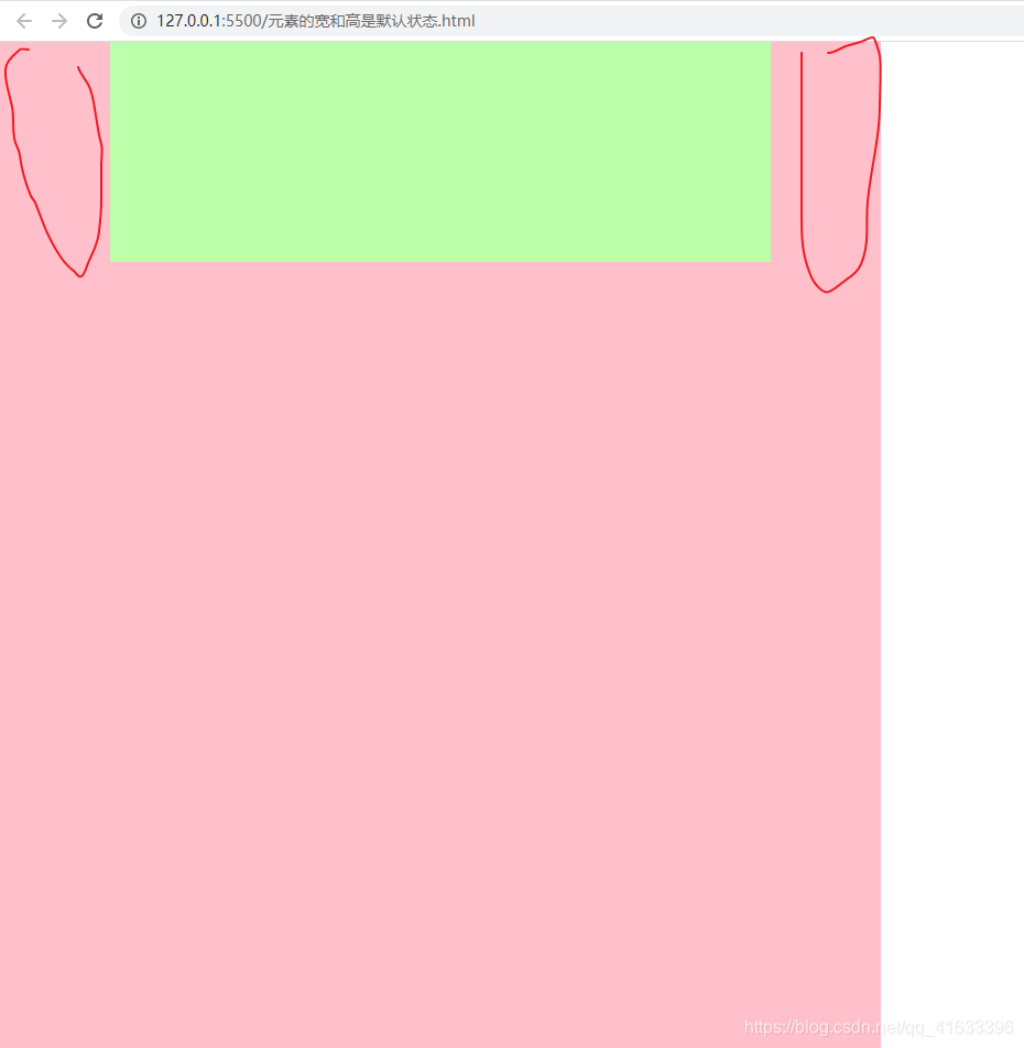
此时元素并没有使用float,因此box2的七个值和box1的宽度是满足等式关系的,因此,给box2设置外边距时,我们可以看到上面的图形,很明显的一点是,box2的内容区的大小是没有变化的
和上面在同样满足box2的宽度已知的情况下,给box2设置内边距,我们可以看到
<!DOCTYPE html>
<html lang="zh">
<head>
<meta charset="UTF-8">
<meta http-equiv="X-UA-Compatible" content="IE=edge">
<meta name="viewport" content="width=device-width, initial-scale=1.0">
<title>Document</title>
<link rel="stylesheet" href="./样式/重置样式表/reset.css">
<style>
.box1{
width:800px;
height:1000px;
background-color: pink;
}
.box2{
width:200px;
height: 200px;
background-color: #bfa;
padding:50px 100px;
}
</style>
</head>
<body>
<div class="box1">
<div class="box2"></div>
</div>
</body>
</html>
总结:当元素的满足那个7个值的等式关系时,当元素的宽被固定时,上下的外边距和内边距会影响那个等式关系,但是,由于该元素的宽已经被固定,因此,可以从上面看到,该元素的内容区的大小是不会变化的
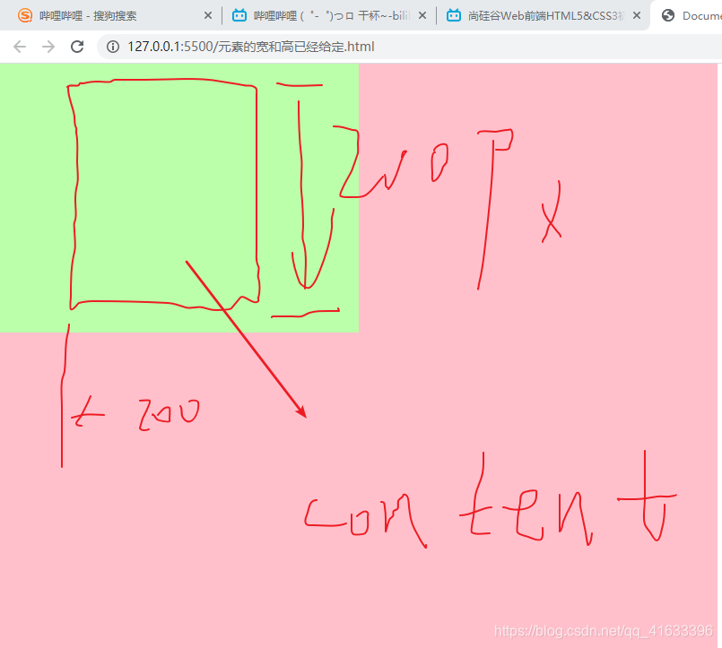
当被设置外边距的元素的宽度不固定时,此时给该元素设置外边距,此时与宽度对应的外边距的变化是
给该元素设置外边距或者是内边距之前
<!DOCTYPE html>
<html lang="zh">
<head>
<meta charset="UTF-8">
<meta http-equiv="X-UA-Compatible" content="IE=edge">
<meta name="viewport" content="width=device-width, initial-scale=1.0">
<title>Document</title>
<link rel="stylesheet" href="./样式/重置样式表/reset.css">
<style>
.box1{
width:800px;
height:1000px;
background-color: pink;
}
.box2{
height:200px;
background-color: #bfa;
}
</style>
</head>
<body>
<div class="box1">
<div class="box2"></div>
</div>
</body>
</html>
当给宽度不固定的元素设置外边距时,这是一般的情况,当宽度不固定时,还有种情况也是往外扩的,比如小米商城设置竖线的宽度的那个,原因,初步理解是因为浮动的原因,加上其宽度没有被定死
<!DOCTYPE html>
<html lang="zh">
    <head>
        <meta charset="UTF-8">
        <meta http-equiv="X-UA-Compatible" content="IE=edge">
        <meta name="viewport" content="width=device-width, initial-scale=1.0">
        <title>Document</title>
        <link rel="stylesheet" href="./样式/重置样式表/reset.css">
        <style>
            .box1{
                width:800px;
                height:1000px;
                background-color: pink;
            }
            .box2{
                height:200px;
                background-color: #bfa;
                margin:100px 100px;
            }
        </style>
    </head>
    <body>
        <div class="box1">
            <div class="box2"></div>
        </div>
    </body>
</html>
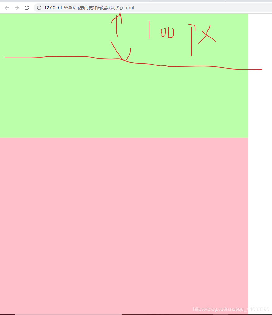
很明显,内容区的宽度被压缩了,也就是相对之前,内容区的宽度不仅大小变化了,而且位置也变化了
当给宽度不固定的元素设置内边距时,这是一般的情况,当宽度不固定时,还有种情况也是往外扩的,比如小米商城设置竖线的宽度的那个,原因,初步理解是因为浮动的原因,加上其宽度没有被定死
<!DOCTYPE html>
<html lang="zh">
<head>
<meta charset="UTF-8">
<meta http-equiv="X-UA-Compatible" content="IE=edge">
<meta name="viewport" content="width=device-width, initial-scale=1.0">
<title>Document</title>
<link rel="stylesheet" href="./样式/重置样式表/reset.css">
<style>
.box1{
width:800px;
height:1000px;
background-color: pink;
}
.box2{
height:200px;
background-color: #bfa;
padding:100px 100px;
}
</style>
</head>
<body>
<div class="box1">
<div class="box2"></div>
</div>
</body>
</html>
由于此代码中box2默认的宽度就是父元素box1的宽度,因此即使写了padding:100px 100px;此时的box2的宽度仍然是没什么变化的,但是还是可以看的出来box2的可见框是变大了的
注意上面说到的被设置外边距或者是内边距的元素宽度固不固定是指有没有明确指明(box2{width:xxpx;
}),除此之外,均算作没有明确指明
根据上面的讨论,可以得到以下两点:
- 元素的宽度或者是高度是否被固定,会对该元素的内容区的大小有变化,有什么变化,可以根据具体的题目,当满足那个等式关系的时候,此时,对内容区的大小和位置有什么影响
- 还有一个就是对元素设置外边距或者是内边距时,在颜色方面的差别的影响


 1298
1298


 被折叠的 条评论
为什么被折叠?
被折叠的 条评论
为什么被折叠?
 到【灌水乐园】发言


