


Python数据分析-Numpy,Matplotlib,Pandas
jupyter使用
anaconda powershell prompt 打开 jupyter notebook
1、输入:cd C:\Users\asus\Desktop\iPython
2、输入:jupyter notebook
笔记
svg:保存矢量图格式
Python数据分析
纲要
基础概念和环境
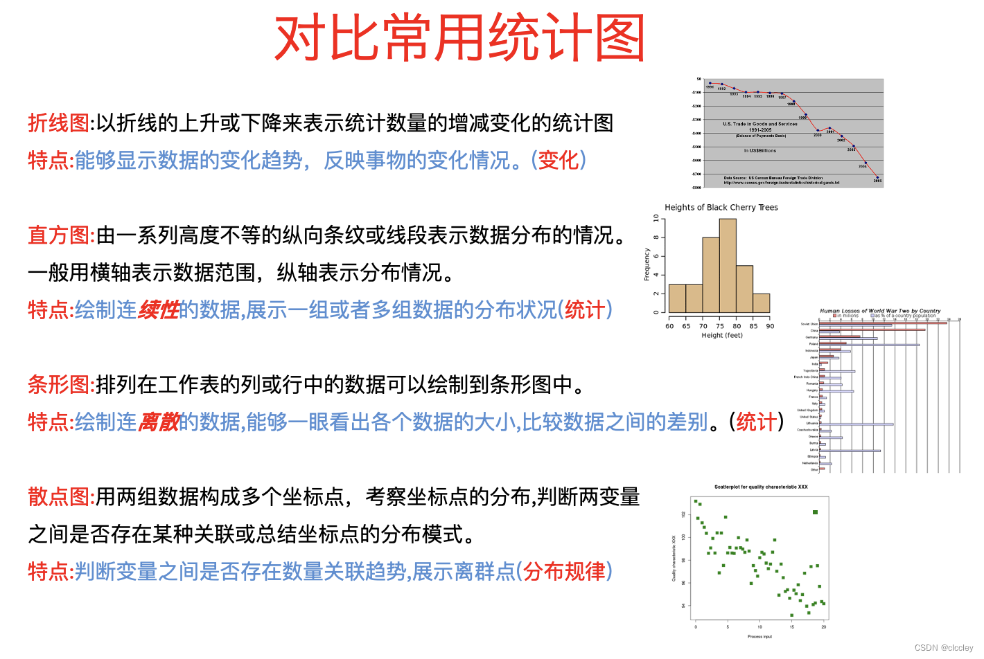
matplotlib
画图
numpy
处理数值型数组
pandas
处理数值型数组、字符串、时间序列、列表、字典等数据类型
综述
1、为什么要学习数据分析
- 有岗位需求
- 是Python数据科学的基础
- 是机器学习课程的基础
- 非常方便的从一堆数据中找一些非常直观的经验、结论共自己或别人使用
2、什么是数据分析
数据分析是用适当的方法对收集来的大量数据进行分析,帮助人们作出判断,以便采取适当行动。
数据分析流程:
提出问题→准备数据→分析数据→获得结论→成果可视化/文字/报告
3、环境安装
创建环境:conda creat——name python3 pyhton=3
切换环境:windows:activate python3
官网地址:www.anaconda.com/downdoad/
4、认识jupyter notebook
一、matplotlib
为什么要学习matplotlib:
- 能将数据进行可视化,更直观的呈现
- 使数据更加客观、更具说服力
1、什么是matplotlib
matplotlib:最流行的Python底层绘图库,主要做数据可视化图表,名字取材于MATLAB,模仿MATLAB构建
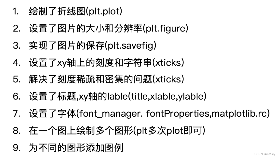
2、matplotlib基本要点
1、matplotlib 基础绘图
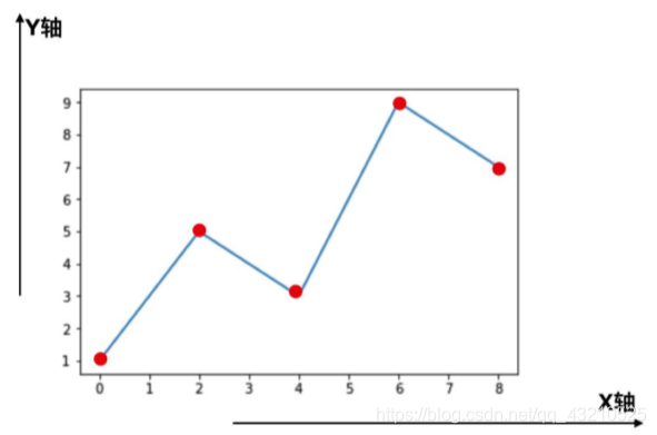
axis轴:指x或者y这种坐标轴
基本要点:
每个红色的点是坐标,把5个点的坐标连接成一条线,组成了一个折线图
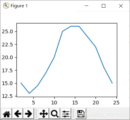
【 p14 】 假设一天中每隔两个小时(range(2,26,2))的气温(℃)分别是[15,13,14.5,17,20,25,26,26,27,22,18,15]
from matplotlib import pyplot as plt
       #导入pyplot
x=range(2,26,2)
       #数据在x轴的位置,是一个可迭代对象
y=[15,13,14.5,17,20,25,26,26,27,22,18,15]
       #数据在y轴的位置,是一个可迭代对象
       #x轴和y轴的数据一起组成了所有要绘制出的坐标
       #分别是(2,15)(4,13)(6,14.5)……
plt.plot(x,y)
       #传入x和y,通过plot绘制出折线图
plt.show()
       #在执行程序的时候展示图形
 存在的问题:
- 设置图片大小(想要一个高清无码大图)
- 保存到本地
- 描述信息,比如x轴和y轴表示什么,这个图表示什么
- 调整x或者y的刻度的间距
- 线条的样式(比如颜色,透明度等)
- 标记出特殊的点(比如告诉别人最高点和最低点在哪里)
- 给图片添加一个水印(防伪,防止盗用)
2、matplotlib 基础绘图和X轴刻度的调整
from matplotlib import pyplot as plt
       #导入pyplot

x=range(2,26,2)
       #数据在x轴的位置,是一个可迭代对象

y=[15,13,14.5,17,20,25,26,26,24,22,18,15]
       #数据在y轴的位置,是一个可迭代对象
       #x轴和y轴的数据一起组成了所有要绘制出的坐标
       #分别是(2,15)(4,13)(6,14.5)……

#设置图片大小
plt.figure(figsize=(20,8),dpi=80)

#绘图
plt.plot(x,y)
       #传入x和y,通过plot绘制出折线图

#设置x轴的刻度

# plt.xticks(x)   #步长2

# plt.xticks(range(2,25))

# _xtick_labels = [i/2 for i in range(2,49)]
# plt.xticks(_xtick_labels)

# _xtick_labels = [i/2 for i in range(2,49)]
# plt.xticks(_xtick_labels[::3])

_xtick_labels = [i/2 for i in range(2,49)]
plt.xticks(range(25,50))

#设置y轴的刻度

# plt.yticks(y)

plt.yticks(range(min(y),max(y)+1))

#保存
plt.savefig("./t1.png")

#展示图形
plt.show()
       #在执行程序的时候展示图形
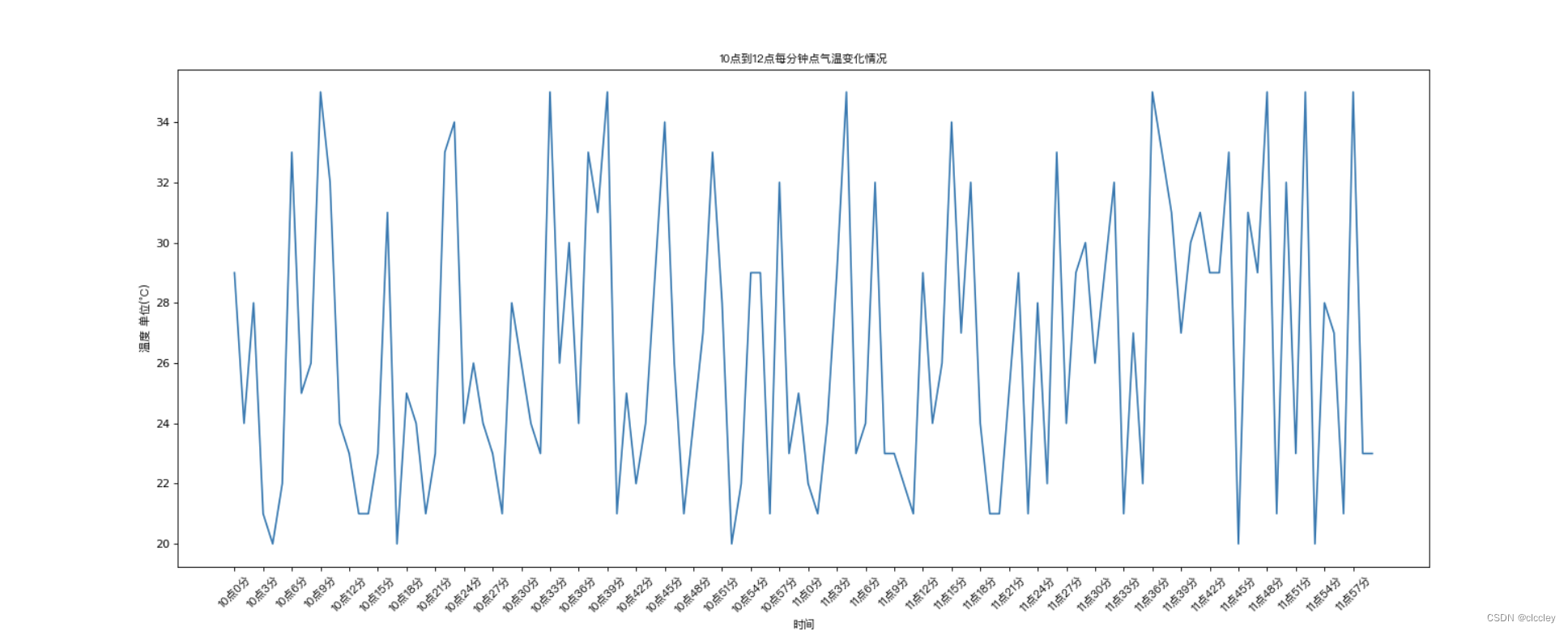
3、matplotlib 绘制10点到12点的气温
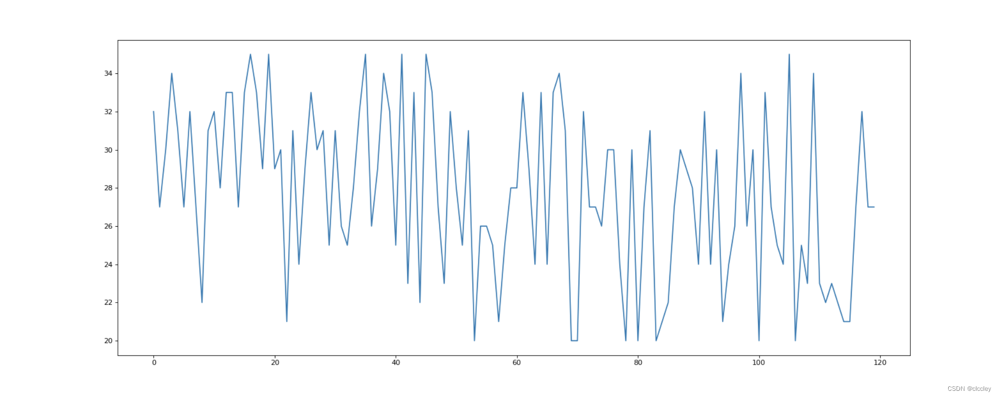
案例
**【 p14 】**如果列表a表示10点到12点的每一分钟的气温,如何绘制折线图观察每分钟气温的变化情况? a=
[random.randint(20,35) for i in range(120)]
from matplotlib import pyplot as plt
import random

x = range(0,120)
y = [random.randint(20,35) for i in range(120)]

# 设置图片大小
plt.figure(figsize=(20,8),dpi=80)

plt.plot(x,y)

plt.show()
4、matplotlib 设置显示中文
from matplotlib import pyplot as plt
import random
import matplotlib
from matplotlib import font_manager

# Windows和Linux下设置中文显示
# font = {'family': 'MicroSoft YaHei',
#         'weight': 'bold',
#         'size': 'larger'}
# matplotlib.rc('font', **font)
# matplotlib.rc('font', family='MicroSoft YaHei', weight='bold')

# 另一种设置字体的方式
my_font = font_manager.FontProperties(fname='/System/Library/Fonts/PingFang.ttc')

x = range(0, 120)
y = [random.randint(20, 35) for i in range(120)]

# 设置图片大小
plt.figure(figsize=(20, 8), dpi=80)

plt.plot(x, y)

# 调整x轴的刻度
# _x = x
# _xtick_labels = ["hello,{}".format(i) for i in _x]
# plt.xticks(x,_xtick_labels)

_xtick_labels = ["10点{}分".format(i) for i in range(60)]
_xtick_labels += ["11点{}分".format(i) for i in range(60)]

# 取步长,数字和字符串一一对应,数据的长度一样
plt.xticks(list(x)[::3], _xtick_labels[::3], rotation=45, fontproperties=my_font)   # rotation旋转的度数

# 添加描述信息
plt.xlabel('时间', fontproperties=my_font)
plt.ylabel('温度 单位(°C)', fontproperties=my_font)
plt.title('10点到12点每分钟点气温变化情况', fontproperties=my_font)

plt.show()
5、matplotlib 设置图形信息
【 p29 】 假设大家在30岁的时候,根据自己的实际情况,统计出来了从11岁到30岁每年交的女(男)朋友的数量如列表a,请绘制出该数据的折线图,以便分析自己每年交女(男)朋友的数量走势
a = [1,0,1,1,2,4,3,2,3,4,4,5,6,5,4,3,3,1,1,1]
要求:
y轴表示个数
x轴表示岁数,比如11岁,12岁等
# coding=utf-8
from matplotlib import pyplot as plt
from matplotlib import font_manager

my_font = font_manager.FontProperties(fname="/System/Library/Fonts/PingFang.ttc")

y = [1, 0, 1, 1, 2, 4, 3, 2, 3, 4, 4, 5, 6, 5, 4, 3, 3, 1, 1, 1]
x = range(11, 31)

# 设置图形大小
plt.figure(figsize=(20, 8), dpi=80)

plt.plot(x, y)

# 设置x轴刻度
_xtick_labels = ["{}岁".format(i) for i in x]
plt.xticks(x, _xtick_labels, fontproperties=my_font)
plt.yticks(range(0, 9))

# 绘制网格
plt.grid(alpha=0.5)

# 展示
plt.show()
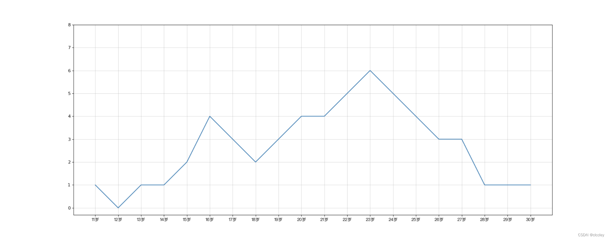
RGB颜色 - 十六进制颜色转换:Link
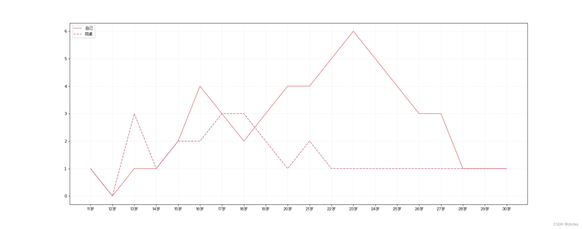
6、matplotlib 绘制多次图形和不同图形的差异介绍和总结
【 p30 】 假设大家在30岁的时候,根据自己的实际情况,统计出来了你和你同桌各自从11岁到30岁每年交的女(男)朋友的数量如列表a和b,请在一个图中绘制出该数据的折线图,以便比较自己和同桌20年间的差异,同时分析每年交女(男)朋友的数量走势
a = [1,0,1,1,2,4,3,2,3,4,4,5,6,5,4,3,3,1,1,1]
b = [1,0,3,1,2,2,3,3,2,1,2,1,1,1,1,1,1,1,1,1]
要求:
y轴表示个数
x轴表示岁数,比如11岁,12岁等
# coding=utf-8
from matplotlib import pyplot as plt
from matplotlib import font_manager

my_font = font_manager.FontProperties(fname="/System/Library/Fonts/PingFang.ttc")

y_1 = [1, 0, 1, 1, 2, 4, 3, 2, 3, 4, 4, 5, 6, 5, 4, 3, 3, 1, 1, 1]
y_2 = [1, 0, 3, 1, 2, 2, 3, 3, 2, 1, 2, 1, 1, 1, 1, 1, 1, 1, 1, 1]

x = range(11, 31)

# 设置图形大小
plt.figure(figsize=(20, 8), dpi=80)

plt.plot(x, y_1, label="自己", color="#F08080")
plt.plot(x, y_2, label="同桌", color="#DB7093", linestyle="--")

# 设置x轴刻度
_xtick_labels = ["{}岁".format(i) for i in x]
plt.xticks(x, _xtick_labels, fontproperties=my_font)
# plt.yticks(range(0,9))

# 绘制网格
plt.grid(alpha=0.4, linestyle=':')

# 添加图例
plt.legend(prop=my_font, loc="upper left")  # upper left: 显示在左上角

# 展示
plt.show()

3、matplotlib的散点图、直方图、柱状图
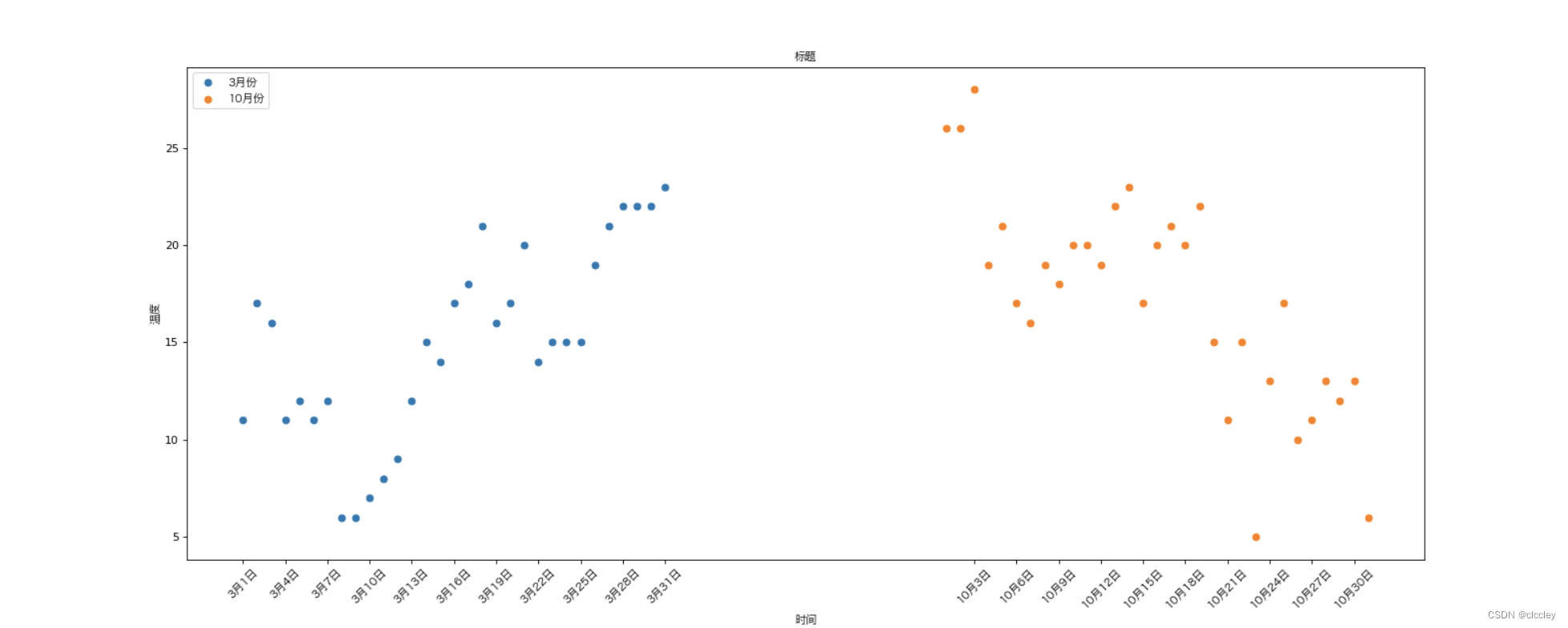
1、matplotlib 绘制散点图
【 p38 】 假设通过爬虫你获取到了北京2016年3,10月份每天白天的最高气温(分别位于列表a,b),那么此时如何寻找出气温和随时间(天)变化的某种规律?
a = [11,17,16,11,12,11,12,6,6,7,8,9,12,15,14,17,18,21,16,17,20,14,15,15,15,19,21,22,22,22,23]
b = [26,26,28,19,21,17,16,19,18,20,20,19,22,23,17,20,21,20,22,15,11,15,5,13,17,10,11,13,12,13,6]
数据来源: http://lishi.tianqi.com/beijing/index.html
# coding=utf-8
from matplotlib import pyplot as plt
from matplotlib import font_manager

my_font = font_manager.FontProperties(fname="/System/Library/Fonts/Hiragino Sans GB.ttc")
y_3 = [11, 17, 16, 11, 12, 11, 12, 6, 6, 7, 8, 9, 12, 15, 14, 17, 18, 21, 16, 17, 20, 14, 15, 15, 15, 19, 21, 22, 22, 22, 23]
y_10 = [26, 26, 28, 19, 21, 17, 16, 19, 18, 20, 20, 19, 22, 23, 17, 20, 21, 20, 22, 15, 11, 15, 5, 13, 17, 10, 11, 13, 12, 13, 6]

x_3 = range(1, 32)
x_10 = range(51, 82)

# 设置图形大小
plt.figure(figsize=(20, 8), dpi=80)

# 使用scatter方法绘制散点图,和之前绘制折线图的唯一区别
plt.scatter(x_3, y_3, label="3月份")
plt.scatter(x_10, y_10, label="10月份")

# 调整x轴的刻度
_x = list(x_3)+list(x_10)
_xtick_labels = ["3月{}日".format(i) for i in x_3]
_xtick_labels += ["10月{}日".format(i-50) for i in x_10]
plt.xticks(_x[::3], _xtick_labels[::3], fontproperties=my_font, rotation=45)

# 添加图例
plt.legend(loc="upper left", prop=my_font)
# plt.legend(handles, labels, loc, title, prop)
# handles:图例中绘制的那些artist;
# labels:图例中每个artist的标签;
# loc:图例的位置;
# title:图例的标题;
# prop:图例中文本的属性设置。

# 添加描述信息
plt.xlabel("时间", fontproperties=my_font)
plt.ylabel("温度", fontproperties=my_font)
plt.title("标题", fontproperties=my_font)

# 展示
plt.show()
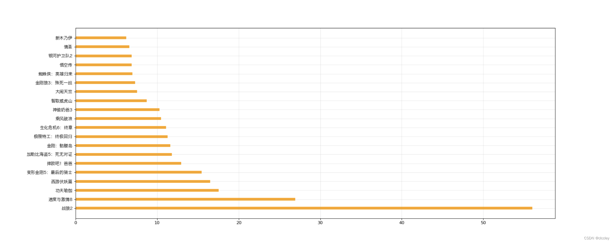
2、matplotlib 绘制条形图
【 p41 】 假设你获取到了2017年内地电影票房前20的电影(列表a)和电影票房数据(列表b),那么如何更加直观的展示该数据?
a = [“战狼2”,“速度与激情8”,“功夫瑜伽”,“西游伏妖篇”,“变形金刚5:最后的骑士”,“摔跤吧!爸爸”,“加勒比海盗5:死无对证”,“金刚:骷髅岛”,“极限特工:终极回归”,“生化危机6:终章”,“乘风破浪”,“神偷奶爸3”,“智取威虎山”,“大闹天竺”,“金刚狼3:殊死一战”,“蜘蛛侠:英雄归来”,“悟空传”,“银河护卫队2”,“情圣”,“新木乃伊”,]
b = [56.01,26.94,17.53,16.49,15.45,12.96,11.8,11.61,11.28,11.12,10.49,10.3,8.75,7.55,7.32,6.99,6.88,6.86,6.58,6.23]
单位:亿
数据来源: http://58921.com/alltime/2017
# 绘制横着的条形图
from matplotlib import pyplot as plt
from matplotlib import font_manager
my_font = font_manager.FontProperties(fname="/System/Library/Fonts/Hiragino Sans GB.ttc")

a = ["战狼2", "速度与激情8", "功夫瑜伽", "西游伏妖篇", "变形金刚5:最后的骑士", "摔跤吧!爸爸", "加勒比海盗5:死无对证", "金刚:骷髅岛", "极限特工:终极回归", "生化危机6:终章", "乘风破浪", "神偷奶爸3", "智取威虎山", "大闹天竺", "金刚狼3:殊死一战", "蜘蛛侠:英雄归来", "悟空传", "银河护卫队2", "情圣", "新木乃伊",]

b = [56.01, 26.94, 17.53, 16.49, 15.45, 12.96, 11.8, 11.61, 11.28, 11.12, 10.49, 10.3, 8.75, 7.55, 7.32, 6.99, 6.88, 6.86, 6.58, 6.23]

# 设置图形大小
plt.figure(figsize=(20, 8), dpi=80)

# 绘制横的条形图 barh
plt.barh(range(len(a)), b, height=0.3, color="orange")

# 竖着 bar
# plt.bar(range(len(a)), b, width=0.3)

# 设置字符串到x轴
plt.yticks(range(len(a)), a, fontproperties=my_font)

plt.grid(alpha=0.3)
# plt.savefig("./movie.png")

plt.show()
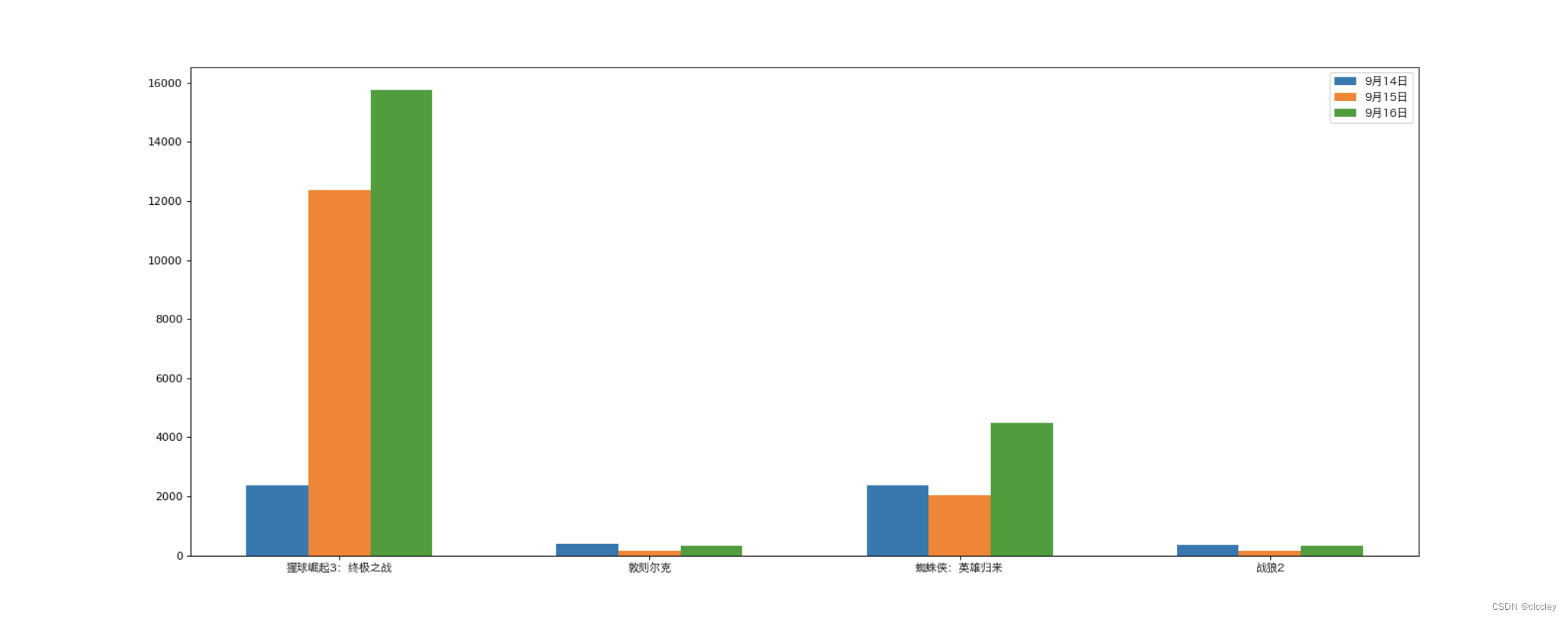
3、matplotlib 绘制多次条形图
【 p43 】 假设你知道了列表a中电影分别在2017-09-14(b_14), 2017-09-15(b_15), 2017-09-16(b_16)三天的票房,为了展示列表中电影本身的票房以及同其他电影的数据对比情况,应该如何更加直观的呈现该数据?
a = [“猩球崛起3:终极之战”,“敦刻尔克”,“蜘蛛侠:英雄归来”,“战狼2”]
b_16 = [15746,312,4497,319]
b_15 = [12357,156,2045,168]
b_14 = [2358,399,2358,362]
数据来源: http://www.cbooo.cn/movieday
# coding=utf-8
from matplotlib import pyplot as plt
from matplotlib import font_manager
my_font = font_manager.FontProperties(fname="/System/Library/Fonts/Hiragino Sans GB.ttc")


a = ["猩球崛起3:终极之战", "敦刻尔克", "蜘蛛侠:英雄归来", "战狼2"]
b_16 = [15746, 312, 4497, 319]
b_15 = [12357, 156, 2045, 168]
b_14 = [2358, 399, 2358, 362]

bar_width = 0.2

# 设置x轴位置
x_14 = list(range(len(a)))
x_15 = [i+bar_width for i in x_14]  # x往右移动一个宽度
x_16 = [i+bar_width*2 for i in x_14]

# 设置图形大小
plt.figure(figsize=(20, 8), dpi=80)

plt.bar(range(len(a)), b_14, width=bar_width, label="9月14日")
plt.bar(x_15, b_15, width=bar_width, label="9月15日")
plt.bar(x_16, b_16, width=bar_width, label="9月16日")

# 设置图例
plt.legend(prop=my_font)

# 设置x轴的刻度的对应
plt.xticks(x_15, a, fontproperties=my_font)

plt.show()
4、matplotlib 绘制直方图
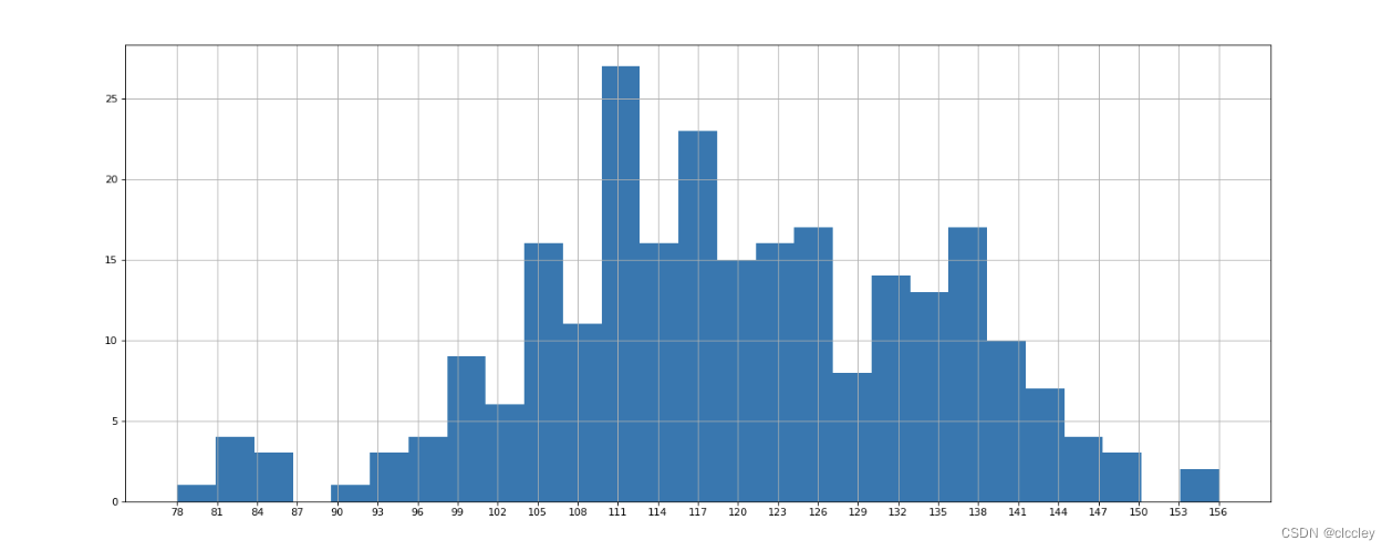
【 p46 】 假设你获取了250部电影的时长(列表a中),希望统计出这些电影时长的分布状态(比如时长为100分钟到120分钟电影的数量,出现的频率)等信息,你应该如何呈现这些数据?
a = [131, 98, 125, 131, 124, 139, 131, 117, 128, 108, 135, 138, 131, 102, 107, 114, 119, 128, 121, 142, 127, 130, 124, 101, 110, 116, 117, 110, 128, 128, 115, 99, 136, 126, 134, 95, 138, 117, 111,78, 132, 124, 113, 150, 110, 117, 86, 95, 144, 105, 126, 130,126, 130, 126, 116, 123, 106, 112, 138, 123, 86, 101, 99, 136, 123, 117, 119, 105, 137, 123, 128, 125, 104, 109, 134, 125, 127, 105, 120, 107, 129, 116, 108, 132, 103, 136, 118, 102, 120, 114, 105, 115, 132, 145, 119, 121, 112, 139, 125, 138, 109, 132, 134, 156, 106, 117, 127, 144, 139, 139, 119, 140, 83, 110, 102, 123, 107, 143, 115, 136, 118, 139, 123, 112, 118, 125, 109, 119, 133, 112, 114, 122, 109, 106, 123, 116, 131, 127, 115, 118, 112, 135, 115, 146, 137, 116, 103, 144, 83, 123, 111, 110, 111, 100, 154, 136, 100, 118, 119, 133, 134, 106, 129, 126, 110, 111, 109, 141, 120, 117, 106, 149, 122, 122, 110, 118, 127, 121, 114, 125, 126, 114, 140, 103, 130, 141, 117, 106, 114, 121, 114, 133, 137, 92, 121, 112, 146, 97, 137, 105, 98, 117, 112, 81, 97, 139, 113, 134, 106, 144, 110, 137, 137, 111, 104, 117, 100, 111, 101, 110, 105, 129, 137, 112, 120, 113, 133, 112, 83, 94, 146, 133, 101, 131, 116, 111, 84, 137, 115, 122, 106, 144, 109, 123, 116, 111, 111, 133, 150]
# coding=utf-8
from matplotlib import pyplot as plt
from matplotlib import font_manager

a = [131, 98, 125, 131, 124, 139, 131, 117, 128, 108, 135, 138, 131, 102, 107, 114, 119, 128, 121, 142, 127, 130, 124, 101, 110, 116, 117, 110, 128, 128, 115,  99, 136, 126, 134,  95, 138, 117, 111,78, 132, 124, 113, 150, 110, 117,  86,  95, 144, 105, 126, 130,126, 130, 126, 116, 123, 106, 112, 138, 123,  86, 101,  99, 136, 123, 117, 119, 105, 137, 123, 128, 125, 104, 109, 134, 125, 127, 105, 120, 107, 129, 116, 108, 132, 103, 136, 118, 102, 120, 114, 105, 115, 132, 145, 119, 121, 112, 139, 125, 138, 109, 132, 134, 156, 106, 117, 127, 144, 139, 139, 119, 140,  83, 110, 102, 123, 107, 143, 115, 136, 118, 139, 123, 112, 118, 125, 109, 119, 133, 112, 114, 122, 109, 106, 123, 116, 131, 127, 115, 118, 112, 135, 115, 146, 137, 116, 103, 144,  83, 123, 111, 110, 111, 100, 154, 136, 100, 118, 119, 133, 134, 106, 129, 126, 110, 111, 109, 141, 120, 117, 106, 149, 122, 122, 110, 118, 127, 121, 114, 125, 126, 114, 140, 103, 130, 141, 117, 106, 114, 121, 114, 133, 137, 92, 121, 112, 146, 97, 137, 105, 98, 117, 112, 81, 97, 139, 113, 134, 106, 144, 110, 137, 137, 111, 104, 117, 100, 111, 101, 110, 105, 129, 137, 112, 120, 113, 133, 112,  83, 94, 146, 133, 101, 131, 116, 111, 84, 137, 115, 122, 106, 144, 109, 123, 116, 111, 111, 133, 150]

# 计算组数
d = 3  # 组距
num_bins = (max(a)-min(a))//d + 1
print(max(a), min(a), max(a)-min(a))
print(num_bins)

# 设置图形的大小
plt.figure(figsize=(20, 8), dpi=80)
plt.hist(a, num_bins)

# 设置x轴的刻度
plt.xticks(range(min(a), max(a)+d, d))

plt.grid()

plt.show()
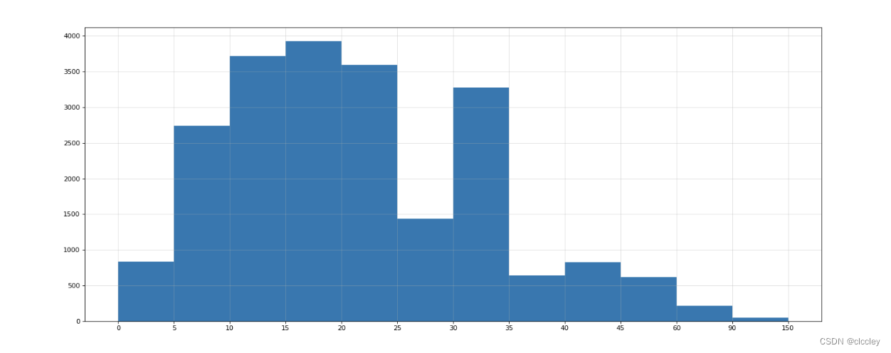
【 p48 】 在美国2004年人口普查发现有124 million的人在离家相对较远的地方工作。根据他们从家到上班地点所需要的时间,通过抽样统计(最后一列)出了下表的数据,这些数据能够绘制成直方图么?
interval = [0,5,10,15,20,25,30,35,40,45,60,90]
width = [5,5,5,5,5,5,5,5,5,15,30,60]
quantity = [836,2737,3723,3926,3596,1438,3273,642,824,613,215,47]
数据来源:https://en.wikipedia.org/wiki/Histogram
普查报告地址:https://www.census.gov/prod/2004pubs/c2kbr-33.pdf
# coding=utf-8
from matplotlib import pyplot as plt
from matplotlib import font_manager

interval = [0, 5, 10, 15, 20, 25, 30, 35, 40, 45, 60, 90]
width = [5, 5, 5, 5, 5, 5, 5, 5, 5, 15, 30, 60]
quantity = [836, 2737, 3723, 3926, 3596, 1438, 3273, 642, 824, 613, 215, 47]

print(len(interval), len(width), len(quantity))

# 设置图形大小
plt.figure(figsize=(20, 8), dpi=80)

plt.bar(range(12), quantity, width=1)

# 设置x轴的刻度
_x = [i-0.5 for i in range(13)]
_xtick_labels = interval+[150]
plt.xticks(_x, _xtick_labels)

plt.grid(alpha = 0.4)
plt.show()
4、更多的画图工具
二、Numpy
1、什么是 Numpy
1、Numpy 数组创建
2、Numpy 数组的计算
2、Numpy 基础
1、Numpy 读取本地数据
2、Numpy 索引和切片
3、Numpy 更多索引方式
3、Numpy 常用统计方法
1、数据的拼接
1、Numpy 中的随机方法
1、Numpy 和 Nan 的常用统计方法
1、Numpy 中填充 Nan 和 youbute 数据的练习
三、Pandas
1、Pandas 的 series 了解
2、Pandas 读取外部数据
3、Pandas 的 dataFrame 创建
4、Pandas 的 Dataframe 描述信息
3、Pandas 的 dataframe 索引
3、Pandas 的 bool 索引和缺失数据的处理
3、电影数直方图
3、Pandas 的常用统计方法
3、字符串离散化的案例
3、数据合并
3、数据分散聚合
3、数据的索引学习
3、数据分散聚合练习和总结
3、Pandas 时间序列
3、案例
3、PM2.5 案例
3、豆瓣电视案例
附件
1. matplotlib可绘制的图形: Link

2. Echarts: Link


 813
813


 被折叠的 条评论
为什么被折叠?
被折叠的 条评论
为什么被折叠?
 到【灌水乐园】发言


