


Vue按比例居中适配组件
实现类似视频缩放,居中,保持页面比例不变形效果
<template>
  <div class="PageWarp">
    <div
      class="content-wrap"
      :style="{
        transform: `scale(${scaleRation})`,
        width: `${width}px !important`,
        height: `${height}px !important`,
      }"
    >
      <slot></slot>
    </div>
  </div>
</template>

<script>
export default {
  name: 'PageWarp',
  props: {
    height: {
      type: Number,
      default: 1920,
    },
    width: {
      type: Number,
      default: 1080,
    },
  },
  data() {
    return {
      scaleRation: 1,
    };
  },
  created() {
    this.adjustScreen();
    window.addEventListener('resize', this.adjustScreen);
  },
  methods: {
    adjustScreen() {
      this.scaleRation =
        window.innerHeight / this.height > window.innerWidth / this.width
          ? window.innerWidth / this.width
          : window.innerHeight / this.height;
    },
  },
};
</script>

<style lang="less" scoped>
.PageWarp {
  width: 100vw;
  height: 100vh;
  display: grid;
  align-content: center;
  justify-content: center;
  background-color: #111111;
  .content-wrap {
    background-color: black;
    box-sizing: border-box;
    overflow: hidden;
  }
}
</style>
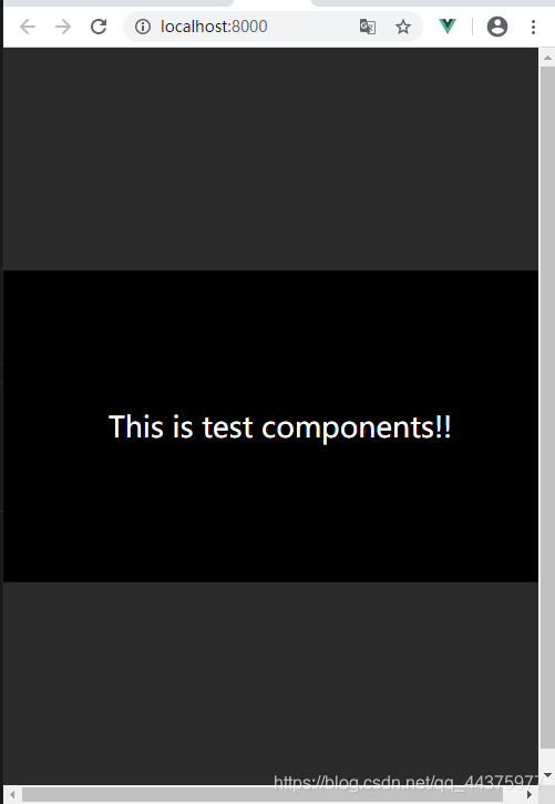
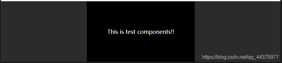
调用
 <pageWrap>
    <div cls="test-component">This is test components!!</div>
 </pageWrap>


 1万+
1万+


 被折叠的 条评论
为什么被折叠?
被折叠的 条评论
为什么被折叠?
 到【灌水乐园】发言


