


HTML+CSS+JS实现按钮悬停效果
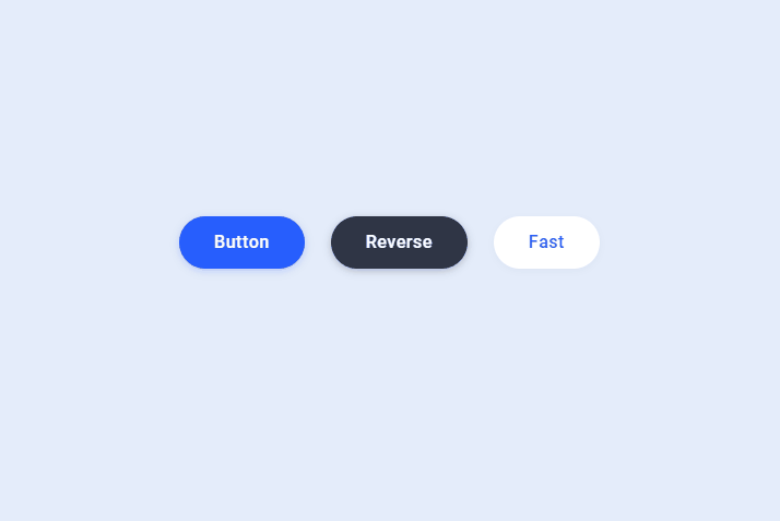
效果图
原地址
https://codepen.io/aaroniker/pen/bGGVMbY
打包下载(无需积分,立即下载)
https://download.csdn.net/download/qq_45136860/85475907
HTML
<a href="" class="button">Button</a>
<a href="" class="button reverse dark">Reverse</a>
<a href="" class="button fast white">Fast</a>
CSS
.button.dark {
  --background: #2F3545;
  --shadow: 0 2px 8px -1px rgba(21, 25, 36, 0.32);
  --shadow-hover: 0 4px 20px -2px rgba(21, 25, 36, 0.5);
}

.button.white {
  --background: #fff;
  --text: #275efe;
  --shadow: 0 2px 8px -1px rgba(18, 22, 33, 0.04);
  --shadow-hover: 0 4px 20px -2px rgba(18, 22, 33, 0.12);
}

.button.fast {
  --duration: .32s;
}

.button {
  --background: #275efe;
  --text: #fff;
  --font-size: 16px;
  --duration: .44s;
  --move-hover: -4px;
  --shadow: 0 2px 8px -1px rgba(39, 94, 254, 0.32);
  --shadow-hover: 0 4px 20px -2px rgba(39, 94, 254, 0.5);
  --font-shadow: var(--font-size);
  padding: 16px 32px;
  font-family: 'Roboto';
  font-weight: 500;
  line-height: var(--font-size);
  border-radius: 24px;
  display: block;
  outline: none;
  text-decoration: none;
  font-size: var(--font-size);
  letter-spacing: .5px;
  background: var(--background);
  color: var(--text);
  box-shadow: var(--shadow);
  transform: translateY(var(--y)) translateZ(0);
  transition: transform var(--duration) ease, box-shadow var(--duration) ease;
}

.button div {
  display: flex;
  overflow: hidden;
  text-shadow: 0 var(--font-shadow) 0 var(--text);
}

.button div span {
  display: block;
  backface-visibility: hidden;
  font-style: normal;
  transition: transform var(--duration) ease;
  transform: translateY(var(--m)) translateZ(0);
}

.button div span:nth-child(1) {
  transition-delay: 0.05s;
}

.button div span:nth-child(2) {
  transition-delay: 0.1s;
}

.button div span:nth-child(3) {
  transition-delay: 0.15s;
}

.button div span:nth-child(4) {
  transition-delay: 0.2s;
}

.button div span:nth-child(5) {
  transition-delay: 0.25s;
}

.button div span:nth-child(6) {
  transition-delay: 0.3s;
}

.button div span:nth-child(7) {
  transition-delay: 0.35s;
}

.button div span:nth-child(8) {
  transition-delay: 0.4s;
}

.button div span:nth-child(9) {
  transition-delay: 0.45s;
}

.button div span:nth-child(10) {
  transition-delay: 0.5s;
}

.button div span:nth-child(11) {
  transition-delay: 0.55s;
}

.button:hover {
  --y: var(--move-hover);
  --shadow: var(--shadow-hover);
}

.button:hover span {
  --m: calc(var(--font-size) * -1);
}

.button.reverse {
  --font-shadow: calc(var(--font-size) * -1);
}

.button.reverse:hover span {
  --m: calc(var(--font-size));
}

html {
  box-sizing: border-box;
  -webkit-font-smoothing: antialiased;
}

* {
  box-sizing: inherit;
}

*:before,
*:after {
  box-sizing: inherit;
}

body {
  min-height: 100vh;
  display: flex;
  font-family: 'Roboto', Arial;
  justify-content: center;
  align-items: center;
  background: #E4ECFA;
}

body .button {
  margin: 0 12px;
}

body .dribbble {
  position: fixed;
  display: block;
  right: 20px;
  bottom: 20px;
}

body .dribbble img {
  display: block;
  height: 28px;
}
JS
document.querySelectorAll('.button').forEach(button => button.innerHTML = '<div><span>' + button.textContent.trim().split('').join('</span><span>') + '</span></div>');


 230
230


 被折叠的 条评论
为什么被折叠?
被折叠的 条评论
为什么被折叠?
 到【灌水乐园】发言


