


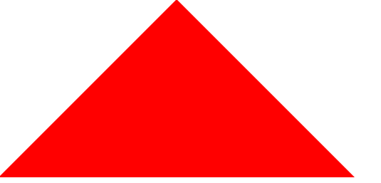
制作css的三角形,方向可以改,如果想朝向上方就消除border-top。
<title>用纯css创建一个三角形</title>
    <style type="text/css">
        * {
            margin: 0;
            padding: 0;
        }

        #box {
            width: 0;
            height: 0;
            border-bottom: 200px solid red;
            /* border-top: 200px solid green; */
            border-left: 200px solid transparent;
            border-right: 200px solid transparent;
        }
    </style>
</head>

<body>
    <div id="box"></div>
</body>
<script>
    window.onload = function() {
        var box = document.getElementById('box');
    }
</script>
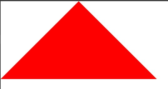
如果将左右不改transparent的话就是下面图形。transparent属性设置透明度。上面三角形是旁边透明状态 。不要设计为白色。
#box {
width: 0;
height: 0;
border-bottom: 200px solid red;
/* border-top: 200px solid green; */
border-left: 200px solid pink;
border-right: 200px solid black;
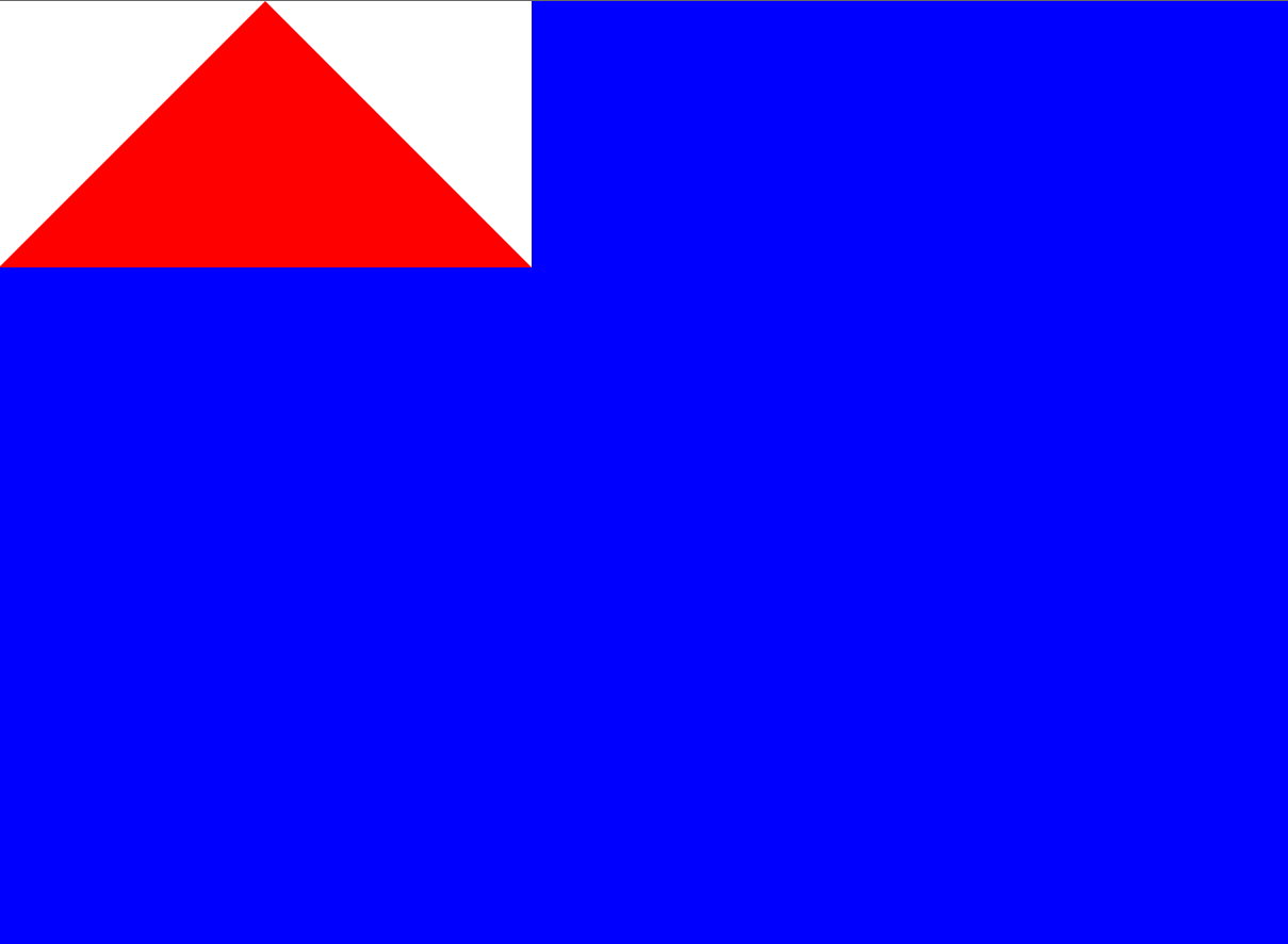
}如果设计为白色。也是三角形。但是如果背景有颜色就会不一样的效果。
 body {
            background-color: blue;
        }

        #box {
            width: 0;
            height: 0;
            border-bottom: 200px solid red;
            /* border-top: 200px solid green; */
            border-left: 200px solid white;
            border-right: 200px solid white;
} 
如果每一条边都存在,有颜色。

 #box {
            width: 0;
            height: 0;
            border-bottom: 200px solid red;
            border-top: 200px solid green;
            border-left: 200px solid pink;
            border-right: 200px solid black;
        }


 2万+
2万+


 被折叠的 条评论
为什么被折叠?
被折叠的 条评论
为什么被折叠?
 到【灌水乐园】发言


