


 <style>
        * {
            margin: 0;
            padding: 0;
        }

        .box {
            width: 200px;
            height: 200px;
            position: relative;
            background: #000;
            margin: 100px auto;
            box-sizing: border-box;
        }
        .box::before,
        .box::after {
            transform: all .3s;
            position: absolute;
            content: "";
            top: -2px;
            right: -2px;
            bottom: -2px;
            left: -2px;
            background: linear-gradient(45deg,rgba(247, 7, 7, 0.8),rgb(231, 216, 4),rgb(0, 255, 0));
            z-index:-1;
            box-sizing: border-box;
            /* 可执行动画 */
            /* animation: run 10s infinite linear; */
        }
        @keyframes run {
            0%{
                background: linear-gradient(45deg,rgba(238, 41, 238, 0.8),transparent,rgb(0, 255, 0));
            }
            25%{
                background: linear-gradient(45deg,rgba(9, 243, 80, 0.8),transparent,rgb(34, 69, 224));
            }
            50%{
                background: linear-gradient(45deg,rgba(243, 122, 9, 0.8),transparent,rgb(241, 18, 18));
            }
            100%{
                background: linear-gradient(45deg,rgba(238, 41, 238, 0.8),transparent,rgb(0, 255, 0));
            }
        }
    </style>
</head>

<body>
    <div class="box"></div>
</body>
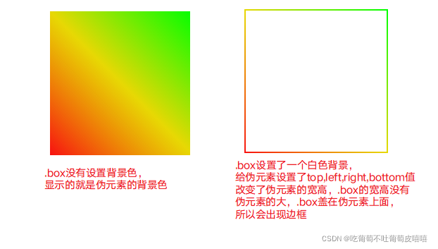
实现思路:
1.给需要添加边框的元素进行定位
2.通过给定位的元素添加伪元素::after ::before
3.通过改变伪元素的top,left,right,bottom值来实现边框
只保留下边框,只需将top,left,right都设置为0
       .box::before,
        .box::after {
            transform: all .3s;
            position: absolute;
            content: "";
            top: 0;
            right: 0;
            bottom: -2px;
            left: 0;
            background: linear-gradient(45deg,rgba(247, 7, 7, 0.8),rgb(231, 216, 4),rgb(0, 255, 0));
            z-index:-1;
            box-sizing: border-box;
        }


 2198
2198


 被折叠的 条评论
为什么被折叠?
被折叠的 条评论
为什么被折叠?
 到【灌水乐园】发言


