


文章目录
- 04.写一篇博客
- 05.百度新闻列表
- 06 图片的使用
- 07 如何下载图片及切图
- 08 知识补充
- 09 百度云盘制作
- 10 简单表格制作
- 11. 个人简历的制作
- 12. 表格知识补充
- 13. 登录表单
- 14.get请求和post请求的区别
- 15. 认识css
- 16. 容器的作用
- 17. 布局与选择器
- 18. 样式表的层叠
- 19. 选择器得权重
- 20.css文本属性
- 21. 常见图片格式的区别
- 22.背景图的使用(比较有用的)
- 23.元素的浮动布局(上)
- 24. 元素的浮动布局(中)
- 25.元素的浮动布局(下)
- 26.为什么需要盒子模型(上)
- 27.为什么需要盒子模型(下)
- 28.布局练习
- 29 css属性简写
- 30 元素的不同类型
- 31.布局中的定位(上)
- 32.布局中的定位(下)
- 33.hover鼠标划入效果
- 34.写在前面的话
- 35.语义化标签
- 36.智能表单
- 37.知识点补充
- [ 后续笔记](https://blog.csdn.net/qq_46539281/article/details/117220303)
04.写一篇博客

05.百度新闻列表

06 图片的使用
<img src="" >

图片的显示顺序,从左到右依次排放的。默认是以底部对齐的,放不下便会到下一层进行显示。

设置wirth 或者 hright 时,图片会进行等比例的放大或缩小。
如果同时设置了width 和height , 图片有可能就会变形。
07 如何下载图片及切图
08 知识补充
超链接
<a href = "xxxx "  target="_blank">点我</a>

target= _blank  打开新的页面 。
无序链表
实心圆(默认)
<ul type="disc">
空心圆
<ul type="circle">
实心方块
<ul type="square">
有序列表
数字(默认)
<ol type="1">
小写字母
<ol type="a">
大写字母
<ol type="A">
小写罗马字母
<ol type="i">
大写罗马字母
<ol type="I">
图片
<img title="提示" alt="失败" src="">

 title : 鼠标划上去时显示的文字
 alt : 图片加载失败,显示的文字
常用的标签
<del></del>   给文字填上删除线
<sup></sup> 将文字变成上标
<u></u> 给文字填上下划线
<center></center>  文本居中
09 百度云盘制作
绝对路径:任何情况下,都可以找得到的地址
相对地址:必须知道当前所在,才能找到
../ 表示上一层目录的
../../ 上一层的上一层目录
./  当前目录
10 简单表格制作
<table></table>   表格
<tr></tr>  表格中的行
<td></td> 行中的单元格
<table border="xxpx"  cellpacing="0">
</table>

border 表格添加边框   cellpacing 单元格间隙
<td width=" "  align="center" ></td>

width 单元格添加宽度
align: 单元格里面的文本居中
<col width="100px "> 单标签  代表一列    第一列宽100px

用法:
<table border="xxpx"  cellpacing="0">
	<col width="100px ">
	<tr>
		.....
	</tr>
	<tr>
		.....
	</tr>

</table>
一行的文字想要进行 文本居中
<tr align="center" ></tr>
11. 个人简历的制作
单元的合并:本质上就是将多余的单元格删除,重新设置单元格的宽度或高度。
<td colspan = "7"></td> 表示当前单元占7个单元格。 跨列
<td rowspan = "3"></td> 跨行
12. 表格知识补充
表头:
<th></th> 加粗并水平居中的td
<colgroup span="6" width="100px"> 前6列为一组,并且宽度都为100px
<tbody>
	表格的主体
</tbody>

按照w3c的标准, 没有写这个标签,浏览器会自动帮我们生成的。一般还是写上比较好。
<!-- --> 注释的使用
标签的嵌套:
- 超链接不能嵌套超链接
- p标签不能嵌套p标签
- 标题标签h1… h6 也不能互相嵌套
13. 登录表单
form  action  mothod
input type  text password buttin radio checkbox  submit
14.get请求和post请求的区别
form meyhod= "post / get "
post 参数 在请求体中
get参数在请求头中。
15. 认识css
css 层叠样式表
行内样式:style
16. 容器的作用
div 可以包裹任何内容,也可以容器直接互相包裹
span 用于包裹一段文本,便于给文本增加样式
关于居中:
text-align:center ;   让容器内部元素水平居中

margin:auto  让元素本身水平居中。  需要设置div 的 width 属性
background-color : gray 设置背景颜色
font-size : 24px 设置字体大小
color : white; 设置文字的颜色
17. 布局与选择器
banner : 横幅
navigation: 导航
bottom: 底部
div容器的特点:
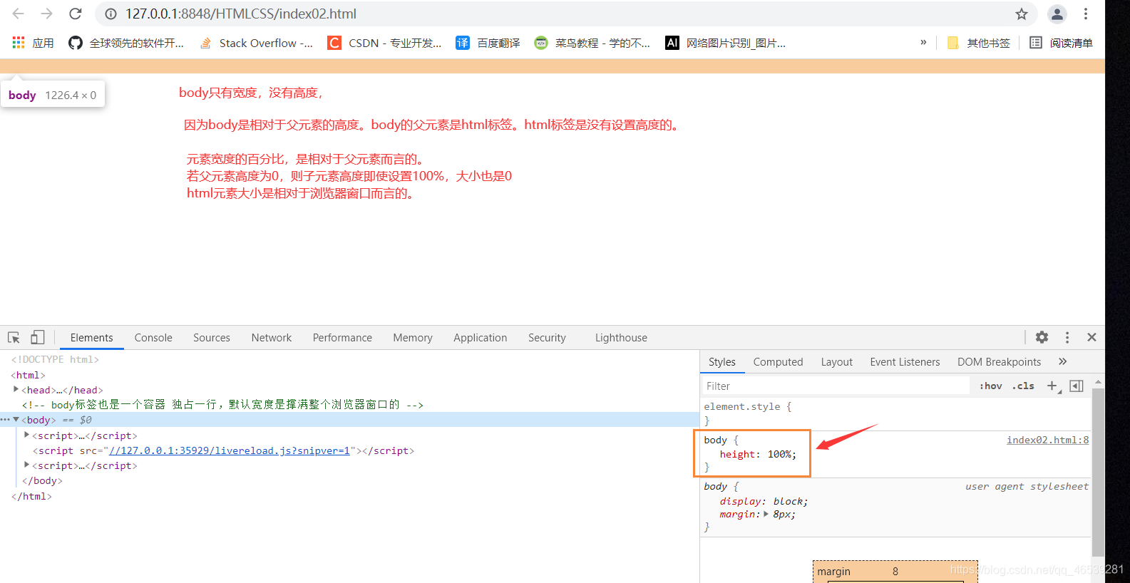
一个空的div , 默认宽度100%,高度为0 , 添加内容时,容器的高度才会被内容所撑开。
body 标签:
在默认情况下,距离页面的两侧会有一定的距离。

margin : 0 即可。
行高:line-height
在浏览器的页面上,字体的默认大小 16px ,  默认行高:21px

让行高与容器的高度相同,其中的文本自然就 垂直(上下)居中了。
margin : 指对当前元素有效,没法写在父元素上。
内部样式:
<style>
	标签选择器{
	}

	#id {
	}

	.类{
	}

	父类   子类{

	}

	* {     通用选择器  : 针对页面上的所有标签都有效
	}

</style>
18. 样式表的层叠
层叠原理
行内样式优先级 > 内部样式
<!DOCTYPE html>
<html>
	<head>
		<meta charset="utf-8">
		<title>样式表的层叠</title>

		<style>
			#navigation{
				text-align: center;
			}

			.item{
				text-decoration: none;
				color: black;
				border-right: solid 1px #808000;
				padding: 0 15px;
			}

			#navigation .last{
				border: none;
			}

		</style>


	</head>
	<body>
		<div id="navigation">
			<a href="#" class="item">首页</a>
			<!-- <span>|</span> -->
			<a href="#" class="item">办公家居</a>
			<!-- <span>|</span> -->
			<a href="#" class="item">数码科技</a>
			<!-- <span>|</span> -->
			<a href="#" class="item">母婴</a>
			<!-- <span>|</span> -->
			<a href="#" class="item">团购</a>
			<!-- <span>|</span> -->
			<!-- <a href="#" class="item" style="border: none;">秒杀活动</a> -->
			<a href="#" class="item last" >秒杀活动</a>
		</div>

	</body>
</html>
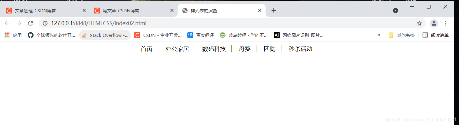
思路:
每个超链接添加右边框,设置内距,最后一个超链接的样式不显示。
在实际网页开发中,作用于同一个元素上的多个样式产生冲突的情况,不可避免的经常发生
当多个样式发生重叠的,优先级别高得样式会生效
因此得名:层叠样式表
19. 选择器得权重
<!DOCTYPE html>
<html>
	<head>
		<meta charset="utf-8">
		<title></title>

		<style type="text/css">

			#p1{
				color: blue;
			}

			*{
				color: orange;
			}

			 .pp{
				color: green;
			}

			 p{
				color: red;
			}

		</style>

	</head>
	<body>

		<p class="pp" id="p1">
			猜猜我是什么颜色
		</p>

	</body>
</html>
规律:
行内样式 > ID 选择器 > 类选择器 > 标签选择器 > 通用选择器
但是光是以上的还不行,遇到复杂的情况就不行了
看下面的一个案例:
<!DOCTYPE html>
<html>
	<head>
		<meta charset="utf-8">
		<title></title>

		<style type="text/css">

			a{
				color: yellow;
			}

			div a {
				color: green;
			};

			.demo a{
				color: black;
			}

			#demo a{
				color: orange;
			}

			div#demo a{
				color: red;
			}

		</style>

	</head>
	<body>

		<a href="">应该是黄色</a>
		<div class="demo">
			<a href="">应该是黑色</a>
		</div>
		<div id="demo">
			<a href="">应该是红色</a>
		</div>

	</body>
</html>
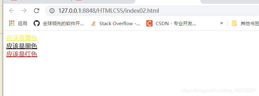
当样式发生冲突的时候,谁的权重值高,谁就生效
通用选择器   权重值:0
标签选择器: 权重值:1
类选择器:  权重值:10
ID选择器: 权重值:100
行内样式 : 权重值:1000
例子:
100      1     10           111
#box      p    .tt

100      10                 110
#box    .tt

选择器选择的范围越小越精确,优先级就越高
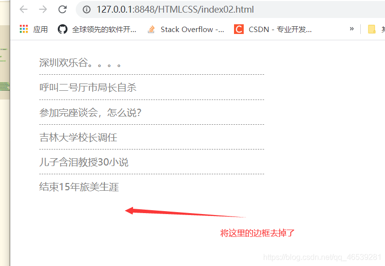
实战案例:
<!DOCTYPE html>
<html>
	<head>
		<meta charset="utf-8">
		<title></title>

		<style type="text/css">

			#news{
				list-style: none;
				width: 370px;
			}

			#news li{
				height: 40px;
				line-height: 40px;
				border-bottom: dashed 1px grey;
			}

			#news li a{
				color: gray;
				text-decoration: none;
			}

			/* 这个样式实现不了,权重值太低了的问题 */
			/* .last{
				border: none;
			} */

			#news .last{
				border: none;
			}

		</style>

	</head>
	<body>

		<ul id="news">
			<li><a href="">深圳欢乐谷。。。。</a></li>
			<li><a href="">呼叫二号厅市局长自杀</a></li>
			<li><a href="">参加完座谈会,怎么说?</a></li>
			<li><a href="">吉林大学校长调任</a></li>
			<li><a href="">儿子含泪教授30小说</a></li>
			<li class="last"><a href="">结束15年旅美生涯</a></li>
		</ul>


	</body>
</html>
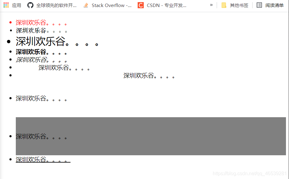
20.css文本属性
字体颜色
字体类型
行高
大小
加粗
倾斜
首行缩进
水平对齐
文字修饰
练习案例:
<!DOCTYPE html>
<html>
	<head>
		<meta charset="utf-8">
		<title></title>

		<style type="text/css">

			.p1{ color: red;} /* 文字颜色  */
			.p2{ font-family: "华文中宋";}/* 字体类型  */
			.p3{ font-size: 26px;}/* 文字大小  */
			.p4{ font-weight: bold;}/* 文字加粗  */
			.p5{ font-style: italic;}/* 文字倾斜  */
			.p6{ text-indent: 60px;}/* 首行缩进  */
			.p7{ text-align: center;}/* 水平对齐方式  */
			.p8{ line-height: 100px;}/* 行高  */
			.p9{ height: 100px;background-color: gray;line-height: 100px;}/* 垂直居中  */
			.p10{ text-decoration: underline;}/* 文本修饰  */

		</style>

	</head>
	<body>

		<ul >
			<li class="p1">深圳欢乐谷。。。。</li>
			<li class="p2">深圳欢乐谷。。。。</li>
			<li class="p3">深圳欢乐谷。。。。</li>
			<li class="p4">深圳欢乐谷。。。。</li>
			<li class="p5">深圳欢乐谷。。。。</li>
			<li class="p6">深圳欢乐谷。。。。</li>
			<li class="p7">深圳欢乐谷。。。。</li>
			<li class="p8">深圳欢乐谷。。。。</li>
			<li class="p9">深圳欢乐谷。。。。</li>
			<li class="p10">深圳欢乐谷。。。。</li>
		</ul>


	</body>
</html>
效果显示:
21. 常见图片格式的区别
红绿篮 称为 三元色
根据这三个颜色的浓度的不同,在计算机里用1-255 的数值来表示。当三种颜色的数值混合在一起的时候,就会产生不同的颜色。
当我们把一张图片无限放的的时候,我们会看到一个一个的像素点。。这个每一个像素点都会保存一个颜色信息,也就是rgb值。
r:红色 g: 绿色 b: 蓝色
图片的格式:
jpg , gif , png
这三种都属于压缩格式,图片为什么要进行压缩呢?方便传输,

 gif: 支持动画,只有全透明和不透明两种模式,只有256种颜色
 jpg:采用有损压缩算法,体积小,不支持透明,不支持动画。
 png:采用无损压缩算法,体积也相对较小,支持背景透明,不支持动画
22.背景图的使用(比较有用的)
<!DOCTYPE html>
<html>
	<head>
		<meta charset="utf-8">
		<title></title>

		<style>
			body{height: 100%;}
		</style>

	</head>

	<!-- body标签也是一个容器 独占一行,默认宽度是撑满整个浏览器窗口的 -->
	<body>
	</body>
</html>
<!DOCTYPE html>
<html>
	<head>
		<meta charset="utf-8">
		<title></title>

		<style>
			html,body{height: 100%;}  /* 这里修改了  */
		</style>

	</head>

	<!-- body标签也是一个容器 独占一行,默认宽度是撑满整个浏览器窗口的 -->
	<body>
	</body>
</html>
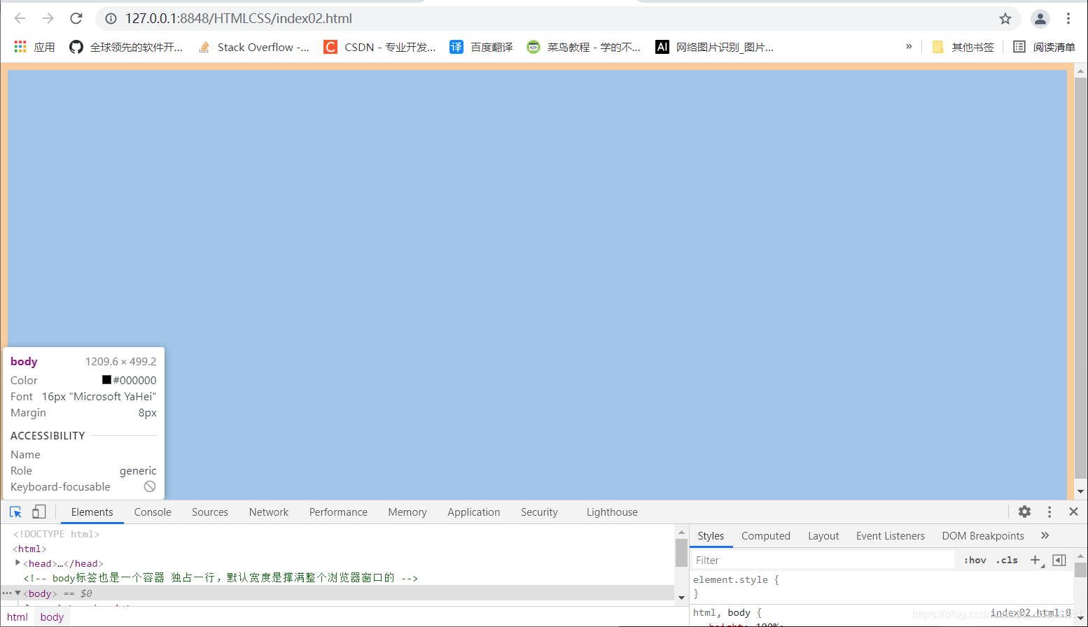
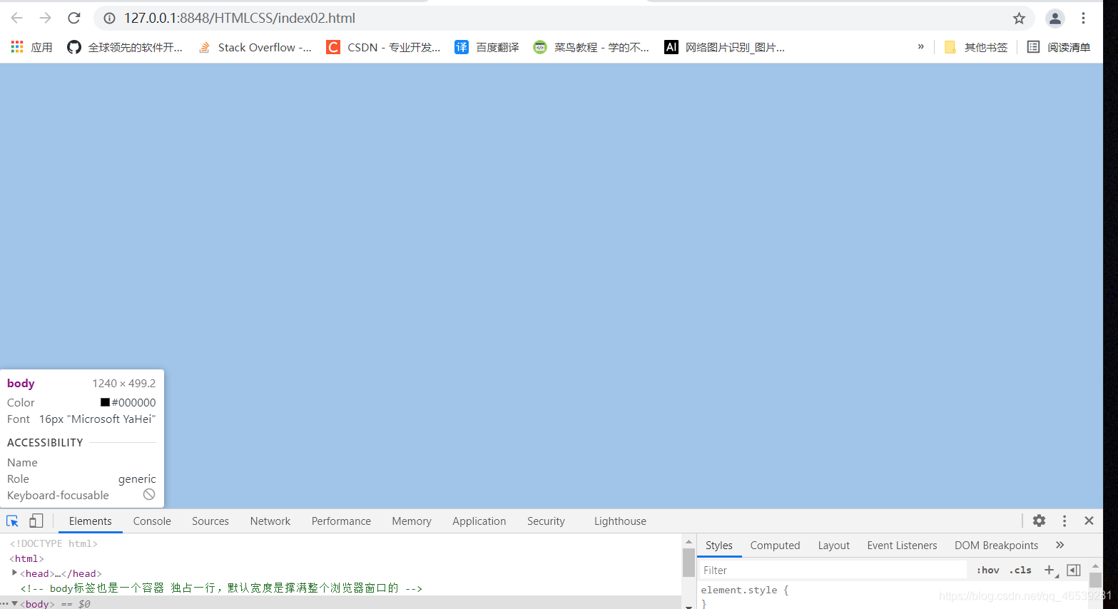
为了解决右边显示的滚动条:
<style>
			html,body{
				height: 100%;
				margin: 0;	  这里
			}
</style>
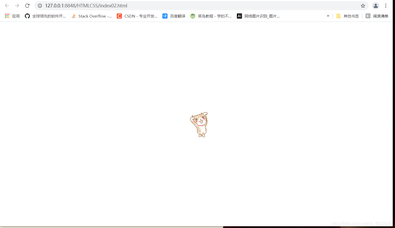
当我们设置背景图片,默认是以平铺的方式展示的。
<!DOCTYPE html>
<html>
	<head>
		<meta charset="utf-8">
		<title></title>

		<style>
			html,body{height: 100%;margin: 0;}

			body{
				background-image: url(imgs/dong.gif);
				background-repeat: no-repeat;  /* 不进行平铺  */
				background-position: center center;
				 /*
				    第一个水平方向: left  center right
					第二个垂直方向: top center bottom
				*/
			}

		</style>

	</head>

	<!-- body标签也是一个容器 独占一行,默认宽度是撑满整个浏览器窗口的 -->
	<body>
	</body>
</html>
可以利用背景图片平铺的方向,设置全屏背景图片
不进行平铺
<style>
			html,body{height: 100%;margin: 0;}

			body{
				background-image: url(imgs/bg.png);
				background-repeat: no-repeat;  /* 不进行平铺  */
			}

		</style>
进行平铺:
<style>
			html,body{height: 100%;margin: 0;}

			body{
				background-image: url(imgs/bg.png);
				/* background-repeat: no-repeat;  /* 不进行平铺  */ */
			}

		</style>
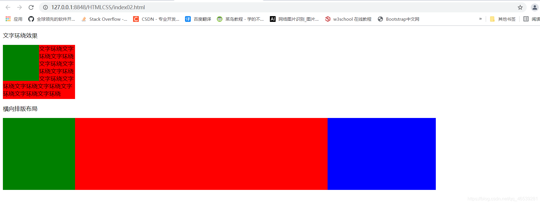
23.元素的浮动布局(上)
html中的元素布局 默认是 从上到下的 。 这个应该注意
浮动元素会脱离网页的文档,与其他元素发生重叠,但是,不会与文字内容发生重叠。(文字环绕效果)(横向排版)
float : left right
<!DOCTYPE html>
<html>
	<head>
		<meta charset="utf-8">
		<title></title>
	</head>
	<style type="text/css">
		.green {
			width: 100px; height: 100px;
			background-color: green;
			float: left;
		}
		.red {
			width: 200px; height: 150px;
			background-color: red;
		}
		.a {
			width: 200px;
			background-color: green;
		}
		.b {
			width: 700px;
			background-color: red;
		}
		.c {
			width: 300px;
			background-color: blue;
		}

		.a,.b,.c {
			float: left; height: 200px;
		}

	</style>
	<body>
		<p>文字环绕效果</p>
		<div class="green"></div>
		<div class="red">
			文字环绕文字环绕文字环绕文字环绕文字环绕文字环绕文字环绕文字环绕文字环绕文字环绕文字环绕文字环绕文字环绕
		</div>

		<p>横向排版布局</p>
		<div class="a"></div>
		<div class="b"></div>
		<div class="c"></div>
	</body>
</html>
24. 元素的浮动布局(中)
消除浮动元素所带来的影响。
background是复合属性
<!DOCTYPE html>
<html>
<head>
<meta charset="utf-8">
<title></title>
</head>
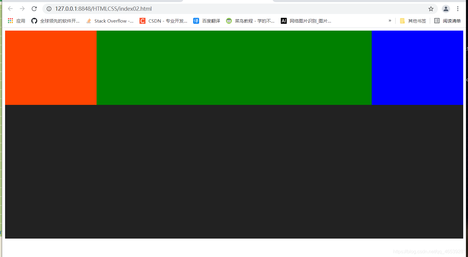
<style type="text/css">
.a{
width: 20%;background: orangered;
}
.b{
width: 60%;background: green;
}
.c{
width: 20%;background: blue;
}
.a ,.b,.c{
float: left;height: 200px;
}
.hh{
height: 360px;background: #222222;
}
</style>
<body>
<div class="a"></div>
<div class="b"></div>
<div class="c"></div>
<div class="hh"></div>
</body>
</html>
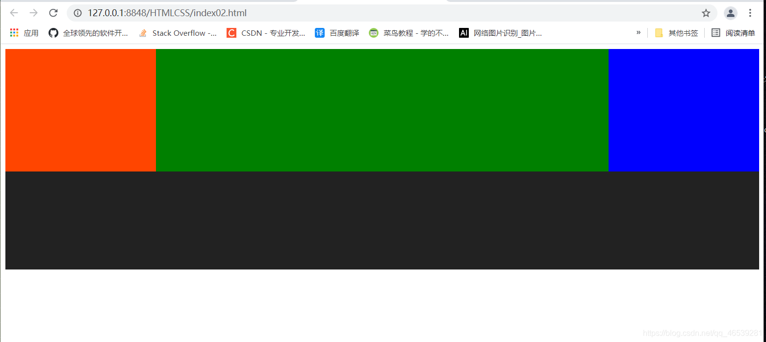
浮动的影响
解决办法:父元素设置高度即可
<!DOCTYPE html>
<html>
	<head>
		<meta charset="utf-8">
		<title></title>
	</head>
	<style type="text/css">

		.a{
			width: 20%;background: orangered;
		}

		.b{
			width: 60%;background: green;
		}

		.c{
			width: 20%;background: blue;
		}

		.a ,.b,.c{
			float: left;height: 200px;
		}

		.hh{
			height: 360px;background: #222222;
		}

		.outer{
			height: 200px;
		}

	</style>
	<body>
		<div class="outer">
			<div class="a"></div>
			<div class="b"></div>
			<div class="c"></div>
		</div>

		<div class="hh"></div>

	</body>
</html>
浮动元素是不会撑开父容器的高度的。
常见办法清除浮动元素的影响:
给浮动元素的父元素添加overflow:auto;   保证父元素的高度保持正常。 overflow 溢出
对于超出父元素边界的元素,父元素可以做自动的调整高度。
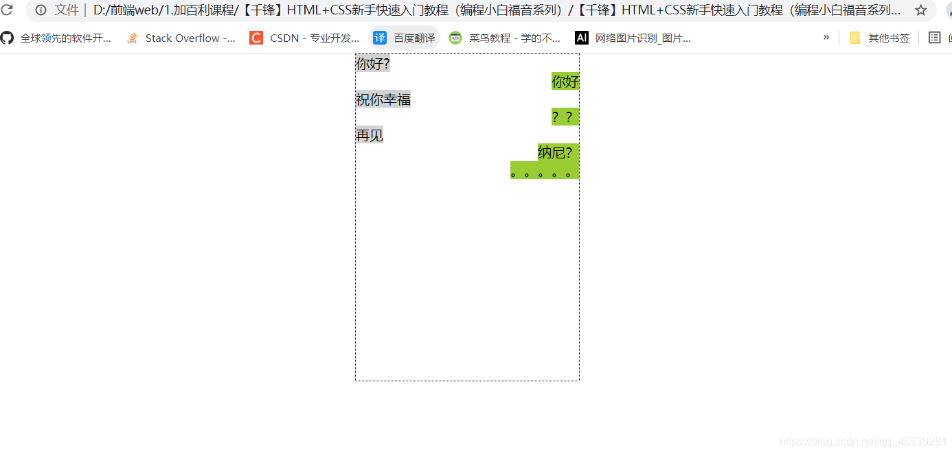
clear:left/right/both
清除元素所代来的影响。当前元素不受上一个浮动元素的影响的时候,就可以这么做。
clear的案例:
<!DOCTYPE html>
<html>
	<head>
		<meta charset="utf-8" />
		<title>聊天对话框</title>
		<style type="text/css">
			* {
				padding: 0;
				margin: 0; /*这行样式必须写,后面的章节会介绍*/
			}

			.content {
				list-style: none; /*将无序列表的默认样式去掉*/
				width: 260px;
				height: 380px;
				margin: auto; /*这个样式可以让对话框居中,不信删掉试试看?*/
				border: 1px dotted black; /*合并的写法*/
			}

			.content .msg {
				clear: both;
			}

			.content .left {
				float: left;
				background: lightgrey;
			}

			.content .right {
				float: right;
				background: yellowgreen;
			}
		</style>
	</head>

	<body>
		<ul class="content">
			<li class="msg left">你好?</li>
			<li class="msg right">你好</li>
			<li class="msg left">祝你幸福</li>
			<li class="msg right">??</li>
			<li class="msg left">再见</li>
			<li class="msg right">纳尼?</li>
			<li class="msg right">。。。。。</li>
		</ul>
	</body>
</html>
25.元素的浮动布局(下)
浮动元素排列的特点:
浮动元素在排列时,只参考前一个元素位置即可。


右浮动的顺序问题:
元素左浮动排列

元素右浮动的排列

浮动元素的重叠问题:

26.为什么需要盒子模型(上)
设置边距

<!DOCTYPE html>
<html>
	<head>
		<meta charset="utf-8">
		<title></title>
	</head>
	<style type="text/css">
		*{
			margin: 0;
			/* 将所有元素边距都设置为0 */
		}

		#box{
			width: 750px;
			overflow: auto;
			margin: auto;
			/*让父元素自动设置边距,左右边距相等,即可达到居中的效果,水平方向有效*/
		}

		.item{
			width: 210px;height:136px;
			float: left;
			margin: 20px;
		}

	</style>
	<body>
		<div id="box">
			<div class="item" style="background: url(img/01.png);"></div>
			<div class="item" style="background: url(img/02.png);"></div>
			<div class="item" style="background: url(img/03.png);"></div>
		</div>


	</body>
</html>
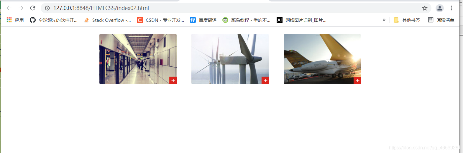

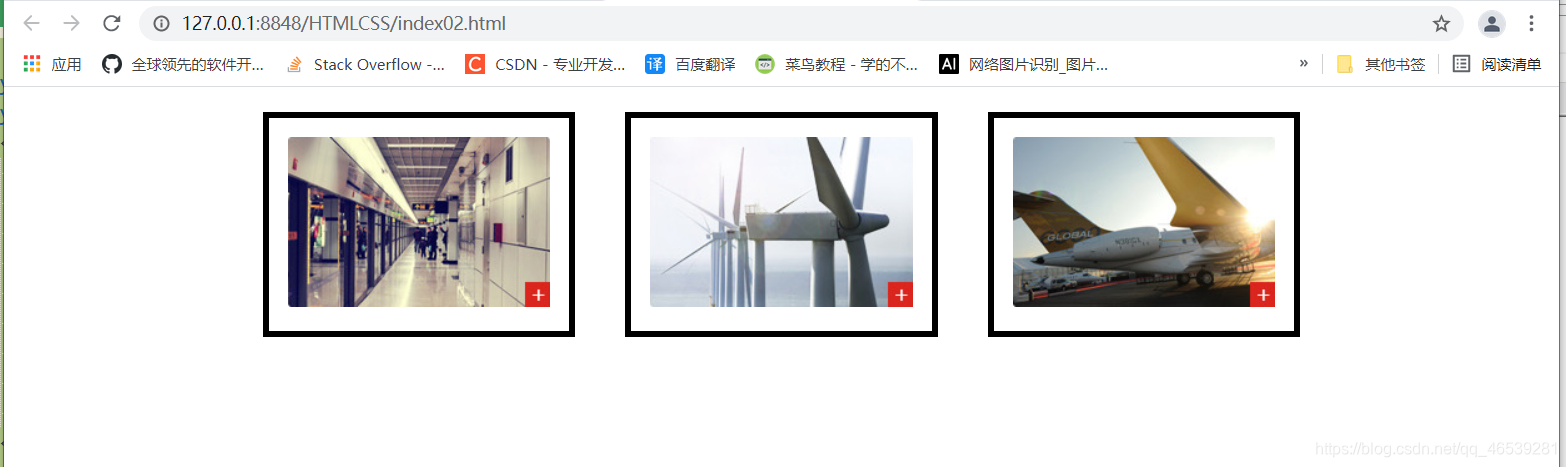
27.为什么需要盒子模型(下)
设置填充


<!DOCTYPE html>
<html>
	<head>
		<meta charset="utf-8">
		<title></title>
	</head>
	<style type="text/css">
		*{
			margin: 0;
			/* 将所有元素边距都设置为0 */
		}

		#box{
			width: 870px;
			overflow: auto;
			margin: auto;
			/*让父元素自动设置边距,左右边距相等,即可达到居中的效果,水平方向有效*/
		}

		.item{
			/* width: 210px;height:136px; */
			float: left;
			margin: 20px;
			border: 5px solid black;
			padding: 15px;
		}


	</style>
	<body>
		<div id="box">
			<div class="item">
				<img src="img/01.png" />
			</div>
			<div class="item">
				<img src="img/02.png" />
			</div>
			<div class="item">
				<img src="img/03.png" />
			</div>
		</div>


	</body>
</html>

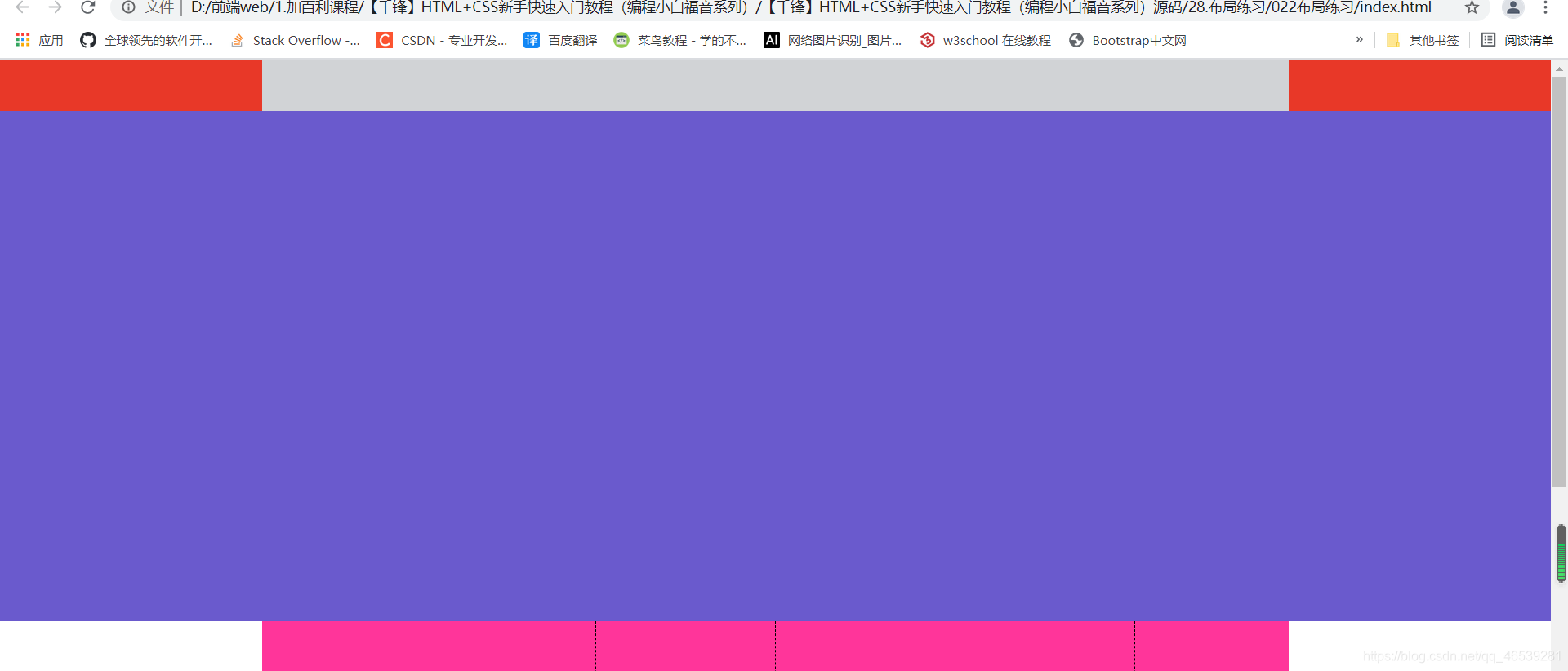
28.布局练习

主要内容部分:高 1005px


<!DOCTYPE html>
<html>
<head>
<meta charset="utf-8">
<title></title>
<style>
* {
margin: 0; padding: 0;
}
#header {
height: 50px;
background: #E83828;
}
#header .head {
width: 1005px; height: 50px;
background: #D1D3D6;
margin: auto; /*居中显示*/
}
#banner {
height: 500px;
background: slateblue;
}
#category {
width: 1005px; height: 200px;
margin: auto; /*居中显示*/
background: #FF359A;
}
#category .item {
width: 125px; height: 165px; /*设置大小*/
padding-left: 25px; /*左填充*/
padding-right:25px; /*右填充*/
padding-bottom: 25px; /*下填充*/
padding-top: 10px; /*上填充*/
border-right: 1px dashed black; /*右边框,1像素,虚线 ,黑色*/
float: left; /*左浮动*/
}
#category .item.first {
padding-left: 0; /*取消左填充*/
}
#category .item.last {
padding-right: 0; /*取消右填充*/
border: 0; /*取消边框*/
}
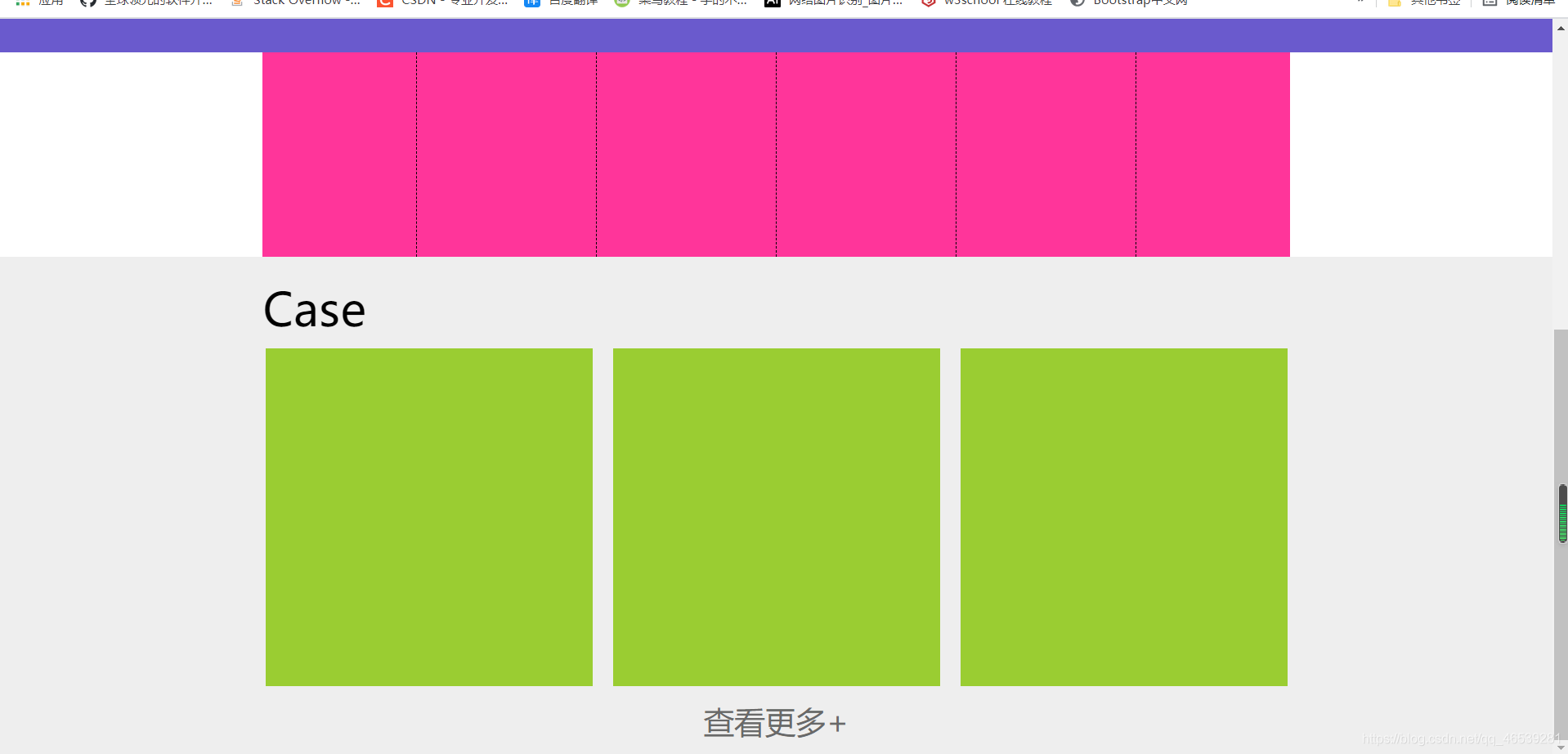
#case { height: 490px; background: #eeeeee; }
#case .title-text {
width: 1005px;
margin: auto; /*水平居中*/
padding-top: 20px; /*上填充*/
padding-bottom: 10px; /*下填充*/
font-size: 45px; /*字体大小*/
}
#case .item-wrapper {
width: 1000px;
margin: auto; /*水平居中*/
overflow: auto; /*自动设置高度,防止因子元素浮动而高度塌陷*/
}
#case .item-wrapper .item {
width: 320px; height: 330px; background: #9ACD32;
float: left; /*左浮动*/
}
#case .item-wrapper .item.mg { margin-left:20px; margin-right:20px; /*左右边距*/ }
#case p {
width: 1005px; height: 40px;
margin-left: auto; margin-right: auto; /*水平居中*/
margin-top: 15px; /*上边距*/
line-height: 40px; /*行高和高度一致时,文字垂直居中*/
text-align: center; /*文字水平居中*/
font-size: 30px; /*字体大小*/
color: dimgray; /*字体颜色*/
}
</style>
</head>
<body>
<div id="header">
<div class="head"></div>
</div>
<div id="banner"></div>
<div id="category">
<div class="item first"></div>
<div class="item"></div>
<div class="item"></div>
<div class="item"></div>
<div class="item"></div>
<div class="item last"></div>
</div>
<div id="case">
<div class="title-text">
Case
</div>
<div class="item-wrapper">
<div class="item"></div>
<div class="item mg"></div>
<div class="item"></div>
</div>
<p>查看更多+</p>
</div>
</body>
</html>
效果:
29 css属性简写
background

顺序必须是按照这样的。
border:

只有颜色是可以省略的。
font

margin:
margin : 10 px  15px 10px  15px    上下左右

margin:      10 px     15px      10px
             上         左右      下

margin:    10 px       15px
             上下       左右


margin:        10 px
             上下 左右

padding: 跟margin规则一样的。

颜色:

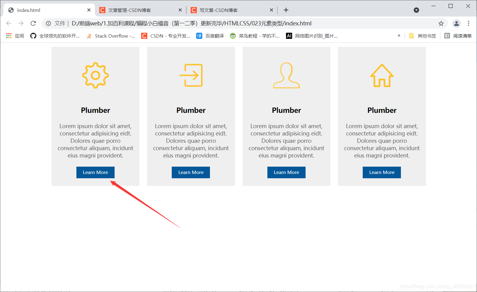
30 元素的不同类型


<!DOCTYPE html>
<html>
	<head>
		<meta charset="utf-8">
		<title></title>
	</head>
	<style>
		* {
			margin: 0; padding: 0;
			font-family: "微软雅黑";
		}
		.container {
			width: 1000px;
			overflow: auto;
			margin: auto;
		}
		.container .subject {
			width: 200px;
			background: #EFEFEF;
			margin: 10px;
			text-align: center;
			padding: 0 15px;
			float: left;
		}
		.container .subject img {
			margin: 40px 20px;
		}
		.container .subject .title {
			font: bold 18px "微软雅黑";
		}
		.container .subject .content {
			padding: 20px 0;
			font-size: 14px;
			color: #666;
		}
		.container .subject a {
			text-decoration: none;
			background: #045899;
			color: white;
			font-size: 12px;
			width: 100px;
			height: 30px;
			line-height: 30px;
			display: block;		这里
			margin: 0 auto 20px;
		}
	</style>
	<body>
		<div class="container">
			<div class="subject">
				<img src="imgs/ziyuan.png" width="70">
				<p class="title">Plumber</p>
				<div class="content">
					Lorem ipsum dolor sit amet, consectetur adipisicing eidt. Dolores quae porro consectetur aliquam, incidunt eius magni provident.
				</div>
				<a href="">Learn More</a>
			</div>
			<div class="subject">
				<img src="imgs/daoru.png" width="70">
				<p class="title">Plumber</p>
				<div class="content">
					Lorem ipsum dolor sit amet, consectetur adipisicing eidt. Dolores quae porro consectetur aliquam, incidunt eius magni provident.
				</div>
				<a href="">Learn More</a>
			</div>
			<div class="subject">
				<img src="imgs/wode.png" width="70">
				<p class="title">Plumber</p>
				<div class="content">
					Lorem ipsum dolor sit amet, consectetur adipisicing eidt. Dolores quae porro consectetur aliquam, incidunt eius magni provident.
				</div>
				<a href="">Learn More</a>
			</div>
			<div class="subject">
				<img src="imgs/home.png" width="70">
				<p class="title">Plumber</p>
				<div class="content">
					Lorem ipsum dolor sit amet, consectetur adipisicing eidt. Dolores quae porro consectetur aliquam, incidunt eius magni provident.
				</div>
				<a href="">Learn More</a>
			</div>
		</div>
	</body>
</html>
31.布局中的定位(上)
position: absolute 绝对 必须添加这个属性,才会生效
相对哪个容器进行定位,这个容器必须添加上position:relative 属性


案例:
<!DOCTYPE html>
<html>
	<head>
		<meta charset="utf-8">
		<title></title>
	</head>
	<style type="text/css">
		html,body {
			margin: 0; padding:0;
		}
		.box {
			width: 1200px; height: 541px;
			background: url(imgs/map.png);
			margin: 10px auto;
			position: relative;
		}
		.p1 {
			left: 149px; top: 144px;
			position: absolute;

		}

		.p1 .point {
			width:15px; height:15px;
			background: #4682B4;
			float: left;
		}
		.p1 .info {
			float: left;
			line-height: 15px;
		}
	</style>
	<body>
		<div class="box">
			<div class="p1">
				<span class="point"></span>
				<span class="info">美西</span>
			</div>
		</div>
	</body>
</html>
32.布局中的定位(下)
注意定位中的 left top 是可以去负数的。
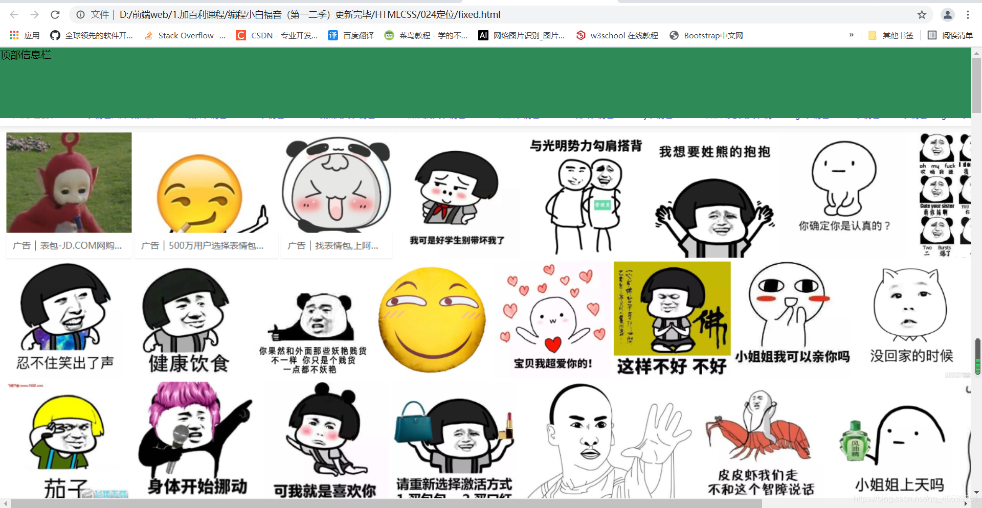
相对对于整个网页来进行定位的,叫固定定位。
position:fixed
可以发现这个元素是固定的,在整个网页中。

案例:
<!DOCTYPE html>
<html>
	<head>
		<meta charset="utf-8" />
		<title>无标题文档</title>
		<style>
			body {
				height: 2500px;
				padding: 0;
				margin: 0;
			}
			#div1 {
				width: 100%;
				height: 110px;
				background: seagreen;
				position: fixed;
				left: 0; top: 0;
			}
		</style>
	</head>

	<body>
		<div id="div1">
			顶部信息栏
		</div>
		<div>
			<img src="imgs/sousuo.png" >
		</div>
	</body>

</html>
注意:子元素相对于父元素定位的规则


子元素会一层一层向上找父元素中是否有postion属性,来进行定位/没有就根据整个网页也就是html容器进行定位。
33.hover鼠标划入效果
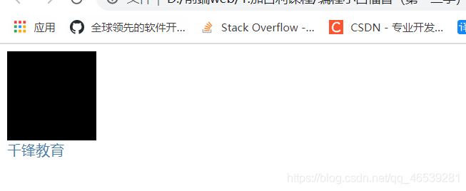
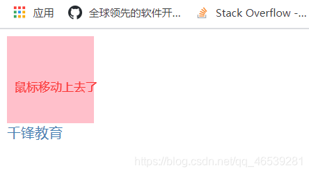
:hover 属性,鼠标移动上去,样式会发生改变 , 任何属性都可以使用:hover
案例:
<!DOCTYPE html>
<html>
	<head>
		<meta charset="utf-8">
		<title></title>
	</head>
	<style>
		.test {
			width: 100px; height: 100px;
			background: #000000;
		}
		.test:hover {
			background: pink;
		}
		.info {
			color: steelblue;
			text-decoration: none;
		}
		.info:hover {
			text-decoration: underline;
		}
	</style>
	<body>
		<div class="test">

		</div>

		<a href="http://www.mobiletrain.org" class="info">千锋教育</a>
	</body>
</html>
练习的案例:
<!DOCTYPE html>
<html>
	<head>
		<meta charset="utf-8">
		<title></title>
	</head>
	<style type="text/css">
		* {
			padding: 0;
		}
		ul {
			list-style: none;
		}
		ul li {
			float: left;
			margin-right: 10px;
		}
		ul li div {
			width:100px; height:100px;
			background: cadetblue;
		}
		ul li.a1:hover div {
			background: url(images/timg.jpg) 0 0;
		}
		ul li.a2:hover div {
			background: url(images/timg.jpg) -100px 0;
		}
		ul li.a3:hover div {
			background: url(images/timg.jpg) -200px 0;
		}
		ul li.a4:hover div {
			background: url(images/timg.jpg) 0px -100px;
		}
		ul li.a5:hover div {
			background: url(images/timg.jpg) -100px -100px;
		}
		ul li.a6:hover div {
			background: url(images/timg.jpg) -200px -100px;
		}
		ul li.a7:hover div {
			background: url(images/timg.jpg) 0px -200px;
		}
		ul li.a8:hover div {
			background: url(images/timg.jpg) -100px -200px;
		}
		ul li.a9:hover div {
			background: url(images/timg.jpg) -200px -200px;
		}
	</style>
	<body>
		<ul>
			<li class="a1">
				001
				<div></div>
			</li>
			<li class="a2">
				002
				<div></div>
			</li>
			<li class="a3">
				003
				<div></div>
			</li>
			<li class="a4">
				004
				<div></div>
			</li>
			<li class="a5">
				005
				<div></div>
			</li>
			<li class="a6">
				006
				<div></div>
			</li>
			<li class="a7">
				007
				<div></div>
			</li>
			<li class="a8">
				008
				<div></div>
			</li>
			<li class="a9">
				009
				<div></div>
			</li>
		</ul>
	</body>
</html>
34.写在前面的话
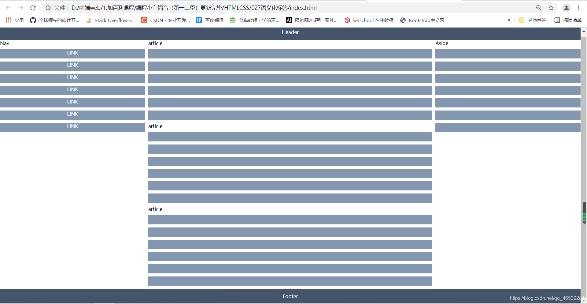
35.语义化标签
语义化标签来进行代替div标签,方便查看
nav  网页的导航部分,aside 网页的侧边栏部分
网页的主体部分,每一个单元用一个article标签进行替代。


不想容器的大小发生改变,又想有填充,可以使用这个属性。

案例:
<!DOCTYPE html>
<html>
	<head>
		<meta charset="utf-8">
		<title></title>
		<style type="text/css">
			* {
				margin:0; padding: 0;
			}
			header, footer {
				height: 50px; background-color: #44546A;
				text-align: center; color: white;
				line-height: 50px;
			}
			main {
				overflow: auto;
			}
			nav,section,aside {
				float: left;
			}
			main>nav {
				width: 25%;
			}
			main>section {
				width: 50%;
				padding: 0 10px;
				box-sizing: border-box;
			}
			main>aside {
				width:25%;
			}
			p {
				height: 30px; background-color: #8497B0;
				text-align: center; margin: 10px 0;
				color: white;
			}
		</style>
	</head>
	<body>
		<header>
			Header
		</header>
		<main>
			<nav>Nav
				<p>LINK</p>
				<p>LINK</p>
				<p>LINK</p>
				<p>LINK</p>
				<p>LINK</p>
				<p>LINK</p>
				<p>LINK</p>
			</nav>
			<section>
				<article>
					article
					<p></p>
					<p></p>
					<p></p>
					<p></p>
					<p></p>
					<p></p>
				</article>
				<article>
					article
					<p></p>
					<p></p>
					<p></p>
					<p></p>
					<p></p>
					<p></p>
				</article>
				<article>
					article
					<p></p>
					<p></p>
					<p></p>
					<p></p>
					<p></p>
					<p></p>
				</article>
			</section>
			<aside>
				Aside
				<p></p>
				<p></p>
				<p></p>
				<p></p>
				<p></p>
				<p></p>
				<p></p>
			</aside>
		</main>
		<footer>
			Footer
		</footer>
	</body>
</html>
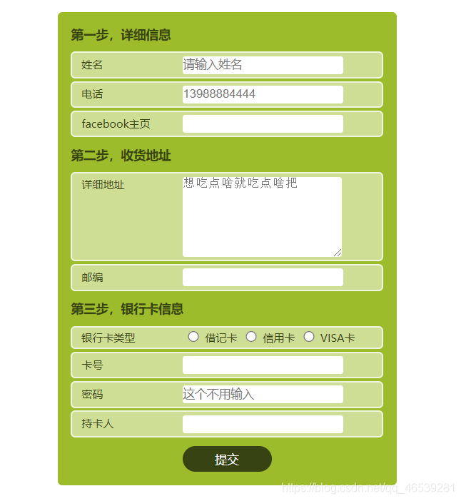
36.智能表单
有关样式的写法:
		外->内

			1. 外边距,填充,
			2. 边框的 颜色,粗细,solid ,弧度
			3. 背景颜色
			4. 字体  大小,类型,粗细,行高等等

方便查看可以先写边框。


<!DOCTYPE html>
<html>
	<head>
		<meta charset="utf-8">
		<title></title>
	</head>
	<style>
		* {
			padding: 0; margin: 0;
		}
		form {
			width: 350px;
			background-color: #9CBC2B;
			margin: 20px auto;
			padding: 5px 15px;
			color: #364411;
			border-radius: 5px;
		}
		.step {
			font-size: 14px;
			font-weight: bold;
			margin: 10px 0;
		}
		.form-line {
			border-radius: 5px;
			border-color: #F0F5DF;
			border-width: 2px;
			border-style: solid;
			padding: 3px;
			margin: 3px 0;
			background-color: #CEDE95;
			font-size: 12px;
			padding-left: 10px;
		}
		.form-line span {
			display: inline-block;
			width: 110px;
		}
		.form-line input {
			background: white;
			border: none;
			height: 20px;
			border-radius: 3px;
			width: 180px;
		}
		.form-line input[type=radio] {
			width: 25px;
			height: 12px;
		}
		.form-line textarea {
			width: 180px;
			height: 70px;
			vertical-align: top;
			border: none;
			border-radius: 3px;
		}
		input.submit-btn {
			border: none;
			background-color: #374313;
			color: white;
			display: block;
			width: 100px;
			padding: 5px 0;
			border-radius: 20px;
			margin: 10px auto;
		}
	</style>
	<body>
		<form action="">
			<section>
				<p class="step">第一步,详细信息</p>
				<p class="form-line">
					<span>姓名</span>
					<input type="text" placeholder="请输入姓名">
				</p>
				<p class="form-line">
					<span>电话</span>
					<input type="text" placeholder="13988884444">
				</p>
				<p class="form-line">
					<span>facebook主页</span>
					<input type="url">
				</p>
			</section>
			<section>
				<p class="step">第二步,收货地址</p>
				<p class="form-line">
					<span>详细地址</span>
					<textarea placeholder="想吃点啥就吃点啥把"></textarea>
				</p>
				<p class="form-line">
					<span>邮编</span>
					<input type="text" >
				</p>
			</section>
			<section>
				<p class="step">第三步,银行卡信息</p>
				<p class="form-line">
					<span>银行卡类型</span>
					<input type="radio" name="cardType">借记卡
					<input type="radio" name="cardType">信用卡
					<input type="radio" name="cardType">VISA卡
				</p>
				<p class="form-line">
					<span>卡号</span>
					<input type="number" >
				</p>
				<p class="form-line">
					<span>密码</span>
					<input type="number" placeholder="这个不用输入" >
				</p>
				<p class="form-line">
					<span>持卡人</span>
					<input type="text" >
				</p>
			</section>
			<p>
				<input type="submit" class="submit-btn" value="提交">
			</p>
		</form>
	</body>
</html>
37.知识点补充
发现上面的这个案例中的文本框的大小是可以随意改变的。

不希望可以随意改变:
resize:none ;   resize表示重设大小

垂直方向进行该改变大小
resize:vertical;     vertical 表示垂直方向
resize:horizontal;   表示水平方向进行调整
当鼠标移动到按钮上的时候,通常情况下,鼠标变成一个小手的形状。
找到按钮的样式。
cursor:pointer;    cursor表示光标 ,pointerb表示指针。

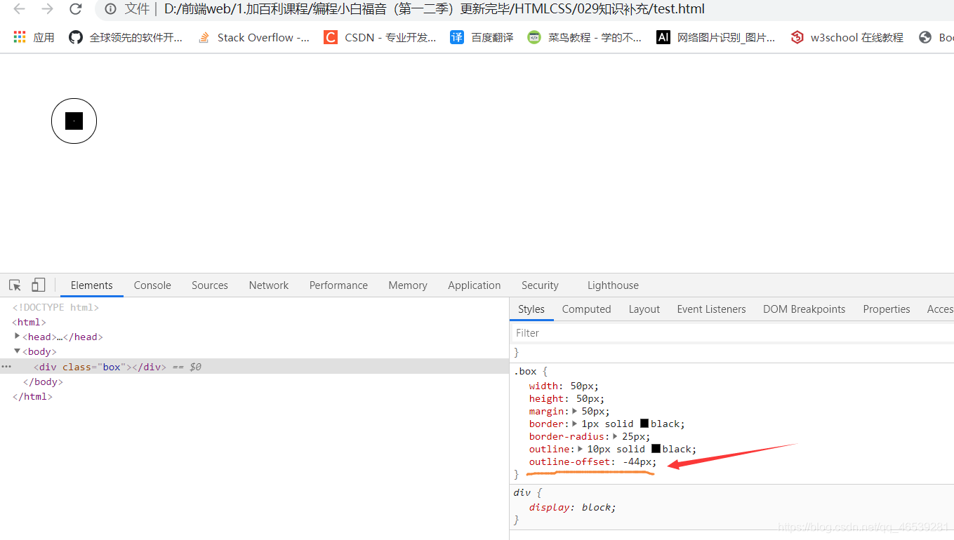
不想要看到轮廓可以这么修改。
outline:none; outline表示轮廓。
下面有关outline的案例:
<!DOCTYPE html>
<html>
	<head>
		<meta charset="utf-8">
		<title></title>
	</head>
	<style>
		.box {
			width: 50px; height: 50px;
			margin: 50px;
			border: 1px solid black;
			border-radius: 25px;
			outline: 10px solid black;
			outline-offset: -35px;
		}
	</style>
	<body>
		<div class="box"></div>
	</body>
</html>


 扫一扫
扫一扫


 2014
2014

 被折叠的 条评论
为什么被折叠?
被折叠的 条评论
为什么被折叠?
 到【灌水乐园】发言


