


 本文介绍了一种响应式网站设计,通过CSS和媒体查询实现不同设备上的灵活布局,包括可调整的导航栏、卡片式文章组织和自适应列。展示了如何在浏览器窗口调整时保持良好视觉效果。
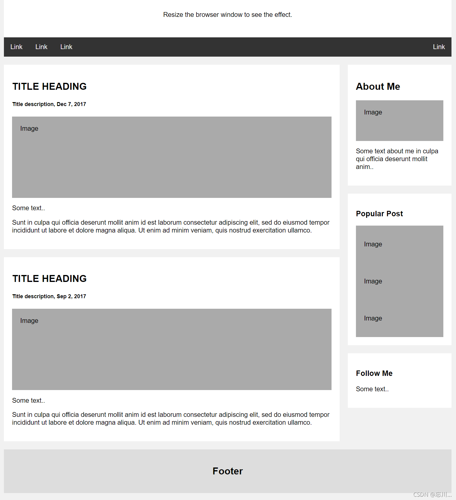
效果如下:
代码如下:
<!DOCTYPE html>
<html lang="en">

<head>
    <meta charset="UTF-8">
    <meta http-equiv="X-UA-Compatible" content="IE=edge">
    <meta name="viewport" content="width=device-width, initial-scale=1.0">
    <title>Document</title>
    <style>
        * {
            box-sizing: border-box;
        }

        body {
            font-family: Arial;
            padding: 10px;
            background: #f1f1f1;
        }

        .wrap {
            max-width: 1100px;
            margin: 0 auto;
        }
        /* 页眉/Blog 标题 */

        .header {
            padding: 30px;
            text-align: center;
            background: white;
        }

        .header h1 {
            font-size: 50px;
        }
        /* 设置上导航栏的样式 */

        .topnav {
            overflow: hidden;
            background-color: #333;
        }
        /* 设置 topnav 链接的样式 */

        .topnav a {
            float: left;
            display: block;
            color: #f2f2f2;
            text-align: center;
            padding: 14px 16px;
            text-decoration: none;
        }
        /* 改变鼠标悬停时的颜色 */

        .topnav a:hover {
            background-color: #ddd;
            color: black;
        }
        /* 创建两个不相等的彼此并排的浮动列 */
        /* 左列 */

        .leftcolumn {
            float: left;
            width: 75%;
        }
        /* 右列 */

        .rightcolumn {
            float: left;
            width: 25%;
            background-color: #f1f1f1;
            padding-left: 20px;
        }
        /* 伪图像 */

        .fakeimg {
            background-color: #aaa;
            width: 100%;
            padding: 20px;
        }
        /* 为文章添加卡片效果 */

        .card {
            background-color: white;
            padding: 20px;
            margin-top: 20px;
        }
        /* 清除列之后的浮动 */

        .row:after {
            content: "";
            display: table;
            clear: both;
        }
        /* 页脚 */

        .footer {
            padding: 20px;
            text-align: center;
            background: #ddd;
            margin-top: 20px;
        }
        /* 响应式布局 - 当屏幕的宽度小于 800 像素时,使两列堆叠而不是并排 */

        @media screen and (max-width: 800px) {
            .leftcolumn,
            .rightcolumn {
                width: 100%;
                padding: 0;
            }
        }
        /* 响应式布局 - 当屏幕的宽度小于 400 像素时,使导航链接堆叠而不是并排 */

        @media screen and (max-width: 400px) {
            .topnav a {
                float: none;
                width: 100%;
            }
        }
    </style>
</head>

<body>
    <div class="wrap">
        <div class="header">
            <h1>Banner</h1>
            <p>Resize the browser window to see the effect.</p>
        </div>

        <div class="topnav">
            <a href="#">Link</a>
            <a href="#">Link</a>
            <a href="#">Link</a>
            <a href="#" style="float:right">Link</a>
        </div>

        <div class="row">
            <div class="leftcolumn">
                <div class="card">
                    <h2>TITLE HEADING</h2>
                    <h5>Title description, Dec 7, 2017</h5>
                    <div class="fakeimg" style="height:200px;">Image</div>
                    <p>Some text..</p>
                    <p>Sunt in culpa qui officia deserunt mollit anim id est laborum consectetur adipiscing elit, sed do eiusmod tempor incididunt ut labore et dolore magna aliqua. Ut enim ad minim veniam, quis nostrud exercitation ullamco.</p>
                </div>
                <div class="card">
                    <h2>TITLE HEADING</h2>
                    <h5>Title description, Sep 2, 2017</h5>
                    <div class="fakeimg" style="height:200px;">Image</div>
                    <p>Some text..</p>
                    <p>Sunt in culpa qui officia deserunt mollit anim id est laborum consectetur adipiscing elit, sed do eiusmod tempor incididunt ut labore et dolore magna aliqua. Ut enim ad minim veniam, quis nostrud exercitation ullamco.</p>
                </div>
            </div>
            <div class="rightcolumn">
                <div class="card">
                    <h2>About Me</h2>
                    <div class="fakeimg" style="height:100px;">Image</div>
                    <p>Some text about me in culpa qui officia deserunt mollit anim..</p>
                </div>
                <div class="card">
                    <h3>Popular Post</h3>
                    <div class="fakeimg">
                        <p>Image</p>
                    </div>
                    <div class="fakeimg">
                        <p>Image</p>
                    </div>
                    <div class="fakeimg">
                        <p>Image</p>
                    </div>
                </div>
                <div class="card">
                    <h3>Follow Me</h3>
                    <p>Some text..</p>
                </div>
            </div>
        </div>

        <div class="footer">
            <h2>Footer</h2>
        </div>
    </div>
</body>

</html>
后期会增加更多响应式布局


 扫一扫
扫一扫


 965
965

 被折叠的 条评论
为什么被折叠?
被折叠的 条评论
为什么被折叠?
 到【灌水乐园】发言


