


首先就是适配的问题
1.可以用vw vh的单位去根据屏幕的大小进行适配(如果大屏内容不是很多可以用)
  .text{
     font-family: Microsoft YaHei;
     font-weight: 400;
     font-size: 1.6vw;
     color: #12fffb;
     line-height: 1vh;
     text-align: center;
}2.推荐还有就是用到scale属性进行屏幕的放大缩小(前提等比的屏幕放大缩小否则会变形)
<1>首先获取窗口的屏幕大小。
<2>用window去监听窗口进行实时变化。
<3>一般把他做成组件使用
完整代码如下:
<template>
  <div class="bsd-frame" ref="bsdFrame">
    <slot></slot>
  </div>
</template>

<script>
import screenfull from "screenfull";
export default {
  name: "frame",
  props: {
    width: {
      type: Number,
      default: 1920,
    },
    height: {
      type: Number,
      default: 1080,
    },
  },
  data() {
    return {
      frameWidth: 0,
      frameHeight: 0,
    };
  },
  methods: {
    setSize() {
      this.frameWidth = this.width || screen.width;
      this.frameHeight = this.height || screen.height;
      const frame = this.$refs.bsdFrame;
      frame.style.width = this.frameWidth + "px";
      frame.style.height = this.frameHeight + "px";
    },
    setScale() {
      this.setSize();
      const bodyWidth = document.body.clientWidth;
      const bodyHeight = document.body.clientHeight;
      const scaleX = bodyWidth / this.frameWidth;
      const scaleY = bodyHeight / this.frameHeight;
      this.$refs.bsdFrame.style.transform = `scale(${scaleX},${scaleY})`;
      // 设置缩放比例到sessionStorage
      sessionStorage.setItem("scaleX", scaleX);
      sessionStorage.setItem("scaleY", scaleY);
      sessionStorage.setItem("devicePixelRatio", scaleX > 2 ? scaleX : 2);
    },
  },
  mounted() {
    this.setScale();
    document.addEventListener("keydown", (event) => {
      if (event.code == "F11") {
        event.preventDefault();
        screenfull.toggle();
      }
    });
    window.addEventListener("resize", this.setScale);

    if (screenfull.enabled) {
      screenfull.on("change", () => {
        this.setScale();
      });
    }
  },
  destroyed() {
    window.removeEventListener("resize", this.setScale);

  },
};
</script>

<style scoped>
.bsd-frame {
  position: fixed;
  transform-origin: left top;
  -webkit-font-smoothing: antialiased;
}
</style>
3.在大屏上echarts 被放大缩小后变得很模糊了,如何解决?
出现问题后的效果图:

解决方法:把他整体转化成svg图片,虽然有可能会被拉扁,但是文字不会变模糊
echarts.init(document.getElementById("id名"), null, {
    renderer: "svg",
 });
4.如果用到vw vh的放大画大屏,echarts的文字和图例以及柱状图柱的大小,如何去自适应?
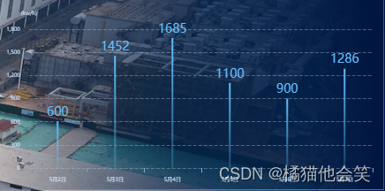
放在很大的页面的话有可能会出现如下图的情况:
遇到这个问题我巧妙的用到了一个方法,不仅可以控制字体大小也可以控制住的宽,直接上代码,把他做成插件的形式,放到全局进行挂载,直接这样用就可以了。
export function fontSize (res) {
    let docEl = document.documentElement,
        clientWidth = window.innerWidth || document.documentElement.clientWidth || document.body.clientWidth;
    if (!clientWidth) return;
    let fontSize = 100 * (clientWidth / 1920);
    return res * fontSize;
}
export default {
    fontSize
}
 let myChart = echarts.init(this.$refs.barChart);
      myChart.clear();
      let option = {
        tooltip: {
          trigger: "axis",
          axisPointer: {
            lineStyle: {
              color: "#ddd",
            },
          },
          padding: [5, 10],
          textStyle: {
            color: "#C8DDF5",
          },
          backgroundColor: "rgb(0, 6, 16,0.6)",
          borderWidth: 0,
          extraCssText: "box-shadow: 0 0 5px rgba(0,0,0,0.3)",
        },
        legend: {
          show: false,
          right: 20,
          orient: "horizontal",
          icon: "rect",
          itemWidth: 20,
          itemHeight: 3,
          textStyle: {
            color: "#fff",
          },
          data: ["自来水", "中水"],
        },
        grid: {
          left: "3%",
          top: "16%",
          right: "3%",
          bottom: 0,
          containLabel: true,
        },
        xAxis: {
          type: "category",
          data: dataName,
          splitLine: {
            show: false,
            interval: "auto",
            lineStyle: {
              color: ["#D4DFF5"],
            },
          },
          axisTick: {
            show: true,
          },
          axisLine: {
            show: false,
            lineStyle: {
              color: "#82A6D5",
            },
          },
          axisLabel: {
            margin: 10,
            textStyle: {
              fontSize: this.fontSize(0.6),
              color: "#C8DDF5",
            },
          },
        },
        yAxis: {
          type: "value",
          name: "(kw/h)",
          nameTextStyle:{
            fontSize:this.fontSize(0.6)
          },
          splitLine: {
            lineStyle: {
              type: "dashed",
              color: "rgba(178,194,211,0.4)",
            },
          },
          axisTick: {
            show: false,
          },
          axisLine: {
            lineStyle: {
              color: "#C8DDF5",
            },
          },
          axisLabel: {
            margin: 10,
            textStyle: {
              fontSize: this.fontSize(0.6),
            },
          },
        },
        series: [
          {
            name: "用电量",
            type: "bar",
            smooth: true,
            showSymbol: false,
            symbol: "circle",
            symbolSize: 8,
            data: datavalue,
            barWidth: this.fontSize(0.8),
            itemStyle: {
              normal: {
                color: new echarts.graphic.LinearGradient(0, 0, 0, 1, [
                  {
                    offset: 0,
                    color: "#64BFFF",
                  },
                  {
                    offset: 1,
                    color: "rgba(85, 203, 255,0.2)",
                  },
                ]),
                label: {
                show: true,
                position: "top",
                textStyle: {
                  color: "#64BFFF",
                  fontSize: this.fontSize(0.6),
                },
              },
              },

            },
          },
        ],
5.


 扫一扫
扫一扫


 639
639

 被折叠的 条评论
为什么被折叠?
被折叠的 条评论
为什么被折叠?
 到【灌水乐园】发言


