


圆角边框
1、border-radius
2、边框阴影:text-shadow文本阴影
box-shadow块元素加阴影
语法:box-shadow:[阴影方式] x-offset 阴影模糊半径 阴影扩展半径 阴影颜色
3、定义一个div,然后写css
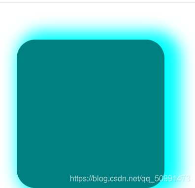
.oo {

    width: 200px;
    height: 200px;
    background: teal;
    border-radius: 25px;
    margin: 50px 0px 0px 50px;
    box-shadow: 11px 0px 20px 11px aqua;
}
图片边框
1、语法:border-image:border-image-source border-image-slice border-image-width border-image-repeat
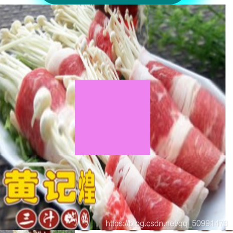
/* 图片边框 */

.bord {

    width: 100px;
    height: 100px;
    border: 100px solid;
    background: violet;
    border-image: url(../images/image1.png) 100 stretch;
}
渐变
1、线性渐变:background-image:linear-gradient(0deg,red,pink);
2、径向渐变 radial-gradient(渐变的中心,渐变形状 渐变大小,起始颜色值,中间颜色值 中间颜色位置,终点颜色)
.a {

    background: linear-gradient(150deg, pink, rgb(12, 218, 156));
    width: 600px;
    height: 200px;
}

.border {

    width: 60px;
    height: 60px;
    box-shadow: 5px 5px 10px 0px rosybrown;
    background: radial-gradient(circle, yellow 0px, red 30px);
    border-radius: 30px;
    font-size
最低0.47元/天 解锁文章


 675
675


 被折叠的 条评论
为什么被折叠?
被折叠的 条评论
为什么被折叠?
 到【灌水乐园】发言


