


圆角
border-radius:10px;同时设置四个角
border-radius: 20px 40px 50px 60px;顺时针方向,左上,右上,右下,左下
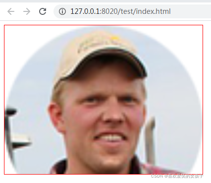
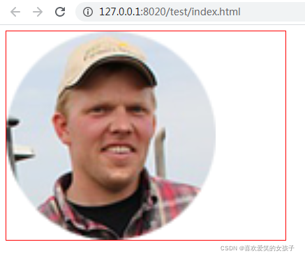
圆形:
<div style=”width:100px; height:100px; background:red; border-radius: 50%;”></div>
阴影:
文字阴影
text-shadow:水平阴影位置 垂直阴影位置 模糊距离 颜色;
text-shadow:5px 5px 10px #000;
容器阴影
box-shadow:水平阴影位置 垂直阴影位置 模糊距离 阴影尺寸 颜色 内阴影;
box-shadow:5px 5px 5px 5px #f00;
内阴影设置
box-shadow:5px 5px 5px 5px #f00 inset;
CSS3背景
background-image:url(pic1.jpg),url(pic2.jpg);同时设置多张背景图片
background-position:left top,right top;分别设置图片的位置
background-repeat:no-repeat,no-repeat;同时设置图片的平铺方式
背景图片大小设置
background-size:宽 高;
background-size:100px 100px;
background-size:cover;完全显示在内容区域,如果超出范围裁剪图片
background-size:contain;显示在内容区域以内,图片比例不同是会留白
background-origin设置背景图片的定位区域
padding-box填充的位置开始
border-box边框的位置开始
content-box内容的位置开始
background-clip背景的绘制区域
padding-box背景绘制在填充内
border-box背景绘制在边框内
content-box背景绘制在内容区域内
CSS3渐变
背景颜色:background:rgba(0,0,0,0.5);
线性渐变
linear-gradient(top|bottom|left|right|left top|0deg,颜色值,颜色值,颜色值);
background:linear-gradient(left,red,green);
background:-webkit-linear-gradient(left,red,green);
-webkit- 谷歌 safari
-moz- 火狐
-ms- IE
-o- oprea
径向渐变
radial-gradient(位置,颜色值,颜色值);
background:-webkit-radial-gradient(center,red,green); 椭圆形的径向渐变
background:-webkit-radial-gradient(center,circle,red,green);正圆形的径向渐变
CSS3变形
旋转rotate(0deg)
transform:rotate(45deg);设置角度使元素相对原点进行旋转,值正数,顺时针旋转,负数,逆时针旋转
.div1:hover{ transform: rotate(45deg);}
移动translate(水平位置,垂直位置);
transform:translate();
transform:translateX(水平位置);
transform:translateY(垂直位置);
.div1:hover{ transform:translate(100px);}
缩放scale()值为1时,原本大小,小于1是缩小,大于1放大
transform:scale(x,y);
transform:scaleX();
transform:scaleY();
.div1:hover{ transform:scale(0.5);}
扭曲skew()倾斜显示
transform:skew(x,y);
transform:skewX();
transform:skewY();
.div1:hover{ transform:skew(30deg,30deg);}
过渡动画
transition:需要过渡动画的样式名/all全部 动画执行时间 动画函数 延迟时间;
transition:all 1s ease 1s;
动画函数:ease速度由快到慢 linear平稳速度 ease-in速度越来越快 ease-out速度越来越慢 ease-in-out先加速再减速
transition-property:all; 需要过渡动画的样式名/all全部
transition-duration:1s;过渡时间
transition-timing-function:ease;动画函数
transition-delay:1s;延迟时间
鼠标移入时旋转360度实例
<!DOCTYPE html>
<html>
<head>
<meta charset="utf-8" />
<title></title>
<style type="text/css">
.div1{ width: 100px; height: 100px; background: red;transition: all 1s ease;}
.div1:hover{ transform:rotate(360deg); }
</style>
</head>
<body>
<div class="div1"></div>
</body>
</html>
自定义动画
@keyframes 自定义动画名{
0%{background:red;}
100%{background:green;}
}
可以由多个百分比构成
@keyframes 自定义动画名{
form{}
to{}
}
引用动画
animation:动画的名称 动画执行时间 动画函数 延迟时间;
animation-name:;调用动画名称
animation-duration:1s;动画执行时间
animation-timing-function:ease;动画函数
animation-delay:1s;延迟时间
animation-iteration-count:2;动画播放的次数,数值,infinite无限循环播放
animation-direction:reverse;动画是否反向播放
reverse反向播放
alternate奇数次正向播放,偶数次反向播放
alternate-reverse奇数次反向播放,偶数次正向播放
animaction-play-state:paused;动画暂停running播放
animation-fill-mode:forwards;动画执行结束后,停留在最后一针
<!DOCTYPE html>
<html>
<head>
<meta charset="utf-8" />
<title></title>
<style type="text/css">
.div1{ width: 100px; height: 100px; background: green; color:red; animation:name 2s ease; animation-iteration-count: infinite; animation-direction: alternate-reverse;}
.div1:hover{ background: green; color: #000; animation-play-state: paused; }
@keyframes name{
0%{ margin-left:0;}
50%{ margin-left: 100px;}
100%{ margin-left: 200px;}
}
</style>
</head>
<body>
<div class="div1"></div>
</body>
</html>
overflow: hidden;溢出隐藏,超出范围的内容不显示
图片轮播特效实例:
<!DOCTYPE html>
<html>
<head>
<meta charset="UTF-8">
<title></title>
<style type="text/css">
*{ margin: 0; padding: 0;}
.main ul li img{ width: 500px; height: 300px;}
.main{ width: 500px; height: 300px; position: relative; overflow: hidden;}
ul,li{ list-style: none;}
.pic{ width: 2500px; height: 300px; position: absolute; left: 0; animation: name 10s; animation-iteration-count: infinite;}
.pic li{ float: left;}
@keyframes name{
0%,10%{left:0;}
25%,35%{ left: -500px;}
50%,60%{ left: -1000px;}
75%,85%{ left: -1500px;}
100%{ left: -2000px;}
}
</style>
</head>


 283
283


 被折叠的 条评论
为什么被折叠?
被折叠的 条评论
为什么被折叠?
 到【灌水乐园】发言


