


 本文介绍了如何使用HTML和CSS创建一个带有动态气泡背景和图片轮播的网页设计,展示了如何使用关键帧动画和布局技巧来实现视觉效果。
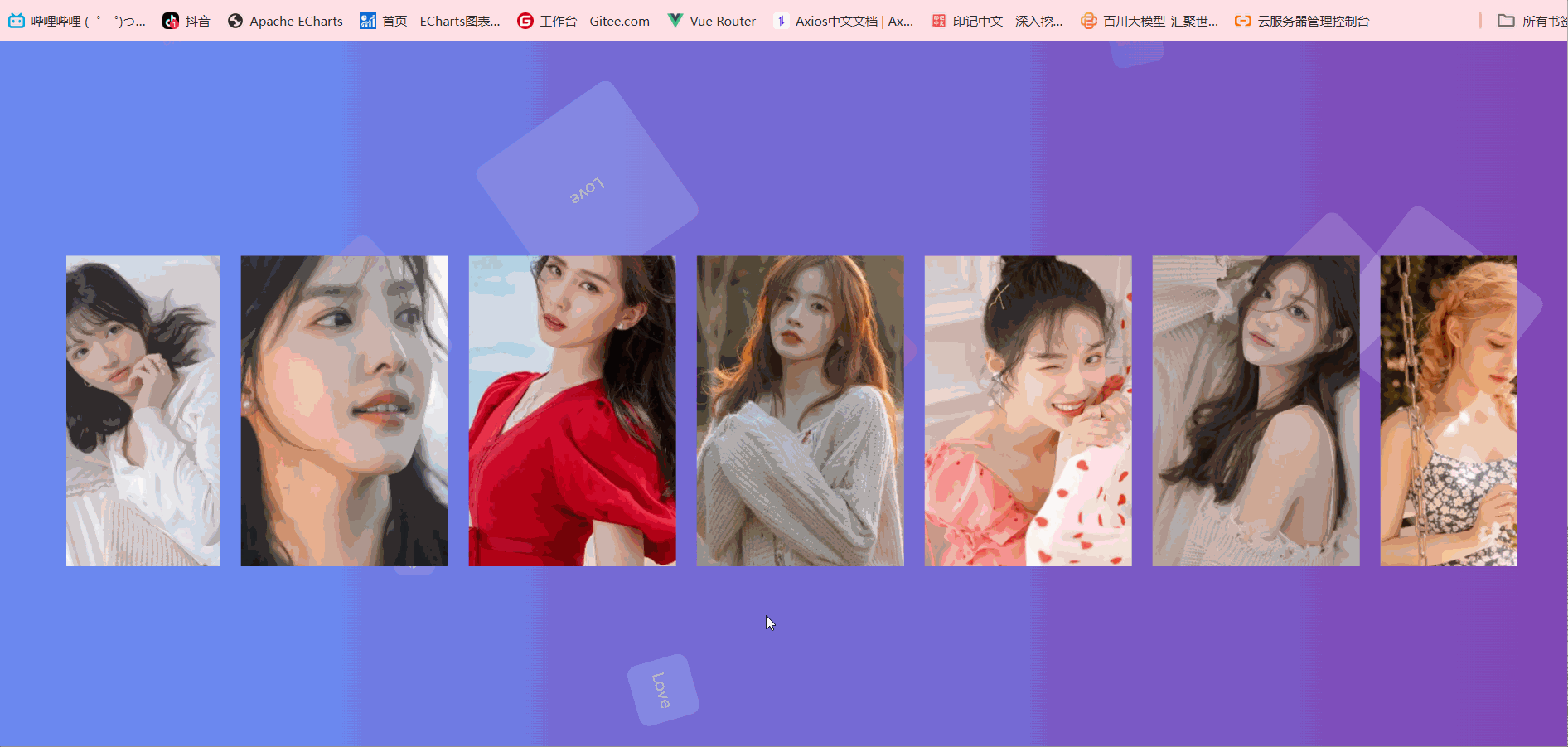
效果图
html部分
<!DOCTYPE html>
<html lang="en">

<head>
  <meta charset="UTF-8">
  <meta name="viewport" content="width=device-width, initial-scale=1.0">
  <link rel="stylesheet" href="./css/index.css">
  <title>Document</title>
</head>

<body>
  <div class="bruce">
    <ul class="bubble-bgwall">
      <li>Love</li>
      <li>Love</li>
      <li>Love</li>
      <li>Love</li>
      <li>Love</li>
      <li>Love</li>
      <li>Love</li>
      <li>Love</li>
      <li>Love</li>
      <li>Love</li>
    </ul>
    <div class="container">
      <ul>
        <li>
          <img src="./images/1.jpg" alt="">
        </li>
        <li>
          <img src="./images/2.jpg" alt="">
        </li>
        <li>
          <img src="./images/3.jpg" alt="">
        </li>
        <li>
          <img src="./images/4.jpg" alt="">
        </li>
        <li>
          <img src="./images/5.jpg" alt="">
        </li>
        <li>
          <img src="./images/6.jpg" alt="">
        </li>
        <li>
          <img src="./images/7.jpg" alt="">
        </li>
        <li>
          <img src="./images/9.jpg" alt="">
        </li>
        <li>
          <img src="./images/10.jpg" alt="">
        </li>
        <li>
          <img src="./images/1.jpg" alt="">
        </li>
        <li>
          <img src="./images/2.jpg" alt="">
        </li>
        <li>
          <img src="./images/3.jpg" alt="">
        </li>
        <li>
          <img src="./images/4.jpg" alt="">
        </li>
        <li>
          <img src="./images/5.jpg" alt="">
        </li>
        <li>
          <img src="./images/6.jpg" alt="">
        </li>
        <li>
          <img src="./images/7.jpg" alt="">
        </li>
      </ul>
    </div>
  </div>
</body>

</html>
css部分
* {
  padding: 0;
  margin: 0;
  box-sizing: border-box;
}
.bruce {
  /* height: 100vh;
  width: 100vw; */
  overflow: auto;
  position: fixed;
  inset: 0;
  background-image: linear-gradient(270deg, #8146b4, #6990f6);
}

.bubble-bgwall {
  overflow: hidden;
  position: fixed;
  margin: 0 auto;
  width: 100%;
  height: 100%;
  padding: 0;
}

.bubble-bgwall li {
  display: flex;
  position: absolute;
  bottom: -200px;
  justify-content: center;
  align-items: center;
  border-radius: 10px;
  width: 50px;
  height: 50px;
  background-color: rgba(255, 255, 255, 0.15);
  color: #ccc;
  animation: bubble 15s infinite;
  z-index: 9999;
}

.bubble-bgwall li:nth-child(1) {
  left: 10%;
}

.bubble-bgwall li:nth-child(2) {
  left: 20%;
  width: 90px;
  height: 90px;
  animation-duration: 7s;
  animation-delay: 2s;
}

.bubble-bgwall li:nth-child(3) {
  left: 25%;
  animation-delay: 4s;
}

.bubble-bgwall li:nth-child(4) {
  left: 40%;
  width: 60px;
  height: 60px;
  background-color: rgba(255, 255, 255, 0.3);
  animation-duration: 8s;
}

.bubble-bgwall li:nth-child(5) {
  left: 70%;
}

.bubble-bgwall li:nth-child(6) {
  left: 80%;
  width: 120px;
  height: 120px;
  background-color: rgba(255, 255, 255, 0.2);
  animation-delay: 3s;
}

.bubble-bgwall li:nth-child(7) {
  left: 32%;
  width: 160px;
  height: 160px;
  animation-delay: 2s;
}

.bubble-bgwall li:nth-child(8) {
  left: 55%;
  width: 40px;
  height: 40px;
  font-size: 12px;
  animation-duration: 15s;
  animation-delay: 4s;
}

.bubble-bgwall li:nth-child(9) {
  left: 25%;
  width: 40px;
  height: 40px;
  background-color: rgba(255, 255, 255, 0.3);
  font-size: 12px;
  animation-duration: 12s;
  animation-delay: 2s;
}

.bubble-bgwall li:nth-child(10) {
  left: 85%;
  width: 160px;
  height: 160px;
  animation-delay: 5s;
}

@keyframes bubble {
  0% {
    opacity: 0.5;
    transform: translateY(0) rotate(45deg);
  }

  25% {
    opacity: 0.75;
    transform: translateY(-400px) rotate(90deg);
  }

  50% {
    opacity: 1;
    transform: translateY(-600px) rotate(135deg);
  }

  100% {
    opacity: 0;
    transform: translateY(-1000px) rotate(180deg);
  }
}
.container {
  width: 1400px;
  position: relative;
  top: 50%;
  left: 50%;
  margin-left: -700px;
  transform: translateY(-50%);
  overflow: hidden;
}
.container:hover ul {
  animation-play-state: paused;
}
.container ul {
  width: 3520px;
  height: 300px;
  animation: move 10s linear infinite;
}
.container ul li {
  list-style: none;
  width: 200px;
  height: 300px;
  float: left;
  margin-right: 20px;
  cursor: pointer;
}
img {
  width: 100%;
  height: 100%;
  object-fit: cover;
}
@keyframes move {
  to {
    transform: translateX(-1980px);
  }
}


 扫一扫
扫一扫


 7904
7904

 被折叠的 条评论
为什么被折叠?
被折叠的 条评论
为什么被折叠?
 到【灌水乐园】发言


