


一、简介
CSS选择器是用于精准定位HTML元素并施加样式规则的核心工具,通过多样化的匹配模式实现灵活控制。基础选择器包括元素选择器(如div)、类选择器(.class)、ID选择器(#id)和通用选择器(*),分别按标签名、类名、唯一ID或全局匹配;组合选择器通过层级关系增强精确性,例如后代选择器(nav a)匹配嵌套元素,子选择器(ul > li)限定直接子级,相邻兄弟(h1 + p)和通用兄弟(h2 ~ p)则控制同级元素。属性选择器(如[href^=“https”])依据属性值匹配,而伪类(:hover、:nth-child())和伪元素(::before、::first-letter)则针对动态状态或虚拟内容设计。此外,分组选择器(h1, h2)可批量应用样式,否定伪类(:not())实现排除逻辑。这些选择器可多层组合,形成高效、可维护的样式方案,共同实现精准的样式控制与页面布局。
二、常规选择器
| 选择器 | 示例 | 示例说明 |
|---|---|---|
* | * | 选择所有元素 |
.class | .intro | 选择所有 class=“intro” 的元素 |
#id | #firstname | 选择所有 id=“firstname” 的元素 |
element | p | 选择所有 <p> 元素 |
element,element | div,p | 选择所有 <div> 元素和 <p> 元素 |
element.class | p.hometown | 选择所有 class=“hometown” 的 <p> 元素 |
element element | div p | 选择 <div> 元素内的所有 <p> 元素 |
element>element | div>p | 选择所有父级是 <div> 元素的 <p> 元素 |
element1~element2 | p~ul | 选择 <p> 元素之后的每一个 <ul> 元素 |
element+element | div+p | 选择所有紧跟在 <div> 元素之后的第一个 <p> 元素 |
[attribute] | [target] | 选择所有带有 target 属性的元素 |
[attribute=value] | [target=_blank] | 选择所有使用 target=“_blank” 的元素 |
[attribute~=value] | [title~=flower] | 选择标题属性包含单词 “flower” 的所有元素 |
[attribute|=language] | [lang|=en] | 选择 lang 属性等于 en,或者以 en- 为开头的所有元素 |
[attribute $ =value] | a[src $ =".pdf"] | 选择每一个 src 属性的值以 “.pdf” 结尾的元素 |
[attribute^=value] | a[src^="https"] | 选择每一个 src 属性的值以 “https” 开头的元素 |
[attribute*=value] | a[src*="runoob"] | 选择每一个 src 属性的值包含子字符串 “runoob” 的元素 |
1.通用选择器 *
<style>
    .example {
        background-color: #f9f9f9;
        padding: 15px;
        margin: 10px 0;
        border-left: 4px solid #3498db;
    }
    * {
        color: #e74c3c;
        font-weight: bold;
    }
</style>
<div class="example">
    <p>这个div内的<strong>所有元素</strong>都会变成红色粗体</p>
    <ul>
        <li>列表项1</li>
        <li>列表项2</li>
    </ul>
</div>

2.类选择器 .class
<style>
    .example {
        background-color: #f9f9f9;
        padding: 15px;
        margin: 10px 0;
        border-left: 4px solid #3498db;
    }
    .highlight {
        background-color: yellow;
        padding: 2px 5px;
    }
</style>
<div class="example">
    <p>这是一个<span class="highlight">高亮</span>文本的示例。</p>
    <p>另一个<span class="highlight">高亮</span>示例。</p>
</div>

3.ID选择器 #id
<style>
    .example {
        background-color: #f9f9f9;
        padding: 15px;
        margin: 10px 0;
        border-left: 4px solid #3498db;
    }
    #special-paragraph {
        border: 2px solid #27ae60;
        padding: 10px;
        border-radius: 5px;
    }
</style>
<div class="example">
    <p id="special-paragraph">这个段落有唯一的ID选择器样式。</p>
    <p>普通段落没有特殊样式。</p>
</div>

4.元素选择器 element
<style>
    .example {
        background-color: #f9f9f9;
        padding: 15px;
        margin: 10px 0;
        border-left: 4px solid #3498db;
    }
    strong {
        color: #3498db;
        font-size: 1.2em;
    }
</style>
<div class="example element-example">
    <p>这个段落中的<strong>strong元素</strong>会被特殊样式化。</p>
    <p>另一个<strong>strong元素</strong>也会被影响。</p>
</div>

5.多元素选择器 element,element
<style>
.example {
background-color: #f9f9f9;
padding: 15px;
margin: 10px 0;
border-left: 4px solid #3498db;
}
.multi-element-example h3,
.multi-element-example h4 {
color: #9b59b6;
font-style: italic;
}
</style>
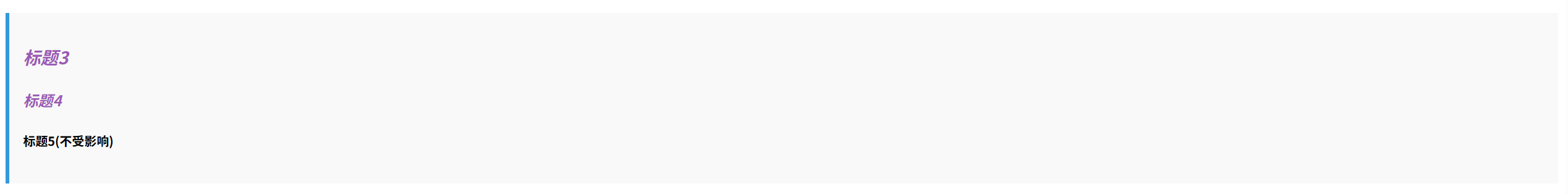
<div class="example multi-element-example">
<h3>标题3</h3>
<h4>标题4</h4>
<h5>标题5(不受影响)</h5>
</div>
6.后代选择器 element element
<style>
.descendant-example div p {
background-color: #f1c40f;
padding: 5px;
}
.example {
background-color: #f9f9f9;
padding: 15px;
margin: 10px 0;
border-left: 4px solid #3498db;
}
</style>
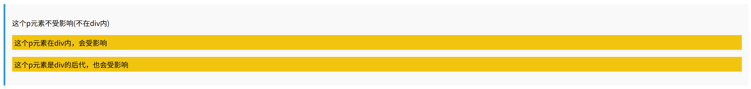
<div class="example descendant-example">
<p>这个p元素不受影响(不在div内)</p>
<div>
<p>这个p元素在div内,会受影响</p>
<section>
<p>这个p元素是div的后代,也会受影响</p>
</section>
</div>
</div>
7.子元素选择器 element>element
<style>
    .child-example > ul > li {
        color: #e67e22;
        list-style-type: square;
    }
    .example {
        background-color: #f9f9f9;
        padding: 15px;
        margin: 10px 0;
        border-left: 4px solid #3498db;
    }
</style>
<div class="example child-example">
    <ul>
        <li>一级列表项(受影响)
            <ul>
                <li>二级列表项(不受影响)</li>
            </ul>
        </li>
        <li>另一个一级列表项(受影响)</li>
    </ul>
</div>

8.兄弟选择器 element~element
<style>
.general-sibling-example h3 ~ p {
font-style: italic;
color: #7f8c8d;
}
.example {
background-color: #f9f9f9;
padding: 15px;
margin: 10px 0;
border-left: 4px solid #3498db;
}
</style>
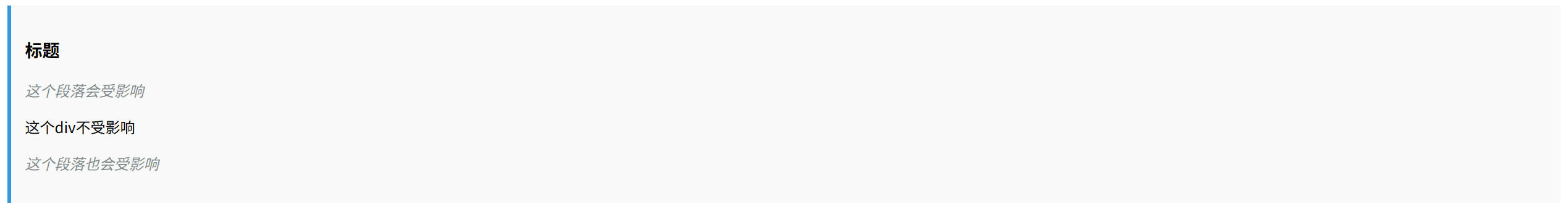
<div class="example general-sibling-example">
<h3>标题</h3>
<p>这个段落会受影响</p>
<div>这个div不受影响</div>
<p>这个段落也会受影响</p>
</div>
9.相邻兄弟选择器 element+element
<style>
.adjacent-sibling-example h4 + p {
background-color: #2ecc71;
color: white;
padding: 5px;
}
.example {
background-color: #f9f9f9;
padding: 15px;
margin: 10px 0;
border-left: 4px solid #3498db;
}
</style>
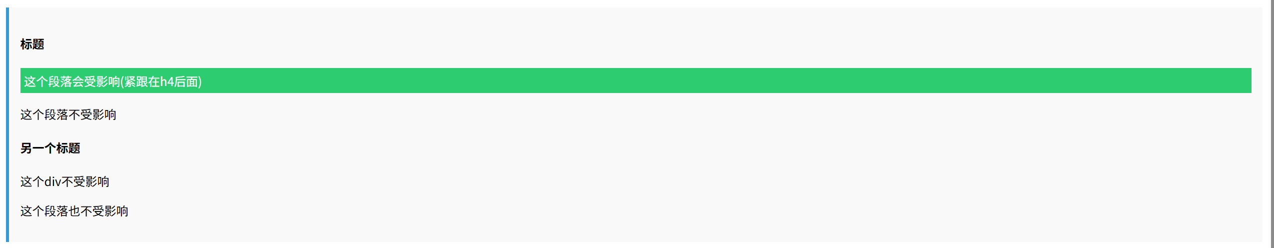
<div class="example adjacent-sibling-example">
<h4>标题</h4>
<p>这个段落会受影响(紧跟在h4后面)</p>
<p>这个段落不受影响</p>
<h4>另一个标题</h4>
<div>这个div不受影响</div>
<p>这个段落也不受影响</p>
</div>
10.属性选择器 [attribute]
<style>
    .attribute-example [data-tooltip] {
        border-bottom: 1px dotted #3498db;
        cursor: help;
    }
    .example {
        background-color: #f9f9f9;
        padding: 15px;
        margin: 10px 0;
        border-left: 4px solid #3498db;
    }
</style>
<div class="example attribute-example">
    <p data-tooltip="这是一个提示">这个元素有data-tooltip属性</p>
    <p>这个元素没有data-tooltip属性</p>
</div>

11.属性值等于选择器 [attribute=value]
<style>
    .attribute-equal-example [type="submit"] {
        background-color: #27ae60;
        color: white;
        border: none;
        padding: 8px 16px;
    }
    .example {
        background-color: #f9f9f9;
        padding: 15px;
        margin: 10px 0;
        border-left: 4px solid #3498db;
    }
</style>
<div class="example attribute-equal-example">
    <button type="button">普通按钮</button>
    <button type="submit">提交按钮</button>
</div>

12.属性值包含单词选择器 [attribute~=value]
<style>
.attribute-contains-word-example [class~="warning"] {
color: #e74c3c;
font-weight: bold;
}
.example {
background-color: #f9f9f9;
padding: 15px;
margin: 10px 0;
border-left: 4px solid #3498db;
}
</style>
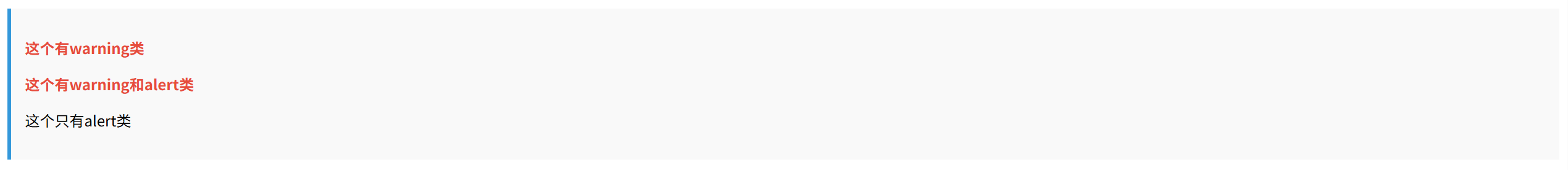
<div class="example attribute-contains-word-example">
<p class="warning">这个有warning类</p>
<p class="warning alert">这个有warning和alert类</p>
<p class="alert">这个只有alert类</p>
</div>
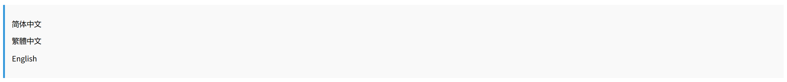
13.属性值以语言代码开头选择器 [attribute|=language]
<style>
    .attribute-lang-example [lang|="zh"] {
        font-family: "Microsoft YaHei", sans-serif;
    }
    .example {
        background-color: #f9f9f9;
        padding: 15px;
        margin: 10px 0;
        border-left: 4px solid #3498db;
    }
</style>
<div class="example attribute-lang-example">
    <p lang="zh-CN">简体中文</p>
    <p lang="zh-TW">繁體中文</p>
    <p lang="en">English</p>
</div>
14.属性值以指定值结尾选择器 [attribute$=value]
<style>
    .attribute-ends-with-example a[href$=".pdf"] {
        background: url('pdf-icon.png') no-repeat left center;
        padding-left: 20px;
        color: #e74c3c;
    }
    .example {
        background-color: #f9f9f9;
        padding: 15px;
        margin: 10px 0;
        border-left: 4px solid #3498db;
    }
</style>
<div class="example attribute-ends-with-example">
    <p><a href="document.pdf">PDF文档</a></p>
    <p><a href="document.doc">Word文档</a></p>
</div>

15.属性值以指定值开头选择器 [attribute^=value]
<style>
    .attribute-starts-with-example a[href^="https"] {
        color: #27ae60;
        font-weight: bold;
    }
    .example {
        background-color: #f9f9f9;
        padding: 15px;
        margin: 10px 0;
        border-left: 4px solid #3498db;
    }
</style>
<div class="example attribute-starts-with-example">
    <p><a href="https://example.com">安全链接(HTTPS)</a></p>
    <p><a href="http://example.com">普通链接(HTTP)</a></p>
</div>

16.属性值包含指定值选择器 [attribute*=value]
<style>
    .attribute-contains-example [class*="btn"] {
        display: inline-block;
        padding: 8px 16px;
        background-color: #3498db;
        color: white;
        text-decoration: none;
        border-radius: 4px;
        margin: 5px;
    }
    .example {
        background-color: #f9f9f9;
        padding: 15px;
        margin: 10px 0;
        border-left: 4px solid #3498db;
    }
</style>
<div class="example attribute-contains-example">
    <a class="btn-primary">主要按钮</a>
    <a class="btn-secondary">次要按钮</a>
    <a class="button">普通按钮(不受影响)</a>
</div>

三、伪类选择器
伪类选择器(Pseudo-class Selectors) 是 CSS 中用于匹配元素特定状态或结构位置的选择器,以单冒号 : 开头,例如 :hover(悬停状态)、:first-child(父元素的第一个子元素)、:nth-child(n)(第 n 个子元素)等,它们不直接对应 DOM 中的实际元素,而是基于用户交互(如 :active)、文档结构(如 :root)或表单状态(如 :checked)动态应用样式,从而增强页面的交互性与逻辑控制能力。
| 选择器 | 示例 | 示例说明 |
|---|---|---|
| :link | a:link | 选择所有未访问链接 |
| :visited | a:visited | 选择所有访问过的链接 |
| :active | a:active | 选择活动链接 |
| :hover | a:hover | 选择鼠标在链接上面时 |
| :focus | input:focus | 选择具有焦点的输入元素 |
| :focus-visible | :focus-visible | 键盘焦点状态 |
| :first-child | p:first-child | 指定只有当p元素是其父级的第一个子级的样式。 |
| :last-child | p:last-child | 选择每个p元素是其父级的最后一个子级。 |
| :first-of-type | p:first-of-type | 选择每个p元素是其父级的第一个p元素 |
| :last-of-type | p:last-of-type | 选择每个p元素是其父级的最后一个p元素 |
| :only-of-type | p:only-of-type | 选择每个p元素是其父级的唯一p元素 |
| :only-child | p:only-child | 选择每个p元素是其父级的唯一子元素 |
| :nth-child(n) | p:nth-child(2) | 选择每个p元素是其父级的第二个子元素 |
| :nth-last-child(n) | p:nth-last-child(2) | 选择每个p元素的是其父级的第二个子元素,从最后一个子项计数 |
| :nth-of-type(n) | p:nth-of-type(2) | 选择每个p元素是其父级的第二个p元素 |
| :nth-last-of-type(n) | p:nth-last-of-type(2) | 选择每个p元素的是其父级的第二个p元素,从最后一个子项计数 |
| :root | :root | 选择文档的根元素 |
| :empty | p:empty | 选择每个没有任何子级的 p 元素(包括文本节点) |
| :target | #news:target | 选择当前活动的 #news 元素(包含该锚名称的点击的 URL) |
| :enabled | input:enabled | 选择每一个已启用的输入元素 |
| :disabled | input:disabled | 选择每一个禁用的输入元素 |
| :checked | input:checked | 选择每个选中的输入元素 |
| :out-of-range | :out-of-range | 匹配值在指定区间之外的 input 元素 |
| :in-range | :in-range | 匹配值在指定区间之内的 input 元素 |
| :read-write | :read-write | 用于匹配可读及可写的元素 |
| :read-only | :read-only | 用于匹配设置 “readonly”(只读)属性的元素 |
| :not(selector) | :not§ | 选择每个并非 p 元素的元素 |
| :has | :has | 允许根据其后代元素来选择一个元素。 |
| :is | :is | 接受任何数量的选择器作为参数,并且返回这些选择器匹配的元素的并集。 |
| :where | :where | 零特异性匹配 |
| :lang(language) | p:lang(it) | 选择一个 lang 属性的起始值=“it” 的所有 p 元素 |
| :optional | :optional | 用于匹配可选的输入元素 |
| :required | :required | 用于匹配设置了 “required” 属性的元素 |
| :valid | :valid | 用于匹配输入值为合法的元素 |
| :invalid | :invalid | 用于匹配输入值为非法的元素 |
| :default | input:default | 默认选项 |
| :indeterminate | input:indeterminate | 不确定状态 |
| :placeholder-shown | input:placeholder-shown | 显示占位文本 |
| :fullscreen | :fullscreen | 全屏模式 |
1.:link - 未访问链接 | :visited - 已访问链接
<div class="selector-desc">选择不同状态的超链接</div>
<style>
    .example {
        background-color: #f9f9f9;
        padding: 15px;
        margin: 10px 0;
        border-left: 4px solid #3498db;
    }
    .link-example a:link {
        color: #3498db;
    }
    .link-example a:visited {
        color: #9b59b6;
    }
</style>
<div class="example link-example">
    <a href="javascript:void(0);">未访问链接(蓝色)</a>
    <a href="https://blog.csdn.net/randy521520" target="_blank" id="visited-link">点击后变为已访问链接(紫色)</a>
</div>

2.:active - 激活状态
<style>
    .example {
        background-color: #f9f9f9;
        padding: 15px;
        margin: 10px 0;
        border-left: 4px solid #3498db;
    }
    .active-example button:active {
        transform: scale(0.95);
        background-color: #e74c3c;
    }
</style>
<div class="example active-example">
    <button>点击时按钮会变小变红</button>
</div>

3.:hover - 悬停状态
<div class="selector-desc">选择鼠标指针悬停在其上的元素</div>
<style>
    .example {
        background-color: #f9f9f9;
        padding: 15px;
        margin: 10px 0;
        border-left: 4px solid #3498db;
    }
    .hover-example .box:hover {
        background-color: #f1c40f;
        cursor: pointer;
    }
</style>
<div class="example hover-example">
    <div class="box">鼠标悬停时背景变黄</div>
</div>

4.:focus - 焦点状态 | :focus-visible - 键盘焦点状态
<div class="selector-desc">选择获得焦点的元素,:focus-visible特别针对键盘导航</div>
<style>
    .example {
        background-color: #f9f9f9;
        padding: 15px;
        margin: 10px 0;
        border-left: 4px solid #3498db;
    }
    .focus-example input:focus {
        outline: 2px solid #2ecc71;
    }
    .focus-example button:focus-visible {
        box-shadow: 0 0 0 3px rgba(46, 204, 113, 0.5);
    }
</style>
<div class="example focus-example">
    <input type="text" placeholder="点击获取焦点">
    <button>按钮(键盘导航时可见)</button>
</div>

5.:first-child - 第一个子元素 | :last-child - 最后一个子元素
<div class="selector-desc">选择父元素中的第一个或最后一个子元素</div>
<style>
    .example {
        background-color: #f9f9f9;
        padding: 15px;
        margin: 10px 0;
        border-left: 4px solid #3498db;
    }
    .child-example li:first-child {
        color: #e74c3c;
    }
    .child-example li:last-child {
        color: #3498db;
    }
</style>
<div class="example child-example">
    <ul>
        <li>第一个子元素(红色)</li>
        <li>中间元素</li>
        <li>最后一个子元素(蓝色)</li>
    </ul>
</div>

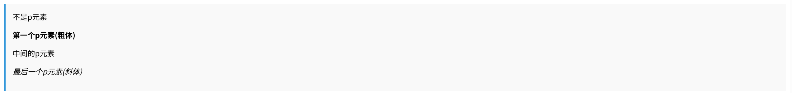
6.:first-of-type - 同类型第一个 | :last-of-type - 同类型最后一个
<div class="selector-desc">选择特定类型的第一个或最后一个元素</div>
<style>
    .example {
        background-color: #f9f9f9;
        padding: 15px;
        margin: 10px 0;
        border-left: 4px solid #3498db;
    }
    .type-example p:first-of-type {
        font-weight: bold;
    }
    .type-example p:last-of-type {
        font-style: italic;
    }
</style>
<div class="example type-example">
    <div>不是p元素</div>
    <p>第一个p元素(粗体)</p>
    <p>中间的p元素</p>
    <p>最后一个p元素(斜体)</p>
</div>
7.:only-of-type - 唯一类型 | :only-child - 唯一子元素
<div class="selector-desc">选择没有同类型兄弟的元素或没有兄弟的元素</div>
<style>
    .example {
        background-color: #f9f9f9;
        padding: 15px;
        margin: 10px 0;
        border-left: 4px solid #3498db;
    }
    .only-example div:only-of-type {
        border: 2px solid #9b59b6;
    }
    .only-example span:only-child {
        background-color: #f1c40f;
    }
</style>
<div class="example only-example">
    <div>唯一的div元素(紫色边框)</div>
    <p><span>唯一的子元素(黄色背景)</span></p>
    <p><span>不是唯一子元素</span><span>因为有兄弟元素</span></p>
</div>

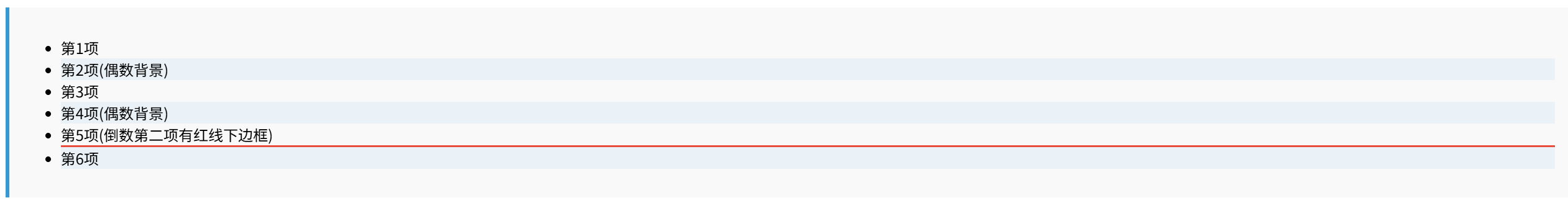
8.:nth-child(n) - 第n个子元素 | :nth-last-child(n) - 倒数第n个子元素
<div class="selector-desc">使用公式选择特定位置的子元素</div>
<style>
    .example {
        background-color: #f9f9f9;
        padding: 15px;
        margin: 10px 0;
        border-left: 4px solid #3498db;
    }
    .nth-child-example li:nth-child(2n) {
        background-color: #eaf2f8;
    }
    .nth-child-example li:nth-last-child(2) {
        border-bottom: 2px solid #e74c3c;
    }
</style>
<div class="example nth-child-example">
    <ul>
        <li>第1项</li>
        <li>第2项(偶数背景)</li>
        <li>第3项</li>
        <li>第4项(偶数背景)</li>
        <li>第5项(倒数第二项有红线下边框)</li>
        <li>第6项</li>
    </ul>
</div>
9.:nth-of-type(n) - 同类型第n个 | :nth-last-of-type(n) - 同类型倒数第n个
<div class="selector-desc">选择特定类型的第n个元素</div>
<style>
.example {
background-color: #f9f9f9;
padding: 15px;
margin: 10px 0;
border-left: 4px solid #3498db;
}
.nth-type-example p:nth-of-type(2n+1) {
color: #27ae60;
}
.nth-type-example p:nth-last-of-type(1) {
text-decoration: underline;
}
</style>
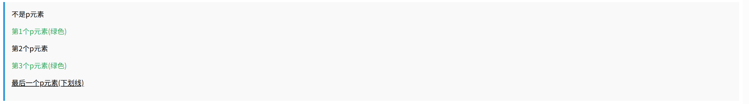
<div class="example nth-type-example">
<div>不是p元素</div>
<p>第1个p元素(绿色)</p>
<p>第2个p元素</p>
<p>第3个p元素(绿色)</p>
<p>最后一个p元素(下划线)</p>
</div>
10.:root - 根元素
<div class="selector-desc">选择文档的根元素(HTML元素)</div>
<style>
    .example {
        background-color: #f9f9f9;
        padding: 15px;
        margin: 10px 0;
        border-left: 4px solid #3498db;
    }
    :root {
        --main-color: #3498db;
    }
    .root-example {
        color: var(--main-color);
    }
</style>
<div class="example root-example">
    这个文本颜色来自:root定义的CSS变量
</div>

11.:empty - 空元素
<div class="selector-desc">选择没有任何子元素的元素(包括文本节点)</div>
<style>
    .example {
        background-color: #f9f9f9;
        padding: 15px;
        margin: 10px 0;
        border-left: 4px solid #3498db;
    }
    .empty-example div:empty {
        height: 20px;
        background-color: #e74c3c;
        margin: 5px 0;
    }
</style>
<div class="example empty-example">
    <div>有内容的div</div>
    <div></div> <!-- 空div -->
    <div>另一个有内容的div</div>
</div>

12.:target - URL目标元素
<style>
    .example {
        background-color: #f9f9f9;
        padding: 15px;
        margin: 10px 0;
        border-left: 4px solid #3498db;
    }
    .target-example div:target {
        background-color: #f1c40f;
        padding: 10px;
        color: red;
    }
</style>
<div class="example target-example">
    <a href="#section1">跳转到第1节</a>
    <a href="#section2">跳转到第2节</a>
    <div id="section1">第1节(点击链接后高亮)</div>
    <div id="section2">第2节(点击链接后高亮)</div>
</div>

13.:enabled - 可用元素 | :disabled - 禁用元素
<style>
    .example {
        background-color: #f9f9f9;
        padding: 15px;
        margin: 10px 0;
        border-left: 4px solid #3498db;
    }
    .state-example input:enabled {
        border: 2px solid #2ecc71;
    }
    .state-example input:disabled {
        background-color: #ecf0f1;
        color: #95a5a6;
    }
</style>
<div class="example state-example">
    <input type="text" placeholder="可用输入框(绿色边框)">
    <input type="text" placeholder="禁用输入框" disabled>
</div>

14.:checked - 选中状态
<style>
    .example {
        background-color: #f9f9f9;
        padding: 15px;
        margin: 10px 0;
        border-left: 4px solid #3498db;
    }
    .checked-example input:checked + label {
        color: #e74c3c;
        font-weight: bold;
    }
</style>
<div class="example checked-example">
    <input type="checkbox" id="check1">
    <label for="check1">选中时文本变红加粗</label><br>
    <input type="radio" name="group" id="radio1">
    <label for="radio1">单选按钮1</label>
    <input type="radio" name="group" id="radio2">
    <label for="radio2">单选按钮2</label>
</div>

15.:out-of-range - 超出范围 | :in-range - 在范围内
<style>
    .example {
        background-color: #f9f9f9;
        padding: 15px;
        margin: 10px 0;
        border-left: 4px solid #3498db;
    }
    .range-example input:out-of-range {
        border-color: #e74c3c;
    }
    .range-example input:in-range {
        border-color: #2ecc71;
    }
</style>
<div class="example range-example">
    <input type="number" min="1" max="10" value="15" placeholder="输入1-10之间的数字">
    <p>输入值超出范围时边框变红,在范围内时变绿</p>
</div>

16.:read-write - 可读写 | :read-only - 只读
<style>
    .example {
        background-color: #f9f9f9;
        padding: 15px;
        margin: 10px 0;
        border-left: 4px solid #3498db;
    }
    .rw-example input:read-write {
        background-color: #eaf2f8;
    }
    .rw-example input:read-only {
        background-color: #f5f5f5;
        color: #999;
    }
</style>
<div class="example rw-example">
    <input type="text" value="可编辑文本">
    <input type="text" value="只读文本" readonly>
</div>

17.:not(selector) - 否定伪类
<style>
.example {
background-color: #f9f9f9;
padding: 15px;
margin: 10px 0;
border-left: 4px solid #3498db;
}
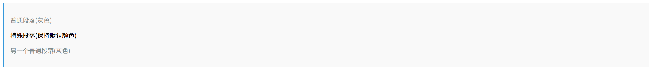
.not-example p:not(.special) {
color: #7f8c8d;
}
</style>
<div class="example not-example">
<p>普通段落(灰色)</p>
<p class="special">特殊段落(保持默认颜色)</p>
<p>另一个普通段落(灰色)</p>
</div>
18.:has() - 包含关系选择器
<style>
.example {
background-color: #f9f9f9;
padding: 15px;
margin: 10px 0;
border-left: 4px solid #3498db;
}
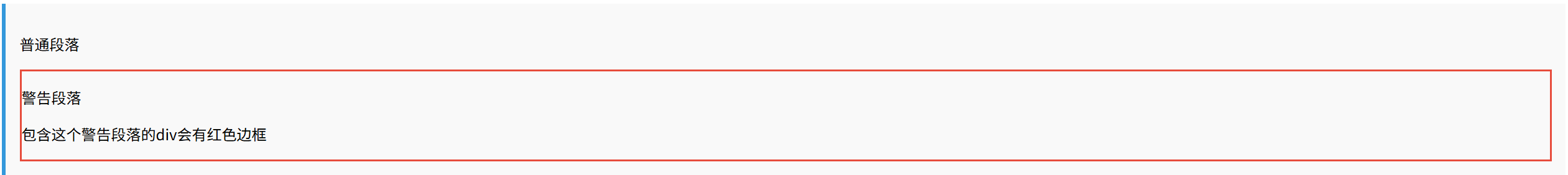
.has-example div:has(p.warning) {
border: 2px solid #e74c3c;
}
</style>
<div class="example has-example">
<div>
<p>普通段落</p>
</div>
<div>
<p class="warning">警告段落</p>
<p>包含这个警告段落的div会有红色边框</p>
</div>
</div>
19.:is() - 匹配列表 | :where() - 零特异性匹配
<style>
.example {
background-color: #f9f9f9;
padding: 15px;
margin: 10px 0;
border-left: 4px solid #3498db;
}
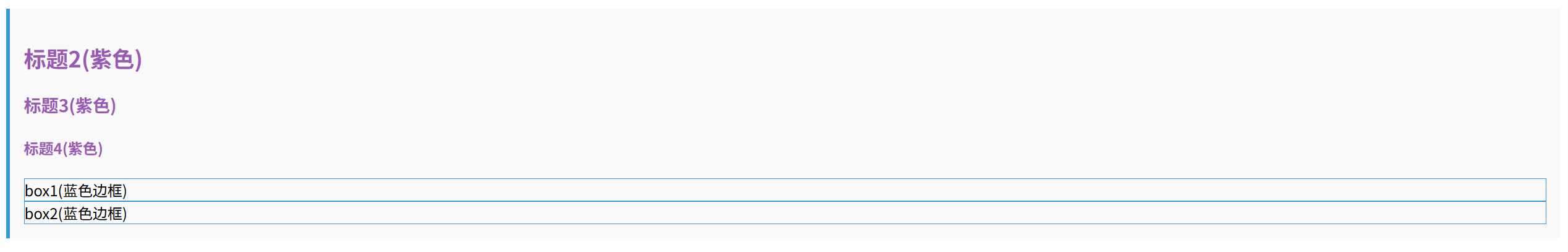
.is-where-example :is(h2, h3, h4) {
color: #9b59b6;
}
.is-where-example :where(.box1, .box2) {
border: 1px solid #3498db;
}
</style>
<div class="example is-where-example">
<h2>标题2(紫色)</h2>
<h3>标题3(紫色)</h3>
<h4>标题4(紫色)</h4>
<div class="box1">box1(蓝色边框)</div>
<div class="box2">box2(蓝色边框)</div>
</div>
20.:lang(language) - 语言选择器
<style>
.example {
background-color: #f9f9f9;
padding: 15px;
margin: 10px 0;
border-left: 4px solid #3498db;
}
.lang-example :lang(en) {
font-style: italic;
}
.lang-example :lang(zh) {
font-weight: bold;
}
</style>
<div class="example lang-example">
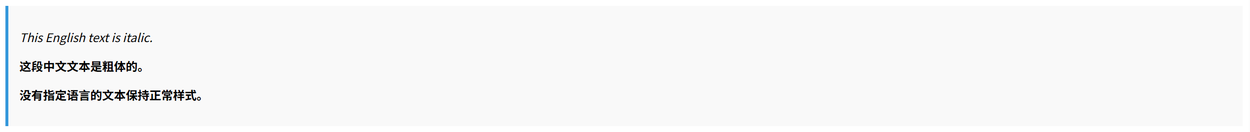
<p lang="en">This English text is italic.</p>
<p lang="zh">这段中文文本是粗体的。</p>
<p>没有指定语言的文本保持正常样式。</p>
</div>
21.:optional - 可选字段 | :required - 必填字段
<style>
    .example {
        background-color: #f9f9f9;
        padding: 15px;
        margin: 10px 0;
        border-left: 4px solid #3498db;
    }
    .opt-req-example input:required {
        border-left: 3px solid #e74c3c;
    }
    .opt-req-example input:optional {
        border-left: 3px solid #2ecc71;
    }
</style>
<div class="example opt-req-example">
    <input type="text" required placeholder="必填字段(红色左边框)">
    <input type="text" placeholder="可选字段(绿色左边框)">
</div>

22.:valid - 有效输入 | :invalid - 无效输入
<style>
    .example {
        background-color: #f9f9f9;
        padding: 15px;
        margin: 10px 0;
        border-left: 4px solid #3498db;
    }
    .valid-example input:valid {
        border-color: #2ecc71;
    }
    .valid-example input:invalid {
        border-color: #e74c3c;
    }
</style>
<div class="example valid-example">
    <input type="email" placeholder="输入有效邮箱" value="valid@example.com">
    <input type="email" placeholder="输入无效邮箱" value="invalid">
</div>

23.:default - 默认选项
<style>
    .example {
        background-color: #f9f9f9;
        padding: 15px;
        margin: 10px 0;
        border-left: 4px solid #3498db;
    }
    .default-example input:default {
        outline: 2px solid #27ae60;
    }
</style>
<div class="example default-example">
    <form>
        <input type="radio" name="color" value="red" checked>
        <label>红色(默认选项)</label><br>
        <input type="radio" name="color" value="blue">
        <label>蓝色</label><br>
        <input type="radio" name="color" value="green">
        <label>绿色</label>
    </form>
</div>

24.:indeterminate - 不确定状态
<style>
    .example {
        background-color: #f9f9f9;
        padding: 15px;
        margin: 10px 0;
        border-left: 4px solid #3498db;
    }
    .indeterminate-example input:indeterminate + label {
        color: #f39c12;
    }
</style>
<div class="example indeterminate-example">
    <input type="checkbox" id="indeterminate-checkbox">
    <label for="indeterminate-checkbox">不确定状态复选框</label>
    <script>
        document.getElementById('indeterminate-checkbox').indeterminate = true;
    </script>
</div>

25.:placeholder-shown - 显示占位文本
<style>
    .example {
        background-color: #f9f9f9;
        padding: 15px;
        margin: 10px 0;
        border-left: 4px solid #3498db;
    }
    .placeholder-example input:placeholder-shown {
        border-color: #3498db;
    }
</style>
<div class="example placeholder-example">
    <input type="text" placeholder="请输入内容">
    <p>当显示占位文本时输入框边框为蓝色</p>
</div>

26.:fullscreen - 全屏模式
<style>
.example {
background-color: #f9f9f9;
padding: 15px;
margin: 10px 0;
border-left: 4px solid #3498db;
}
.fullscreen-example:-webkit-full-screen {
background-color: #2c3e50;
color: white;
}
.fullscreen-example:-ms-fullscreen {
background-color: #2c3e50;
color: white;
}
</style>
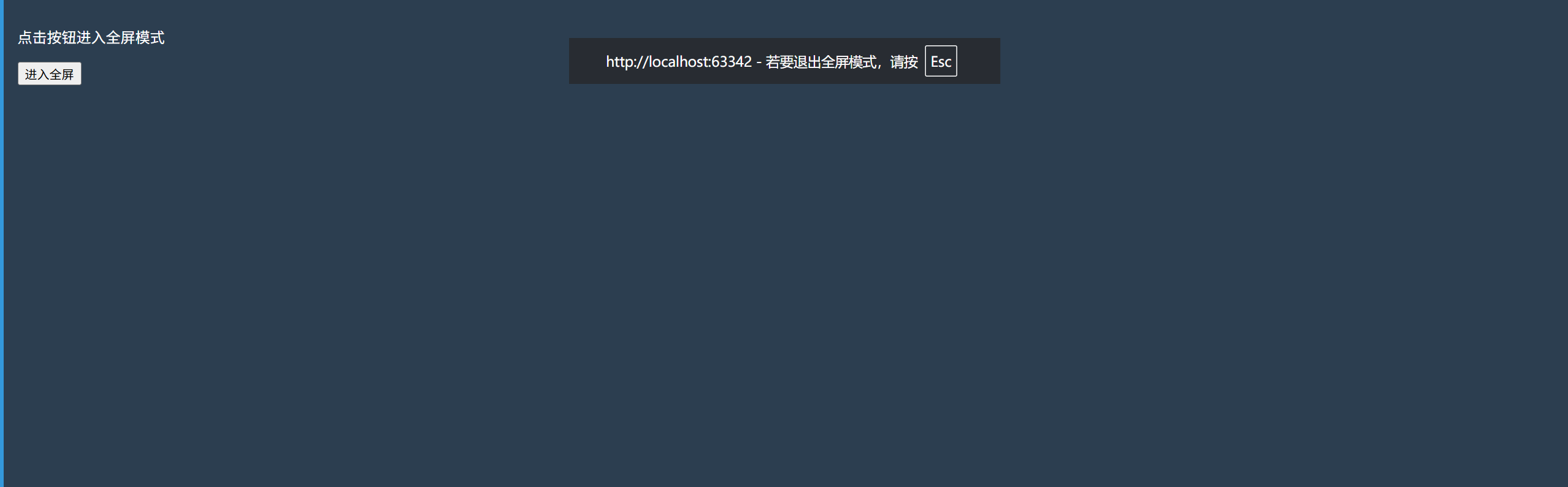
<div class="example fullscreen-example" id="fullscreen-div">
<p>点击按钮进入全屏模式</p>
<button onclick="document.getElementById('fullscreen-div').requestFullscreen()">
进入全屏
</button>
</div>
<script>
// 为:target示例添加平滑滚动
document.querySelectorAll('a[href^="#"]').forEach(anchor => {
anchor.addEventListener('click', function (e) {
e.preventDefault();
document.querySelector(this.getAttribute('href')).scrollIntoView({
behavior: 'smooth'
});
});
});
</script>
四、伪元素选择器
伪元素选择器(Pseudo-element Selectors) 是 CSS 中用于定位并样式化元素特定部分或虚拟内容的选择器,以双冒号 :: 开头(如 ::before、::first-line),允许开发者插入生成内容(需配合 content 属性)、修饰首行/首字母(::first-line/::first-letter)、高亮选中文本(::selection)或控制占位符(::placeholder),它们不改变 DOM 结构,而是通过 CSS 动态创建或修饰视觉片段,从而精确控制元素的局部样式与布局表现。
| 选择器 | 示例 | 示例说明 |
|---|---|---|
| ::before | p::before | 在每个<p>元素之前插入内容 |
| ::after | p::after | 在每个<p>元素之后插入内容 |
| ::first-letter | p::first-letter | 选择每一个<p>元素的第一个文字 |
| ::first-line | p::first-line | 选择每一个<p>元素的第一行 |
| ::selection | p::selection | 选择每一个<p>元素被用户选中的文字 |
| ::placeholder | input::placeholder | 选择input的占位符文本 |
| ::marker | li::marker | 选择样式化列表项(<li>、<summary>)的标记(如圆点、数字) |
| ::backdrop | ::backdrop | 全屏模式(Fullscreen API)下的背景层 |
| ::file-selector-button | ::file-selector-button | 选择文件上传按钮(<input type=“file”>) |
1.::before、::after示例
<style>
    .quote::before {
        content: "❗";
        margin-right: 5px;
    }
    .quote::after {
        content: "(请仔细阅读)";
        color: gray;
        font-size: 0.8em;
    }
</style>
<p class="quote">这是一条重要提示</p>

2.::first-letter示例
<style>
    .dropcap::first-letter {
        font-size: 2em;
        float: left;
        line-height: 1;
        margin-right: 5px;
        color: #ff5722;
    }
</style>
<p class="dropcap">伪元素可以增强文本的视觉效果。</p>

3.::first-line示例
<style>
    .first-line{
        width: 280px;
    }
    .first-line::first-line {
        font-weight: bold;
        color: blue;
    }
</style>
<p class="first-line">这段文字的第一行会显示为粗体蓝色,其余部分保持默认样式。伪元素允许我们精确控制元素的特定部分。</p>

4.::selection示例
<style>
    .highlight::selection {
        background: #ffeb3b;
        color: #000;
    }
</style>
<p class="highlight">选中这段文字试试看!</p>

5.::marker示例
<style>
    li::marker {
        color: red;
        font-size: 1.2em;
    }
</style>
<ul>
    <li>列表项 1</li>
    <li>列表项 2</li>
</ul>

6.::placeholder示例
<style>
    input::placeholder {
        color: red;
        font-style: italic;
    }
</style>
<input type="text" placeholder="请输入用户名">

7.::file-selector-button示例
<style>
    input[type="file"]::file-selector-button {
        background: red;
        color: white;
        border: none;
        padding: 8px 16px;
        border-radius: 4px;
    }
</style>
<input type="file">

8.::backdrop示例,必须搭配Fullscreen API使用
<style>
/* 全屏容器样式 */
#fullscreen-container {
width: 100vw;
height: 100vh;
display: flex;
justify-content: center;
align-items: center;
}
/* 内容区域样式 */
#fullscreen-content {
width: 300px;
height: 200px;
background: lightblue;
display: flex;
align-items: center;
justify-content: center;
}
/* 关键修改:将 ::backdrop 作用于 document 层级 */
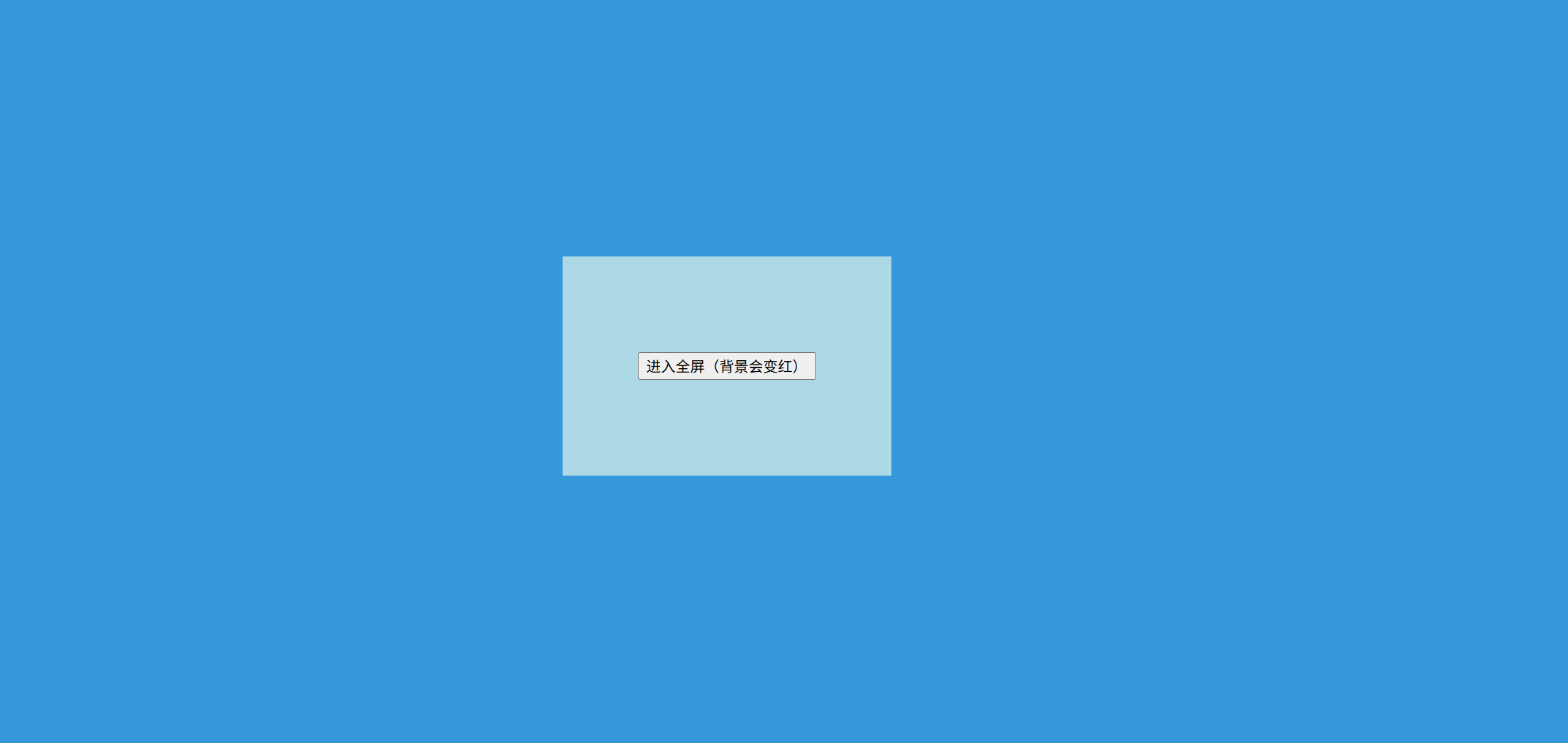
:fullscreen::backdrop {
background: #3498db;
}
</style>
<div id="fullscreen-container">
<div id="fullscreen-content">
<button onclick="this.closest('#fullscreen-container').requestFullscreen()">
进入全屏(背景会变红)
</button>
</div>
</div>
<script>
// 添加全屏状态变化监听
document.addEventListener('fullscreenchange', () => {
if (document.fullscreenElement) {
console.log('已进入全屏,背景色应为红色');
}
});
</script>


 扫一扫
扫一扫


 1648
1648

 被折叠的 条评论
为什么被折叠?
被折叠的 条评论
为什么被折叠?
 到【灌水乐园】发言


