


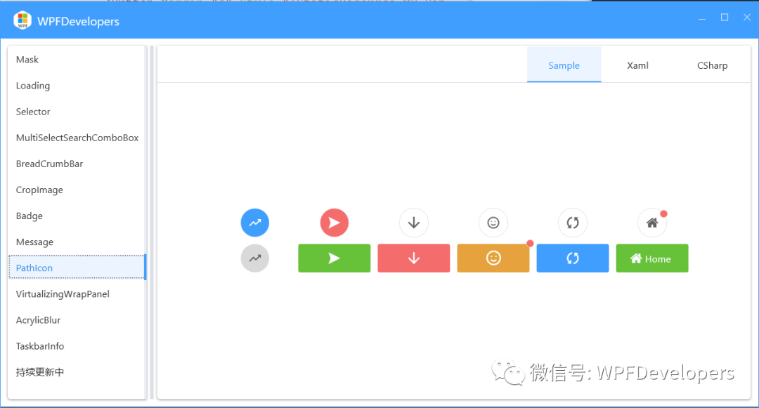
 本文介绍了如何在WPF中实现一个名为PathIcon的自定义控件,该控件用于显示路径图标。通过定义依赖属性Kind和Data,以及处理Kind变化的方法,动态加载和设置图标的路径数据。示例代码展示了如何在实际应用中使用这个控件来装饰按钮。
WPF 实现路径图标控件
控件名:PathIcon
作 者:WPFDevelopersOrg - 驚鏵
原文链接[1]:https://github.com/WPFDevelopersOrg/WPFDevelopers
框架使用
.NET4;Visual Studio 2022;
1)新增 PathIcon.cs 代码如下:
定义
PathIcon类,它继承自Control类,新增两个依赖属性Kind属性是一个枚举类型的依赖属性,用于指定图标的种类。Data属性是一个Geometry类型的依赖属性,用于存储图标的路径数据。
OnKindChanged当Kind属性发生变化时会被调用。它首先获取新值,并根据新值构建资源名称。然后,通过调用FindResource方法查找对应的$"WD.{kind}Geometry"资源,并将其赋值给Data属性。
using System.Windows;
using System.Windows.Controls;
using System.Windows.Media;

namespace WPFDevelopers.Controls
{
    public class PathIcon : Control
    {
        public static readonly DependencyProperty KindProperty =
            DependencyProperty.Register(nameof(Kind), typeof(string), typeof(PathIcon),
                new PropertyMetadata(string.Empty, OnKindChanged));

        public static readonly DependencyProperty DataProperty =
            DependencyProperty.Register(nameof(Data), typeof(Geometry), typeof(PathIcon));

        public PackIconKind Kind
        {
            get { return (PackIconKind)GetValue(KindProperty); }
            set { SetValue(KindProperty, value); }
        }

        public Geometry Data
        {
            get { return (Geometry)GetValue(DataProperty); }
            set { SetValue(DataProperty, value); }
        }

        private static void OnKindChanged(DependencyObject d, DependencyPropertyChangedEventArgs e)
        {
            var pathIcon = (PathIcon)d;
            var kind = (string)e.NewValue;
            if (!string.IsNullOrWhiteSpace(kind))
            {
                kind = $"WD.{kind}Geometry";
                pathIcon.Data = (Geometry)pathIcon.FindResource(kind);
            }
            else
                pathIcon.Data = null;
        }

        static PathIcon()
        {
            DefaultStyleKeyProperty.OverrideMetadata(typeof(PathIcon), new FrameworkPropertyMetadata(typeof(PathIcon)));
        }
    }
}
2)新增 PathIcon.xaml 代码如下:
使用
Viewbox控件包裹Path控件,以实现路径图标的缩放效果。
<ResourceDictionary
    xmlns="http://schemas.microsoft.com/winfx/2006/xaml/presentation"
    xmlns:x="http://schemas.microsoft.com/winfx/2006/xaml"
    xmlns:controls="clr-namespace:WPFDevelopers.Controls">
    <ResourceDictionary.MergedDictionaries>
        <ResourceDictionary Source="Basic/ControlBasic.xaml" />
    </ResourceDictionary.MergedDictionaries>

    <Style
        x:Key="WD.PathIcon"
        BasedOn="{StaticResource WD.ControlBasicStyle}"
        TargetType="{x:Type controls:PathIcon}">
        <Setter Property="Padding" Value="0" />
        <Setter Property="FocusVisualStyle" Value="{x:Null}" />
        <Setter Property="Focusable" Value="False" />
        <Setter Property="Height" Value="16" />
        <Setter Property="VerticalAlignment" Value="Center" />
        <Setter Property="VerticalContentAlignment" Value="Stretch" />
        <Setter Property="Foreground">
            <Setter.Value>
                <Binding Path="Foreground" RelativeSource="{RelativeSource Mode=FindAncestor, AncestorType={x:Type Control}}" />
            </Setter.Value>
        </Setter>
        <Setter Property="Width" Value="16" />
        <Setter Property="Template">
            <Setter.Value>
                <ControlTemplate TargetType="{x:Type controls:PathIcon}">
                    <Viewbox
                        Margin="{TemplateBinding Padding}"
                        HorizontalAlignment="{TemplateBinding HorizontalContentAlignment}"
                        VerticalAlignment="{TemplateBinding VerticalContentAlignment}"
                        UseLayoutRounding="True">
                        <Path
                            x:Name="PART_Path"
                            Data="{TemplateBinding Data}"
                            Fill="{TemplateBinding Foreground}"
                            SnapsToDevicePixels="{TemplateBinding SnapsToDevicePixels}"
                            Stretch="Uniform"
                            UseLayoutRounding="False" />
                    </Viewbox>
                </ControlTemplate>
            </Setter.Value>
        </Setter>
    </Style>

    <Style
        x:Key="WD.MiniPathIcon"
        BasedOn="{StaticResource WD.PathIcon}"
        TargetType="{x:Type controls:PathIcon}">
        <Setter Property="Height" Value="10" />
        <Setter Property="Width" Value="7" />
    </Style>

    <Style BasedOn="{StaticResource WD.PathIcon}" TargetType="{x:Type controls:PathIcon}" />
</ResourceDictionary>
3)新增示例 PathIconExample.xaml 代码如下:
<UniformGrid
            HorizontalAlignment="Center"
            VerticalAlignment="Center"
            Columns="6"
            Rows="2">
            <Button
                Margin="4"
                wd:ElementHelper.IsRound="True"
                Style="{StaticResource WD.PrimaryButton}">
                <wd:PathIcon Data="M682 256h256v256l-98-98-268 268-170-170-256 256-60-60 316-316 170 170 208-208z" />
            </Button>
            <Button
                Margin="4"
                wd:ElementHelper.IsRound="True"
                Style="{StaticResource WD.DangerPrimaryButton}">
                <wd:PathIcon Kind="Arrow" />
            </Button>
            <Button
                Margin="4"
                wd:ElementHelper.IsRound="True"
                Style="{StaticResource WD.DangerDefaultButton}">
                <wd:PathIcon Kind="SortArrow" />
            </Button>
            <Button
                Margin="4"
                wd:ElementHelper.IsRound="True"
                Style="{StaticResource WD.WarningDefaultButton}">
                <wd:PathIcon Kind="SmileyOutline" />
            </Button>
            <Button
                Margin="4"
                wd:ElementHelper.IsRound="True"
                Style="{StaticResource WD.DefaultButton}">
                <wd:PathIcon Kind="Replace" />
            </Button>
            <Button
                Margin="4"
                wd:Badge.HorizontalOffset="17"
                wd:Badge.IsShow="True"
                wd:Badge.VerticalOffset="8"
                wd:ElementHelper.IsRound="True"
                Style="{StaticResource WD.SuccessDefaultButton}">
                <wd:PathIcon Kind="Home" />
            </Button>
            <Button
                Margin="4"
                wd:ElementHelper.IsRound="True"
                Style="{StaticResource WD.NormalButton}">
                <wd:PathIcon PathData="M682 256h256v256l-98-98-268 268-170-170-256 256-60-60 316-316 170 170 208-208z" />
            </Button>
            <Button Margin="4" Style="{StaticResource WD.SuccessPrimaryButton}">
                <wd:PathIcon Kind="Arrow" />
            </Button>
            <Button Margin="4" Style="{StaticResource WD.DangerPrimaryButton}">
                <wd:PathIcon Kind="SortArrow" />
            </Button>
            <Button
                Margin="4"
                wd:Badge.IsShow="True"
                Style="{StaticResource WD.WarningPrimaryButton}">
                <wd:PathIcon
                    Width="20"
                    Height="20"
                    Kind="SmileyOutline" />
            </Button>
            <Button Margin="4" Style="{StaticResource WD.PrimaryButton}">
                <wd:PathIcon Kind="Replace" />
            </Button>
            <Button Margin="4" Style="{StaticResource WD.SuccessPrimaryButton}">
                <StackPanel Orientation="Horizontal">
                    <wd:PathIcon Kind="Home" />
                    <TextBlock Margin="4,0" Text="Home" />
                </StackPanel>
            </Button>
        </UniformGrid>
参考资料
[1]
原文链接: https://github.com/WPFDevelopersOrg/WPFDevelopers


 3672
3672

 被折叠的 条评论
为什么被折叠?
被折叠的 条评论
为什么被折叠?
 到【灌水乐园】发言


