


了解下前端er耕耘的田----------浏览器科普
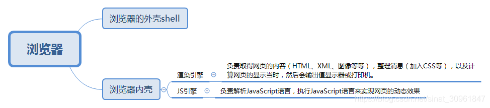
一、组成:Shell + 内核
(图侵删)
Shell :
User Interface(用户界面)   ---包括地址栏、后退/前进按钮、书签目录等
Browser engine(浏览器引擎)  ---在用户界面和渲染引擎之间传送指令/在客户端本地缓存中读写数据
Networking(网络)     	    ---完成网络调用或资源下载的模块
UI Backend(UI 后端)         ---绘制基本的浏览器窗口内控件(输入框、按钮、单选按钮等)
Date Persistence(数据持久化存储)---浏览器在硬盘中保存 cookie、localStorage等各种数据
号外:(数据存储化可通过浏览器引擎提供的API进行调用)
内核:
渲染引擎       ---(Rendering Engine),也称为布局(排版)引擎(Layout Engine)人话就是
			  负责对网页语法的解释和渲染显示到浏览器。完整详见[1]

JS引擎         --- 解释执行JS脚本的模块。tip见[2]
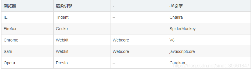
现代浏览器的JS引擎和渲染引擎
 (图侵删)
(图侵删)
- Trident [又称MSHTML]:IE,MaxThon,TT,The World,360,搜狗浏览器等。微软开发的渲染引擎,市场占有率高,但与W3C标准脱节,大量Bug等安全问题没有得到解决。
- Gecko:Netscape6及以上版本,Firefox,MozillaSuite/SeaMonkey等。功能强大、丰富,可以支持很多复杂网页效果和浏览器扩展接口,但是要消耗很多的资源,比如内存。
- Presto:Opera7及以上。[Opera内核原为:Presto,现为:Blink;]。Presto内核被称为公认的浏览网页速度最快的内核,这得益于它在开发时的天生优势,在处理JS脚本等脚本语言时,会比其他的内核快3倍左右,缺点就是为了达到很快的速度而丢掉了一部分网页兼容性。
- Webkit:Safari,Chrome等。[Chrome的:Blink(WebKit的分支)]。优点是网页浏览速度较快,虽然不及 Presto 但是也胜于 Gecko 和 Trident,缺点是对于网页代码的容错性不高,也就是说对网页代码的兼容性较低,会使一些编写不标准的网页无法正确显示。
二、页面渲染流程:
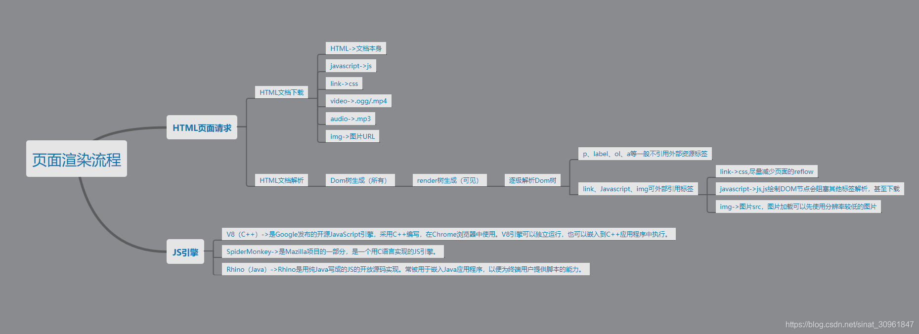
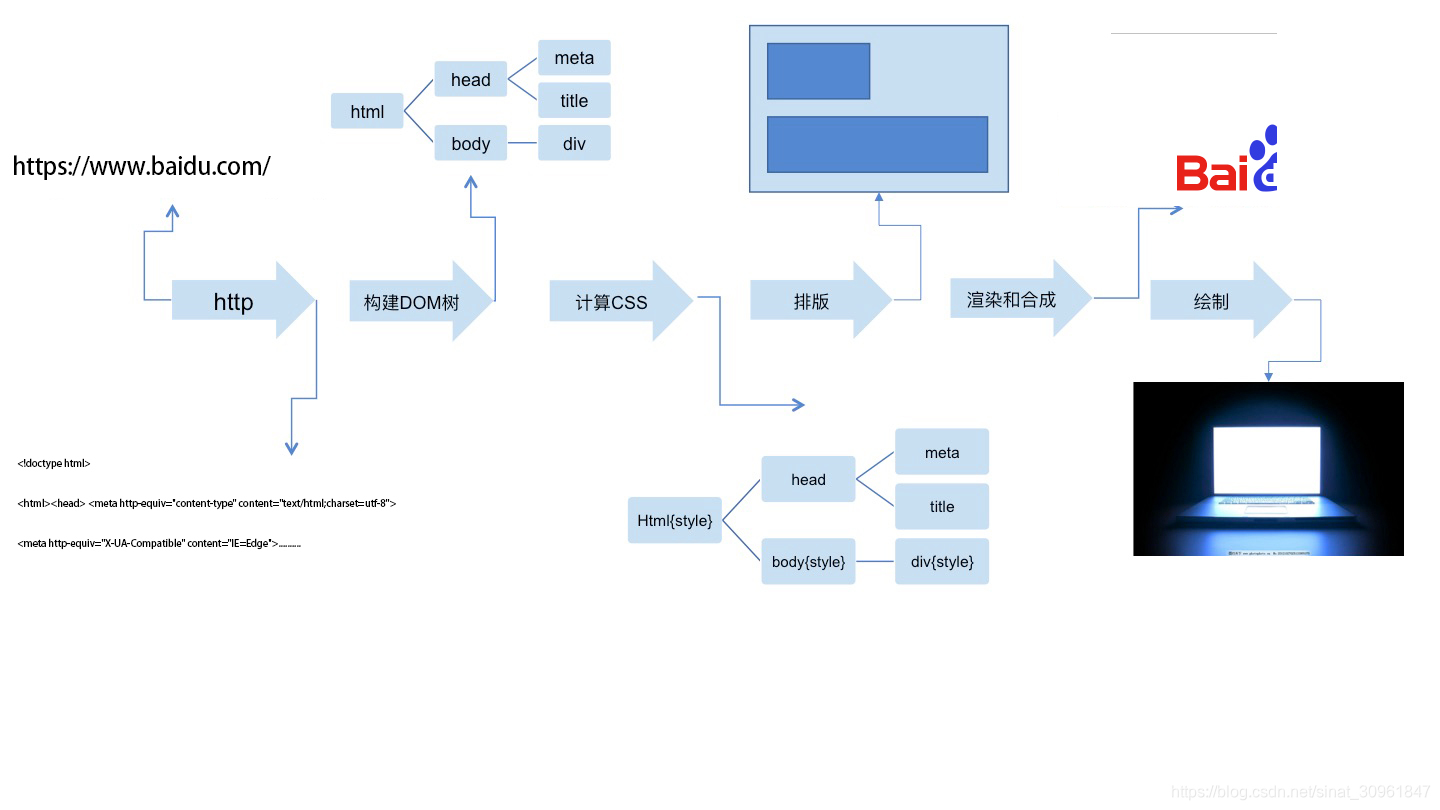
- 浏览器首先使用 HTTP 协议或者 HTTPS 协议,向服务端请求页面;
- 把请求回来的 HTML 代码经过解析,构建成 DOM 树;
- 计算 DOM 树上的 CSS 属性;
- 最后根据 CSS 属性对元素逐个进行渲染,得到内存中的位图;
- 一个可选的步骤是对位图进行合成,这会极大地增加后续绘制的速度;
- 合成之后,再绘制到界面上。
其实从 HTTP 请求回来开始,这个过程并非一般想象中的一步做完再做下一步,而是一条流水线。从 HTTP 请求回来,就产生了流式的数据(啥叫流数据),后续的 DOM 树构建、CSS 计算、渲染、合成、绘制,都是尽可能地流式处理前一步的产出:即不需要等到上一步骤完全结束,就开始处理上一步的输出,这样我们在浏览网页时,才会看到逐步出现的页面。
贴上一个兴趣URL:通过分析Chrome源码深入理解浏览器如何渲染页面
从Chrome源码看浏览器如何构建DOM树
[1]负责取得并解析网页的内容(DOM文档如HTML、XML,图像等等)、整理讯息(例如加入CSS规则等),以及计算网页的显示方式,然后会输出至显示器或打印机。浏览器的内核的不同对于网页的语法解释会有不同,所以渲染的效果也不相同。所有网页浏览器、电子邮件客户端以及其它需要编辑、显示网络内容的应用程序都需要内核。
[2]最开始渲染引擎和JS引擎并没有区分的很明确,后来JS引擎越来越独立,内核就倾向于只指渲染引擎。常见有 V8 引擎、JavaScriptCore。
茶歇:
- 关于JS对象的拷贝问题
<!DOCTYPE html>
<html lang="en">
<head>
    <meta charset="UTF-8">
    <meta name="viewport" content="width=device-width, initial-scale=1.0">
    <meta http-equiv="X-UA-Compatible" content="ie=edge">
    <title>JS对象的拷贝</title>
</head>
<body>
    <script>
        /*一、场景
             除了基本类型跟null,对象之间的赋值,只是将地址指向同一个,而不是真正意义上的拷贝
        */
        // 将一个对象赋值给另外一个对象
        var a = [1,2,3];
        var b = a;
        b.push(4);
        console.log('a:============'+a); // a变成了[1,2,3,4]
        // 自定义对象
        var obj = {a:10};
        var obj2 = obj;
        obj2.a = 20;
        console.log('obj:=========='+obj.a); // obj的a变成了20
        /**
         *  二、浅拷贝
            封装一个函数,来对对象进行拷贝,通过for in 循环获取基本类型,赋值每一个基本类型,才能真正意义上的复制一个对象
         **/
         var obj3 = { a: 10 };
         function copy(obj){
             var newObj = {};
             for (var attr in obj){
                 newObj[attr] = obj[attr];
             }
             return newObj;
         }
         var obj4 = copy(obj3);
         obj4.a = 20;
         console.log('obj3:=================='+obj3.a);
         /**
          * 三、深拷贝
          *     但是这里存在隐患,如果obj中,a的值不是10,而是一个对象,这样就会导致在for in中,将a这个对象的引用赋值为新对象,导致存在对象引用的问题。
          * **/
         var obj5 = {a: {b: 10}};
         function copy2(obj){
            var newObj = {};
            for (var attr in obj){
                newObj[attr] = obj[attr];
            }
            return newObj;
         }
         var obj6 = copy2(obj5);
         obj6.a.b = 20;
         console.log(obj5.a.b);
        //  因此,由于这个copy对象只是对第一层进行拷贝,无法拷贝深层的对象,这个copy为浅拷贝,我们需要通过递归,来拷贝深层的对象。将copy改造成递归即可
        var obj7 = {a:{b:10}};
        function deepCopy(obj){
            if(typeof obj != 'object'){
                return obj;
            }
            var newobj = {};
            for ( var attr in obj) {
                newobj[attr] = deepCopy(obj[attr]);
            }
            return newobj;
        }
        var obj8 = deepCopy(obj);
        obj8.a.b = 20;
        alert(obj7.a.b); //10


        /**
         * 深copy方法1:JSON.parse(JSON.stringify(obj));
         * 缺点:对象必须是JSON格式
         * **/
        let obj9 = {
            name: 'Kitty'
        }
        let obj10 = JSON.parse(JSON.stringify(obj9));
        obj10.name = 'Jone'
        console.log(obj9);
        console.log(obj10);
        console.log(obj9 === obj10);
        // ===============================================
        let obj11 = {
            a: '1',
            b: '2',
            c: function(){}
        }
        let obj12= JSON.parse(JSON.stringify(obj11));
        console.log(obj12);
        /**
         * 深copy方法2:Object.assign(target, ...sources)
         * Object.assign()方法用于将所有可枚举的属性的值从一个或多个源对象复制到目标对象,返回目标对象.
         * **/
        // 复制
        let c = Object.assign({}, { a: 'apple' });
        console.log(c); // { a: apple }
        // 合并
        let o = {}
        let d = Object.assign(o, { a: 'apple' }, { b: 'banana' }, { c: 'cake' })
        console.log(d)
        // 若对象本身存在的属性会更新,不存在的属性会增加
        let e = { name: 'Kitty' };
        var f = { name: 'Jone', id: 10 };
        var ef = Object.assign(e, f);
        console.log(e);
        console.log(f);
        console.log(ef);
        /**
         * 深度拷贝方法3:迭代递归法 for...in
         * **/
            // 迭代递归法:深拷贝对象与数组
        function deepClone(obj) {
            if (!isObject(obj)) {
                throw new Error('obj 不是一个对象!')
            }
            //判断传进来的是对象还是数组
            let isArray = Array.isArray(obj)
            let cloneObj = isArray ? [] : {}
            //通过for...in来拷贝
            for (let key in obj) {
                cloneObj[key] = isObject(obj[key]) ? deepClone(obj[key]) : obj[key]
            }

            return cloneObj
        }
        let result = deepClone(test)
        console.log(result)
        for (let key in result) {
            if (isObject(result[key]))
                console.log(`${key}相同吗? `, result[key] === test[key])
        }
        //我们发现,arr 和 obj 都深拷贝成功了,它们的内存引用已经不同了,但 func、date、reg 和 err 并没有复制成功,因为它们有特殊的构造函数。
        /**
         * 深度拷贝方法4:迭代递归法 Reflect
         * **/
        // 代理法
        function deepClone(obj) {
            if (!isObject(obj)) {
                throw new Error('obj 不是一个对象!')
            }

            let isArray = Array.isArray(obj)
            let cloneObj = isArray ? [...obj] : { ...obj }
            Reflect.ownKeys(cloneObj).forEach(key => {
                cloneObj[key] = isObject(obj[key]) ? deepClone(obj[key]) : obj[key]
            })

            return cloneObj
        }

        let result = deepClone(test)

        console.log(result)

        for (let key in result) {
            if (isObject(result[key]))
                console.log(`${key}相同吗? `, result[key] === test[key])
        }
        // 结果其实和使用for...in相同。
     </script>
</body>
</html>
- 一些css可以实现的图形
<!DOCTYPE html>
<html lang="en">
<head>
<meta charset="UTF-8">
<meta name="viewport" content="width=device-width, initial-scale=1.0">
<meta http-equiv="X-UA-Compatible" content="ie=edge">
<title>CSS的各种形状</title>
<style>
body { background: #282c34; }
div { margin: 10px 0px; }
/* 正方形 */
.square {
width: 100px;
height: 100px;
background: aliceblue;
}
/* 长方形 */
.rectangle {
width: 200px;
height: 100px;
background: antiquewhite;
}
/* 圆形 */
.circle {
width: 100px;
height: 100px;
background: aqua;
border-radius: 50%;
}
/* 椭圆 */
.oval {
width: 200px;
height: 100px;
background: aquamarine;
border-radius: 100px / 50px;
}
/* 上三角 */
.triangle-up {
width: 0;
height: 0;
border-left: 50px solid transparent;
border-right: 50px solid transparent;
border-bottom: 100px solid azure;
}
/* 下三角 */
.triangle-down {
width: 0;
height: 0;
border-left: 50px solid transparent;
border-right: 50px solid transparent;
border-top: 100px solid beige;
}
/* 左三角 */
.triangle-left {
width: 0;
height: 0;
border-top: 50px solid transparent;
border-bottom: 50px solid transparent;
border-right: 100px solid bisque;
}
/* 右三角 */
.triangle-right {
width: 0;
height: 0;
border-top: 50px solid transparent;
border-bottom: 50px solid transparent;
border-left: 100px solid black;
}
/* 左上角 */
.triangle-topleft {
width: 0;
height: 0;
border-top: 100px solid blanchedalmond;
border-right: 100px solid transparent;
}
/* 右上角 */
.triangle-topright {
width: 0;
height: 0;
border-top: 100px solid blue;
border-left: 100px solid transparent;
}
/* 左下角 */
.triangle-bottomleft {
width: 0;
height: 0;
border-bottom: 100px solid blueviolet;
border-right: 100px solid transparent;
}
/* 右下角 */
.triangle-bottomright {
width: 0;
height: 0;
border-bottom: 100px solid brown;
border-left: 100px solid transparent;
}
/* 箭头 */
.curvedarrow {
position: absolute;
width: 0;
height: 0;
border-top: 9px solid transparent;
border-right: 9px solid burlywood;
transform: rotate(10deg);
}
.curvedarrow:after {
content: '';
position: absolute;
border: 0 solid transparent;
border-top: 3px solid burlywood;
border-radius: 20px 0 0 0;
top: -12px;
left: -9px;
width: 12px;
height: 12px;
transform: rotate(45deg);
}
/* 梯形 */
.trapezoid {
border-bottom: 100px solid cadetblue;
border-left: 25px solid transparent;
border-right: 25px solid transparent;
height: 0;
width: 100px;
}
/* 平行四边形 */
.parallelogram {
width: 150px;
height: 100px;
transform: skew(20deg);
background: chartreuse;
}
/* 星星(六角) */
.star-six {
width: 0;
height: 0;
border-left: 50px solid transparent;
border-right: 50px solid transparent;
border-bottom: 100px solid chocolate;
position: relative;
}
.star-six:after {
width: 0;
height: 0;
border-left: 50px solid transparent;
border-right: 50px solid transparent;
border-top: 100px solid chocolate;
position: absolute;
content: '';
top: 30px;
left: -50px;
}
/* 星星(五角) */
.star-five {
margin: 100px 0;
position: relative;
display: block;
color: coral;
width: 0px;
height: 0px;
border-right: 100px solid transparent;
border-bottom: 70px solid coral;
border-left: 100px solid transparent;
transform: rotate(35deg);
}
.star-five:before {
border-bottom: 80px solid coral;
border-left: 30px solid transparent;
border-right: 30px solid transparent;
position: absolute;
width: 0;
height: 0;
top: -45px;
left: -65px;
display: block;
content: '';
transform: rotate(-35deg);
}
.star-five:after {
position: absolute;
display: block;
color: coral;
top: 3px;
left: -105px;
width: 0px;
height: 0px;
border-right: 100px solid transparent;
border-bottom: 70px solid coral;
border-left: 100px solid transparent;
transform: rotate(-70deg);
content: '';
}
/* 五边形 */
.pentagon {
position: relative;
width: 54px;
box-sizing: content-box;
border-width: 50px 18px 0;
border-style: solid;
border-color: cornflowerblue transparent;
}
.pentagon:before {
content: '';
position: absolute;
height: 0;
width: 0;
top: -85px;
left: -18px;
border-width: 0 45px 35px;
border-style: solid;
border-color: transparent transparent cornflowerblue;
}
/* 六边形 */
.hexagon {
margin-top: 50px;
width: 100px;
height: 55px;
background: cornsilk;
position: relative;
}
.hexagon:before {
content: "";
position: absolute;
top: -25px;
left: 0;
width: 0;
height: 0;
border-left: 50px solid transparent;
border-right: 50px solid transparent;
border-bottom: 25px solid cornsilk;
}
.hexagon:after {
content: "";
position: absolute;
bottom: -25px;
left: 0;
width: 0;
height: 0;
border-left: 50px solid transparent;
border-right: 50px solid transparent;
border-top: 25px solid cornsilk;
}
/* 八边形 */
.octagon {
margin-top: 50px;
width: 100px;
height: 100px;
background: darkblue;
position: relative;
}
.octagon:before {
content: "";
width: 50px;
height: 0;
position: absolute;
top: 0;
left: 0;
border-bottom: 25px solid darkblue;
border-left: 25px solid #282c34;
border-right: 25px solid #282c34;
}
.octagon:after {
content: "";
width: 50px;
height: 0;
position: absolute;
bottom: 0;
left: 0;
border-top: 25px solid darkblue;
border-left: 25px solid #282c34;
border-right: 25px solid #282c34;
}
/* 爱心 */
.heart {
position: relative;
width: 100px;
height: 90px;
}
.heart:before,
.heart:after {
position: absolute;
content: '';
left: 50px;
top: 0;
width: 50px;
height: 80px;
background: darkcyan;
border-radius: 50px 50px 0 0;
transform: rotate(-45deg);
transform-origin: 0 100%;
}
.heart:after {
left: 0;
transform: rotate(45deg);
transform-origin: 100% 100%;
}
/* 无穷大 */
.infinity {
position: relative;
width: 212px;
height: 100px;
box-sizing: content-box;
}
.infinity:before,
.infinity:after {
content: '';
box-sizing: content-box;
position: absolute;
top: 0;
left: 0;
width: 60px;
height: 60px;
border: 20px solid darkgoldenrod;
border-radius: 50px 50px 0 50px;
transform: rotate(-45deg);
}
.infinity:after {
left: auto;
right: 0;
border-radius: 50px 50px 50px 0;
transform: rotate(45deg);
}
/* 菱形 */
.diamond {
width: 0;
height: 0;
border: 50px solid transparent;
border-bottom-color: darkgray;
position: relative;
top: -50px;
}
.diamond:after {
content: '';
position: absolute;
left: -50px;
top: 50px;
width: 0;
height: 0;
border: 50px solid transparent;
border-top-color: darkgray;
}
/* 钻石 */
.diamond-shield {
width: 0;
height: 0;
border: 50px solid transparent;
border-bottom: 20px solid darkgreen;
position: relative;
top: -50px;
}
.diamond-shield:after {
content: '';
position: absolute;
left: -50px;
top: 20px;
width: 0;
height: 0;
border: 50px solid transparent;
border-top: 70px solid darkgreen;
}
/* 钻戒 */
.diamond-narrow {
margin-top: 50px;
width: 0;
height: 0;
border: 50px solid transparent;
border-bottom: 70px solid darkgrey;
position: relative;
top: -50px;
}
.diamond-narrow:after {
content: '';
position: absolute;
left: -50px;
top: 70px;
width: 0;
height: 0;
border: 50px solid transparent;
border-top: 70px solid darkgray;
}
/* 钻石2 */
.cut-diamond {
margin-top: 50px;
border-style: solid;
border-color: transparent transparent darkkhaki transparent;
border-width: 0 25px 25px 25px;
height: 0;
width: 50px;
box-sizing: content-box;
position: relative;
margin: 20px 0 50px 0;
}
.cut-diamond:after {
content: "";
position: absolute;
top: 25px;
left: -25px;
width: 0;
height: 0;
border-style: solid;
border-color: darkkhaki transparent transparent transparent;
border-width: 70px 50px 0 50px;
}
/* 蛋蛋 */
.egg {
display: block;
width: 126px;
height: 180px;
background: darkmagenta;
border-radius: 50% 50% 50% 50% / 60% 60% 40% 40%;
}
/* 吃豆人 */
.pacman {
width: 0px;
height: 0px;
border-right: 60px solid transparent;
border-top: 60px solid darkolivegreen;
border-left: 60px solid darkolivegreen;
border-bottom: 60px solid darkolivegreen;
border-top-left-radius: 60px;
border-top-right-radius: 60px;
border-bottom-left-radius: 60px;
border-bottom-right-radius: 60px;
}
/* 对话泡泡 */
.talkbubble {
width: 120px;
height: 80px;
background: darkorange;
position: relative;
-moz-border-radius: 10px;
-webkit-border-radius: 10px;
border-radius: 10px;
}
.talkbubble:before {
content: "";
position: absolute;
right: 100%;
top: 26px;
width: 0;
height: 0;
border-top: 13px solid transparent;
border-right: 26px solid darkorange;
border-bottom: 13px solid transparent;
}
/* 12点 爆发 */
.burst-12 {
background: darkorchid;
width: 80px;
height: 80px;
position: relative;
text-align: center;
}
.burst-12:before,
.burst-12:after {
content: "";
position: absolute;
top: 0;
left: 0;
height: 80px;
width: 80px;
background: darkorchid;
}
.burst-12:before {
transform: rotate(30deg);
}
.burst-12:after {
transform: rotate(60deg);
}
/* 8点 爆发 */
.burst-8 {
background: darkred;
width: 80px;
height: 80px;
position: relative;
text-align: center;
transform: rotate(20deg);
}
.burst-8:before {
content: "";
position: absolute;
top: 0;
left: 0;
height: 80px;
width: 80px;
background: darkred;
transform: rotate(135deg);
}
/* 太极 */
.yin-yang {
width: 96px;
box-sizing: content-box;
height: 48px;
background: floralwhite;
border-color: firebrick;
border-style: solid;
border-width: 2px 2px 50px 2px;
border-radius: 100%;
position: relative;
}
.yin-yang:before {
content: "";
position: absolute;
top: 50%;
left: 0;
background: floralwhite;
border: 18px solid firebrick;
border-radius: 100%;
width: 12px;
height: 12px;
box-sizing: content-box;
}
.yin-yang:after {
content: "";
position: absolute;
top: 50%;
left: 50%;
background: firebrick;
border: 18px solid floralwhite;
border-radius: 100%;
width: 12px;
height: 12px;
box-sizing: content-box;
}
/* 徽章丝带 */
#badge-ribbon {
position: relative;
background: forestgreen;
height: 100px;
width: 100px;
border-radius: 50px;
}
#badge-ribbon:before,
#badge-ribbon:after {
content: '';
position: absolute;
border-bottom: 70px solid forestgreen;
border-left: 40px solid transparent;
border-right: 40px solid transparent;
top: 70px;
left: -10px;
transform: rotate(-140deg);
}
#badge-ribbon:after {
left: auto;
right: -10px;
transform: rotate(140deg);
}
/* 太空入侵者(电脑游戏名) */
#space-invader {
box-shadow: 0 0 0 1em fuchsia,
0 1em 0 1em fuchsia,
-2.5em 1.5em 0 .5em fuchsia,
2.5em 1.5em 0 .5em fuchsia,
-3em -3em 0 0 fuchsia,
3em -3em 0 0 fuchsia,
-2em -2em 0 0 fuchsia,
2em -2em 0 0 fuchsia,
-3em -1em 0 0 fuchsia,
-2em -1em 0 0 fuchsia,
2em -1em 0 0 fuchsia,
3em -1em 0 0 fuchsia,
-4em 0 0 0 fuchsia,
-3em 0 0 0 fuchsia,
3em 0 0 0 fuchsia,
4em 0 0 0 fuchsia,
-5em 1em 0 0 fuchsia,
-4em 1em 0 0 fuchsia,
4em 1em 0 0 fuchsia,
5em 1em 0 0 fuchsia,
-5em 2em 0 0 fuchsia,
5em 2em 0 0 fuchsia,
-5em 3em 0 0 fuchsia,
-3em 3em 0 0 fuchsia,
3em 3em 0 0 fuchsia,
5em 3em 0 0 fuchsia,
-2em 4em 0 0 fuchsia,
-1em 4em 0 0 fuchsia,
1em 4em 0 0 fuchsia,
2em 4em 0 0 fuchsia;
background: fuchsia;
width: 1em;
height: 1em;
overflow: hidden;
margin: 50px 0 70px 65px;
}
/* 电视 */
#tv {
position: relative;
width: 200px;
height: 150px;
margin: 20px 0;
background: gainsboro;
border-radius: 50% / 10%;
color: white;
text-align: center;
text-indent: .1em;
}
#tv:before {
content: '';
position: absolute;
top: 10%;
bottom: 10%;
right: -5%;
left: -5%;
background: inherit;
border-radius: 5% / 50%;
}
/* 雪佛龙 */
#chevron {
position: relative;
text-align: center;
padding: 12px;
margin-bottom: 6px;
height: 60px;
width: 200px;
}
#chevron:before {
content: '';
position: absolute;
top: 0;
left: 0;
height: 100%;
width: 51%;
background: ghostwhite;
transform: skew(0deg, 6deg);
}
#chevron:after {
content: '';
position: absolute;
top: 0;
right: 0;
height: 100%;
width: 50%;
background: ghostwhite;
transform: skew(0deg, -6deg);
}
/* 放大镜 */
#magnifying-glass {
font-size: 10em;
display: inline-block;
width: 0.4em;
box-sizing: content-box;
height: 0.4em;
border: 0.1em solid gold;
position: relative;
border-radius: 0.35em;
}
#magnifying-glass:before {
content: "";
display: inline-block;
position: absolute;
right: -0.25em;
bottom: -0.1em;
border-width: 0;
background: gold;
width: 0.35em;
height: 0.08em;
transform: rotate(45deg);
}
/* facebook图标 */
#facebook-icon {
background: goldenrod;
text-indent: -999em;
width: 100px;
height: 110px;
box-sizing: content-box;
border-radius: 5px;
position: relative;
overflow: hidden;
border: 15px solid goldenrod;
border-bottom: 0;
}
#facebook-icon:before {
content: "/20";
position: absolute;
background: goldenrod;
width: 40px;
height: 90px;
bottom: -30px;
right: -37px;
border: 20px solid #282c34;
border-radius: 25px;
box-sizing: content-box;
}
#facebook-icon:after {
content: "/20";
position: absolute;
width: 55px;
top: 50px;
height: 20px;
background: #282c34;
right: 5px;
box-sizing: content-box;
}
/* 月亮 */
#moon {
width: 80px;
height: 80px;
border-radius: 50%;
box-shadow: 15px 15px 0 0 gray;
}
/* 旗 */
#flag {
width: 110px;
height: 56px;
box-sizing: content-box;
padding-top: 15px;
position: relative;
background: green;
color: white;
font-size: 11px;
letter-spacing: 0.2em;
text-align: center;
text-transform: uppercase;
}
#flag:after {
content: "";
position: absolute;
left: 0;
bottom: 0;
width: 0;
height: 0;
border-bottom: 13px solid #282c34;
border-left: 55px solid transparent;
border-right: 55px solid transparent;
}
/* 圆锥 */
#cone {
width: 0;
height: 0;
border-left: 70px solid transparent;
border-right: 70px solid transparent;
border-top: 100px solid greenyellow;
border-radius: 50%;
}
/* 十字架 */
#cross {
background: grey;
height: 100px;
position: relative;
left: 50px;
width: 20px;
}
#cross:after {
background: grey;
content: "";
height: 20px;
left: -40px;
position: absolute;
top: 40px;
width: 100px;
}
/* 根基 */
#base {
background: honeydew;
display: inline-block;
height: 55px;
margin-left: 20px;
margin-top: 55px;
position: relative;
width: 100px;
}
#base:before {
border-bottom: 35px solid honeydew;
border-left: 50px solid transparent;
border-right: 50px solid transparent;
content: "";
height: 0;
left: 0;
position: absolute;
top: -35px;
width: 0;
}
/* 指示器 */
#pointer {
width: 200px;
height: 40px;
position: relative;
background: hotpink;
}
#pointer:after {
content: "";
position: absolute;
left: 0;
bottom: 0;
width: 0;
height: 0;
border-left: 20px solid #282c34;
border-top: 20px solid transparent;
border-bottom: 20px solid transparent;
}
#pointer:before {
content: "";
position: absolute;
right: -20px;
bottom: 0;
width: 0;
height: 0;
border-left: 20px solid hotpink;
border-top: 20px solid transparent;
border-bottom: 20px solid transparent;
}
/* 锁 */
#lock {
font-size: 8px;
position: relative;
width: 18em;
height: 13em;
border-radius: 2em;
top: 10em;
box-sizing: border-box;
border: 3.5em solid indianred;
border-right-width: 7.5em;
border-left-width: 7.5em;
margin: 0 0 6rem 0;
}
#lock:before {
content: "";
box-sizing: border-box;
position: absolute;
border: 2.5em solid indianred;
width: 14em;
height: 12em;
left: 50%;
margin-left: -7em;
top: -12em;
border-top-left-radius: 7em;
border-top-right-radius: 7em;
}
#lock:after {
content: "";
box-sizing: border-box;
position: absolute;
border: 1em solid indianred;
width: 5em;
height: 8em;
border-radius: 2.5em;
left: 50%;
top: -1em;
margin-left: -2.5em;
}
</style>
</head>
<body>
<div class="square"></div>
<div class="rectangle"></div>
<div class="circle"></div>
<div class="oval"></div>
<div class="triangle-up"></div>
<div class="triangle-down"></div>
<div class="triangle-left"></div>
<div class="triangle-right"></div>
<div class="triangle-topleft"></div>
<div class="triangle-topright"></div>
<div class="triangle-bottomleft"></div>
<div class="triangle-bottomright"></div>
<div style="height: 100px;"><div class="curvedarrow"></div></div>
<div class="trapezoid"></div>
<div class="parallelogram"></div>
<div class="star-six"></div>
<div class="star-five"></div>
<div class="pentagon"></div>
<div class="hexagon"></div>
<div class="octagon"></div>
<div class="heart"></div>
<div class="infinity"></div>
<div class="diamond"></div>
<div class="diamond-shield"></div>
<div class="diamond-narrow"></div>
<div class="cut-diamond"></div>
<div class="egg"></div>
<div class="pacman"></div>
<div class="burst-12"></div>
<div class="burst-8"></div>
<div class="yin-yang"></div>
<div id="badge-ribbon"></div>
<div id="space-invader"></div>
<div id="tv"></div>
<div id="chevron"></div>
<div id="manifying-glass"></div>
<div id="facebook-icon"></div>
<div id="moon"></div>
<div id="flag"></div>
<div id="cone"></div>
<div id="cross"></div>
<div id="base"></div>
<div id="pointer"></div>
<div id="lock"></div>
</body>
</html>


 885
885


 被折叠的 条评论
为什么被折叠?
被折叠的 条评论
为什么被折叠?
 到【灌水乐园】发言


