


一:使用highchart实现3D饼图
HTML:需要一个容器来绘图
<div class="dataItemRight" id="trafficData"></div>
JS:所需js文件
<script src="js/jquery.min.js" type="text/javascript" charset="utf-8"></script>
<script src="http://cdn.highcharts.com.cn/highcharts/highcharts.js"></script>
<script src="http://code.highcharts.com.cn/highcharts/8.1.2/highcharts-3d.js"></script>
js代码块:重点已注释
<script type="text/javascript">
Highcharts.chart('trafficData', {
colors:['#4D7BF3','#FCC419'],
chart: {
type: 'pie',
options3d: {
enabled: true,//启用
alpha: 25,//内旋转角度
beta: 0// 外旋转角度
}
},
title: {//标题
text: '单位:元',
align: 'right',
color: "#333333",
x: -55,
y: 37
},
legend: {
//重点,在这里设置图例不生效,手动问号???
//不知道问什么,需要在下面plotOptions.pie.showInLegend来设置图例的显示才可以
},
credits: {
enabled: false
},
tooltip: {
pointFormat: '{series.name}: <b>{point.percentage:.1f}%</b>'
},
plotOptions: {
pie: {
allowPointSelect: true,
cursor: 'pointer',
depth: 80,// 重点,实现3d效果
dataLabels: {
enabled: true,
format: '{point.name}{point.percentage:.1f}%'
},
showInLegend: true//重点图例显示
}
},
series: [{
name: 'Brands',
colorByPoint: true,
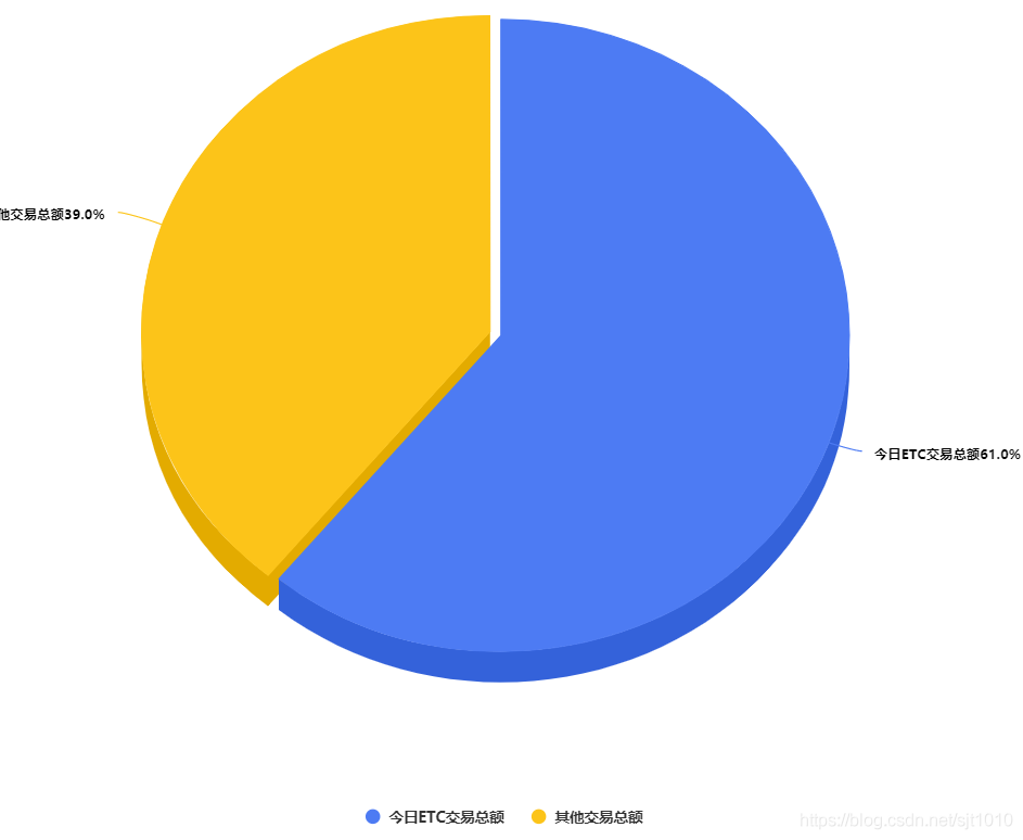
data: [{
name: '今日ETC交易总额',
y: 61,
sliced: true,
selected: true
}, {
name: '其他交易总额',
y: 39
}]
}]
});
</script>效果图:


 1345
1345


 被折叠的 条评论
为什么被折叠?
被折叠的 条评论
为什么被折叠?
 到【灌水乐园】发言


