转载:http://blog.csdn.net/qq_17766199/article/details/52863741
重用 < include/>
< include>标签可以在一个布局中引入另外一个布局,这个的好处显而易见。类似于我们经常用到的工具类,随用随调。便于统一修改使用。
举例说明:首先写一个公共的布局title_bar.xml,app中常用的标题栏。
<?xml version="1.0" encoding="utf-8"?>
<RelativeLayout
    xmlns:android="http://schemas.android.com/apk/res/android"
    xmlns:tools="http://schemas.android.com/tools"
    android:layout_width="match_parent"
    android:background="@color/background"
    android:layout_height="48dp">

    <ImageView
        android:layout_width="wrap_content"
        android:layout_height="match_parent"
        android:paddingLeft="15dp"
        android:paddingRight="15dp"
        android:src="@drawable/icon_back"/>

    <TextView
        tools:text="标题"
        android:layout_width="wrap_content"
        android:layout_height="wrap_content"
        android:layout_centerInParent="true"
        android:textSize="18sp"
        android:textColor="@color/white" />

    <TextView
        tools:text="确定"
        android:layout_width="wrap_content"
        android:gravity="center"
        android:layout_height="match_parent"
        android:layout_alignParentRight="true"
        android:paddingLeft="15dp"
        android:paddingRight="15dp"
        android:textSize="16sp"
        android:textColor="@color/white" />

</RelativeLayout>
- 1
- 2
- 3
- 4
- 5
- 6
- 7
- 8
- 9
- 10
- 11
- 12
- 13
- 14
- 15
- 16
- 17
- 18
- 19
- 20
- 21
- 22
- 23
- 24
- 25
- 26
- 27
- 28
- 29
- 30
- 31
- 32
- 33
- 34
- 35
- 1
- 2
- 3
- 4
- 5
- 6
- 7
- 8
- 9
- 10
- 11
- 12
- 13
- 14
- 15
- 16
- 17
- 18
- 19
- 20
- 21
- 22
- 23
- 24
- 25
- 26
- 27
- 28
- 29
- 30
- 31
- 32
- 33
- 34
- 35
预览:
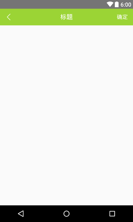
下来activity_main.xml调用它:
<?xml version="1.0" encoding="utf-8"?>
<RelativeLayout
    xmlns:android="http://schemas.android.com/apk/res/android"
    android:layout_width="match_parent"
    android:layout_height="match_parent">

    <include
        layout="@layout/title_bar"/>

</RelativeLayout>
运行后效果和预览一样一样的。当然我们也可以在< include>标签当中重新设置宽高等layout属性。
用TextView同时显示图片和文字
这个我就不细说了,举一个我们项目中的一个例子,代码一看便知。
首先要完成的效果是如下图:
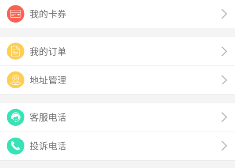
这种效果很常见,一般实现方法是这样。(貌似没人这样写吧,哈哈)
<?xml version="1.0" encoding="utf-8"?>
<LinearLayout
    xmlns:android="http://schemas.android.com/apk/res/android"
    android:layout_width="match_parent"
    android:layout_height="match_parent">

    <LinearLayout
        android:orientation="horizontal"
        android:background="@color/white"
        android:layout_width="match_parent"
        android:layout_height="50dp">

        <ImageView
            android:layout_marginLeft="10dp"
            android:layout_width="wrap_content"
            android:src="@drawable/icon_1"
            android:layout_height="match_parent" />

        <TextView
            android:paddingLeft="10dp"
            android:paddingRight="10dp"
            android:textSize="16sp"
            android:text="我的卡券"
            android:gravity="center_vertical"
            android:layout_width="0dp"
            android:layout_weight="1"
            android:layout_height="match_parent" />

        <ImageView
            android:layout_marginRight="10dp"
            android:src="@drawable/icon_4"
            android:layout_width="wrap_content"
            android:layout_height="match_parent"/>
    </LinearLayout>

</LinearLayout>
- 1
- 2
- 3
- 4
- 5
- 6
- 7
- 8
- 9
- 10
- 11
- 12
- 13
- 14
- 15
- 16
- 17
- 18
- 19
- 20
- 21
- 22
- 23
- 24
- 25
- 26
- 27
- 28
- 29
- 30
- 31
- 32
- 33
- 34
- 35
- 36
- 1
- 2
- 3
- 4
- 5
- 6
- 7
- 8
- 9
- 10
- 11
- 12
- 13
- 14
- 15
- 16
- 17
- 18
- 19
- 20
- 21
- 22
- 23
- 24
- 25
- 26
- 27
- 28
- 29
- 30
- 31
- 32
- 33
- 34
- 35
- 36
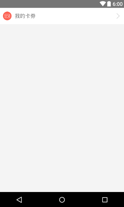
效果图:
那么我们优化一下:
<?xml version="1.0" encoding="utf-8"?>
<LinearLayout
    xmlns:android="http://schemas.android.com/apk/res/android"
    android:layout_width="match_parent"
    android:layout_height="match_parent">

    <TextView
        android:drawableLeft="@drawable/icon_1"
        android:drawableRight="@drawable/icon_4"
        android:drawablePadding="10dp"
        android:paddingLeft="10dp"
        android:paddingRight="10dp"
        android:textSize="16sp"
        android:text="我的卡券"
        android:background="@color/white"
        android:gravity="center_vertical"
        android:layout_width="match_parent"
        android:layout_height="50dp" />

</LinearLayout>
- 1
- 2
- 3
- 4
- 5
- 6
- 7
- 8
- 9
- 10
- 11
- 12
- 13
- 14
- 15
- 16
- 17
- 18
- 19
- 20
- 21
- 1
- 2
- 3
- 4
- 5
- 6
- 7
- 8
- 9
- 10
- 11
- 12
- 13
- 14
- 15
- 16
- 17
- 18
- 19
- 20
- 21
你没有看错,少了两个ImageView和去除嵌套LinearLayout。效果不用说一样一样的。当然EditView等也一样的,还有属性drawableBottom和drawableTop供你使用。同时利用代码setCompoundDrawables(Drawable left, Drawable top, Drawable right, Drawable bottom)可以让我们动态去设置图片
用LinearLayout自带的分割线
还记得上文用TextView同时显示图片和文字中的例子吗?我们可以看到每个条目之间都是有一根分隔线的,那么怎么实现呢?别人我不知道,反正我原来是用一个View设置高度实现的。相信一定有人和我一样。
那么老办法我就不演示了,直接上代码:
<LinearLayout
    xmlns:android="http://schemas.android.com/apk/res/android"
    android:layout_width="match_parent"
    android:layout_height="match_parent"
    android:orientation="vertical"
    android:divider="@drawable/divider"
    android:showDividers="middle">

    <TextView
        android:drawableLeft="@drawable/icon_1"
        android:drawableRight="@drawable/icon_4"
        android:drawablePadding="10dp"
        android:paddingLeft="10dp"
        android:paddingRight="10dp"
        android:textSize="16sp"
        android:text="我的卡券"
        android:background="@color/white"
        android:gravity="center_vertical"
        android:layout_width="match_parent"
        android:layout_height="50dp" />

    <TextView
        android:drawableLeft="@drawable/icon_2"
        android:drawableRight="@drawable/icon_4"
        android:drawablePadding="10dp"
        android:paddingLeft="10dp"
        android:paddingRight="10dp"
        android:textSize="16sp"
        android:text="地址管理"
        android:background="@color/white"
        android:gravity="center_vertical"
        android:layout_width="match_parent"
        android:layout_height="50dp" />

    <TextView
        android:drawableLeft="@drawable/icon_3"
        android:drawableRight="@drawable/icon_4"
        android:drawablePadding="10dp"
        android:paddingLeft="10dp"
        android:paddingRight="10dp"
        android:textSize="16sp"
        android:text="检查更新"
        android:background="@color/white"
        android:gravity="center_vertical"
        android:layout_width="match_parent"
        android:layout_height="50dp" />

</LinearLayout>
- 1
- 2
- 3
- 4
- 5
- 6
- 7
- 8
- 9
- 10
- 11
- 12
- 13
- 14
- 15
- 16
- 17
- 18
- 19
- 20
- 21
- 22
- 23
- 24
- 25
- 26
- 27
- 28
- 29
- 30
- 31
- 32
- 33
- 34
- 35
- 36
- 37
- 38
- 39
- 40
- 41
- 42
- 43
- 44
- 45
- 46
- 47
- 48
- 1
- 2
- 3
- 4
- 5
- 6
- 7
- 8
- 9
- 10
- 11
- 12
- 13
- 14
- 15
- 16
- 17
- 18
- 19
- 20
- 21
- 22
- 23
- 24
- 25
- 26
- 27
- 28
- 29
- 30
- 31
- 32
- 33
- 34
- 35
- 36
- 37
- 38
- 39
- 40
- 41
- 42
- 43
- 44
- 45
- 46
- 47
- 48
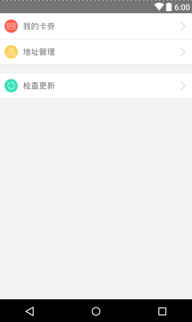
效果图:
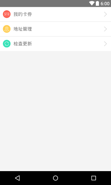
实现的核心部分其实是LinearLayout的这两行。
android:divider="@drawable/divider"
android:showDividers="middle"
其中divider.xml是分隔线样式。
<?xml version="1.0" encoding="utf-8"?>
<shape xmlns:android="http://schemas.android.com/apk/res/android"
       android:shape="rectangle">

    <size android:width="1dp"
          android:height="1dp"/>

    <solid android:color="#e1e1e1"/>

</shape>
showDividers 是分隔线的显示位置,beginning、middle、end分别代表显示在开始位置,中间,末尾。
还有dividerPadding属性这里没有用到,意思很明确给divider添加padding。感兴趣可以试试。
Space控件
还是接着上面的例子,如果要给条目中间添加间距,怎么实现呢?当然也很简单,比如添加一个高10dp的View,或者使用android:layout_marginTop="10dp"等方法。但是增加View违背了我们的初衷,并且影响性能。使用过多的margin其实会影响代码的可读性。
这时你就可以使用Space,他是一个轻量级的。我们可以看下源码:
/**
* Space is a lightweight View subclass that may be used to create gaps between components
* in general purpose layouts.
*/
public final class Space extends View {
/**
* {@inheritDoc}
*/
public Space(Context context, AttributeSet attrs, int defStyleAttr, int defStyleRes) {
super(context, attrs, defStyleAttr, defStyleRes);
if (getVisibility() == VISIBLE) {
setVisibility(INVISIBLE);
}
}
/**
* {@inheritDoc}
*/
public Space(Context context, AttributeSet attrs, int defStyleAttr) {
this(context, attrs, defStyleAttr, 0);
}
/**
* {@inheritDoc}
*/
public Space(Context context, AttributeSet attrs) {
this(context, attrs, 0);
}
/**
* {@inheritDoc}
*/
public Space(Context context) {
this(context, null);
}
/**
* Draw nothing.
*
* @param canvas an unused parameter.
*/
@Override
public void draw(Canvas canvas) {
}
/**
* Compare to: {@link View#getDefaultSize(int, int)}
* If mode is AT_MOST, return the child size instead of the parent size
* (unless it is too big).
*/
private static int getDefaultSize2(int size, int measureSpec) {
int result = size;
int specMode = MeasureSpec.getMode(measureSpec);
int specSize = MeasureSpec.getSize(measureSpec);
switch (specMode) {
case MeasureSpec.UNSPECIFIED:
result = size;
break;
case MeasureSpec.AT_MOST:
result = Math.min(size, specSize);
break;
case MeasureSpec.EXACTLY:
result = specSize;
break;
}
return result;
}
@Override
protected void onMeasure(int widthMeasureSpec, int heightMeasureSpec) {
setMeasuredDimension(
getDefaultSize2(getSuggestedMinimumWidth(), widthMeasureSpec),
getDefaultSize2(getSuggestedMinimumHeight(), heightMeasureSpec));
}
}
- 1
- 2
- 3
- 4
- 5
- 6
- 7
- 8
- 9
- 10
- 11
- 12
- 13
- 14
- 15
- 16
- 17
- 18
- 19
- 20
- 21
- 22
- 23
- 24
- 25
- 26
- 27
- 28
- 29
- 30
- 31
- 32
- 33
- 34
- 35
- 36
- 37
- 38
- 39
- 40
- 41
- 42
- 43
- 44
- 45
- 46
- 47
- 48
- 49
- 50
- 51
- 52
- 53
- 54
- 55
- 56
- 57
- 58
- 59
- 60
- 61
- 62
- 63
- 64
- 65
- 66
- 67
- 68
- 69
- 70
- 71
- 72
- 73
- 74
- 75
- 76
- 77
可以看到在draw方法没有绘制任何东西,那么性能也就几乎没有影响。
实现代码与效果:
<?xml version="1.0" encoding="utf-8"?>
<LinearLayout
    xmlns:android="http://schemas.android.com/apk/res/android"
    android:layout_width="match_parent"
    android:layout_height="match_parent"
    android:orientation="vertical"
    android:divider="@drawable/divider"
    android:showDividers="middle|beginning|end">

    <TextView
        android:drawableLeft="@drawable/icon_1"
        android:drawableRight="@drawable/icon_4"
        android:drawablePadding="10dp"
        android:paddingLeft="10dp"
        android:paddingRight="10dp"
        android:textSize="16sp"
        android:text="我的卡券"
        android:background="@color/white"
        android:gravity="center_vertical"
        android:layout_width="match_parent"
        android:layout_height="50dp" />

    <TextView
        android:drawableLeft="@drawable/icon_2"
        android:drawableRight="@drawable/icon_4"
        android:drawablePadding="10dp"
        android:paddingLeft="10dp"
        android:paddingRight="10dp"
        android:textSize="16sp"
        android:text="地址管理"
        android:background="@color/white"
        android:gravity="center_vertical"
        android:layout_width="match_parent"
        android:layout_height="50dp" />

    <Space
        android:layout_width="match_parent"
        android:layout_height="15dp"/>

    <TextView
        android:drawableLeft="@drawable/icon_3"
        android:drawableRight="@drawable/icon_4"
        android:drawablePadding="10dp"
        android:paddingLeft="10dp"
        android:paddingRight="10dp"
        android:textSize="16sp"
        android:text="检查更新"
        android:background="@color/white"
        android:gravity="center_vertical"
        android:layout_width="match_parent"
        android:layout_height="50dp" />

</LinearLayout>
- 1
- 2
- 3
- 4
- 5
- 6
- 7
- 8
- 9
- 10
- 11
- 12
- 13
- 14
- 15
- 16
- 17
- 18
- 19
- 20
- 21
- 22
- 23
- 24
- 25
- 26
- 27
- 28
- 29
- 30
- 31
- 32
- 33
- 34
- 35
- 36
- 37
- 38
- 39
- 40
- 41
- 42
- 43
- 44
- 45
- 46
- 47
- 48
- 49
- 50
- 51
- 52
- 53
- 54
- 1
- 2
- 3
- 4
- 5
- 6
- 7
- 8
- 9
- 10
- 11
- 12
- 13
- 14
- 15
- 16
- 17
- 18
- 19
- 20
- 21
- 22
- 23
- 24
- 25
- 26
- 27
- 28
- 29
- 30
- 31
- 32
- 33
- 34
- 35
- 36
- 37
- 38
- 39
- 40
- 41
- 42
- 43
- 44
- 45
- 46
- 47
- 48
- 49
- 50
- 51
- 52
- 53
- 54
使用TextView的行间距
先上我们需要实现的效果图:

效果很简单,实现代码:
<?xml version="1.0" encoding="utf-8"?>
<LinearLayout
    xmlns:android="http://schemas.android.com/apk/res/android"
    android:layout_height="100dp"
    android:background="@color/white"
    android:layout_width="match_parent"
    xmlns:tools="http://schemas.android.com/tools">

    <ImageView
        android:padding="25dp"
        android:src="@drawable/kd_1"
        android:layout_width="100dp"
        android:layout_height="100dp"/>

    <LinearLayout
        android:layout_width="match_parent"
        android:orientation="vertical"
        android:layout_height="100dp">

        <TextView
            tools:text="揽件方式:上门取件"
            android:gravity="center_vertical"
            android:layout_width="match_parent"
            android:layout_height="25dp"/>

        <TextView
            tools:text="快递公司:顺丰快递"
            android:gravity="center_vertical"
            android:layout_width="match_parent"
            android:layout_height="25dp"/>

        <TextView
            tools:text="预约时间:9月6日 立即取件"
            android:gravity="center_vertical"
            android:layout_width="match_parent"
            android:layout_height="25dp"/>

        <TextView
            tools:text="快递费用:等待称重确定价格"
            android:gravity="center_vertical"
            android:layout_width="match_parent"
            android:layout_height="25dp"/>

    </LinearLayout>

</LinearLayout>
- 1
- 2
- 3
- 4
- 5
- 6
- 7
- 8
- 9
- 10
- 11
- 12
- 13
- 14
- 15
- 16
- 17
- 18
- 19
- 20
- 21
- 22
- 23
- 24
- 25
- 26
- 27
- 28
- 29
- 30
- 31
- 32
- 33
- 34
- 35
- 36
- 37
- 38
- 39
- 40
- 41
- 42
- 43
- 44
- 45
- 46
- 1
- 2
- 3
- 4
- 5
- 6
- 7
- 8
- 9
- 10
- 11
- 12
- 13
- 14
- 15
- 16
- 17
- 18
- 19
- 20
- 21
- 22
- 23
- 24
- 25
- 26
- 27
- 28
- 29
- 30
- 31
- 32
- 33
- 34
- 35
- 36
- 37
- 38
- 39
- 40
- 41
- 42
- 43
- 44
- 45
- 46
这里我偷懒了多嵌套了一层LinearLayout,但。。。这不重要,我先直接修改。
优化后代码:
<?xml version="1.0" encoding="utf-8"?>
<LinearLayout
    xmlns:android="http://schemas.android.com/apk/res/android"
    android:layout_height="100dp"
    android:background="@color/white"
    android:layout_width="match_parent">

    <ImageView
        android:padding="25dp"
        android:src="@drawable/kd_1"
        android:layout_width="100dp"
        android:layout_height="match_parent"/>

    <TextView
        android:textSize="14dp"
        android:lineSpacingExtra="8dp"
        android:gravity="center_vertical"
        android:text="揽件方式:上门取件\n快递公司:顺丰快递\n预约时间:9月6日 立即取件\n快递费用:等待称重确定价格"
        android:layout_width="match_parent"
        android:layout_height="match_parent" />

</LinearLayout>
- 1
- 2
- 3
- 4
- 5
- 6
- 7
- 8
- 9
- 10
- 11
- 12
- 13
- 14
- 15
- 16
- 17
- 18
- 19
- 20
- 21
- 22
- 1
- 2
- 3
- 4
- 5
- 6
- 7
- 8
- 9
- 10
- 11
- 12
- 13
- 14
- 15
- 16
- 17
- 18
- 19
- 20
- 21
- 22
老规矩,效果一样一样的。可以看到我们仅仅利用Android:lineSpacingExtra="8dp"这一行代码就省去了3个TextView,如果行数更多呢?是不是方便多了。
其中:lineSpacingExtra属性代表的是行间距,他默认是0,是一个绝对高度值。同时还有lineSpacingMultiplier属性,它代表行间距倍数,默认为1.0f,是一个相对高度值。我们来使用一下:
<?xml version="1.0" encoding="utf-8"?>
<LinearLayout
    xmlns:android="http://schemas.android.com/apk/res/android"
    android:layout_height="100dp"
    android:background="@color/white"
    android:layout_width="match_parent">

    <ImageView
        android:padding="25dp"
        android:src="@drawable/kd_1"
        android:layout_width="100dp"
        android:layout_height="100dp"/>

    <TextView
        android:textSize="14dp"
        android:lineSpacingMultiplier="1.3"
        android:gravity="center_vertical"
        android:text="揽件方式:上门取件\n快递公司:顺丰快递\n预约时间:9月6日 立即取件\n快递费用:等待称重确定价格"
        android:layout_width="match_parent"
        android:layout_height="match_parent" />

</LinearLayout>
- 1
- 2
- 3
- 4
- 5
- 6
- 7
- 8
- 9
- 10
- 11
- 12
- 13
- 14
- 15
- 16
- 17
- 18
- 19
- 20
- 21
- 22
- 1
- 2
- 3
- 4
- 5
- 6
- 7
- 8
- 9
- 10
- 11
- 12
- 13
- 14
- 15
- 16
- 17
- 18
- 19
- 20
- 21
- 22
当然了这两条属性可以同时使用,查看源码可以知道,他们的高度计算规则为mTextPaint.getFontMetricsInt(null) * 行间距倍数 + 行间距。


 1569
1569


 被折叠的 条评论
为什么被折叠?
被折叠的 条评论
为什么被折叠?
 到【灌水乐园】发言


