


写在前面
今天练习的这个项目是一个加载动画,这个加载动画主要是为了在网络不好,页面加载缓慢时给用户的一个提示,一个好的加载动画,可以缓解用户的焦虑情绪,让等待变得有趣,现在很多产品也越来越注重这一块的设计了,因此,我们在之前也分享了很多很多的加载动画效果。
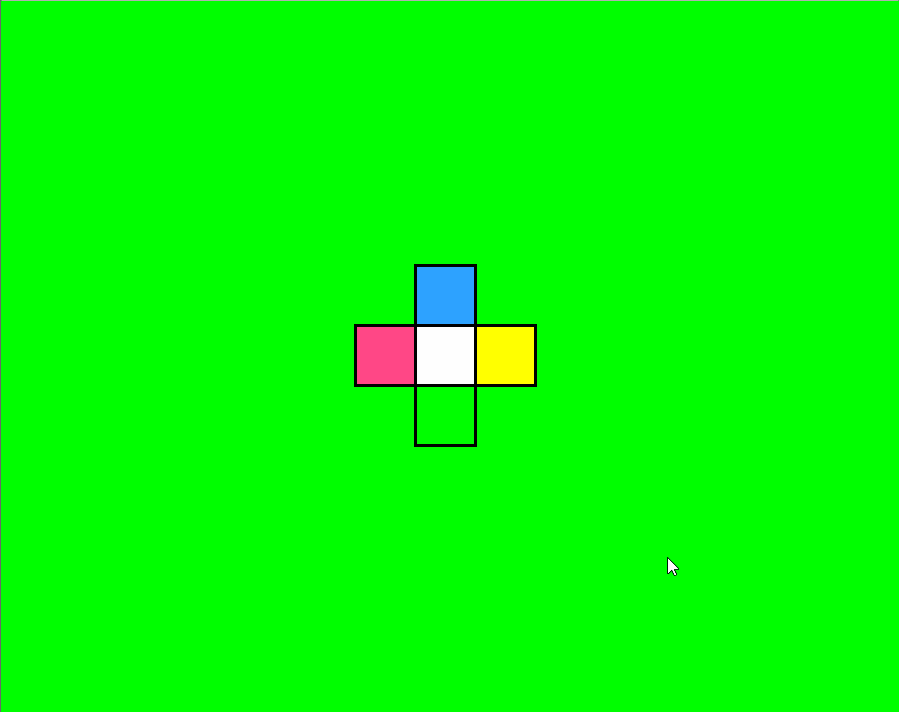
而我们今天练习的这个项目,非常简单,最终效果请看下面动画截图:
HTML代码:
<!doctype html>
<html>
  <head>
    <meta charset="utf-8">
    <title>【每日一练】31—CSS 实现一个彩色旋转方块动画效果</title>
  </head>
  <body>
    <section>
      <div class="loader">
        <div></div>
        <div></div>
        <div></div>
        <div></div>
      </div>
    </section>
  </body>
</html>
CSS代码:
*
{
  margin: 0;
  padding: 0;
  box-sizing: border-box;
}
section
{
  display: flex;
  justify-content: center;
  align-items: center;
  min-height: 100vh;
  animation: changeBgColor 4s steps(1) infinite;
}
@keyframes changeBgColor
{
  0%
  {
    background: #ff0;
  }
  25%
  {
    background: #0f0;
  }
  50%
  {
    background: #ff4786;
  }
  75%
  {
    background: #2da2ff;
  }
  100%
  {
    background: #ff0;
  }
}


.loader
{
  position: relative;
  width: 50px;
  height: 50px;
  background: #000;
  animation: rotate 1s linear infinite;
}
.loader div
{
  position: absolute;
  width: 100%;
  height: 100%;
  background: #000;
  animation: animate 1s linear infinite;
}
@keyframes animate
{
  0%
  {
    transform: rotate(0deg);
  }
  50%,100%
  {
    transform: rotate(180deg);
  }
}


@keyframes rotate
{
  0%
  {
    transform: rotate(90deg);
  }
  50%,100%
  {
    transform: rotate(0deg);
  }
}
.loader div:nth-child(1)
{
  top: -100%;
  left: -2px;
  transform-origin: bottom right;
}
.loader div:nth-child(1)::before
{
  background: #ff0;
}
.loader div:nth-child(2)
{
  right: -100%;
  top: -2px;
  transform-origin: bottom left;
}
.loader div:nth-child(2)::before
{
  background: #0f0;
}
.loader div:nth-child(3)
{
  bottom: -100%;
  left: 2px;
  transform-origin: top left;
}
.loader div:nth-child(3)::before
{
  background: #ff4786;
}
.loader div:nth-child(4)
{
  left: -100%;
  top: 2px;
  transform-origin: top right;
}
.loader div:nth-child(4)::before
{
  background: #2da2ff;
}
.loader:before,
.loader div::before
{
  content: '';
  position: absolute;
  top: 2px;
  left: 2px;
  right: 2px;
  bottom: 2px;
  background: #fff;
}
写在最后
以上就是我们今天【每日一练】的全部内容,希望今天的小练习对你有用,如果你觉得有帮助的话,请点赞我,关注我,并将它分享给你身边做开发的朋友,也许能够帮助到他。
我是杨小爱,我们明天见。
学习更多技能
请点击下方公众号


 1267
1267


 被折叠的 条评论
为什么被折叠?
被折叠的 条评论
为什么被折叠?
 到【灌水乐园】发言


