


写在前面
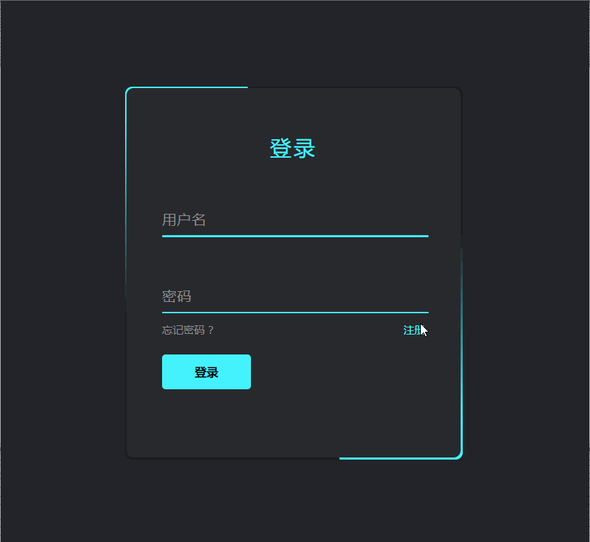
登录表单,也是很多网站常用的功能之一,因此,今天我们就一起来练习一个登录表单的效果,这个登录表单跟我们之前练习的有点不一样,它是自带边框动画效果的,具体的请看以下的最终效果:
看完了最终效果,我们再来看一下它的代码实现过程,具体如下:
HTML代码:
<!DOCTYPE html>
<html>
<head>
  <meta charset="UTF-8">
  <title>【每日一练】71—CSS实现动画登录表单效果</title>
</head>
<body>
  <div class="box">
    <form autocomplete="off">
      <h2>登录</h2>
      <div class="inputBox">
        <input type="text" required="required">
        <span>用户名</span>
        <i></i>
      </div>
      <div class="inputBox">
        <input type="password" required="required">
        <span>密码</span>
        <i></i>
      </div>
      <div class="links">
        <a href="http://www.webqdkf.com">忘记密码 ?</a>
        <a href="http://www.webqdkf.com">注册</a>
      </div>
      <input type="submit" value="登录">
    </form>
  </div>
</body>
</html>
CSS代码:
*
{
  margin: 0;
  padding: 0;
  box-sizing: border-box;
  font-family: 'Poppins', sans-serif;
}
body
{
  display: flex;
  justify-content: center;
  align-items: center;
  min-height: 100vh;
  flex-direction: column;
  background: #23242a;
}
.box
{
  position: relative;
  width: 380px;
  height: 420px;
  background: #1c1c1c;
  border-radius: 8px;
  overflow: hidden;
}
.box::before
{
  content: '';
  z-index: 1;
  position: absolute;
  top: -50%;
  left: -50%;
  width: 380px;
  height: 420px;
  transform-origin: bottom right;
  background: linear-gradient(0deg,transparent,#45f3ff,#45f3ff);
  animation: animate 6s linear infinite;
}
.box::after
{
  content: '';
  z-index: 1;
  position: absolute;
  top: -50%;
  left: -50%;
  width: 380px;
  height: 420px;
  transform-origin: bottom right;
  background: linear-gradient(0deg,transparent,#45f3ff,#45f3ff);
  animation: animate 6s linear infinite;
  animation-delay: -3s;
}
@keyframes animate
{
  0%
  {
    transform: rotate(0deg);
  }
  100%
  {
    transform: rotate(360deg);
  }
}
form
{
  position: absolute;
  inset: 2px;
  background: #28292d;
  padding: 50px 40px;
  border-radius: 8px;
  z-index: 2;
  display: flex;
  flex-direction: column;
}
h2
{
  color: #45f3ff;
  font-weight: 500;
  text-align: center;
  letter-spacing: 0.1em;
}
.inputBox
{
  position: relative;
  width: 300px;
  margin-top: 35px;
}
.inputBox input
{
  position: relative;
  width: 100%;
  padding: 20px 10px 10px;
  background: transparent;
  outline: none;
  box-shadow: none;
  border: none;
  color: #23242a;
  font-size: 1em;
  letter-spacing: 0.05em;
  transition: 0.5s;
  z-index: 10;
}
.inputBox span
{
  position: absolute;
  left: 0;
  padding: 20px 0px 10px;
  pointer-events: none;
  font-size: 1em;
  color: #8f8f8f;
  letter-spacing: 0.05em;
  transition: 0.5s;
}
.inputBox input:valid ~ span,
.inputBox input:focus ~ span
{
  color: #45f3ff;
  transform: translateX(0px) translateY(-34px);
  font-size: 0.75em;
}
.inputBox i
{
  position: absolute;
  left: 0;
  bottom: 0;
  width: 100%;
  height: 2px;
  background: #45f3ff;
  border-radius: 4px;
  overflow: hidden;
  transition: 0.5s;
  pointer-events: none;
  z-index: 9;
}
.inputBox input:valid ~ i,
.inputBox input:focus ~ i
{
  height: 44px;
}
.links
{
  display: flex;
  justify-content: space-between;
}
.links a
{
  margin: 10px 0;
  font-size: 0.75em;
  color: #8f8f8f;
  text-decoration: beige;
}
.links a:hover,
.links a:nth-child(2)
{
  color: #45f3ff;
}
input[type="submit"]
{
  border: none;
  outline: none;
  padding: 11px 25px;
  background: #45f3ff;
  cursor: pointer;
  border-radius: 4px;
  font-weight: 600;
  width: 100px;
  margin-top: 10px;
}
input[type="submit"]:active
{
  opacity: 0.8;
}
写在最后
以上就是我们今天的【每日一练】全部内容,希望今天的小练习对你有用,如果你觉得有帮助的话,请点赞我,关注我,并将它分享给你身边做开发的朋友,也许能够帮助到他。
我是杨小爱,我们明天见。
学习更多技能
请点击下方公众号


 348
348


 被折叠的 条评论
为什么被折叠?
被折叠的 条评论
为什么被折叠?
 到【灌水乐园】发言


