


https://segmentfault.com/a/1190000002780453#articleHeader18
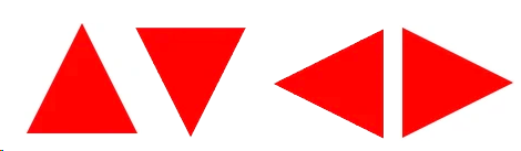
向上的箭头
#triangle-up {
    width: 0;
    height: 0;
    border-left: 50px solid transparent;
    border-right: 50px solid transparent;
    border-bottom: 100px solid red;
}

向下的剪头
#triangle-down {
    width: 0;
    height: 0;
    border-left: 50px solid transparent;
    border-right: 50px solid transparent;
    border-top: 100px solid red;
}
向左的箭头
#triangle-left {
    width: 0;
    height: 0;
    border-top: 50px solid transparent;
    border-right: 100px solid red;
    border-bottom: 50px solid transparent;
}
向右的剪头
#triangle-right {
    width: 0;
    height: 0;
    border-top: 50px solid transparent;
    border-left: 100px solid red;
    border-bottom: 50px solid transparent;
}
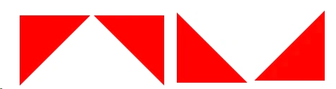
左上的箭头
#triangle-topleft {
    width: 0;
    height: 0;
    border-top: 100px solid red;
    border-right: 100px solid transparent;
}
右上的箭头
#triangle-topright {
    width: 0;
    height: 0;
    border-top: 100px solid red;
    border-left: 100px solid transparent;
}
左下的箭头
#triangle-bottomleft {
    width: 0;
    height: 0;
    border-bottom: 100px solid red;
    border-right: 100px solid transparent;
}
右下的箭头
#triangle-bottomright {
    width: 0;
    height: 0;
    border-bottom: 100px solid red;
    border-left: 100px solid transparent;
}
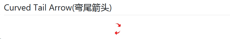
可以通过修改 #curvedarrow 的 rotate() 值来形成不同的方向
#curvedarrow {
  position: relative;
  width: 0;
  height: 0;
  border-top: 9px solid transparent;
  border-right: 9px solid red;
  -webkit-transform: rotate(10deg);
  -moz-transform: rotate(10deg);
  -ms-transform: rotate(10deg);
  -o-transform: rotate(10deg);
}
#curvedarrow:after {
  content: "";
  position: absolute;
  border: 0 solid transparent;
  border-top: 3px solid red;
  border-radius: 20px 0 0 0;
  top: -12px;
  left: -9px;
  width: 12px;
  height: 12px;
  -webkit-transform: rotate(45deg);
  -moz-transform: rotate(45deg);
  -ms-transform: rotate(45deg);
  -o-transform: rotate(45deg);
}
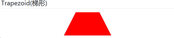
#trapezoid {
    border-bottom: 100px solid red;
    border-left: 50px solid transparent;
    border-right: 50px solid transparent;
    height: 0;
    width: 100px;
}
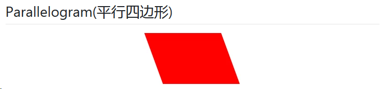
#parallelogram {
    width: 150px;
    height: 100px;
    -webkit-transform: skew(20deg);
       -moz-transform: skew(20deg);
         -o-transform: skew(20deg);
    background: red;
}
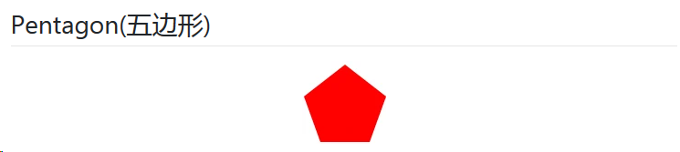
#pentagon {
    position: relative;
    width: 54px;
    border-width: 50px 18px 0;
    border-style: solid;
    border-color: red transparent;
}
#pentagon:before {
    content: "";
    position: absolute;
    height: 0;
    width: 0;
    top: -85px;
    left: -18px;
    border-width: 0 45px 35px;
    border-style: solid;
    border-color: transparent transparent red;
}
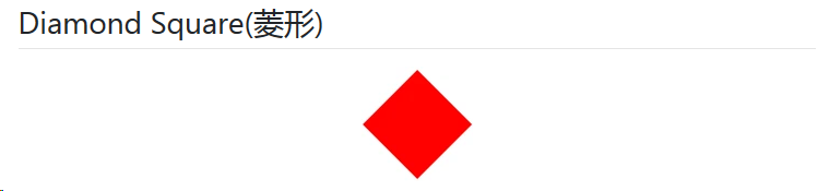
#diamond {
    width: 0;
    height: 0;
    border: 50px solid transparent;
    border-bottom-color: red;
    position: relative;
    top: -50px;
}
#diamond:after {
    content: '';
    position: absolute;
    left: -50px;
    top: 50px;
    width: 0;
    height: 0;
    border: 50px solid transparent;
    border-top-color: red;
}
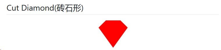
#cut-diamond {
    border-style: solid;
    border-color: transparent transparent red transparent;
    border-width: 0 25px 25px 25px;
    height: 0;
    width: 50px;
    position: relative;
    margin: 20px 0 50px 0;
}
#cut-diamond:after {
    content: "";
    position: absolute;
    top: 25px;
    left: -25px;
    width: 0;
    height: 0;
    border-style: solid;
    border-color: red transparent transparent transparent;
    border-width: 70px 50px 0 50px;
}
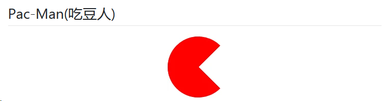
#pacman {
  width: 0px;
  height: 0px;
  border-right: 60px solid transparent;
  border-top: 60px solid red;
  border-left: 60px solid red;
  border-bottom: 60px solid red;
  border-top-left-radius: 60px;
  border-top-right-radius: 60px;
  border-bottom-left-radius: 60px;
  border-bottom-right-radius: 60px;
}
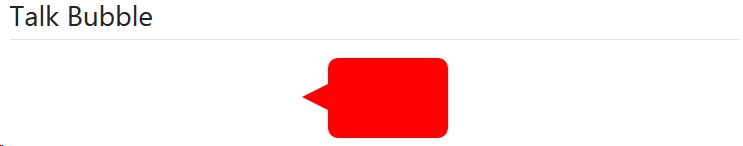
#talkbubble {
   width: 120px;
   height: 80px;
   background: red;
   position: relative;
   -moz-border-radius:    10px;
   -webkit-border-radius: 10px;
   border-radius:         10px;
}
#talkbubble:before {
   content:"";
   position: absolute;
   right: 100%;
   top: 26px;
   width: 0;
   height: 0;
   border-top: 13px solid transparent;
   border-right: 26px solid red;
   border-bottom: 13px solid transparent;
}
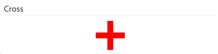
#cross {
  background: red;
  height: 100px;
  position: relative;
  width: 20px;
}
#cross:after {
  background: red;
  content: "";
  height: 20px;
  left: -40px;
  position: absolute;
  top: 40px;
  width: 100px;
}


 476
476


 被折叠的 条评论
为什么被折叠?
被折叠的 条评论
为什么被折叠?
 到【灌水乐园】发言


