


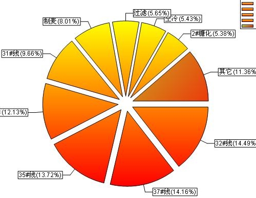
当饼图的分块大于10块的时候,往往会显得很杂乱,标签可能会叠加到一起,所以应该在饼图中加入“其它”块,把那些top10分开表示,剩下的就可以放在“其它”块里,这样界面较美观,以下为代码实现
其中dataRowPro 为datatable中的datarow
<textarea name="code" class="c-sharp" rows="15" cols="50">private string m_strColumn = string.Empty; // 显示该列的数字 private string m_strName = string.Empty; // 显示列名 ArrayList dataRowProList = new ArrayList(); Hashtable htShowName = new Hashtable(); if (dataRowPro.Length > 10) //当分类大于10的时候 { for (int i = 0; i < dataRowPro.Length; i++) { dataRowProList.Add(Convert.ToDouble(dataRowPro[i][m_strColumn])); htShowName.Add(dataRowProList[i], dataRowPro[i][m_strShowName].ToString().Trim()); } dataRowProList.Sort(); for (int i = 0; i < dataRowProList.Count - 1; i++) { dataRowPro[i][m_strColumn] = dataRowProList[dataRowProList.Count - 1-i]; dataRowPro[i][m_strShowName] = htShowName[dataRowProList[dataRowProList.Count - 1 - i]].ToString(); } double totals = 0.0; for (int i = 0; i < 9; i++) { if (string.IsNullOrEmpty(dataRowPro[i][m_strColumn].ToString()) == true) { dataRowPro[i][m_strColumn] = "0"; } segment[i] = myPane.AddPieSlice(Convert.ToDouble(dataRowPro[i][m_strColumn]) / protypeTotal * 100, Color.Yellow, Color.Red, 450f, 0.1+i/50, dataRowPro[i][m_strShowName].ToString().Trim() + "(" + Math.Round(Convert.ToDouble(dataRowPro[i][m_strColumn]) / protypeTotal * 100, 2) + "%)"); totals += Convert.ToDouble(dataRowPro[i][m_strColumn]) / protypeTotal * 100; } totals = 100.00 - totals; segment[9] = myPane.AddPieSlice(totals, Color.GreenYellow, Color.Red, 40f, 0.1, "其它" + "(" + Math.Round(totals, 2) + "%)"); } else { for (int i = 0; i < dataRowPro.Length; i++) { if (string.IsNullOrEmpty(dataRowPro[i][m_strColumn].ToString()) == true) { dataRowPro[i][m_strColumn] = "0"; } segment[i] = myPane.AddPieSlice(Convert.ToDouble(dataRowPro[i][m_strColumn]) / protypeTotal * 100, Color.FromArgb(ra.Next(2, 255), ra.Next(3, 235), ra.Next(4, 200)), Color.Red, 40f, 0.1, dataRowPro[i][m_strShowName].ToString().Trim() + "(" + Math.Round(Convert.ToDouble(dataRowPro[i][m_strColumn]) / protypeTotal * 100, 2) + "%)"); } } masterPane.AxisChange(); </textarea>
这是部分逻辑代码实现,只要实现了datarowpro,以下代码可直接用


 4567
4567

 被折叠的 条评论
为什么被折叠?
被折叠的 条评论
为什么被折叠?
 到【灌水乐园】发言


