


1.概述
Button按钮组成可以为文本或者图标或者两者的集合,并为按钮设置相应的动作。
(1).With text, using the Button class
<Button
	android:layout_width="wrap_content"
	android:layout_height="wrap_content"
	android:text="@string/button_text"
... />
(2).With an icon, using the ImageButton class
<ImageButton
	android:layout_width="wrap_content"
	android:layout_height="wrap_content"
	android:src="@drawable/button_icon"
... />
(3).With text and an icon, using the Button class with the android:drawableLeft attribute,可在text的四周合适的位置添加图片
<Button
	android:layout_width="wrap_content"
	android:layout_height="wrap_content"
	android:text="@string/button_text"
	android:drawableLeft="@drawable/button_icon"
... />


2.响应事件
(1).Add the android:onClick attribute to the <Button> element in XML layout.
<?xml version="1.0" encoding="utf-8"?>
<Button xmlns:android="http://schemas.android.com/apk/res/android"
	android:id="@+id/button_send"
	android:layout_width="wrap_content"
	android:layout_height="wrap_content"
	android:text="@string/button_send"
	android:onClick="sendMessage" />
/** Called when the user touches the button */ public void sendMessage(View view) { // Do something in response to button click }(2).Using an OnClickListener
Declare the click event handler pragmatically rather than in an XML layout. This might be necessary if you instantiate the Button at runtime or you need to declare the click behavior in a Fragment subclass.
Button button = (Button) findViewById(R.id.button_send);
button.setOnClickListener(new View.OnClickListener() {
    public void onClick(View v) {
        // Do something in response to button click
    }
});
3.自定义背景
(1).将多个图片置于 res/drawable/ 目录下
(2).创建一个xml文件(custom.xml),置于
res/drawable/目录下<?xml version="1.0" encoding="utf-8"?> <!-- custom.xml --> <selector xmlns:android="http://schemas.android.com/apk/res/android"> <item android:drawable="@android:drawable/pic1" android:state_pressed="true" /> <item android:drawable="@android:drawable/pic2" /> <!-- <item>标签元素的位置很重要,当这个xml文件被引用时,会从前往后找到一个适合的item标签,默认的至于最后 --> </selector>(3).标签使用background属性
<Button
	android:id="@+id/button_send"
	android:layout_width="wrap_content"
	android:layout_height="wrap_content"
	android:text="@string/button_send"
	android:onClick="sendMessage"
	android:background="@drawable/custom"  />
default
press


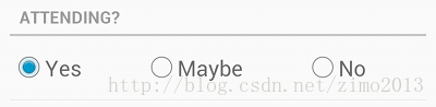
4.Radio Buttons
To create each radio button option, create a RadioButton in your layout. However, because radio buttons are mutually exclusive, you must group them together inside aRadioGroup. By grouping them together, the system ensures that only one radio button can be selected at a time.TheRadioGroup is a subclass of LinearLayoutthat has a verticalorientationby default.RadioButton是LinearLayout的子类
<?xml version="1.0" encoding="utf-8"?> <RadioGroup xmlns:android="http://schemas.android.com/apk/res/android" android:layout_width="fill_parent" android:layout_height="wrap_content" android:orientation="vertical"> <RadioButton android:id="@+id/radio_pirates" android:layout_width="wrap_content" android:layout_height="wrap_content" android:text="@string/pirates" android:onClick="onRadioButtonClicked"/> <RadioButton android:id="@+id/radio_ninjas" android:layout_width="wrap_content" android:layout_height="wrap_content" android:text="@string/ninjas" android:onClick="onRadioButtonClicked"/> </RadioGroup>viewPager与RadioButton的对应关系public void onRadioButtonClicked(View view) { // Is the button now checked? boolean checked = ((RadioButton) view).isChecked(); // Check which radio button was clicked switch(view.getId()) { case R.id.radio_pirates: if (checked) // Pirates are the best break; case R.id.radio_ninjas: if (checked) // Ninjas rule break; } }/**根据viewPager选中postion,指定哪个radioGroup被选中*/ @Override public void onPageSelected(int position) { group.check(group.getChildAt(position).getId()); } /**根据radioGroup选中的position,指定viewPager的当前页*/ @Override public void onCheckedChanged(RadioGroup group, int checkedId) { viewPager.setCurrentItem(group.indexOfChild(group.findViewById(checkedId))); }
5.Toggle Buttons / Switches
ToggleButton 和Switch 控件是CompoundButton的子类 , so you can implement their behavior the same way.You can add a basic toggle button to your layout with the ToggleButton object. Android 4.0 (API level 14) introduces another kind of toggle button called a switch that provides a slider control, which you can add with a Switch object.
Toggle buttons
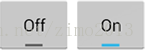
Switches (in Android 4.0+)
<ToggleButton
	android:id="@+id/togglebutton"
	android:layout_width="wrap_content"
	android:layout_height="wrap_content"
	android:textOn="Vibrate on"
	android:textOff="Vibrate off"
	android:onClick="onToggleClicked"/>
ToggleButton toggle = (ToggleButton) findViewById(R.id.togglebutton); //设置监听器 toggle.setOnCheckedChangeListener(new CompoundButton.OnCheckedChangeListener() { public void onCheckedChanged(CompoundButton buttonView, boolean isChecked) { if (isChecked) { // The toggle is enabled } else { // The toggle is disabled } } }); //或者另一种方法设置 public void onToggleClicked(View view) { // Is the toggle on? boolean on = ((ToggleButton) view).isChecked(); if (on) { // Enable vibrate } else { // Disable vibrate } }


 1018
1018


 被折叠的 条评论
为什么被折叠?
被折叠的 条评论
为什么被折叠?
 到【灌水乐园】发言


