


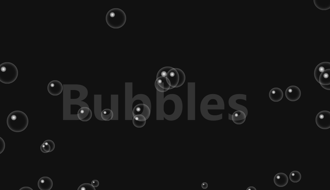
给大家分享一个用CSS 3.0实现的泡泡特效,效果如下:
以下是代码实现,欢迎大家复制、粘贴和收藏。
- <!DOCTYPE html>
- <html lang="en">
-
- <head>
- <meta charset="UTF-8">
- <meta name="viewport" content="width=device-width, initial-scale=1.0">
- <title>CSS 3.0实现泡泡特效</title>
- <style>
- * {
- margin: 0;
- padding: 0;
- }
-
- section {
- position: relative;
- width: 100%;
- height: 100vh;
- overflow: hidden;
- background: #111;
- display: flex;
- align-items: center;
- justify-content: center;
- }
-
- section h2 {
- font-size: 10em;
- color: #333;
- }
-
- section span {
- position: absolute;
- bottom: -50px;
- background: transparent;
- border-radius: 50%;
- pointer-events: none;
- box-shadow: inset 0 0 10px rgba(255, 255, 255, 0.5);
- animation: animate 4s linear infinite;
- }
-
- section span::before {
- content: '';
- position: absolute;
- width: 100%;
- height: 100%;
- transform: scale(0.25) translate(-70%, -70%);
- background: radial-gradient(#fff, transparent);
- border-radius: 50%;
- }
-
- @keyframes animate {
- 0% {
- transform: translateY(0%);
- opacity: 1;
- }
-
- 99% {
- opacity: 1;
- }
-
- 100% {
- transform: translateY(-1200%);
- opacity: 0;
- }
- }
- </style>
- </head>
-
- <body>
- <section>
- <h2>Bubbles</h2>
- </section>
- <script>
- function createBubble() {
- const section = document.querySelector('section')
- const createElement = document.createElement('span')
-
- let size = Math.random() * 60
- createElement.style.width = 20 + size + 'px'
- createElement.style.height = 20 + size + 'px'
- createElement.style.left = Math.random() * innerWidth + 'px'
- section.append(createElement)
- setTimeout(() => {
- createElement.remove()
- }, 4000)
- }
- setInterval(createBubble, 50)
- </script>
- </body>
-
- </html>


 扫一扫
扫一扫


 被折叠的 条评论
为什么被折叠?
被折叠的 条评论
为什么被折叠?
 到【灌水乐园】发言


