


微生物生态:从phyloseq对象输出β多样性箱线图
有些时候,β多样性的比较都是用排序的方法实现,但也可以换换口味,用箱线图比较,比如这样:
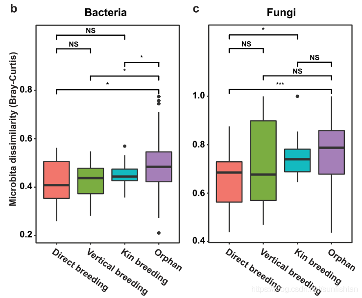
这时候,需要利用Bray-Curtis,或者其他类型的距离矩阵,分组统计。如果你的距离矩阵包含在phyloseq里,那么下面的代码会帮你把phyloseq对象,转换为可以做箱线图的格式。
library(phyloseq)
physeq = merge_phyloseq(physeq, sampledata, random_tree)
physeq

wu = phyloseq::distance(physeq, "bray")
wu.m = melt(as.matrix(wu))
wu.m = wu.m %>%
  filter(as.character(Var1) != as.character(Var2)) %>%
  mutate_if(is.factor, as.character)

sd = data.frame(sample_data(physeq))

sd = sd %>%
  select("SampleID", "type") %>%
  mutate_if(is.factor,as.character)

colnames(sd) = c("Var1", "Type1")
wu.sd = left_join(wu.m, sd, by = "Var1")

colnames(sd) = c("Var2", "Type2")
wu.sd = left_joinwu.sd, sd, by = "Var2")
作图:
`library(ggplot2)
p = ggplot(wu.sd, aes(x = Type2, y = value)) +
  theme_bw() +
  geom_point() +
  geom_boxplot(aes(color = ifelse(Type1 == Type2, "red", "black" ))) +
  scale_color_identity() +
  facet_wrap(~ Type1, scales = "free_x") +
  theme(axis.text.x=element_text(angle = 90, hjust = 1, vjust = 0.5)) +
  ggtitle(paste0("Distance Metric = ", "bray")) +
  ylab("bray") +
  xlab("type")

p


 2万+
2万+


 被折叠的 条评论
为什么被折叠?
被折叠的 条评论
为什么被折叠?
 到【灌水乐园】发言


