


移动端页面input输入框被键盘遮挡问题
<body class="layout-fixed">
    <!-- fixed定位的头部 -->
    <header>

    </header>

    <!-- 可以滚动的区域 -->
    <main>
        <!-- 内容在这里... -->
    </main>

    <!-- fixed定位的底部 -->
    <footer>
        <input type="text" placeholder="Footer..."/>
        <button class="submit">提交</button>
    </footer>
</body>v
header, footer, main {
    display: block;
}
header {
    position: fixed;
    height: 50px;
    left: 0;
    right: 0;
    top: 0;
}
footer {
    position: fixed;
    height: 34px;
    left: 0;
    right: 0;
    bottom: 0;
}
main {
    margin-top: 50px;
    margin-bottom: 34px;
    height: 2000px
}
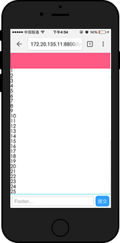
下面这个样子。
键盘唤起下面这样
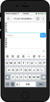
是为什么呢?: 软键盘唤起后,页面的 fixed 元素将失效(即无法浮动,也可理解为成了 absolute 定位)
解决方案: 将原 body 滚动的区域域移到 main 内部
header, footer, main {
    display: block;
}
header {
    position: fixed;
    height: 50px;
    left: 0;
    right: 0;
    top: 0;
}
footer {
    position: fixed;
    height: 34px;
    left: 0;
    right: 0;
    bottom: 0;
}
main {
    /* main绝对定位,进行内部滚动 */
    position: absolute;
    top: 50px;
    bottom: 34px;
    /* 使之可以滚动 */
    overflow-y: scroll;
  /* 增加该属性,可以增加弹性 */
  -webkit-overflow-scrolling: touch;
}
main .content {
    height: 2000px;
}
h5底部输入框被键盘遮挡问题
var oHeight = $(document).height(); //浏览器当前的高度
   $(window).resize(function(){

        if($(document).height() < oHeight){

        $("#footer").css("position","static");
    }else{

        $("#footer").css("position","absolute");
    }

   });
js解决软键盘遮挡输入框问题
链接 http://blog.csdn.net/u011500781/article/details/53926425


 1万+
1万+


 被折叠的 条评论
为什么被折叠?
被折叠的 条评论
为什么被折叠?
 到【灌水乐园】发言


