


因为是使用纯洁的CSS3实现,因此,IE6~8浏览器又将被侵猪笼。
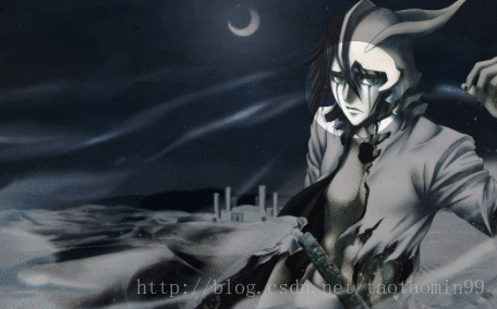
看一下效果:
HTML代码:
<a href="#" class="test_outer">
    <span class="test_cover trans"></span>
    <img src="wuluqiaola.jpg" width="521"> // 嗯 图片寄几替换
</a>
CSS代码:
* {
    padding: 0;
    margin: 0;
  }

  .trans {
    /*transition*/
    -webkit-transition: 0.3s ease;
    -moz-transition: 0.3s ease;
    -ms-transition: 0.3s ease;
    -o-transition: 0.3s ease;
    transition: 0.3s ease;
  }

  .test_outer {
    display: block;
    width: 512px;
    height: 381px;
    margin: 1em auto;
    position: relative;
    overflow: hidden;
  }

  .test_cover {
    width: 100px;
    height: 100px;
    border: 512px solid rgba(0, 0, 0, .35);
    border-radius: 50%;
    position: absolute;
    left: -197px;
    top: -465px;
  }

  .test_cover:hover {
    width: 150px;
    height: 150px;
    left: -207px;
    top: -490px;
  }

  .test_cover:hover:after {
    content: "看,美男!";
    margin: 50px 0 0 -30px;
    color: #fff;
    font: bold 20px/1.2 '微软雅黑';
    text-shadow: 1px 1px rgba(0, 0, 0, .35);
    position: absolute;
  }
原理
虽说效果离不开CSS3,但,最最关键的核心属性是CSS border属性,偌大的半透明边框属性(demo中边框宽度512像素),边框颜色为rgba黑色半透明,然后50%圆角。
相关CSS代码:
.test_cover {
    width: 100px;
    height: 100px;
    border: 512px solid rgba(0, 0, 0, .35);
    border-radius: 50%;
    position: absolute;
    left: -197px;
    top: -465px;
  }
很简单吧,然后父标签来个尺寸限制,溢出隐藏就完事大吉了。
实际应用
由于本效果是CSS驱动的,因此对于PC浏览器,目前还无法投入实际应用,但是,如果针对Android或是iphone、ipad等设备开发页面,该技术就可以有实际的应用了。
应用背景如下:
当我们退出一款新的产品的时候,所有的用户都是new user,他们面对一个新颖陌生的产品,肯定会有一些不熟悉的地方,此时,一个善意的引导与说明就很有必要。既可以展示产品的优点,又方便用户上手操作。
此时,我们可以尝试使用遮罩效果(可以将用户的注意力focus在一点上)来做引导提示,体验会很舒服。
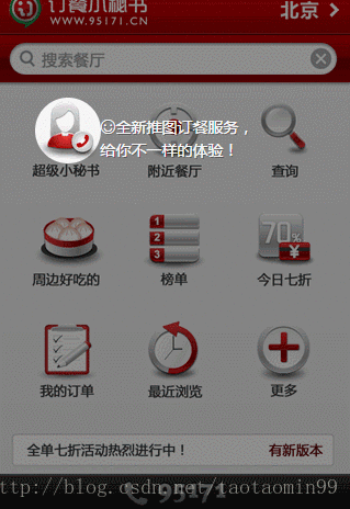
demo展示GIF:
CSS代码:
.trans {
    /*transition*/
    -webkit-transition: 0.3s ease;
    -moz-transition: 0.3s ease;
    -ms-transition: 0.3s ease;
    -o-transition: 0.3s ease;
    transition: 0.3s ease;
}
.test_outer {
    width: 320px;
    height: 480px;
    margin: 1em auto;
    position: relative;
    overflow: hidden;
}
.test_cover {
    width: 60px;
    height: 60px;
    border: 480px solid rgba(0, 0, 0, .45);
    border-radius: 50%;
    position: absolute;
}

.test_cover_pos1 {
    left: -227px;
    top: -478px;
}
.test_cover_pos1:after {
    content: '☺首先选择您所在的城市';
    margin: 16px 0 0 -140px;
}

.test_cover_pos2 {
    left: -447px;
    top: -378px;
}
.test_cover_pos2:after {
    width: 140px;
    content: '☺全新推图订餐服务,给你不一样的体验!';
    margin: 16px 0 0 60px;
}

.test_cover_pos3 {
    left: -337px;
    top: -48px;
}
.test_cover_pos3:after {
    content: '☺随时拨打订餐!';
    margin: -20px 0 0 -20px;
    white-space: nowrap;
}

.test_cover_pos1:after, .test_cover_pos2:after, .test_cover_pos3:after {
    color: #fff;
    font-family: '微软雅黑';
    text-shadow: 1px 1px rgba(0,0,0,.35);
    position: absolute;
}
HTML代码:
<div class="test_outer">
    <span id="testCover" class="test_cover test_cover_pos1 trans"></span>
    <img src="/study/image/radius_cover_wap_bg.png" width="320" height="480" border="0" />
</div>
JS:
(function(stepIndex) {
    var objStep = document.getElementById("testCover");
    var funStep = function() {
        objStep.className = objStep.className.replace(/\d/, (stepIndex + 1));
        stepIndex++;
        if (stepIndex > 2) {
            stepIndex = 0;
        }
        setTimeout(funStep, 3000);
    };
    setTimeout(funStep, 3000);
})(1);
原理与上面的简单demo一直,多的就是用脚本做定时播放了哈!demo页面有完整的代码展示,这里就不平白撑篇幅了。
关于浸猪笼的浏览器:
IE浏览器实际上也是可以实现类似的效果的,这里的类似是指同样可以实现中间镂空,四周半透明的遮罩(滤镜,你懂的);至于圆角效果,如果你精力足够,也是可以折腾出来的(VML等,你懂的)。不过个人观点没必要过多折腾,精力有限,应该放在更重要的事情上。
跟张鑫旭博客学习


 597
597


 被折叠的 条评论
为什么被折叠?
被折叠的 条评论
为什么被折叠?
 到【灌水乐园】发言


