


____tz_zs
使用 matplotlib / pylab 制作 DataFrame 数据的图。
pandas.DataFrame.plot
https://pandas.pydata.org/pandas-docs/stable/generated/pandas.DataFrame.plot.html
DataFrame.plot(x=None, y=None, kind='line', ax=None, subplots=False, sharex=None, sharey=False, layout=None, figsize=None, use_index=True, title=None, grid=None, legend=True, style=None, logx=False, logy=False, loglog=False, xticks=None, yticks=None, xlim=None, ylim=None, rot=None, fontsize=None, colormap=None, table=False, yerr=None, xerr=None, secondary_y=False, sort_columns=False, **kwds)
参数:
ax:matplotlib轴对象,默认为None。
subplots:默认为False,如果为True则为每列数据制作单独的子图。
sharex 、sharey : 布尔值,共享x,y轴。
layout : 元组(行,列)用于子图的布局。
figsize:元组(宽度,高度),以英寸为单位。
use_index:布尔值,默认为True,使用index作为x轴的坐标。
title:字符串或列表,用于图的标题。如果传入一个字符串,则在图的顶部打印字符串。如果传入的是一个列表且子图为True,则在相应子图上方打印列表中的每个项目。
grid:布尔值,默认为None,是否显示网格线。
返回:
axes对象 或者 numpy.ndarray。
代码:
DataFrame.plot 和 Series.plot 的简单使用
# -*- coding: utf-8 -*-
"""
@author: tz_zs
以下代码中,使用 plt.xlabel 和 ax.set_xlabel 效果是一样的。
因为 plt.xlabel 方法在源码中,是调用 gca().set_xlabel(其他方法 plt.legend 等也是如此)。
我们画图以及设置图的属性,都是作用在 axes 对象上。
"""
import matplotlib.pyplot as plt
import pandas as pd
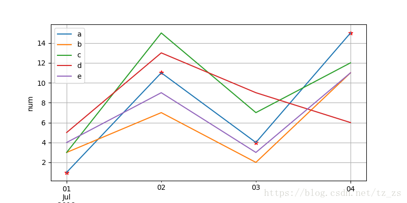
list_l = [[1, 3, 3, 5, 4], [11, 7, 15, 13, 9], [4, 2, 7, 9, 3], [15, 11, 12, 6, 11]]
date_range = pd.date_range(start="20180701", periods=4)
df = pd.DataFrame(list_l, index=date_range,
columns=['a', 'b', 'c', 'd', 'e'])
# -------------- DataFrame.plot --------------
df_ax = df.plot(figsize=(8, 4))
# print(type(df_ax)) # <class 'matplotlib.axes._subplots.AxesSubplot'>
plt.xlabel("time")
plt.ylabel("num")
plt.legend(loc="best")
plt.scatter(df.index, df["a"], c="red", marker="*") # 这个例子中,散点图是在 plt.legend 命令之后画的,所以不会出现在图例中(对比下面的例子理解)。
plt.grid(True)
# -------------- Series.plot --------------
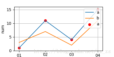
s = pd.Series(df["a"])
print(s)
"""
2018-07-01 1
2018-07-02 11
2018-07-03 4
2018-07-04 15
Freq: D, Name: a, dtype: int64
"""
plt.figure(figsize=(4, 2)) # 创建一个新的 figure
s_ax = s.plot()
s_ax.scatter(s.index, s, c="red", marker="o")
s_ax2 = df["b"].plot() # 此例中我同时使用了 DataFrame.plot 和 Series.plot,他们都会返回一个 axes 对象,但他们其实是同一个对象
print(s_ax == s_ax2) # True
s_ax.set_xlabel("time")
s_ax.set_ylabel("num")
s_ax.legend(loc='upper right')
s_ax.grid(True)
plt.show()
.
.
.
plt.subplots 和 DataFrame.plot 组合使用 (ps:plt.subplots)
# -*- coding: utf-8 -*-
"""
@author: tz_zs
"""
import matplotlib.pyplot as plt
import pandas as pd
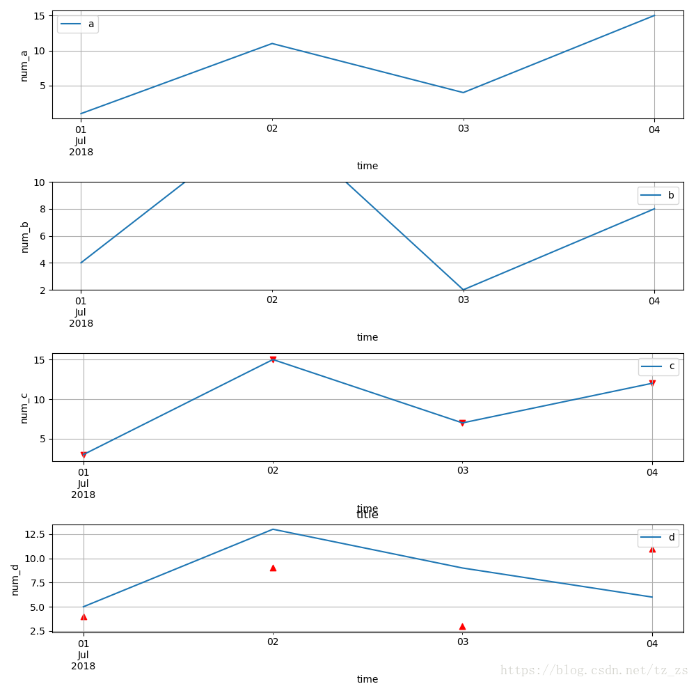
list_l = [[1, 4, 3, 5, 4], [11, 15, 15, 13, 9], [4, 2, 7, 9, 3], [15, 8, 12, 6, 11]]
date_range = pd.date_range(start="20180701", periods=4)
df = pd.DataFrame(list_l, index=date_range,
columns=['a', 'b', 'c', 'd', 'e'])
fig, (ax1, ax2, ax3, ax4) = plt.subplots(4, 1, gridspec_kw={'height_ratios': [1, 1, 1, 1]},
figsize=(10, 12))
df["a"].plot(ax=ax1)
ax1.set_xlabel("time")
ax1.set_ylabel("num_a")
ax1.legend(loc="best")
ax1.grid(True)
df["b"].plot(ax=ax2)
ax2.set_xlabel("time")
ax2.set_ylabel("num_b")
ax2.legend(loc="best")
ax2.grid(True)
ax2.set_ylim(2, 10) # 限制y轴显示的区间
df["c"].plot(ax=ax3)
ax3.set_xlabel("time")
ax3.set_ylabel("num_c")
ax3.legend(loc="best")
ax3.grid(True)
ax3.scatter(df.index, df["c"], c="red", marker="v") # 在拐点处画标记
df["d"].plot(ax=ax4)
ax4.set_xlabel("time")
ax4.set_ylabel("num_d")
ax4.legend(loc="best")
ax4.grid(True)
ax4.scatter(df.index, df["e"], c="red", marker="^")
plt.title("title")
plt.tight_layout() # 布局紧凑
plt.show()
.
.
end


 1809
1809


 被折叠的 条评论
为什么被折叠?
被折叠的 条评论
为什么被折叠?
 到【灌水乐园】发言


