


在css3中新增加了过渡功能,用来设置元素从一种样式变为另一种样式时过渡的动态效果。下面分别介绍实现过渡功能的几个属性
1、transition-property
transition-property 指定应用过渡属性的名称,详见: https://developer.mozilla.org/zh-CN/docs/Web/CSS/transition-property
transition-property可以取3种值:
- none : 没有过渡动画;
- all : 所有可被动画的属性都表现出过渡动画。
- 具体的属性名
2、transition-duration
transition-duration表示指定时间后进行过渡,默认时间为0s,不过渡。详解见: https://developer.mozilla.org/zh-CN/docs/Web/CSS/transition-duration
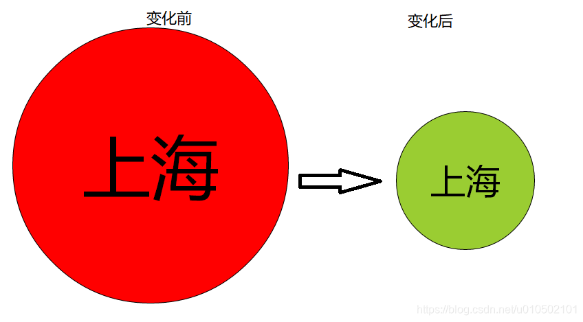
案例一:
<!DOCTYPE html>
<html>
	<head>
		<meta charset="UTF-8">
		<title></title>
		<style type="text/css">
			#name{
				height: 400px;
				width: 400px;
				position: absolute;
				left: 0px;
				right: 0px;
				top: 0px;
				bottom: 0px;
				margin: auto;
				border: 1px solid;
				border-radius: 50%;
				background: red;
				font: 100px "微软雅黑";
				text-align: center;
				line-height: 400px;
			}

			#name{
				transition-property: background, width, height,font,line-height;
				transition-duration: 0.5s, 1.5s, 1.5s, 1.5s, 1.5s;
			}

			#name:hover{
				background: yellowgreen;
				width: 200px;
				height: 200px;
				font: 50px "微软雅黑";
				line-height: 200px;
			}
		</style>
	</head>
	<body>
		<div id="name">
			上海
		</div>
	</body>
</html>
效果如下:
3、transition-timing-function
transition-timing-function用于设置样式中间过渡的状态,该属性有以下可选值:
- linear:规定以相同速度开始至结束的过渡效果(等于 cubic-bezier(0,0,1,1);
- ease :规定慢速开始,然后变快,然后慢速结束的过渡效果(cubic-bezier(0.25,0.1,0.25,1);
- ease-in 规定以慢速开始的过渡效果(等于 cubic-bezier(0.42,0,1,1));
- ease-out 规定以慢速结束的过渡效果(等于 cubic-bezier(0,0,0.58,1));
- ease-in-out 规定以慢速开始和结束的过渡效果(等于 cubic-bezier(0.42,0,0.58,1));
- cubic-bezier(n,n,n,n) 在 cubic-bezier 函数中定义自己的值。可能的值是 0 至 1 之间的数值。
4、transition-delay
transition-delay表示延迟多长时间开始样式过渡。
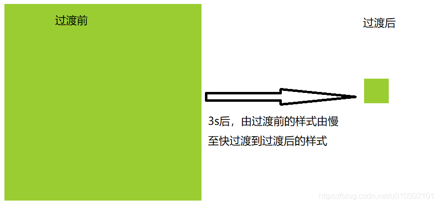
案例二:
<!DOCTYPE html>
<html>
	<head>
		<meta charset="UTF-8">
		<title></title>
		<style type="text/css">
			#name{
				width: 400px;
				height: 400px;
				position: absolute;
				left: 0px;
				right: 0px;
				top: 0px;
				bottom: 0px;
				margin: auto;
				background: yellowgreen;
				/*样式过渡时由慢变快*/
				transition-timing-function: ease-in;
				/*表示只允许width和height进行过渡*/
				transition-property: width, height;
				/*表示width和height过渡的时间均为5s*/
				transition-duration: 5s;
				/*表示鼠标放在div上3秒之后才开始过渡*/
				transition-delay: 3s;
			}
			#name:hover{
				width: 50px;
				height: 50px;
			}
		</style>
	</head>
	<body>
		<div id="name">

		</div>
	</body>
</html>
效果如下:
5、transitionend过渡完成事件
transitionend 事件在 CSS3 完成过渡后触发。注意: 如果过渡在完成前移除,例如 CSS transition-property 属性被移除,过渡事件将不被触发。
<!DOCTYPE html>
<html>
	<head>
		<meta charset="UTF-8">
		<style type="text/css">
			#id{
				width: 300px;
				height: 300px;
				background: yellowgreen;

				/*设置过渡*/
				transition-property: width, height, background;
				transition-duration: 3s, 3s, 5s;
			}
		</style>
	</head>
	<body>
		<div id="id">

		</div>
	</body>
	<script type="text/javascript">
		window.onload=function(){
			var idNode = document.querySelector("#id");
			idNode.onmouseover=function(){
				idNode.style.width = "50px";
				idNode.style.height = "50px";
				idNode.style.background = "red";
			}
			/*当过渡完成后执行下面的alert语句。由于有width、height、background三个
			 过渡属性,因此要触发三次下面的监听器*/
			idNode.addEventListener("transitionend", function(){
				alert("过渡完成!");
			})
		}
	</script>
</html>
执行效果,当鼠标放在div上方时,width、height、background三个指定的过渡属性过渡完成后,分别触发transitionend过渡完成监听器,因此会弹出三次alert对话框。


 3528
3528


 被折叠的 条评论
为什么被折叠?
被折叠的 条评论
为什么被折叠?
 到【灌水乐园】发言


