


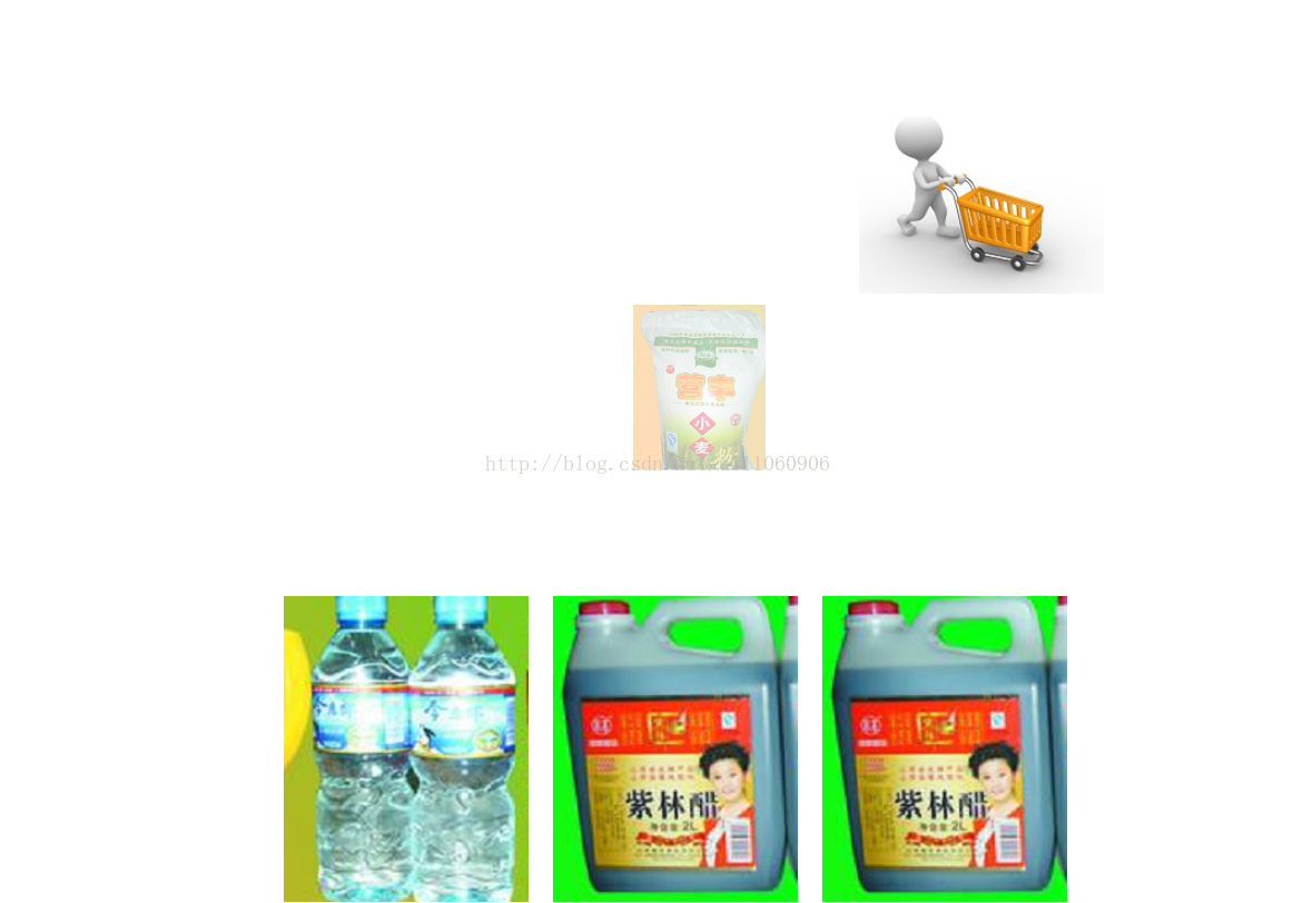
购物车飞入动画:
<!DOCTYPE html>
<html>
<head lang="en">
    <meta charset="UTF-8">
    <title></title>

    <style>
        .con{
            width: 1000px;
            height: 700px;
            border: 1px solid transparent;
            position:relative;
        }

        .che{
            width: 200px;
            height:200px;
            background-image: url("img/c.jpg");
            background-repeat: no-repeat;
            margin-top: 100px;
            margin-right: 100px;
            position: absolute;
            right: 0px;
            top: 0px;
        }

        .cont{
            height: 280px;
            margin-top: 50%;
        }

        .wu1{
            width: 200px;
            height: 250px;
            margin: 10px;
            background-image: url("img/10.png");
            background-repeat: no-repeat;
            -webkit-transition: all 1s;
            float: left;
        }

        .wu1:active{
            transform: translate(350%,-180%) scale(0.3);
            opacity:0
        }

        .wu2{
            width: 200px;
            height: 250px;
            margin: 10px;
            background-image: url("img/12.png");
            background-repeat: no-repeat;
            -webkit-transition: all 1s;
            float: left;
        }

        .wu2:active{
            transform: translate(250%,-180%) scale(0.3);
            opacity:0
        }

        .wu3{
            width: 200px;
            height: 250px;
            margin: 10px;
            background-image: url("img/13.png");
            background-repeat: no-repeat;
            -webkit-transition: all 1s;
            float: left;
        }

        .wu3:active{
            transform: translate(140%,-180%) scale(0.3);
            opacity:0
        }

        .wu4{
            width: 200px;
            height: 250px;
            margin: 10px;
            background-image: url("img/13.png");
            background-repeat: no-repeat;
            -webkit-transition: all 1s;
            float: left;
        }

        .wu4:active{
            transform: translate(30%,-180%) scale(0.3);
            opacity:0
        }
    </style>
</head>
<body>
<div class="con">
    <div class="che"></div>

    <div class="cont">
        <div class="wu1"></div>
        <div class="wu2"></div>
        <div class="wu3"></div>
        <div class="wu4"></div>
    </div>
</div>


</body>
<html>
运行结果:


 5349
5349


 被折叠的 条评论
为什么被折叠?
被折叠的 条评论
为什么被折叠?
 到【灌水乐园】发言


