


来源:https://www.r-graph-gallery.com/297-circular-barplot-with-groups/
# Create dataset
data=data.frame(
individual=paste( "Mister ", seq(1,60), sep=""),
value=sample( seq(10,100), 60, replace=T)
)
# Set a number of 'empty bar'
empty_bar=10
# Add lines to the initial dataset
to_add = matrix(NA, empty_bar, ncol(data))
colnames(to_add) = colnames(data)
data=rbind(data, to_add)
data$id=seq(1, nrow(data))
# Get the name and the y position of each label
label_data=data
number_of_bar=nrow(label_data)
angle= 90 - 360 * (label_data$id-0.5) /number_of_bar # I substract 0.5 because the letter must have the angle of the center of the bars. Not extreme right(1) or extreme left (0)
label_data$hjust<-ifelse( angle < -90, 1, 0)
label_data$angle<-ifelse(angle < -90, angle+180, angle)
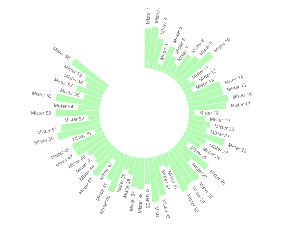
# Make the plot
p = ggplot(data, aes(x=as.factor(id), y=value)) + # Note that id is a factor. If x is numeric, there is some space between the first bar
geom_bar(stat="identity", fill=alpha("green", 0.3)) +
ylim(-100,120) +
theme_minimal() +
theme(
axis.text = element_blank(),
axis.title = element_blank(),
panel.grid = element_blank(),
plot.margin = unit(rep(-1,4), "cm")
) +
coord_polar(start = 0) +
geom_text(data=label_data, aes(x=id, y=value+10, label=individual, hjust=hjust), color="black", fontface="bold",alpha=0.6, size=2.5, angle= label_data$angle, inherit.aes = FALSE )
p
#library(tidyverse)

# Create dataset
data=data.frame(
  individual=paste( "Mister ", seq(1,60), sep=""),
  group=c( rep('A', 10), rep('B', 30), rep('C', 14), rep('D', 6)) ,
  value=sample( seq(10,100), 60, replace=T)
)

# Set a number of 'empty bar' to add at the end of each group
empty_bar=4
to_add = data.frame( matrix(NA, empty_bar*nlevels(data$group), ncol(data)) )
colnames(to_add) = colnames(data)
to_add$group=rep(levels(data$group), each=empty_bar)
data=rbind(data, to_add)
data=data %>% arrange(group)
data$id=seq(1, nrow(data))

# Get the name and the y position of each label
label_data=data
number_of_bar=nrow(label_data)
angle= 90 - 360 * (label_data$id-0.5) /number_of_bar     # I substract 0.5 because the letter must have the angle of the center of the bars. Not extreme right(1) or extreme left (0)
label_data$hjust<-ifelse( angle < -90, 1, 0)
label_data$angle<-ifelse(angle < -90, angle+180, angle)

# Make the plot
p = ggplot(data, aes(x=as.factor(id), y=value, fill=group)) +       # Note that id is a factor. If x is numeric, there is some space between the first bar
  geom_bar(stat="identity", alpha=0.5) +
  ylim(-100,120) +
  theme_minimal() +
  theme(
    legend.position = "none",
    axis.text = element_blank(),
    axis.title = element_blank(),
    panel.grid = element_blank(),
    plot.margin = unit(rep(-1,4), "cm")
  ) +
  coord_polar() +
  geom_text(data=label_data, aes(x=id, y=value+10, label=individual, hjust=hjust), color="black", fontface="bold",alpha=0.6, size=2.5, angle= label_data$angle, inherit.aes = FALSE )

p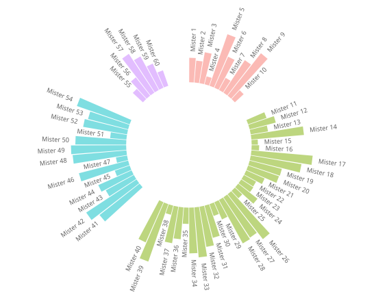
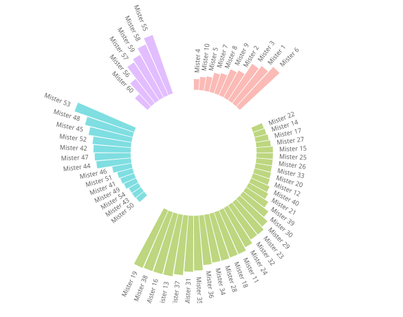
# library
#library(tidyverse)

# Create dataset
data=data.frame(
  individual=paste( "Mister ", seq(1,60), sep=""),
  group=c( rep('A', 10), rep('B', 30), rep('C', 14), rep('D', 6)) ,
  value=sample( seq(10,100), 60, replace=T)
)

data = data %>% arrange(group,value)
# Set a number of 'empty bar' to add at the end of each group
empty_bar=4
to_add = data.frame( matrix(NA, empty_bar*nlevels(data$group), ncol(data)) )
colnames(to_add) = colnames(data)
to_add$group=rep(levels(data$group), each=empty_bar)
data=rbind(data, to_add)
data=data %>% arrange(group)
data$id=seq(1, nrow(data))

# Get the name and the y position of each label
label_data=data
number_of_bar=nrow(label_data)
angle= 90 - 360 * (label_data$id-0.5) /number_of_bar     # I substract 0.5 because the letter must have the angle of the center of the bars. Not extreme right(1) or extreme left (0)
label_data$hjust<-ifelse( angle < -90, 1, 0)
label_data$angle<-ifelse(angle < -90, angle+180, angle)

# Make the plot
p = ggplot(data, aes(x=as.factor(id), y=value, fill=group)) +       # Note that id is a factor. If x is numeric, there is some space between the first bar
  geom_bar(stat="identity", alpha=0.5) +
  ylim(-100,120) +
  theme_minimal() +
  theme(
    legend.position = "none",
    axis.text = element_blank(),
    axis.title = element_blank(),
    panel.grid = element_blank(),
    plot.margin = unit(rep(-1,4), "cm")
  ) +
  coord_polar() +
  geom_text(data=label_data, aes(x=id, y=value+10, label=individual, hjust=hjust), color="black", fontface="bold",alpha=0.6, size=2.5, angle= label_data$angle, inherit.aes = FALSE )

p


 3001
3001


 被折叠的 条评论
为什么被折叠?
被折叠的 条评论
为什么被折叠?
 到【灌水乐园】发言


