


怎样才能做一个大白?
原问题来自知乎:
怎样才能做一个大白?
我们来看看排名第一的答主做了什么:
<!doctype html>
<html>
<head>
<meta charset="utf-8">
<title>大白</title>
<style>
*{ margin:0; padding:0;}
body{ background:#999;}
.Baymax{width:300px; height:600px; margin:20px auto auto auto;  position:relative; }
.head{width:100px; height:75px; position:absolute; left:100px;  border-radius:50%; background:#FFF; box-shadow: 0px 6px 6px #888888,6px 6px 6px #ccc inset; z-index:100; }
.eyes-l{width:15px; height:15px; border-radius:50%; background:#000; position:absolute; left:20px; top:35px;}
.eyes-r{width:15px; height:15px; border-radius:50%; background:#000; position:absolute; right:20px; top:35px;}
.mourse{width:30px; height:3px;  position:absolute; top:42px; left:35px; border-radius:50%;box-shadow: 0px 1px 0px #000;}


.body{ width:214px; height:320px; left:50%; transform:translate(-50%,0); position:absolute;border-radius:45% 45% 50% 50%; top:55px; background:#FFF; z-index:99; box-shadow: 6px 0px 6px #CCC inset,-6px 0px 6px #ccc inset;}
.belly{width:224px; height:264px; border-radius:42% 42% 50% 50%; position:absolute; bottom:0; left:50%; transform:translate(-50%,0); background:#fff;box-shadow: 0px 3px 2px #888888, 0px -6px 6px #ccc inset ;}
.belly:before{width:20px; height:120px; position:absolute; left:-2px; content:" "; top:50px; border-radius:50% 20% 20% 50%;box-shadow: 4px 0px 6px #ccc inset; transform:rotate(3deg);}
.belly:after{width:20px; height:120px; position:absolute; right:-2px; content:" "; top:50px; border-radius:20% 50% 50% 20%;box-shadow: -4px 0px 6px #ccc inset; transform:rotate(-3deg);}


.leg-l{width:80px; height:145px; position:absolute; left:70px; top:290px; background:#fff;border-radius:40% 30% 10px 45%; box-shadow: -2px 0px 2px #999 inset, 4px 0px 4px #CCC inset, -4px 0px 4px #CCC inset; }
.leg-r{width:80px; height:145px; position:absolute; right:70px; top:290px; background:#fff;border-radius:30% 40% 45% 10px;box-shadow: 2px 0px 2px #999 inset, 4px 0px 4px #CCC inset, -4px 0px 4px #CCC inset; }

.hand-l{width:78px; height:224px; position:absolute; left:20px; top:75px; background:#fff; border-radius:50%; transform:rotate(16deg); box-shadow:6px 6px 6px #ccc inset; z-index:91;}
.hl-l{width:50px; height:100px; background:#fff; position:absolute; top:160px; border-radius:50% 50% 40% 40%;transform:rotate(-20deg); left:15px;}
.hl-l:before{ content:""; width:15px; height:82px;box-shadow: 4px 0px 6px #ccc inset; transform:rotate(-0deg); position:absolute; left:0; top:10px;border-radius:50% 20% 20% 50%;}
.f-1{width: 14px;height: 30px;background: #fff;position: absolute;bottom: -40px;left: 65px;transform: rotate(-35deg);border-radius: 50% 50% 40%;box-shadow: 0px -2px 2px #ccc inset;z-index: 90;}
.f-2{width: 14px;height: 40px;background: #fff;position: absolute;bottom: -55px;left: 50px;transform: rotate(-45deg);border-radius: 50% 50% 40%;box-shadow: 0px -2px 2px #ccc inset;z-index: 90;}
.f-3{width: 14px;height: 40px;background: #fff;position: absolute;bottom: -62px;left: 49px;transform: rotate(-45deg);border-radius: 50% 50% 40%;box-shadow: 0px -2px 2px #ccc inset;z-index: 89;}

.hand-r{width:78px; height:224px; position:absolute; right:20px; top:75px; background:#fff; border-radius:50%; transform:rotate(-16deg); box-shadow:-6px -6px 6px #ccc inset; z-index:91;}
.hr-r{width:50px; height:100px; background:#fff; position:absolute; top:160px; border-radius:50% 50% 40% 40%;transform:rotate(20deg); right:15px;}
.hr-r:before{ content:""; width:15px; height:82px;box-shadow: -4px 0px 6px #ccc inset; transform:rotate(-0deg); position:absolute; right:0; top:10px;border-radius:20% 50% 50% 20%;}
.fr-1{width: 14px;height: 30px;background: #fff;position: absolute;bottom: -40px;right: 65px;transform: rotate(35deg);border-radius: 50% 50% 40%;box-shadow: 0px -2px 2px #ccc inset;z-index: 90;}
.fr-2{width: 14px;height: 40px;background: #fff;position: absolute;bottom: -55px;right: 50px;transform: rotate(45deg);border-radius: 50% 50% 40%;box-shadow: 0px -2px 2px #ccc inset;z-index: 90;}
.fr-3{width: 14px;height: 40px;background: #fff;position: absolute;bottom: -62px;right: 49px;transform: rotate(45deg);border-radius: 50% 50% 40%;box-shadow: 0px -2px 2px #ccc inset;z-index: 89;}

.cover-s{width:64px;  height:15px; position:absolute; left:50%; transform:translate(-50%,0); top:19px; z-index:101;}
.cover-x{width:64px; height:12px; position:absolute; left:50%; transform:translate(-50%,0); bottom:12px; z-index:101; overflow:hidden;}
.left{width:17px; height:15px; float:left; background:#fff;}
.right{width:17px; height:15px; float:right; background:#fff;}


.heart{width:30px; height:30px; border-radius:50%; position:absolute; box-shadow:2px 2px 2px #ccc inset; right:55px; top:60px; z-index:111; border:1px solid #ccc;}

@keyframes myfirst
{
0% {transform:rotate(0deg);}
25% {transform:rotate(6deg);}
50%{transform:rotate(0deg);}
75%{transform:rotate(-6deg);}
100{transform:rotate(0deg);}
}

@-moz-keyframes myfirst /* Firefox */
{
0% {transform:rotate(0deg);}
25% {transform:rotate(6deg);}
50%{transform:rotate(0deg);}
75%{transform:rotate(-6deg);}
100{transform:rotate(0deg);}
}

@-webkit-keyframes myfirst /* Safari 和 Chrome */
{
0% {transform:rotate(0deg);}
25% {transform:rotate(10deg);}
50%{transform:rotate(0deg);}
75%{transform:rotate(-10deg);}
100{transform:rotate(0deg);}
}

.head{
animation: myfirst 10s infinite;
-moz-animation: myfirst 30s infinite;   /* Firefox */
-webkit-animation: myfirst 30s infinite;    /* Safari 和 Chrome */
}

@keyframes eyeclose1
{
0% {top:19px;}
10% {top:28px;}
20%{top:19px;}
20%{top:28px;}
40%{top:19px;}

}

@-moz-keyframes eyeclose1 /* Firefox */
{
0% {top:19px;}
10% {top:28px;}
20%{top:19px;}
20%{top:27px;}
40%{top:19px;}

}

@-webkit-keyframes eyeclose1 /* Safari 和 Chrome */
{
0% {top:19px;}
5% {top:27px;}
10%{top:19px;}
15%{top:27px;}
20%{top:19px;}

}

.cover-s{
animation: eyeclose1 3s infinite 2s;
-moz-animation: eyeclose1 3s infinite 2s;   /* Firefox */
-webkit-animation: eyeclose1 3s infinite 2s;    /* Safari 和 Chrome */
}

@keyframes eyeclose2
{
0% {bottom:12px;}
10% {bottom:20px;}
20%{bottom:12px;}
20%{bottom:20px;}
40%{bottom:12px;}

}

@-moz-keyframes eyeclose2 /* Firefox */
{
0% {bottom:12px;}
10% {bottom:20px;}
20%{bottom:12px;}
20%{bottom:20px;}
40%{bottom:12px;}

}

@-webkit-keyframes eyeclose2 /* Safari 和 Chrome */
{
0% {bottom:12px;}
5% {bottom:20px;}
10%{bottom:12px;}
15%{bottom:20px;}
20%{bottom:12px;}


}

.cover-x{
animation: eyeclose2 3s infinite 2s;
-moz-animation: eyeclose2 3s infinite 2s;   /* Firefox */
-webkit-animation: eyeclose2 3s infinite 2s;    /* Safari 和 Chrome */
}
</style>
</head>

<body>
<div class="Baymax">
<div class="head">
    <div class="cover-s"><div class="left"></div><div class="right"></div></div>
        <div class="cover-x"><div class="left"></div><div class="right"></div></div>
    <div class="eyes-l"></div>
        <div class="eyes-r"></div>
        <div class="mourse"></div>
    </div>
    <div class="hand-l">
    <div class="hl-l"></div>
    <div class="f-1"></div>
        <div class="f-2"></div>
        <div class="f-3"></div>
    </div>
    <div class="hand-r">
    <div class="hr-r"></div>
    <div class="fr-1"></div>
        <div class="fr-2"></div>
        <div class="fr-3"></div>
    </div>
    <div class="body">
    <div class="heart"></div>
    <div class="belly"></div>
    </div>
    <div class="leg-l"></div>
    <div class="leg-r"></div>
</div>
</body>
</html>
新建txt文档,复制粘贴上面代码,后缀改为html,用浏览器打开。
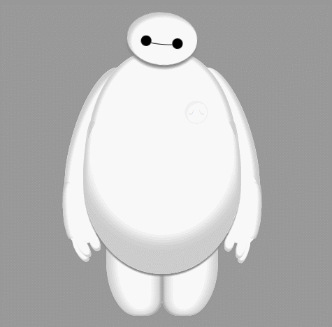
他用CSS3画了一个大白出来!!!还是能动的!!!!
评论中已经有不少妹子开始勾搭答主了。
这个故事告诉我们:
代码写的好,妹子少不了!
然后有人修复了一些bug,做出了一个威力加强版的,在这儿。
或者点击这个。
效果如下:


 1万+
1万+


 被折叠的 条评论
为什么被折叠?
被折叠的 条评论
为什么被折叠?
 到【灌水乐园】发言


