


wx.showToast(Object object)
显示消息提示框
参数
Object object
| 属性 | 类型 | 默认值 | 必填 | 说明 | 最低版本 |
|---|---|---|---|---|---|
| title | string | 是 | 提示的内容 | ||
| icon | string | 'success' | 否 | 图标 | |
| image | string | 否 | 自定义图标的本地路径,image 的优先级高于 icon | 1.1.0 | |
| duration | number | 1500 | 否 | 提示的延迟时间 | |
| mask | boolean | false | 否 | 是否显示透明蒙层,防止触摸穿透 | |
| success | function | 否 | 接口调用成功的回调函数 | ||
| fail | function | 否 | 接口调用失败的回调函数 | ||
| complete | function | 否 | 接口调用结束的回调函数(调用成功、失败都会执行) |
object.icon 的合法值
| 值 | 说明 | 最低版本 |
|---|---|---|
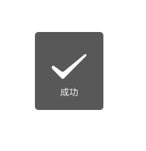
| success | 显示成功图标,此时 title 文本最多显示 7 个汉字长度 | |
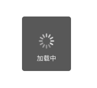
| loading | 显示加载图标,此时 title 文本最多显示 7 个汉字长度 | |
| none | 不显示图标,此时 title 文本最多可显示两行,1.9.0及以上版本支持 |
示例代码
wx.showToast({
  title: '成功',
  icon: 'success',
  duration: 2000
})
注意
wx.showLoading和wx.showToast同时只能显示一个wx.showToast应与wx.hideToast配对使用
wx.hideToast(Object object)
隐藏消息提示框
参数
Object object
| 属性 | 类型 | 默认值 | 必填 | 说明 |
|---|---|---|---|---|
| success | function | 否 | 接口调用成功的回调函数 | |
| fail | function | 否 | 接口调用失败的回调函数 | |
| complete | function | 否 | 接口调用结束的回调函数(调用成功、失败都会执行) |
wx.showModal(Object object)
显示模态对话框
参数
Object object
| 属性 | 类型 | 默认值 | 必填 | 说明 |
|---|---|---|---|---|
| title | string | 是 | 提示的标题 | |
| content | string | 是 | 提示的内容 | |
| showCancel | boolean | true | 否 | 是否显示取消按钮 |
| cancelText | string | '取消' | 否 | 取消按钮的文字,最多 4 个字符 |
| cancelColor | string | #000000 | 否 | 取消按钮的文字颜色,必须是 16 进制格式的颜色字符串 |
| confirmText | string | '确定' | 否 | 确认按钮的文字,最多 4 个字符 |
| confirmColor | string | #576B95 | 否 | 确认按钮的文字颜色,必须是 16 进制格式的颜色字符串 |
| success | function | 否 | 接口调用成功的回调函数 | |
| fail | function | 否 | 接口调用失败的回调函数 | |
| complete | function | 否 | 接口调用结束的回调函数(调用成功、失败都会执行) |
object.success 回调函数
参数
Object res
| 属性 | 类型 | 说明 | 最低版本 |
|---|---|---|---|
| confirm | boolean | 为 true 时,表示用户点击了确定按钮 | |
| cancel | boolean | 为 true 时,表示用户点击了取消(用于 Android 系统区分点击蒙层关闭还是点击取消按钮关闭) | 1.1.0 |
示例代码
wx.showModal({
  title: '提示',
  content: '这是一个模态弹窗',
  success(res) {
    if (res.confirm) {
      console.log('用户点击确定')
    } else if (res.cancel) {
      console.log('用户点击取消')
    }
  }
})

注意
- Android 6.7.2 以下版本,点击取消或蒙层时,回调 fail, errMsg 为 "fail cancel";
- Android 6.7.2 及以上版本 和 iOS 点击蒙层不会关闭模态弹窗,所以尽量避免使用「取消」分支中实现业务逻辑
wx.showLoading(Object object)
基础库 1.1.0 开始支持,低版本需做兼容处理。
显示 loading 提示框。需主动调用 wx.hideLoading 才能关闭提示框
参数
Object object
| 属性 | 类型 | 默认值 | 必填 | 说明 |
|---|---|---|---|---|
| title | string | 是 | 提示的内容 | |
| mask | boolean | false | 否 | 是否显示透明蒙层,防止触摸穿透 |
| success | function | 否 | 接口调用成功的回调函数 | |
| fail | function | 否 | 接口调用失败的回调函数 | |
| complete | function | 否 | 接口调用结束的回调函数(调用成功、失败都会执行) |
示例代码
wx.showLoading({
  title: '加载中',
})

setTimeout(function () {
  wx.hideLoading()
}, 2000)
注意
wx.showLoading和wx.showToast同时只能显示一个wx.showLoading应与wx.hideLoading配对使用
wx.hideLoading(Object object)
基础库 1.1.0 开始支持,低版本需做兼容处理。
隐藏 loading 提示框
参数
Object object
| 属性 | 类型 | 默认值 | 必填 | 说明 |
|---|---|---|---|---|
| success | function | 否 | 接口调用成功的回调函数 | |
| fail | function | 否 | 接口调用失败的回调函数 | |
| complete | function | 否 | 接口调用结束的回调函数(调用成功、失败都会执行) |
另外在wxml中也可以使用loading组件来显示加载,在data中设置一个变量来控制显示隐藏即可
<loading hidden="{{hidden}}">
    加载中...
</loading>
wx.showActionSheet(Object object)
显示操作菜单
参数
Object object
| 属性 | 类型 | 默认值 | 必填 | 说明 |
|---|---|---|---|---|
| itemList | Array.<string> | 是 | 按钮的文字数组,数组长度最大为 6 | |
| itemColor | string | #000000 | 否 | 按钮的文字颜色 |
| success | function | 否 | 接口调用成功的回调函数 | |
| fail | function | 否 | 接口调用失败的回调函数 | |
| complete | function | 否 | 接口调用结束的回调函数(调用成功、失败都会执行) |
object.success 回调函数
参数
Object res
| 属性 | 类型 | 说明 |
|---|---|---|
| tapIndex | number | 用户点击的按钮序号,从上到下的顺序,从0开始 |
示例代码
wx.showActionSheet({
  itemList: ['A', 'B', 'C'],
  success(res) {
    console.log(res.tapIndex)
  },
  fail(res) {
    console.log(res.errMsg)
  }
})

注意
- Android 6.7.2 以下版本,点击取消或蒙层时,回调 fail, errMsg 为 "fail cancel";
- Android 6.7.2 及以上版本 和 iOS 点击蒙层不会关闭模态弹窗,所以尽量避免使用「取消」分支中实现业务逻辑
以上文本内容来自文档:https://developers.weixin.qq.com/miniprogram/dev/api/ui/interaction/wx.showToast.html


 5185
5185


 被折叠的 条评论
为什么被折叠?
被折叠的 条评论
为什么被折叠?
 到【灌水乐园】发言


