


转载自:http://blog.csdn.net/u014801157/article/details/24372517
图层设置是ggplot2做图的关键。通过查看ggplot图形对象的数据结构我们了解到一个图层至少包含几何类型、统计类型和位置调整三方面的东西,当然数据和映射得首先建立。如果把ggplot2当成是太极,这些内容的设置就相当于太极的招式,有固定方法;对招式理解透彻后以随意对它们进行组合,并融合数据层面的一些设置(如分面、美学属性映射等)创造出用于解决问题的完美图形。
1 图层的几何和统计类型
1.1 几何/统计类型设置函数
在ggplot2中,每种几何类型都有对应的(默认)统计类型,反之亦然。两者不分家,所以得放在一起来说。几何类型的设置函数全部为geom_xxx形式,而统计类型设置函数全部为stat_xxx的形式:
<span style="color: rgb(0, 42, 84);">library</span>(ggplot2)
<span style="color: rgb(0, 42, 84);">ls</span>(<span style="color: rgb(209, 0, 0);">"package:ggplot2"</span>, <span style="color: rgb(0, 84, 0);">pattern</span>=<span style="color: rgb(209, 0, 0);">"^geom_.+"</span>)
##  [1] "geom_abline"     "geom_area"       "geom_bar"
##  [4] "geom_bin2d"      "geom_blank"      "geom_boxplot"
##  [7] "geom_contour"    "geom_crossbar"   "geom_density"
## [10] "geom_density2d"  "geom_dotplot"    "geom_errorbar"
## [13] "geom_errorbarh"  "geom_freqpoly"   "geom_hex"
## [16] "geom_histogram"  "geom_hline"      "geom_jitter"
## [19] "geom_line"       "geom_linerange"  "geom_map"
## [22] "geom_path"       "geom_point"      "geom_pointrange"
## [25] "geom_polygon"    "geom_quantile"   "geom_raster"
## [28] "geom_rect"       "geom_ribbon"     "geom_rug"
## [31] "geom_segment"    "geom_smooth"     "geom_step"
## [34] "geom_text"       "geom_tile"       "geom_violin"
## [37] "geom_vline"
<span style="color: rgb(0, 42, 84);">ls</span>(<span style="color: rgb(209, 0, 0);">"package:ggplot2"</span>, <span style="color: rgb(0, 84, 0);">pattern</span>=<span style="color: rgb(209, 0, 0);">"^stat_.+"</span>)
##  [1] "stat_abline"      "stat_bin"         "stat_bin2d"
##  [4] "stat_bindot"      "stat_binhex"      "stat_boxplot"
##  [7] "stat_contour"     "stat_density"     "stat_density2d"
## [10] "stat_ecdf"        "stat_function"    "stat_hline"
## [13] "stat_identity"    "stat_qq"          "stat_quantile"
## [16] "stat_smooth"      "stat_spoke"       "stat_sum"
## [19] "stat_summary"     "stat_summary2d"   "stat_summary_hex"
## [22] "stat_unique"      "stat_vline"       "stat_ydensity"
很多,有小部分是相同的。如果一个个介绍就得写成说明书了,跟软件包作者写的函数说明没什么两样;再说也没必要,不是每个人都会用到全部的类型。下面看一下几何函数geom_point和统计函数stat_identity的参数:
<span style="color: rgb(0, 0, 195);"># 函数说明,非运行代码</span>
<span style="color: rgb(0, 42, 84);">geom_point</span>(<span style="color: rgb(0, 84, 0);">mapping</span> = <span style="color: rgb(0, 0, 127);">NULL</span>, <span style="color: rgb(0, 84, 0);">data</span> = <span style="color: rgb(0, 0, 127);">NULL</span>, <span style="color: rgb(0, 84, 0);">stat</span> = <span style="color: rgb(209, 0, 0);">"identity"</span>,
           <span style="color: rgb(0, 84, 0);">position</span> = <span style="color: rgb(209, 0, 0);">"identity"</span>, <span style="color: rgb(0, 84, 0);">na.rm</span> = <span style="color: rgb(184, 93, 0);">FALSE</span>, ...)
<span style="color: rgb(0, 42, 84);">stat_identity</span>(<span style="color: rgb(0, 84, 0);">mapping</span> = <span style="color: rgb(0, 0, 127);">NULL</span>, <span style="color: rgb(0, 84, 0);">data</span> = <span style="color: rgb(0, 0, 127);">NULL</span>, <span style="color: rgb(0, 84, 0);">geom</span> = <span style="color: rgb(209, 0, 0);">"point"</span>,
              <span style="color: rgb(0, 84, 0);">position</span> = <span style="color: rgb(209, 0, 0);">"identity"</span>, <span style="color: rgb(0, 84, 0);">width</span> = <span style="color: rgb(0, 0, 127);">NULL</span>,
              <span style="color: rgb(0, 84, 0);">height</span> = <span style="color: rgb(0, 0, 127);">NULL</span>, ...)
有4个参数是一样的:映射(mapping)、数据(data)、位置(position)和点点点(Dot-dot-dot: …)。H.W.特别强调了mapping和data参数的先后顺序在几何/统计类型设定函数和ggplot函数中的差别:ggplot函数先设定数据,再设定映射;而几何/统计类型函数则相反,因为确定作图或统计之前一般都已经有数据,只需指定映射即可。如果不写参数名,它们的用法是这样的:
<span style="color: rgb(0, 0, 195);"># 示例,非运行代码</span>
<span style="color: rgb(0, 42, 84);">ggplot</span>(数据, 映射)
<span style="color: rgb(0, 42, 84);">geom_xxx</span>(映射, 数据)
<span style="color: rgb(0, 42, 84);">stat_xxx</span>(映射, 数据)
"点点点"参数是R语言非常特殊的一个数据类型,用在函数的参数用表示任意参数,在这里表示传递给图层的任意参数如color, shape, alpha等。
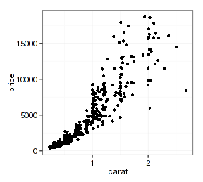
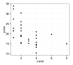
前面我们一直用geom_point来做散点图,其实完全可以用stat_identity来做,得到的图形是完全相同的:
<span style="color: rgb(0, 0, 195);"># 取ggplot2的diamonds数据集的一部分数据:</span>
<span style="color: rgb(0, 42, 84);">set.seed</span>(<span style="color: rgb(184, 93, 0);">100</span>)
d.sub <span style="color: rgb(84, 0, 84); "><strong><-</strong></span> diamonds[<span style="color: rgb(0, 42, 84);">sample</span>(<span style="color: rgb(0, 42, 84);">nrow</span>(diamonds), <span style="color: rgb(184, 93, 0);">500</span>),]
p <span style="color: rgb(84, 0, 84); "><strong><-</strong></span> <span style="color: rgb(0, 42, 84);">ggplot</span>(d.sub, <span style="color: rgb(0, 42, 84);">aes</span>(<span style="color: rgb(0, 84, 0);">x</span>=carat, <span style="color: rgb(0, 84, 0);">y</span>=price))
<span style="color: rgb(0, 42, 84);">theme_set</span>(<span style="color: rgb(0, 42, 84);">theme_bw</span>())
p + <span style="color: rgb(0, 42, 84);">stat_identity</span>()
p + <span style="color: rgb(0, 42, 84);">geom_point</span>()

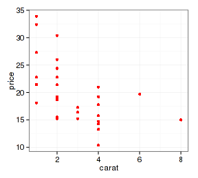
查看图层组成可以看到两者都有geom_point、stat_identity和position_identity:
(p + <span style="color: rgb(0, 42, 84);">stat_identity</span>())$layers
## [[1]]
## geom_point:
## stat_identity: width = NULL, height = NULL
## position_identity: (width = NULL, height = NULL)
(p + <span style="color: rgb(0, 42, 84);">geom_point</span>())$layers
## [[1]]
## geom_point: na.rm = FALSE
## stat_identity:
## position_identity: (width = NULL, height = NULL)
如果把geom_xxx类函数获得的图层称为“几何图层”,stat_xxx类函数获得的图层就可以称为“统计图层”。但这样的说法很不合适,因为每个图层都包含这两个东西,两者没有本质差别。如果你一定要把geom或stat清理掉(设为NULL),不会有任何错误信息,但图层的内容还是老样:
(p + <span style="color: rgb(0, 42, 84);">stat_identity</span>(<span style="color: rgb(0, 84, 0);">geom</span>=<span style="color: rgb(0, 0, 127);">NULL</span>))$layers
## [[1]]
## geom_point:
## stat_identity: width = NULL, height = NULL
## position_identity: (width = NULL, height = NULL)
(p + <span style="color: rgb(0, 42, 84);">geom_point</span>(<span style="color: rgb(0, 84, 0);">stat</span>=<span style="color: rgb(0, 0, 127);">NULL</span>))$layers
## [[1]]
## geom_point: na.rm = FALSE
## stat_identity:
## position_identity: (width = NULL, height = NULL)
为什么设置两套方案,H.W.有他的理由吧,毕竟有很多人只作图不统计,也有很多人做了很多统计以后才偶尔作个图。
1.2 图层对象
geom_xxx和stat_xxx可以指定数据,映射、几何类型和统计类型,一般来说,有这些东西我们就可以作图了。但实际情况是这些函数不可以直接出图,因为它不是完整的ggplot对象:
p <span style="color: rgb(84, 0, 84); "><strong><-</strong></span> <span style="color: rgb(0, 42, 84);">geom_point</span>(<span style="color: rgb(0, 84, 0);">mapping</span>=<span style="color: rgb(0, 42, 84);">aes</span>(<span style="color: rgb(0, 84, 0);">x</span>=carat, <span style="color: rgb(0, 84, 0);">y</span>=price), <span style="color: rgb(0, 84, 0);">data</span>=d.sub)
<span style="color: rgb(0, 42, 84);">class</span>(p)
## [1] "proto" "environment"
p
## mapping: x = carat, y = price
## geom_point: na.rm = FALSE
## stat_identity:
## position_identity: (width = NULL, height = NULL)
图层只是存储类型为environment的R语言对象,它只有建立在ggplot结构的基础上才会成为图形,在这里哪怕是一个空的ggplot对象框架都很有用。这好比仓库里的帐篷,如果你找不到地方把它们支起来,这些东西顶多是一堆货物:
<span style="color: rgb(0, 42, 84);">ggplot</span>() + p

前面说过多个图层的相加是有顺序的,图层和ggplot对象的加法也是有顺序的,如果把ggplot对象加到图层上就没有意义。这种规则同样适用于映射和ggplot的相加:
p + <span style="color: rgb(0, 42, 84);">ggplot</span>()
## NULL
<span style="color: rgb(0, 42, 84);">class</span>(<span style="color: rgb(0, 42, 84);">aes</span>(<span style="color: rgb(0, 84, 0);">x</span>=carat, <span style="color: rgb(0, 84, 0);">y</span>=price) + <span style="color: rgb(0, 42, 84);">ggplot</span>(d.sub))
## [1] "NULL"
<span style="color: rgb(0, 42, 84);">class</span>(<span style="color: rgb(0, 42, 84);">ggplot</span>(d.sub) + <span style="color: rgb(0, 42, 84);">aes</span>(<span style="color: rgb(0, 84, 0);">x</span>=carat, <span style="color: rgb(0, 84, 0);">y</span>=price))
## [1] "gg" "ggplot"
2 图层的位置调整参数
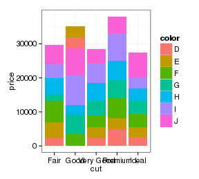
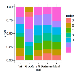
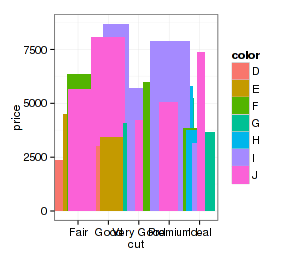
这和位置映射没有关系,当前版ggplot2只有5种:
- dodge:“避让”方式,即往旁边闪,如柱形图的并排方式就是这种。
- fill:填充方式, 先把数据归一化,再填充到绘图区的顶部。
- identity:原地不动,不调整位置
- jitter:随机抖一抖,让本来重叠的露出点头来
- stack:叠罗汉
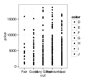
p <span style="color: rgb(84, 0, 84); "><strong><-</strong></span> <span style="color: rgb(0, 42, 84);">ggplot</span>(d.sub, <span style="color: rgb(0, 42, 84);">aes</span>(<span style="color: rgb(0, 84, 0);">x</span>=cut, <span style="color: rgb(0, 84, 0);">y</span>=price, <span style="color: rgb(0, 84, 0);">fill</span>=color))
p + <span style="color: rgb(0, 42, 84);">geom_bar</span>(<span style="color: rgb(0, 84, 0);">stat</span>=<span style="color: rgb(209, 0, 0);">"summary"</span>, <span style="color: rgb(0, 84, 0);">fun.y</span>=<span style="color: rgb(209, 0, 0);">"mean"</span>, <span style="color: rgb(0, 84, 0);">position</span>=<span style="color: rgb(209, 0, 0);">"stack"</span>)
p + <span style="color: rgb(0, 42, 84);">geom_bar</span>(<span style="color: rgb(0, 84, 0);">stat</span>=<span style="color: rgb(209, 0, 0);">"summary"</span>, <span style="color: rgb(0, 84, 0);">fun.y</span>=<span style="color: rgb(209, 0, 0);">"mean"</span>, <span style="color: rgb(0, 84, 0);">position</span>=<span style="color: rgb(209, 0, 0);">"fill"</span>)
p + <span style="color: rgb(0, 42, 84);">geom_bar</span>(<span style="color: rgb(0, 84, 0);">stat</span>=<span style="color: rgb(209, 0, 0);">"summary"</span>, <span style="color: rgb(0, 84, 0);">fun.y</span>=<span style="color: rgb(209, 0, 0);">"mean"</span>, <span style="color: rgb(0, 84, 0);">position</span>=<span style="color: rgb(209, 0, 0);">"dodge"</span>)
p + <span style="color: rgb(0, 42, 84);">geom_bar</span>(<span style="color: rgb(0, 84, 0);">stat</span>=<span style="color: rgb(209, 0, 0);">"summary"</span>, <span style="color: rgb(0, 84, 0);">fun.y</span>=<span style="color: rgb(209, 0, 0);">"mean"</span>, <span style="color: rgb(0, 84, 0);">position</span>=<span style="color: rgb(209, 0, 0);">"jitter"</span>)

上面柱形图的抖动很没道理,但散点图里面就有效果了:
p + <span style="color: rgb(0, 42, 84);">geom_point</span>(<span style="color: rgb(0, 84, 0);">position</span>=<span style="color: rgb(209, 0, 0);">"identity"</span>)
p + <span style="color: rgb(0, 42, 84);">geom_point</span>(<span style="color: rgb(0, 84, 0);">position</span>=<span style="color: rgb(209, 0, 0);">"jitter"</span>)
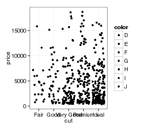
所以怎么调整还得看图形的需要。
再看看x轴数据连续的图形:
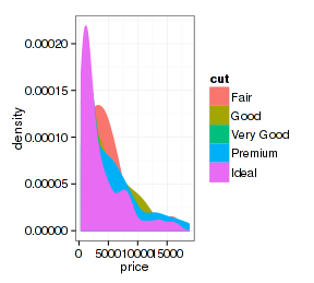
p <span style="color: rgb(84, 0, 84); "><strong><-</strong></span> <span style="color: rgb(0, 42, 84);">ggplot</span>(d.sub, <span style="color: rgb(0, 42, 84);">aes</span>(<span style="color: rgb(0, 84, 0);">x</span>=price, <span style="color: rgb(0, 84, 0);">fill</span>=cut, <span style="color: rgb(0, 84, 0);">color</span>=cut))
p + <span style="color: rgb(0, 42, 84);">stat_density</span>(<span style="color: rgb(0, 84, 0);">position</span>=<span style="color: rgb(209, 0, 0);">"stack"</span>)
p + <span style="color: rgb(0, 42, 84);">stat_density</span>(<span style="color: rgb(0, 84, 0);">position</span>=<span style="color: rgb(209, 0, 0);">"fill"</span>)
p + <span style="color: rgb(0, 42, 84);">stat_density</span>(<span style="color: rgb(0, 84, 0);">position</span>=<span style="color: rgb(209, 0, 0);">"identity"</span>)
p + <span style="color: rgb(0, 42, 84);">stat_density</span>(<span style="color: rgb(0, 84, 0);">position</span>=<span style="color: rgb(209, 0, 0);">"identity"</span>, <span style="color: rgb(0, 84, 0);">fill</span>=<span style="color: rgb(209, 0, 0);">"transparent"</span>)
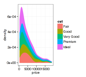
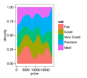
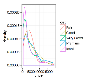
看起来很奇妙,改变一个参数就得到不同的图形。
3 图层组合
图层的组合不是连续使用几个几何或统计类型函数那么简单。ggplot函数可以设置数据和映射,每个图层设置函数(geom_xxx和stat_xxx)也都可以设置数据和映射,这虽然给组合图制作带来很大便利,但也可能产生一些混乱。如果不同图层设置的数据和映射不同,将会产生什么后果?得了解规则。
3.1 简单组合
不同的图层使用同一套数据,只是几何类型或统计类型有差别。这是最简单也是最常用的,用ggplot函数设置好数据和映射,把几个图层加起来即可:
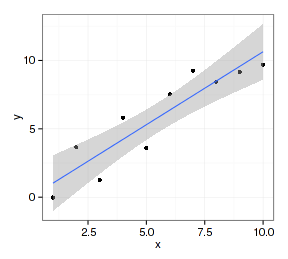
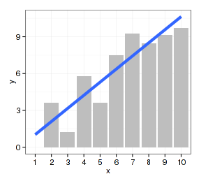
datax <span style="color: rgb(84, 0, 84); "><strong><-</strong></span> <span style="color: rgb(0, 42, 84);">data.frame</span>(<span style="color: rgb(0, 84, 0);">x</span>=<span style="color: rgb(184, 93, 0);">1</span>:<span style="color: rgb(184, 93, 0);">10</span>, <span style="color: rgb(0, 84, 0);">y</span>=<span style="color: rgb(0, 42, 84);">rnorm</span>(<span style="color: rgb(184, 93, 0);">10</span>)+<span style="color: rgb(184, 93, 0);">1</span>:<span style="color: rgb(184, 93, 0);">10</span>)
p  <span style="color: rgb(84, 0, 84); "><strong><-</strong></span> <span style="color: rgb(0, 42, 84);">ggplot</span>(datax, <span style="color: rgb(0, 42, 84);">aes</span>(<span style="color: rgb(0, 84, 0);">x</span>=x, <span style="color: rgb(0, 84, 0);">y</span>=y))
p + <span style="color: rgb(0, 42, 84);">geom_point</span>() + <span style="color: rgb(0, 42, 84);">geom_line</span>()
p + <span style="color: rgb(0, 42, 84);">geom_point</span>() + <span style="color: rgb(0, 42, 84);">geom_smooth</span>(<span style="color: rgb(0, 84, 0);">method</span>=<span style="color: rgb(209, 0, 0);">"lm"</span>)

ggplot2的图层设置函数对映射的数据类型是有较严格要求的,比如geom_point和geom_line函数要求x映射的数据类型为数值向量,而geom_bar函数要使用因子型数据。如果数据类型不符合映射要求就得做类型转换,在组合图形时还得注意图层的先后顺序:
p  <span style="color: rgb(84, 0, 84); "><strong><-</strong></span> <span style="color: rgb(0, 42, 84);">ggplot</span>(datax, <span style="color: rgb(0, 42, 84);">aes</span>(<span style="color: rgb(0, 84, 0);">x</span>=<span style="color: rgb(0, 42, 84);">factor</span>(x), <span style="color: rgb(0, 84, 0);">y</span>=y)) + <span style="color: rgb(0, 42, 84);">xlab</span>(<span style="color: rgb(209, 0, 0);">"x"</span>)
p + <span style="color: rgb(0, 42, 84);">geom_bar</span>(<span style="color: rgb(0, 84, 0);">stat</span>=<span style="color: rgb(209, 0, 0);">"identity"</span>, <span style="color: rgb(0, 84, 0);">fill</span>=<span style="color: rgb(209, 0, 0);">"gray"</span>) +
  <span style="color: rgb(0, 42, 84);">geom_line</span>(<span style="color: rgb(0, 42, 84);">aes</span>(<span style="color: rgb(0, 84, 0);">group</span>=<span style="color: rgb(184, 93, 0);">1</span>), <span style="color: rgb(0, 84, 0);">size</span>=<span style="color: rgb(184, 93, 0);">2</span>) + <span style="color: rgb(0, 42, 84);">geom_point</span>(<span style="color: rgb(0, 84, 0);">color</span>=<span style="color: rgb(209, 0, 0);">"red"</span>)
p + <span style="color: rgb(0, 42, 84);">geom_bar</span>(<span style="color: rgb(0, 84, 0);">stat</span>=<span style="color: rgb(209, 0, 0);">"identity"</span>, <span style="color: rgb(0, 84, 0);">fill</span>=<span style="color: rgb(209, 0, 0);">"gray"</span>) +
  <span style="color: rgb(0, 42, 84);">geom_smooth</span>(<span style="color: rgb(0, 42, 84);">aes</span>(<span style="color: rgb(0, 84, 0);">group</span>=<span style="color: rgb(184, 93, 0);">1</span>), <span style="color: rgb(0, 84, 0);">method</span>=<span style="color: rgb(209, 0, 0);">"lm"</span>, <span style="color: rgb(0, 84, 0);">se</span>=<span style="color: rgb(184, 93, 0);">FALSE</span>, <span style="color: rgb(0, 84, 0);">size</span>=<span style="color: rgb(184, 93, 0);">2</span>)
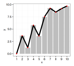
上面第一个图除了花哨一点外没有任何科学意义,如果放在论文中会被骂得狗学喷头:一套数据重复作图还都是一个意思,是不是脑子有病?但这里只是说明作图方法。作图过程应先作柱形图,因为它要求x映射是因子型数据。x映射为因子的数据作散点图的调整步骤相对简单。如果先作散点图,把坐标轴从数值向量(连续型)改为因子型相当麻烦。
3.2 不同映射的组合
映射反映的是数据变量。多数情况下一个图形中使用的是同一个数据集,只是变量不同。通常情况下x,y轴至少有一个是相同的,可以用不同图层叠加不同的数据变量:
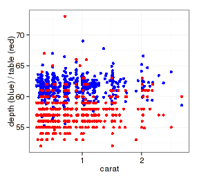
p <span style="color: rgb(84, 0, 84); "><strong><-</strong></span> <span style="color: rgb(0, 42, 84);">ggplot</span>(d.sub, <span style="color: rgb(0, 42, 84);">aes</span>(<span style="color: rgb(0, 84, 0);">x</span>=carat)) + <span style="color: rgb(0, 42, 84);">ylab</span>(<span style="color: rgb(209, 0, 0);">"depth (blue) / table (red)"</span>)
p + <span style="color: rgb(0, 42, 84);">geom_point</span>(<span style="color: rgb(0, 42, 84);">aes</span>(<span style="color: rgb(0, 84, 0);">y</span>=depth), <span style="color: rgb(0, 84, 0);">color</span>=<span style="color: rgb(209, 0, 0);">"blue"</span>)  +
  <span style="color: rgb(0, 42, 84);">geom_point</span>(<span style="color: rgb(0, 42, 84);">aes</span>(<span style="color: rgb(0, 84, 0);">y</span>=table), <span style="color: rgb(0, 84, 0);">color</span>=<span style="color: rgb(209, 0, 0);">"red"</span>)
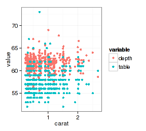
但是为什么要这么做呢?预先处理一下数据再作图会更好,图标都已经帮你设好了:
<span style="color: rgb(0, 42, 84);">library</span>(reshape2)
datax <span style="color: rgb(84, 0, 84); "><strong><-</strong></span> <span style="color: rgb(0, 42, 84);">melt</span>(d.sub, <span style="color: rgb(0, 84, 0);">id.vars</span>=<span style="color: rgb(209, 0, 0);">"carat"</span>, <span style="color: rgb(0, 84, 0);">measure.vars</span>=<span style="color: rgb(0, 42, 84);">c</span>(<span style="color: rgb(209, 0, 0);">"depth"</span>, <span style="color: rgb(209, 0, 0);">"table"</span>))
<span style="color: rgb(0, 42, 84);">ggplot</span>(datax, <span style="color: rgb(0, 42, 84);">aes</span>(<span style="color: rgb(0, 84, 0);">x</span>=carat, <span style="color: rgb(0, 84, 0);">y</span>=value, <span style="color: rgb(0, 84, 0);">color</span>=variable)) + <span style="color: rgb(0, 42, 84);">geom_point</span>()
3.3 不同类型数据的组合
如果在geom_xxx函数中改变数据会怎么样呢?不同类型的数据一般不会有完全相同的变量,否则就不是“不同类型”了,所以映射也会相应做修改。下面把钻石数据diamonds和汽车数据mtcars这两个风牛马不相及的数据放在一起看看。(首先声明:下面的方法只是演示,图形没有任何科学意义。科学图形应该能让观众直观地了解数据,而不是让明白者糊涂让糊涂者脑残。有不少人喜欢用双坐标作混合数据图,个人认为那是很愚昧的做法。)
diamonds数据我们在前面已经了解过了,先看看R datasets包里面的mtcars数据:
<span style="color: rgb(0, 42, 84);">data</span>(mtcars, <span style="color: rgb(0, 84, 0);">package</span>=<span style="color: rgb(209, 0, 0);">"datasets"</span>)
<span style="color: rgb(0, 42, 84);">str</span>(mtcars)
## 'data.frame':	32 obs. of  11 variables:
##  $ mpg : num  21 21 22.8 21.4 18.7 18.1 14.3 24.4 22.8 19.2 ...
##  $ cyl : num  6 6 4 6 8 6 8 4 4 6 ...
##  $ disp: num  160 160 108 258 360 ...
##  $ hp  : num  110 110 93 110 175 105 245 62 95 123 ...
##  $ drat: num  3.9 3.9 3.85 3.08 3.15 2.76 3.21 3.69 3.92 3.92 ...
##  $ wt  : num  2.62 2.88 2.32 3.21 3.44 ...
##  $ qsec: num  16.5 17 18.6 19.4 17 ...
##  $ vs  : num  0 0 1 1 0 1 0 1 1 1 ...
##  $ am  : num  1 1 1 0 0 0 0 0 0 0 ...
##  $ gear: num  4 4 4 3 3 3 3 4 4 4 ...
##  $ carb: num  4 4 1 1 2 1 4 2 2 4 ...
<span style="color: rgb(0, 42, 84);">head</span>(mtcars, <span style="color: rgb(184, 93, 0);">4</span>)
##                 mpg cyl disp  hp drat    wt  qsec vs am gear carb
## Mazda RX4      21.0   6  160 110 3.90 2.620 16.46  0  1    4    4
## Mazda RX4 Wag  21.0   6  160 110 3.90 2.875 17.02  0  1    4    4
## Datsun 710     22.8   4  108  93 3.85 2.320 18.61  1  1    4    1
## Hornet 4 Drive 21.4   6  258 110 3.08 3.215 19.44  1  0    3    1
好,开始玩点玄乎的:
p  <span style="color: rgb(84, 0, 84); "><strong><-</strong></span> <span style="color: rgb(0, 42, 84);">ggplot</span>(<span style="color: rgb(0, 84, 0);">data</span>=d.sub, <span style="color: rgb(0, 42, 84);">aes</span>(<span style="color: rgb(0, 84, 0);">x</span>=carat, <span style="color: rgb(0, 84, 0);">y</span>=price, <span style="color: rgb(0, 84, 0);">color</span>=cut))
layer1 <span style="color: rgb(84, 0, 84); "><strong><-</strong></span> <span style="color: rgb(0, 42, 84);">geom_point</span>(<span style="color: rgb(0, 42, 84);">aes</span>(<span style="color: rgb(0, 84, 0);">x</span>=carb, <span style="color: rgb(0, 84, 0);">y</span>=mpg), mtcars, <span style="color: rgb(0, 84, 0);">color</span>=<span style="color: rgb(209, 0, 0);">"black"</span>)
(p1 <span style="color: rgb(84, 0, 84); "><strong><-</strong></span> p + layer1)

图中数据点是正确的,但坐标轴标题却对不上号。看看ggplot对象的数据、映射和图层:
<span style="color: rgb(0, 42, 84);">head</span>(p1$data, <span style="color: rgb(184, 93, 0);">4</span>)
##       carat       cut color clarity depth table price    x    y    z
## 16601  1.01 Very Good     D     SI1  62.1    59  6630 6.37 6.41 3.97
## 13899  0.90     Ideal     D     SI1  62.4    55  5656 6.15 6.19 3.85
## 29792  0.30     Ideal     D     SI1  61.6    56   709 4.34 4.30 2.66
## 3042   0.30 Very Good     G     VS1  62.0    60   565 4.27 4.31 2.66
p1$mapping
## List of 3
##  $ x     : symbol carat
##  $ y     : symbol price
##  $ colour: symbol cut
p1$layers
## [[1]]
## mapping: x = carb, y = mpg
## geom_point: na.rm = FALSE, colour = black
## stat_identity:
## position_identity: (width = NULL, height = NULL)
数据和映射都还是ggplot原来设置的样子,layer2图层设置的都没有存储到ggplot图形列表对象的data和mapping元素中,而是放在了图层中,但图层中设定的数据不知道跑哪里。
如果再增加一个图层,把坐标轴标题标清楚:
layer2 <span style="color: rgb(84, 0, 84); "><strong><-</strong></span> <span style="color: rgb(0, 42, 84);">geom_point</span>(<span style="color: rgb(0, 42, 84);">aes</span>(<span style="color: rgb(0, 84, 0);">y</span>=depth))
(p1 <span style="color: rgb(84, 0, 84); "><strong><-</strong></span> p1 + layer2 + <span style="color: rgb(0, 42, 84);">xlab</span>(<span style="color: rgb(209, 0, 0);">"carb(black) / carat"</span>) + <span style="color: rgb(0, 42, 84);">ylab</span>(<span style="color: rgb(209, 0, 0);">"mpg(black) / depth"</span>))
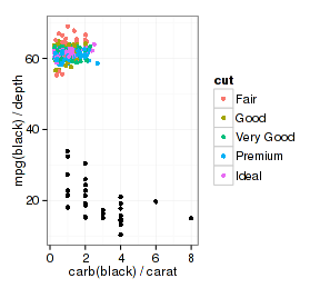
很有意思。layer2重新指定了y映射,但没碰原来ggplot对象设置的x和color映射,从获得的图形来看y数据改变了,x和color还是原ggplot对象的设置。查看一下映射和图层:
p1$mapping
## List of 3
##  $ x     : symbol carat
##  $ y     : symbol price
##  $ colour: symbol cut
p1$layers
## [[1]]
## mapping: x = carb, y = mpg
## geom_point: na.rm = FALSE, colour = black
## stat_identity:
## position_identity: (width = NULL, height = NULL)
##
## [[2]]
## mapping: y = depth
## geom_point: na.rm = FALSE
## stat_identity:
## position_identity: (width = NULL, height = NULL)
可以这么理解:ggplot2图层作图时依次从ggplot对象和图层中获取数据/映射,如果两者映射有重叠,后者将替换前者,但只是在该图层中进行替换而不影响ggplot对象。
如果ggplot对象的映射比图层的映射多,而图层又使用了不同的数据,这是什么情况?看看:
p + <span style="color: rgb(0, 42, 84);">geom_point</span>(<span style="color: rgb(0, 42, 84);">aes</span>(<span style="color: rgb(0, 84, 0);">x</span>=carb, <span style="color: rgb(0, 84, 0);">y</span>=mpg), mtcars)
## Error: arguments imply differing number of rows: 32, 0
由于图层继承了ggplot对象的color映射,但又找不到数据,所以没法作图。解决办法是把原有的映射用NULL取代,或者设为常量(非映射):
p + <span style="color: rgb(0, 42, 84);">geom_point</span>(<span style="color: rgb(0, 42, 84);">aes</span>(<span style="color: rgb(0, 84, 0);">x</span>=carb, <span style="color: rgb(0, 84, 0);">y</span>=mpg, <span style="color: rgb(0, 84, 0);">color</span>=<span style="color: rgb(0, 0, 127);">NULL</span>), mtcars)
p + <span style="color: rgb(0, 42, 84);">geom_point</span>(<span style="color: rgb(0, 42, 84);">aes</span>(<span style="color: rgb(0, 84, 0);">x</span>=carb, <span style="color: rgb(0, 84, 0);">y</span>=mpg), mtcars, <span style="color: rgb(0, 84, 0);">color</span>=<span style="color: rgb(209, 0, 0);">"red"</span>)
4 SessionInfo
<span style="color: rgb(0, 42, 84);">sessionInfo</span>()
## R version 3.1.0 (2014-04-10)
## Platform: x86_64-pc-linux-gnu (64-bit)
##
## locale:
##  [1] LC_CTYPE=zh_CN.UTF-8       LC_NUMERIC=C
##  [3] LC_TIME=zh_CN.UTF-8        LC_COLLATE=zh_CN.UTF-8
##  [5] LC_MONETARY=zh_CN.UTF-8    LC_MESSAGES=zh_CN.UTF-8
##  [7] LC_PAPER=zh_CN.UTF-8       LC_NAME=C
##  [9] LC_ADDRESS=C               LC_TELEPHONE=C
## [11] LC_MEASUREMENT=zh_CN.UTF-8 LC_IDENTIFICATION=C
##
## attached base packages:
## [1] tcltk     stats     graphics  grDevices utils     datasets  methods
## [8] base
##
## other attached packages:
## [1] reshape2_1.2.2  ggplot2_0.9.3.1 zblog_0.1.0     knitr_1.5
##
## loaded via a namespace (and not attached):
##  [1] colorspace_1.2-4 digest_0.6.4     evaluate_0.5.3   formatR_0.10
##  [5] grid_3.1.0       gtable_0.1.2     highr_0.3        labeling_0.2
##  [9] MASS_7.3-31      munsell_0.4.2    plyr_1.8.1       proto_0.3-10
## [13] Rcpp_0.11.1      scales_0.2.4     stringr_0.6.2    tools_3.1.0


 1672
1672


 被折叠的 条评论
为什么被折叠?
被折叠的 条评论
为什么被折叠?
 到【灌水乐园】发言


