


Echarts 是一种常用的图表。
帅帅哥常的操作笔记分解
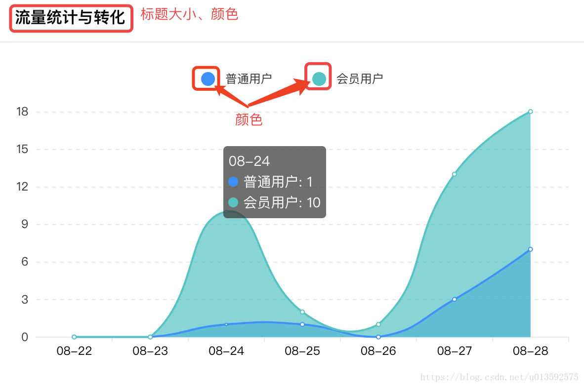
| 颜色: color: ['#1890FF', '#00C6C4’]
标题大小、颜色: title : { text:'流量统计与转化', x: 'center', y: '70%', textStyle:{ fontSize: 14, color: '#000', fontWeight: 'normal', }, }
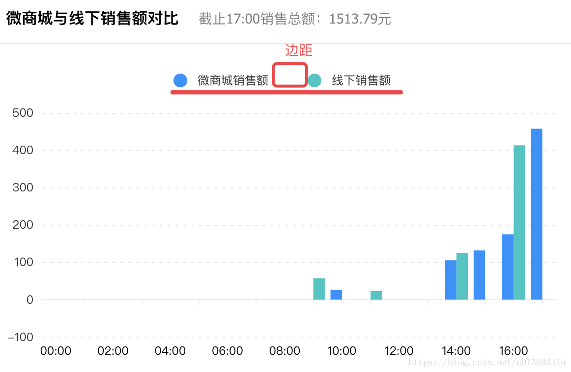
图表的内边距:可理解为padding grid: { left: '2%', right: '2%', bottom: '6%', containLabel: true } |
|
| 图表标题: legend: { 居中 orient: ‘horizon tal', // 'horizontal/vertical’ , x: 'center’, 表标题标志类型(圆) icon: 'circle’, 内边距 padding: [20, 0, 0, 0], 表标题圆宽高 itemWidth: 40, itemHeight: 10, 表标题间距 itemGap: 40, }, |
|
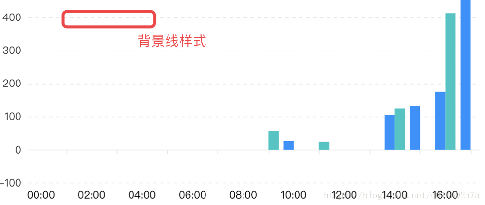
| X、Y 轴背景线的样式: xAxis : { splitLine:{ lineStyle: { type: 'dashed', color: '#E8E8E8', } } }
|
|
| X 轴文字过长处理方法: xAxis : { 1、倾斜 axisLabel: { interval: 0, rotate: 40, }
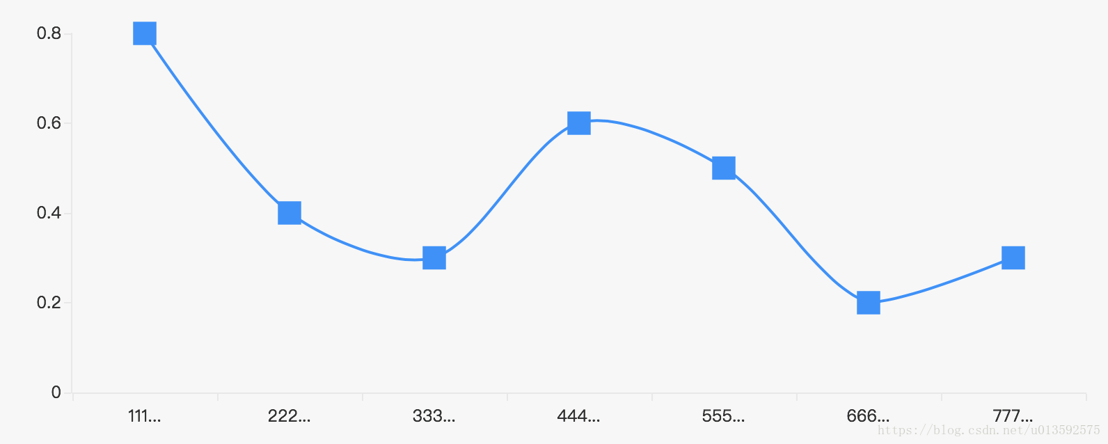
2、垂直 axisLabel: { formatter:function(value) { return value.split("").join("\n"); } }
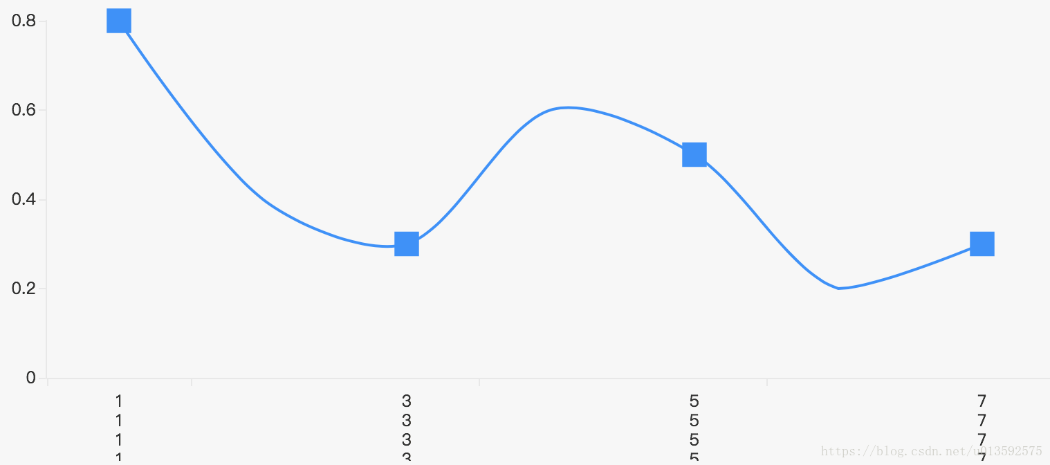
3、省略号 axisLabel: { formatter: function (value, index) { // 1 2 这些你自定义就行 var v = value.substring(0, 3) + '...' return value.length > 2 ? v : value } }
}
注) 1、interval 坐标轴刻度标签的显示间隔(类目轴中有效),默认会采用标签不重叠的方式显示(默认会将部分文字显示不全)
可以设置为0强制显示所有标签,如果设置为1,表示隔一个标签显示一个标签,如果为3,表示隔3个标签显示一个标签,以此类推。 2、rotate 标签倾斜的角度,在类目轴的类目标签显示不全时可以通过旋转防止标签重叠,旋转的角度是-90到90度。
| 倾斜:
垂直:
省略号:
|
| X 、Y 轴数据转换 xAxis: { X轴坐标轴两端空白 boundaryGap : false
X 、Y轴网络线去除 splitLine:{ show: false }
X 、Y 轴网络区域去除 splitArea : {show : false}
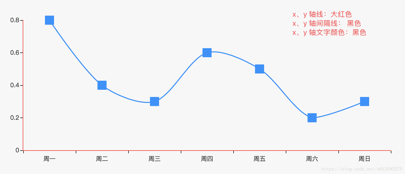
X 、Y 轴线颜色、宽度 axisLine: { lineStyle: { color: ‘red', width: 1, } }
X 、Y 轴线分隔线、颜色 axisTick: { show:false, lineStyle: { color: ‘#000', width: 1, } }
X 、Y 轴文字颜色 axisLabel: { textStyle: { color: '#000' }, } }
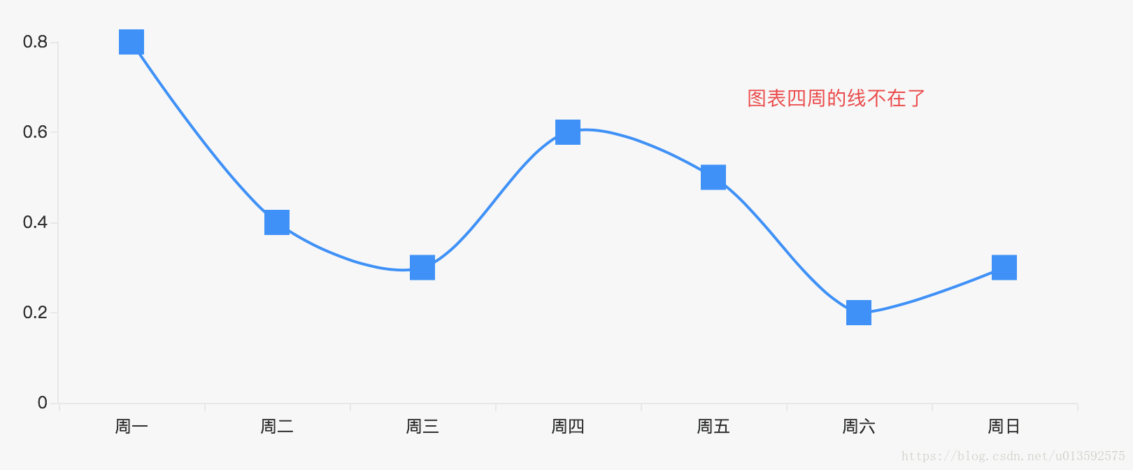
图表边框线去除 grid: { show:'true', borderWidth:'0' }
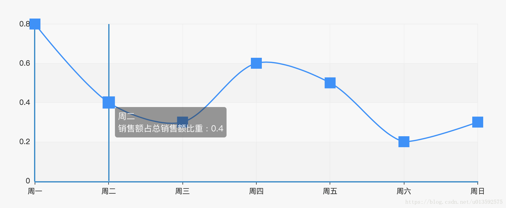
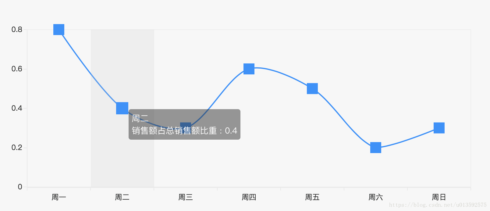
鼠标放上去有阴影 tooltip : { trigger: 'axis', axisPointer: { type: ‘shadow' } }, }
| 修改前:
修改后: X、Y 轴数据转换
图表边框线去除:(边框线存在原力如下:鼠标放上去有阴影)
鼠标放上去有阴影:
|
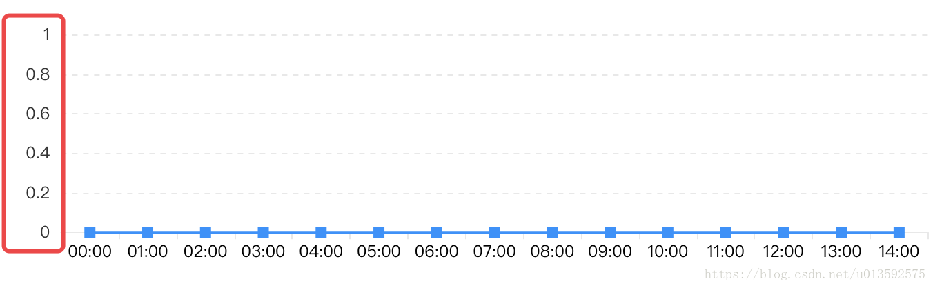
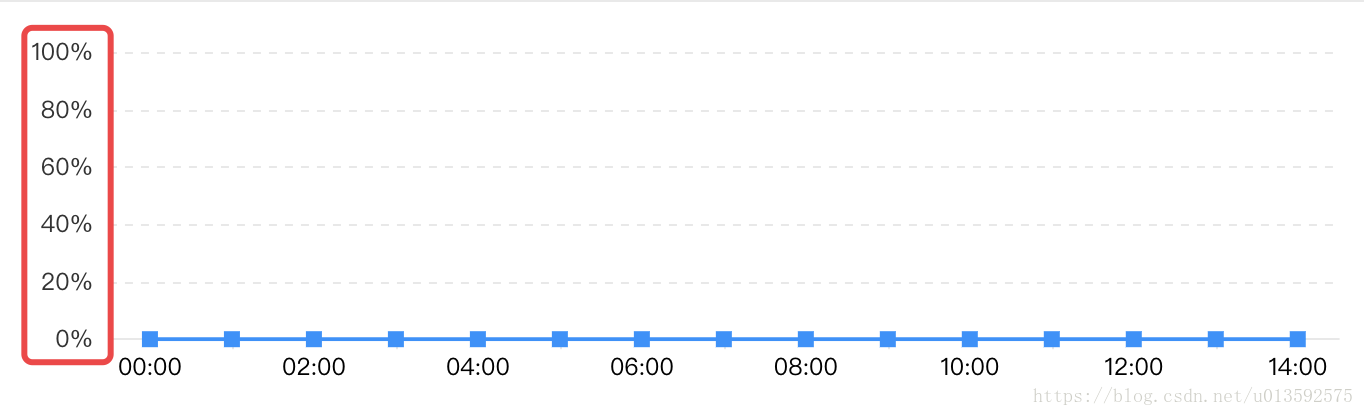
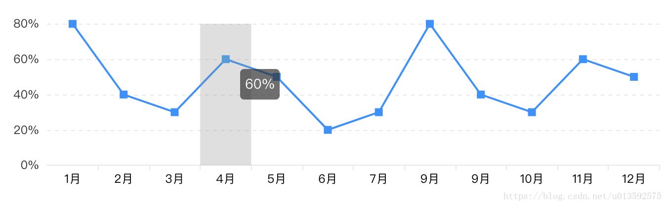
| Y 轴的数据转换: 1、小数转成百分比 yAxis: { type: 'value', axisLabel:{ // formatter:'{value}%' formatter:function(value) { return value*100 + '%'; } } },
2、鼠标放上去的地方也要转成百分比 tooltip: { trigger: 'axis', axisPointer: { type: 'shadow' }, formatter:function(c) { return (c[0].value)*100 + '%'; } },
注)Echarts 中 如果要写js,都在 formatter 这个函数里面写。 | 修改前:
修改后: 1、小数转成百分比
2、鼠标放上去的地方也要转成百分比
|
|
|
|

ECharts 基础引入方法
| Js 中使用方法 | 参考官方文档,直接引用 | 参考官方文档,直接引用 |
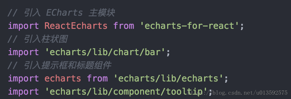
| react 中使用方法 |
| // 引入 ECharts 主模块 import ReactEcharts from 'echarts-for-react'; // 引入柱状图 import 'echarts/lib/chart/bar'; // 引入提示框和标题组件 import echarts from 'echarts/lib/echarts'; import 'echarts/lib/component/tooltip’;
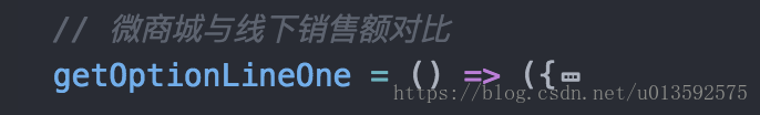
getOptionLineOne = ( ) =>({ //do something })
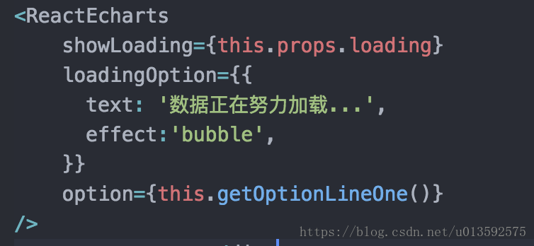
<ReactEcharts showLoading={this.props.loading} loadingOption={{ text: '数据正在努力 加载…', effect:'bubble’, }} option={this.getOptionLineOne()} style={{ height: 328 }} />
|
| vue 中使用方法 |
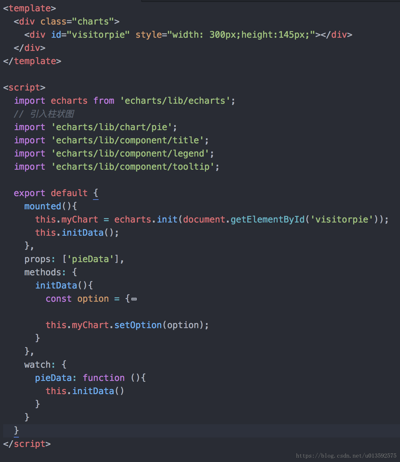
| <script> import echarts from 'echarts/lib/echarts'; // 引入柱状图 import 'echarts/lib/chart/pie'; import 'echarts/lib/component/title'; import 'echarts/lib/component/legend'; import 'echarts/lib/component/tooltip';
<template> <div style="width: 300px;height:145px;"></div> </template>
export default { mounted(){ this.myChart = echarts.init(document.getElementById('visitorpie')); this.initData(); }, props: ['pieData'], methods: { initData(){ const option = { // do something }; this.myChart.setOption(option); } }, watch: { pieData: function (){ this.initData() } } } </script> |
|
|
|
|


 3257
3257


 被折叠的 条评论
为什么被折叠?
被折叠的 条评论
为什么被折叠?
 到【灌水乐园】发言


