


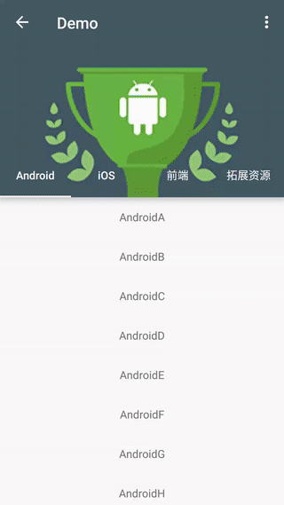
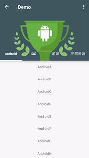
CoordinatorTabLayout


CoordinatorTabLayout is a custom composite control that quickly implements the combination of TabLayout and CoordinatorLayout. Inherited to the CoordinatorLayout, in the following components used CollapsingToolbarLayout contains TabLayout.
Usage
Step 1
Add the following to your build.gradle:
dependencies {
    compile 'cn.hugeterry.coordinatortablayout:coordinatortablayout:1.1.0'
}
Step 2
Config in xml:
<cn.hugeterry.coordinatortablayout.CoordinatorTabLayout xmlns:android="http://schemas.android.com/apk/res/android"
    xmlns:app="http://schemas.android.com/apk/res-auto"
    android:id="@+id/coordinatortablayout"
    android:layout_width="match_parent"
    android:layout_height="match_parent">

    <android.support.v4.view.ViewPager
        android:id="@+id/vp"
        android:layout_width="match_parent"
        android:layout_height="match_parent"
        app:layout_behavior="@string/appbar_scrolling_view_behavior" />
</cn.hugeterry.coordinatortablayout.CoordinatorTabLayout>
Step 3
Use it in your own code:
1.setTitle(String title):Set the CoordinatorTabLayout's title.
2.setupWithViewPager(ViewPager viewPager):To link the two together.
3.setImageArray(int[] imageArray):Set the image array of the header according to the number of tabs and pass it to the control.
        //Add the fragment to the viewpager
        initFragments();
        initViewPager();
        //Image array
        mImageArray = new int[]{
                R.mipmap.bg_android,
                R.mipmap.bg_ios,
                R.mipmap.bg_js,
                R.mipmap.bg_other};

        mCoordinatorTabLayout = (CoordinatorTabLayout) findViewById(R.id.coordinatortablayout);
        mCoordinatorTabLayout.setTitle("Demo")
                .setImageArray(mImageArray)
                .setupWithViewPager(mViewPager);
Finish, enjoy it.
More
Set the content scrim
setImageArray(int[] imageArray, int[] colorArray):Set the color array to use for the content scrim for each tab.
        mColorArray = new int[]{
                android.R.color.holo_blue_light,
                android.R.color.holo_red_light,
                android.R.color.holo_orange_light,
                android.R.color.holo_green_light};
        mCoordinatorTabLayout.setImageArray(mImageArray, mColorArray);
Set translucent status bar
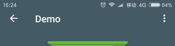
setTransulcentStatusBar(Activity activity):Set translucent status bar,Support android4.4 and above.
mCoordinatorTabLayout.setTransulcentStatusBar(activity);
Set back enable
setBackEnable(Boolean canBack):To enable the Up button for an activity that has a parent activity.
    @Override
    protected void onCreate(Bundle savedInstanceState) {
        ...
        mCoordinatorTabLayout.setBackEnable(true);
        ...
    }
    @Override
    public boolean onOptionsItemSelected(MenuItem item) {
        if (item.getItemId() == android.R.id.home) {
            finish();
        }
        return super.onOptionsItemSelected(item);
    }
Load header images from network
setLoadHeaderImagesListener(LoadHeaderImagesListener loadHeaderImagesListener):Set the listener that gets the header images.
    @Override
    protected void onCreate(Bundle savedInstanceState) {
        ...
        mCoordinatorTabLayout.setTitle("Demo")
                .setBackEnable(true)
                .setContentScrimColorArray(mColorArray)
                .setLoadHeaderImagesListener(new LoadHeaderImagesListener() {
                    @Override
                    public void loadHeaderImages(ImageView imageView, TabLayout.Tab tab) {
                        switch (tab.getPosition()) {
                            case 0:
                                //load header images
                                break;
                            ...
                        }
                    }
                })
                .setupWithViewPager(mViewPager);
    }
You also can load header images using glide/picasso,Sample
Gets the child control
getActionBar():get the ActionBargetTabLayout():get the TabLayoutgetImageView():get the ImageView
Attributes
app:contentScrim-> color.Defaults to ?attr/colorPrimaryapp:tabIndicatorColor-> color.app:tabTextColor-> color.


 扫一扫
扫一扫
 950
950

 被折叠的 条评论
为什么被折叠?
被折叠的 条评论
为什么被折叠?
 到【灌水乐园】发言


