


1、八卦制作
转载自:http://www.hulufei.com/post/about-before-and-after-pseudo-element
css:
#ba{
    width: 96px;
    height: 48px;
    background: #eee;
    border-color: red;
    border-style: solid;
    border-width: 2px 2px 50px 2px;
    border-radius: 100%;
    position: relative;
}
#ba:after,#ba:before{
    content: '';
    position: absolute;
    top: 50%;
    width: 12px;
    height: 12px;
    border-radius: 100%;
}
#ba:after{
    border: 18px solid red;
    left: 0;
    background: #eee;
}
#ba:before{
    border: 18px solid #eee;
    right: 0;
    background: red;
}
html:
<div id="ba"></div>效果:

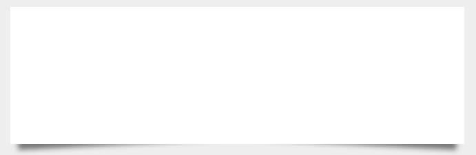
2、阴影制作
转载自https://paulund.co.uk/playground/demo/css_box_shadow/sass-box-shadow.php
css:
body{
    background: #eee;
}
div.box{
    width: 50%;
    height: 200px;
    background: #FFF;
    margin: 40px auto;
    position: relative;
}
div.box:before,div.box:after{
    position: absolute;
    content: "";
    bottom: 15px;
    top: 80%;
    width: 50%;
    background: #777;
    box-shadow: 0 15px 10px #777;
    z-index: -1;
}
div.box:before{
    left: 10px;
    transform: rotate(-3deg);
}
div.box:after{
    right: 10px;
    transform: rotate(3deg);
}
html:
<div class="box"></div>效果:
3、左右阴影
body{
    background: #eee;
}
div.box{
    width: 50%;
    height: 200px;
    background: #FFF;
    margin: 40px auto;
    position: relative;
    box-shadow: 0 1px 4px rgba(0, 0, 0, 0.3), 0 0 40px rgba(0, 0, 0, 0.1) inset;
}
div.box:before{
    content: "";
    position: absolute;
    box-shadow: 0 0 20px rgba(0, 0, 0, 0.8);
    top: 10px;
    bottom: 10px;
    left: 0;
    right: 0;
    border-radius: 100px / 10px;
    z-index: -1;
}
div.box:after{
    right: 10px;
    left: auto;
    transform: skew(8deg) rotate(3deg);
}
效果:
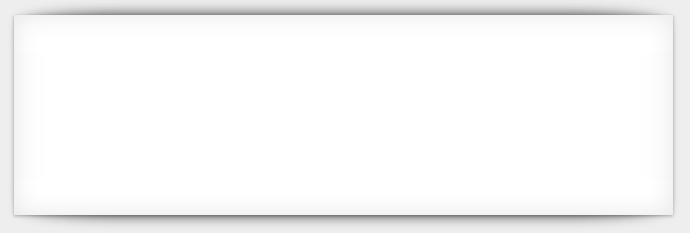
3、上下阴影
body{
    background: #eee;
}
div.box{
    width: 50%;
    height: 200px;
    background: #FFF;
    margin: 40px auto;
    position: relative;
    box-shadow: 0 1px 4px rgba(0, 0, 0, 0.3), 0 0 40px rgba(0, 0, 0, 0.1) inset;
}
div.box:before{
    content: "";
    position: absolute;
    box-shadow: 0 0 20px rgba(0, 0, 0, 0.8);
    top: 0;
    bottom: 0;
    left: 10px;
    right: 10px;
    border-radius: 100px / 10px;
    z-index: -1;
}
div.box:after{
    right: 10px;
    left: auto;
    transform: skew(8deg) rotate(3deg);
}
效果:


 扫一扫
扫一扫
 427
427

 被折叠的 条评论
为什么被折叠?
被折叠的 条评论
为什么被折叠?
 到【灌水乐园】发言


