


对于Material Design 控件已经不是新鲜的控件了。
早在2015年,谷歌在推出Android5.0的同时推出了全新的设计Material Design,谷歌为了给我们提供更加规范的MD设计风格的控件,推出了Design支持包,Design常用的控件有下面8个:
- TextInputLayout 文本输入布局
- Snackbar
- TabLayout 选项卡布局
- FloatingActionButton 浮动按钮
- NavigationView 导航视图
- AppBarLayout 应用程序栏布局
- CoordinatorLayout 协作布局
- CollapsingToolbarLayout 折叠工具栏布局
下面我们逐个来看看
首先我们要在build文件中引入support:design
dependencies {
compile fileTree(dir: 'libs', include: ['*.jar'])
testCompile 'junit:junit:4.12'
compile 'com.android.support:design:24.0.0'
compile 'com.android.support:appcompat-v7:24.0.0'
compile 'com.android.support:support-v4:24.0.0'
}
1、 TextInputLayout 文本输入布局
TextInputLayout把EditText的android:hint属性的值以浮动标签的形式显示出来,通过setErrorEnabled(boolean)和setError(CharSequence)来显示提示信息。
效果图:

    <android.support.design.widget.TextInputLayout
        android:id="@+id/text_input_layout"
        android:layout_width="match_parent"
        android:layout_height="wrap_content">

        <EditText
            android:layout_width="match_parent"
            android:layout_height="wrap_content"
            android:hint="请输入手机号码"
            android:inputType="number"
            android:maxLength="11" />
    </android.support.design.widget.TextInputLayout>
java代码提示信息
        TextInputLayout textInputLayout = (TextInputLayout) findViewById(R.id.text_input_layout);
        textInputLayout.setErrorEnabled(true);
        textInputLayout.setError("手机号码格式有误");
2、 Snackbar
Snackbar反馈操作,注意Snackbar显示或者消失的时候有一个回调方法。
       Snackbar snackbar=Snackbar.make(tab_layout,"snackbar",Snackbar.LENGTH_LONG);
        //回调方法
        snackbar.setCallback(new Snackbar.Callback() {
            @Override
            public void onDismissed(Snackbar snackbar, int event) {
                super.onDismissed(snackbar, event);
            }
            @Override
            public void onShown(Snackbar snackbar) {
                super.onShown(snackbar);
            }
        });
        snackbar.show();
3、TabLayout 选项卡布局
一般情况下,它总是喜欢和ViewPager成对出现,他们如同情侣般,恩恩爱爱,走到那都是卿卿我我的
    <android.support.design.widget.TabLayout
        android:id="@+id/tab_layout"
        app:tabIndicatorColor="@color/colorPrimary"
        app:tabSelectedTextColor="@color/colorPrimaryDark"
        app:tabTextColor="#ff0000"
        android:layout_width="match_parent"
        android:layout_height="wrap_content">

    </android.support.design.widget.TabLayout>

    <android.support.v4.view.ViewPager
        android:id="@+id/viewPager"
        android:layout_width="match_parent"
        android:layout_height="match_parent" />
tablayout.setupWithViewPager();
使用这种方法标题由ViewPager决定viewPager.addOnPageChangeListener(new TabLayoutOnPageChangeListener(tablayout));
使用这种方法标题由Tablayout决定
下面我们用TabLayout和ViewPager来实现选项卡的切换
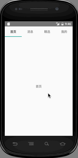
先看效果图:

新建HomeActivity
public class HomeActivity extends FragmentActivity {

    private TitleFragmentPagerAdapter pagerAdapter;

    private ViewPager viewPager;

    private TabLayout tabLayout;

    @Override
    protected void onCreate(Bundle savedInstanceState) {
        super.onCreate(savedInstanceState);
        setContentView(R.layout.activity_home);
        pagerAdapter = new TitleFragmentPagerAdapter(getSupportFragmentManager(), this);
        viewPager = (ViewPager) findViewById(R.id.viewPager);
        viewPager.setAdapter(pagerAdapter);
        tabLayout = (TabLayout) findViewById(R.id.tab_layout);
        tabLayout.setupWithViewPager(viewPager);
        tabLayout.setTabMode(TabLayout.MODE_FIXED);
        //tabLayout.setTabMode(TabLayout.MODE_SCROLLABLE);
    }
}
这里需要注意一下,setupWithViewPager必须在ViewPager.setAdapter()之后调用,查看源码
public void setupWithViewPager(ViewPager viewPager) {
    PagerAdapter adapter = viewPager.getAdapter();
    if(adapter == null) {
        throw new IllegalArgumentException("ViewPager does not have a PagerAdapter set");
    } else {
        ...
    }
}
你会发现,如果适配器为空,则直接抛出异常了。
这里我们用
tablayout.setupWithViewPager();
如前面提到的使用这种方法标题由ViewPager决定
新建 ListFragment
public class ListFragment extends Fragment {

    public static final String TYPE = "TYPE";
    private String mType;

    public static ListFragment newInstance(String type) {
        Bundle args = new Bundle();
        args.putString(TYPE, type);
        ListFragment listFragment = new ListFragment();
        listFragment.setArguments(args);
        return listFragment;
    }

    @Override
    public void onCreate(Bundle savedInstanceState) {
        super.onCreate(savedInstanceState);
        mType = getArguments().getString(TYPE);
    }

    @Nullable
    @Override
    public View onCreateView(LayoutInflater inflater, ViewGroup container, Bundle savedInstanceState) {
        View view = inflater.inflate(R.layout.fragment_list, container, false);
        TextView textView = (TextView) view;
        textView.setText(mType);
        return view;
    }

}
新建fragment_list布局
<?xml version="1.0" encoding="utf-8"?>
<TextView xmlns:android="http://schemas.android.com/apk/res/android"
android:layout_width="match_parent"
 android:layout_height="match_parent"
android:gravity="center" />
如果想改标题颜色和选中后的颜色,我们可以通过tabSelectedTextColor和tabTextColor相关属性调整。
    <android.support.design.widget.TabLayout
        android:id="@+id/tab_layout"
        app:tabIndicatorColor="@color/colorPrimary"
        app:tabSelectedTextColor="@color/colorPrimaryDark"
        app:tabTextColor="#ff0000"
        android:layout_width="match_parent"
        android:layout_height="wrap_content">
这样一个选项卡滑动已经轻松的搞定了,是不是感觉很爽,代码实现如此简单。
4、 FloatingActionButton浮动按钮
FloatingActionButton通常是一个漂浮的小圆圈,它有动态效果,比如变形、弹出、位移等。FloatingActionButton默认的背景颜色是主题的colorAccent,还可以通过app:backgroundTint来修改,也可以通过android:backgroundTint属性修改,但是android:backgroundTint属性只能在API21及以上使用。
 <android.support.design.widget.FloatingActionButton
        android:id="@+id/fab_add_task"
        android:layout_width="wrap_content"
        android:layout_height="wrap_content"
        android:src="@drawable/ic_launcher"
        app:backgroundTint="@color/colorAccent"
        app:fabSize="normal" />
好了,今天就先写到这。其他四个使用会在下一篇再做分析。

坚持原创作者简介:洪生鹏。一个文学爱好者,个人公众号:爱开发(aikaifa)。开发小助手,长期不断推送优选博文、优秀开源项目。热衷旅行、写作,过着白天到工地搬砖、晚上写故事的生活。


 263
263


 被折叠的 条评论
为什么被折叠?
被折叠的 条评论
为什么被折叠?
 到【灌水乐园】发言


